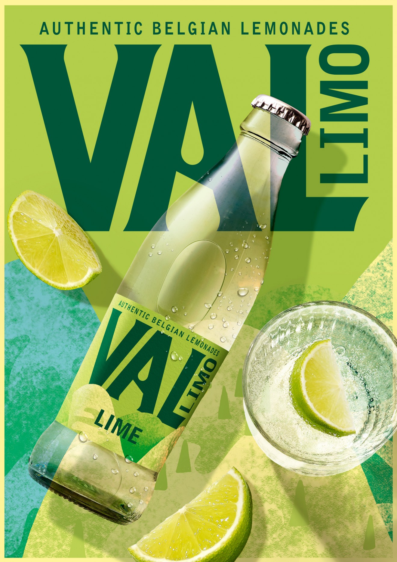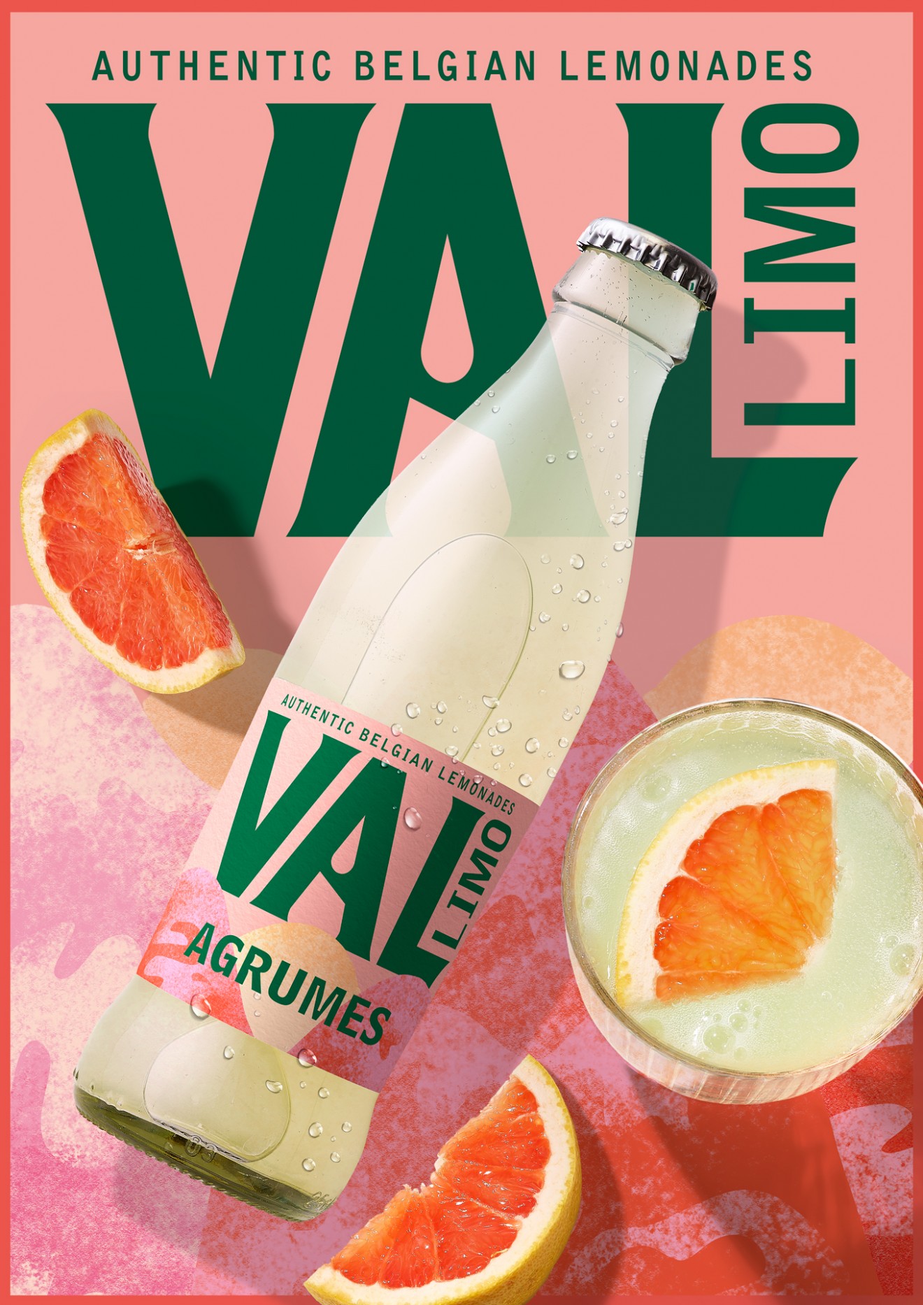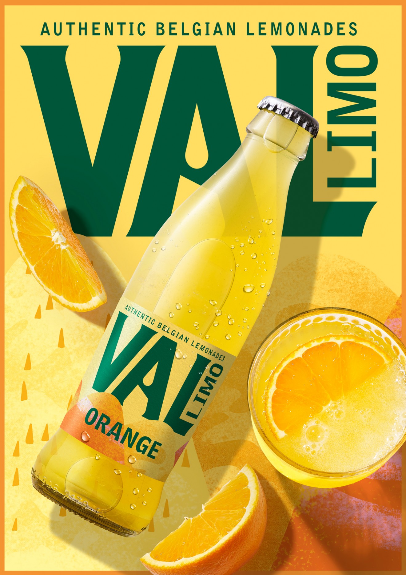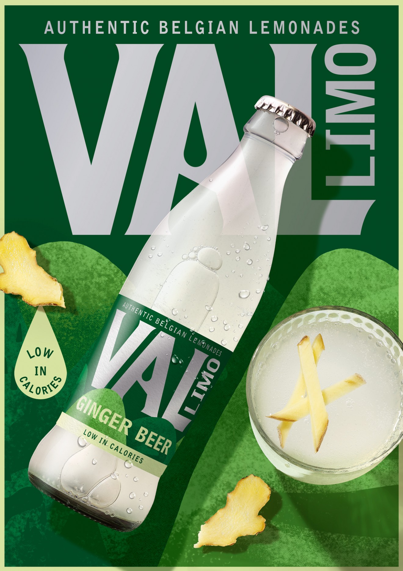
Val Lemonades Redesign for BROUWERIJ HAACHT
Back to the source.
The Belgian beer market is a tough place to do business, and like many other markets across Europe it has become evident that breweries are wise to maintain and invest in the soft-drink/non-alcoholic part of their product portfolios. Our client Brouwerij Haacht knows this only too well and has been servicing their café partners and the food-service industry with their Val mineral water and soft-drink brand for generations.
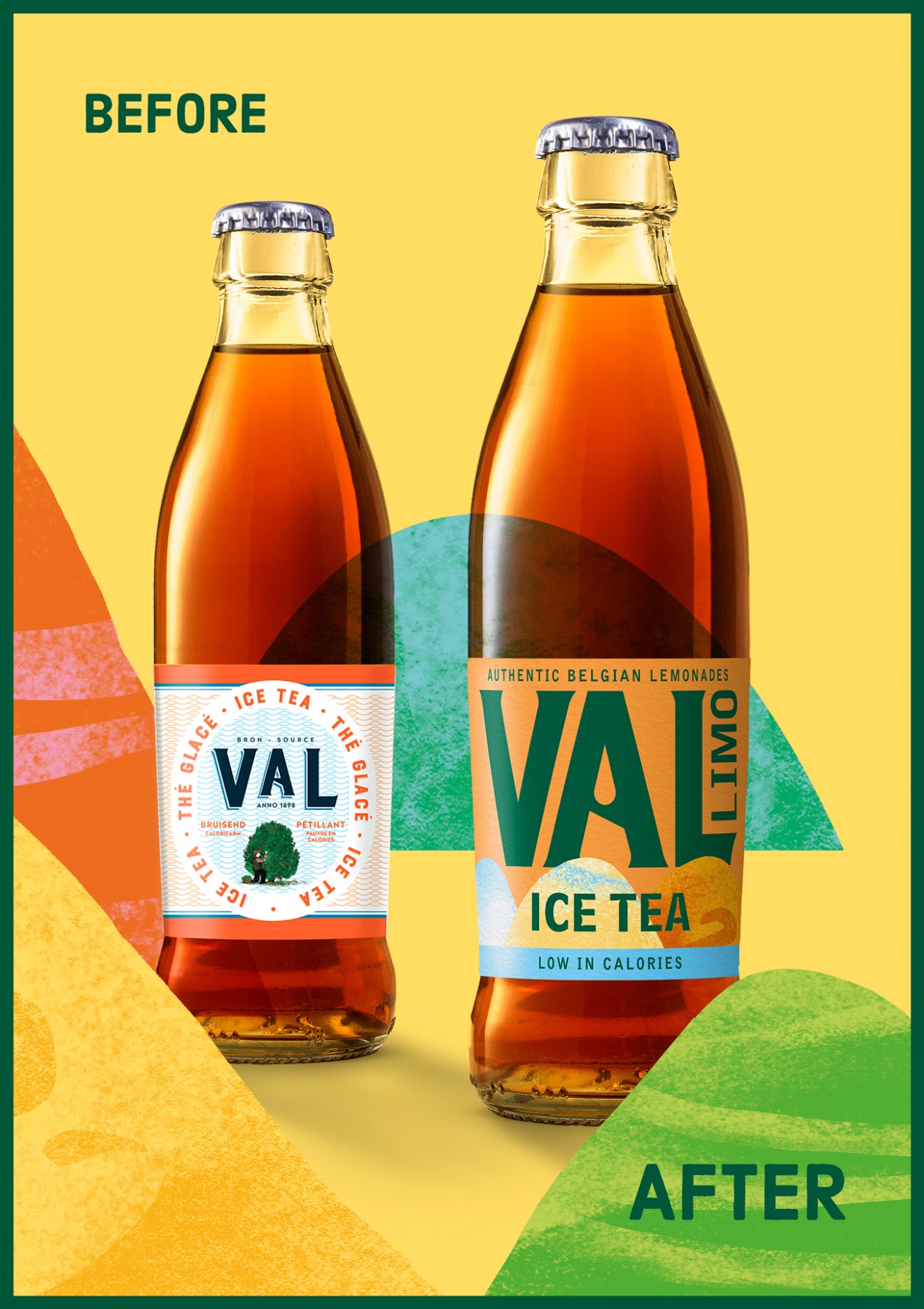
However, as time and the ever-changing markets often show us, brands need to stay on their toes to ensure relevance and desirability. Within the market specifically of modern lemonades and mixers, the number of competitors has increased significantly, leaving Val appearing somewhat dated and out-of-touch. There was a very real need to bring Val into the present day to compete eye-to-eye with new emerging trend-setting brands and also delight their café partners with an alternative they can be proud of.
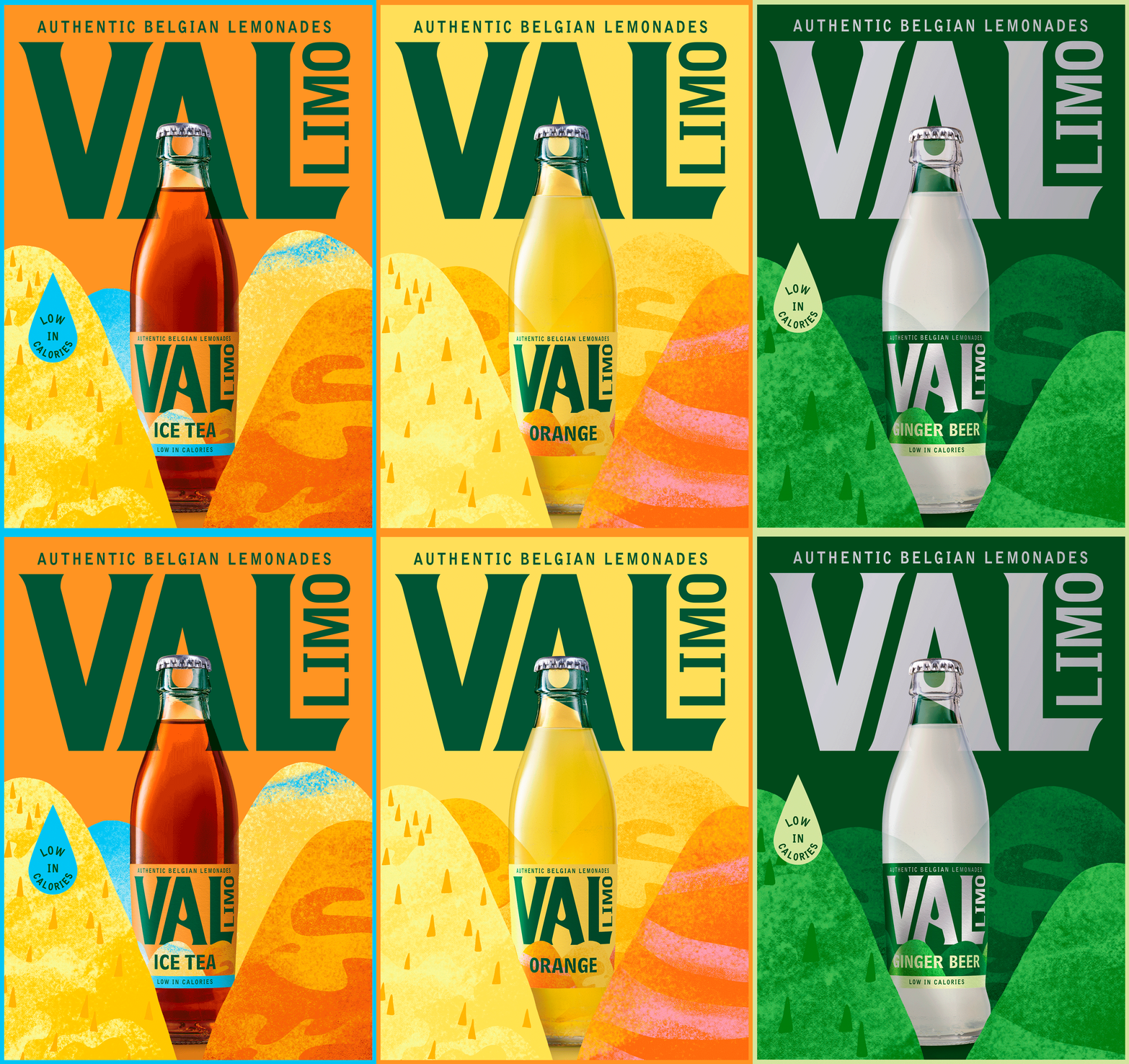
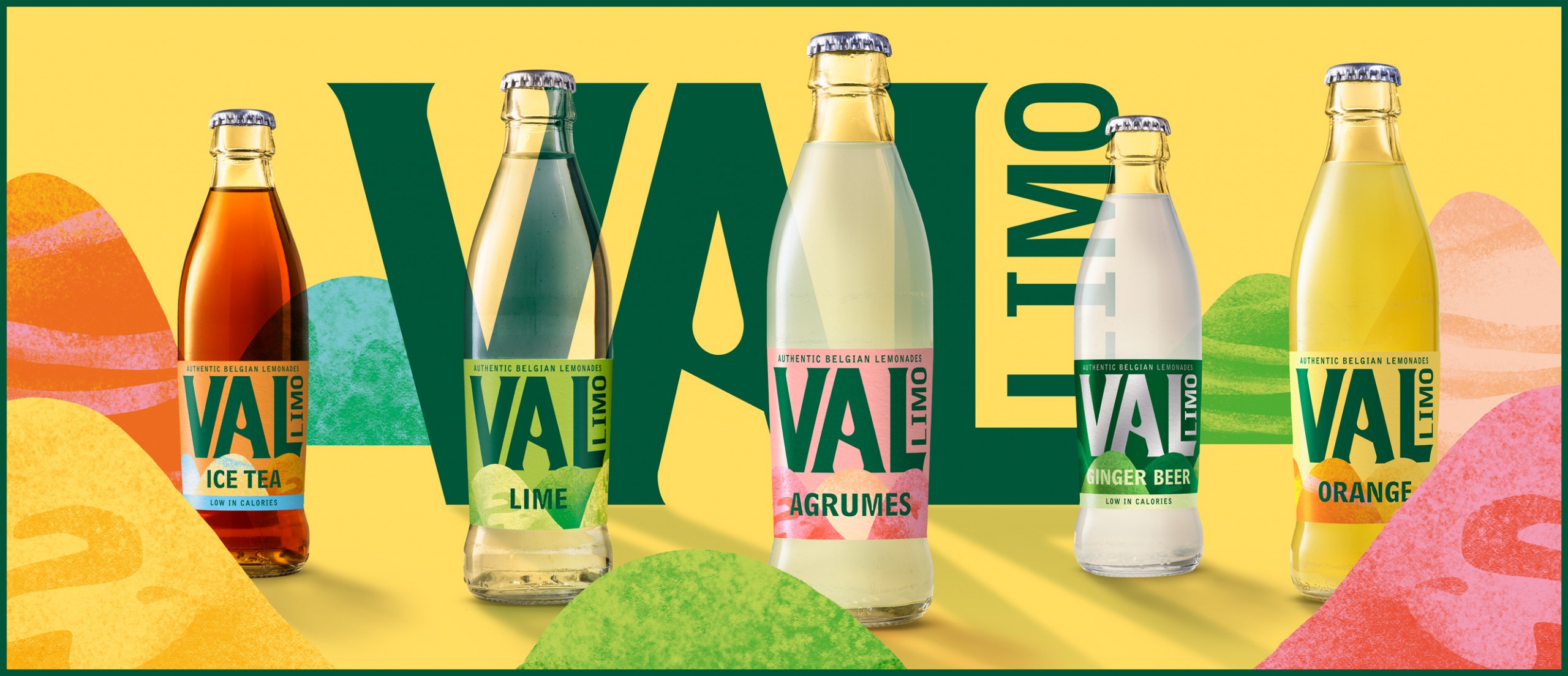
Our approach was to build a feeling of modernity and naturality by focusing on simplicity and the power of the Val brand name and its typography. Why over-complicate things when you can just strip a design down to its bare essentials but still deliver on appetite appeal and distinctivity. This range of authentic Belgian lemonades found its home in an abstract valley that reflects the brand name whilst utilizing colour coding and tactile textures to differentiate the flavours.