Redesign for TAMINI
A truly bon, bonbon.
Don’t we just love it, the pure pleasure of a sweet candy treat. But too much sugar, calories and too many additives aren’t what our body needs. Healthy snacking is a tricky business, full of challenging trade-off’s but that’s where Tamini comes in. Based on their root-to-sweets product production philosophy, the people at Tamini are driven to deliver absolutely the fruitiest, almost guilt-free candy sweet on the market. Crammed with a super high real natural fruit content, enriched fibres, but low in sugars, the Tamini sweet treat could be what you’re looking for.
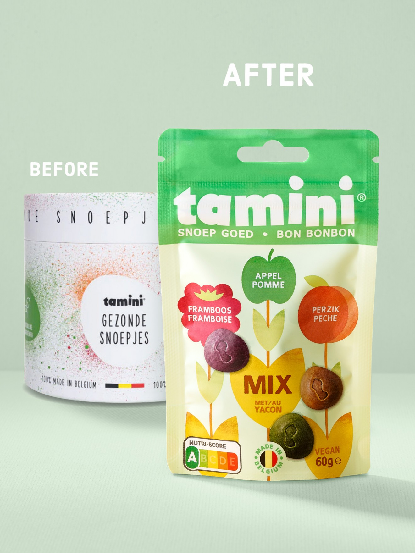
So, the product was there, but what about the packaging? Often start-ups do the best they can with what they have to swiftly help the business get off the ground. Short term solutions can bring a product to market but often need a serious re-think when the time is right to make a bigger impact on the retail world. So therefore, it was up to us to help transform their humble origins to a brand and packaging strategy that proudly and joyfully articulates their unique product story in a language that resonates with consumers. Our challenge was a tricky one. Tamini is a brand that caters for a sweet indulgence but is by far the healthiest and most natural option out there. No, we’re not a health product, and yes, our product contains natural fructose sugars, but in no way are we comparable to the countless unhealthy and sugar high candy competitors out there. So, if you’ll excuse the pun, we were looking for the perfect sweet spot. A packaging design identity that beautifully supports the natural fruit nature of our product, whilst remaining indulgent and delicious at the same time.
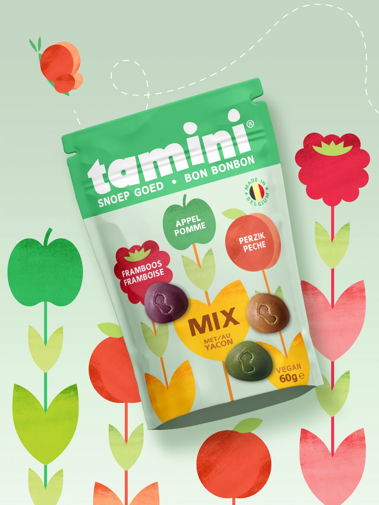
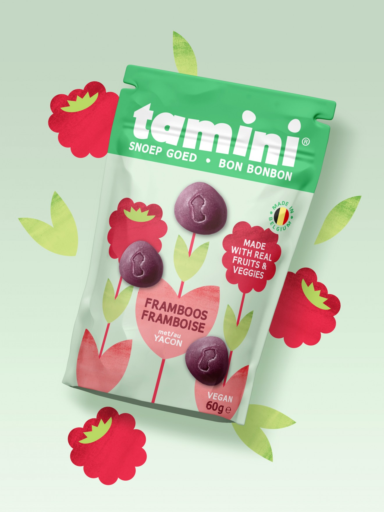
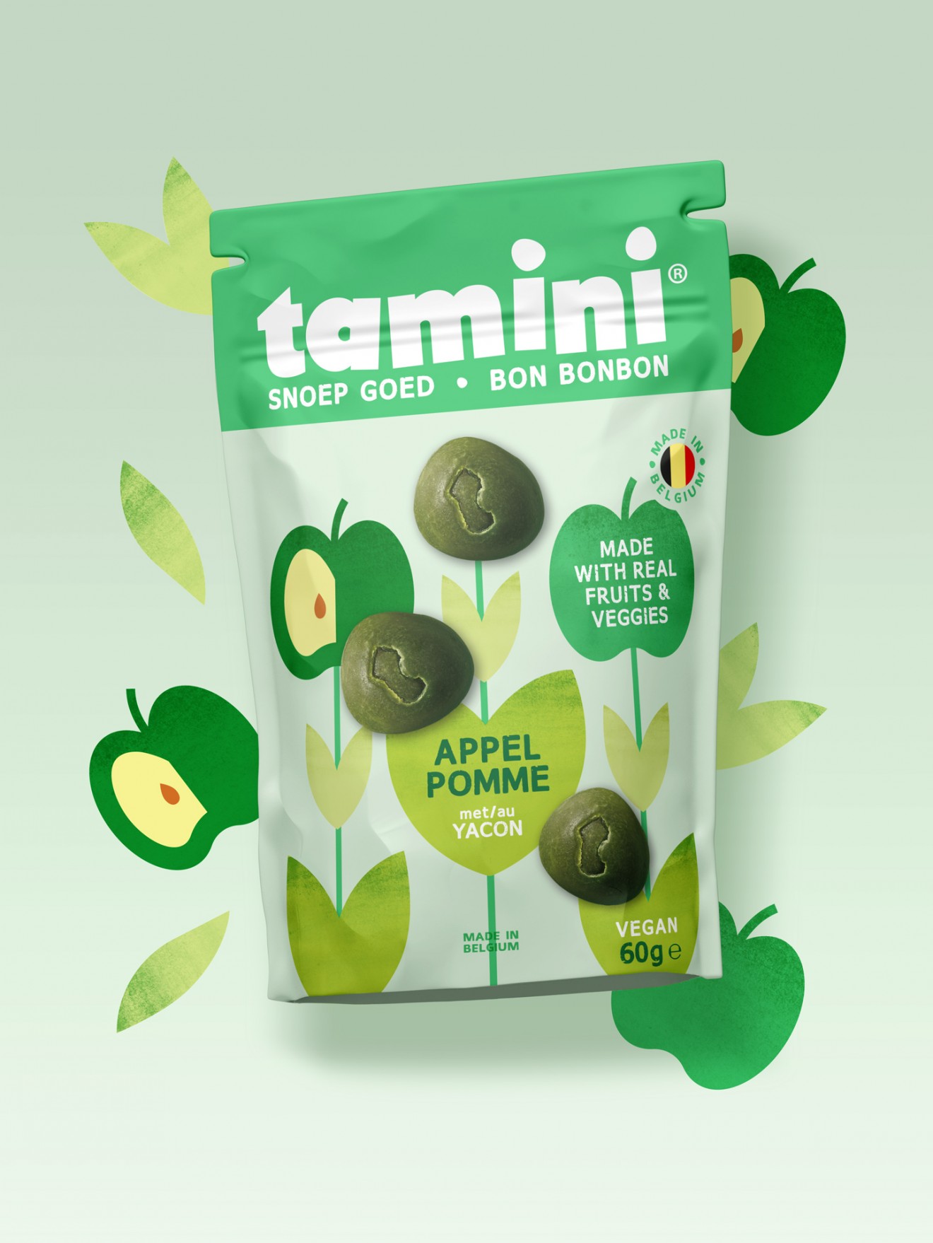
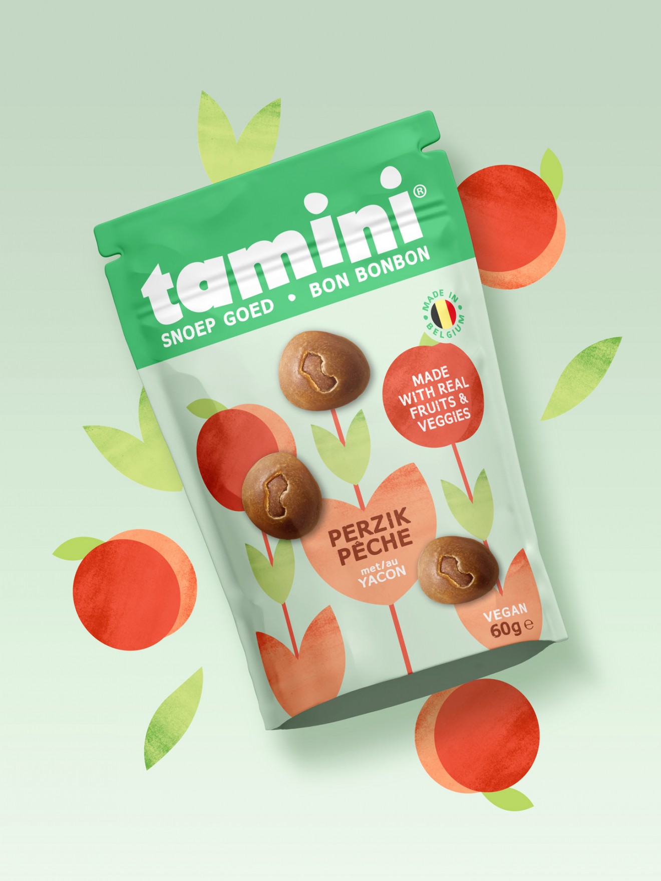
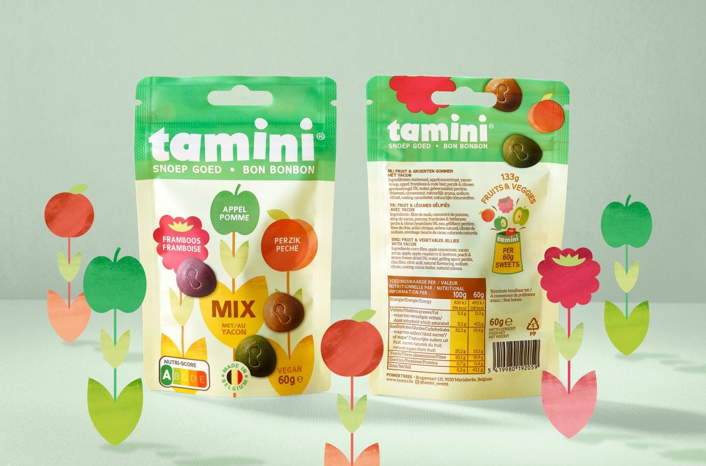
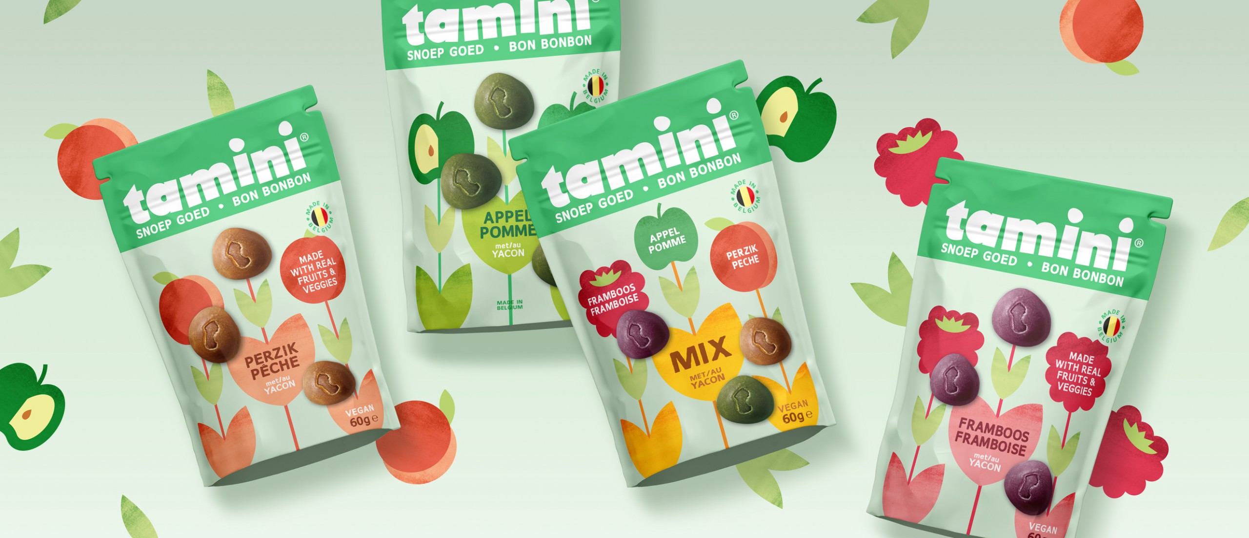
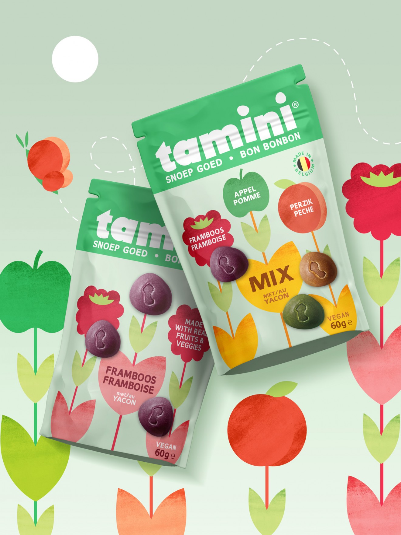
Collected in cute little pouches, the peach, raspberry and apple fruit flavours were supported by a visual languge true to their natural roots and designed to paint a fresher more vibrant picture than the overly artificial in-your-face graphics mostly associated with the sweet category. Now also with a branding that was powerful enough to make a true statement, the Tamini name was brought front-and-centre, knowing how important it’s descriptive nature is in supporting the product’s positioning and character.