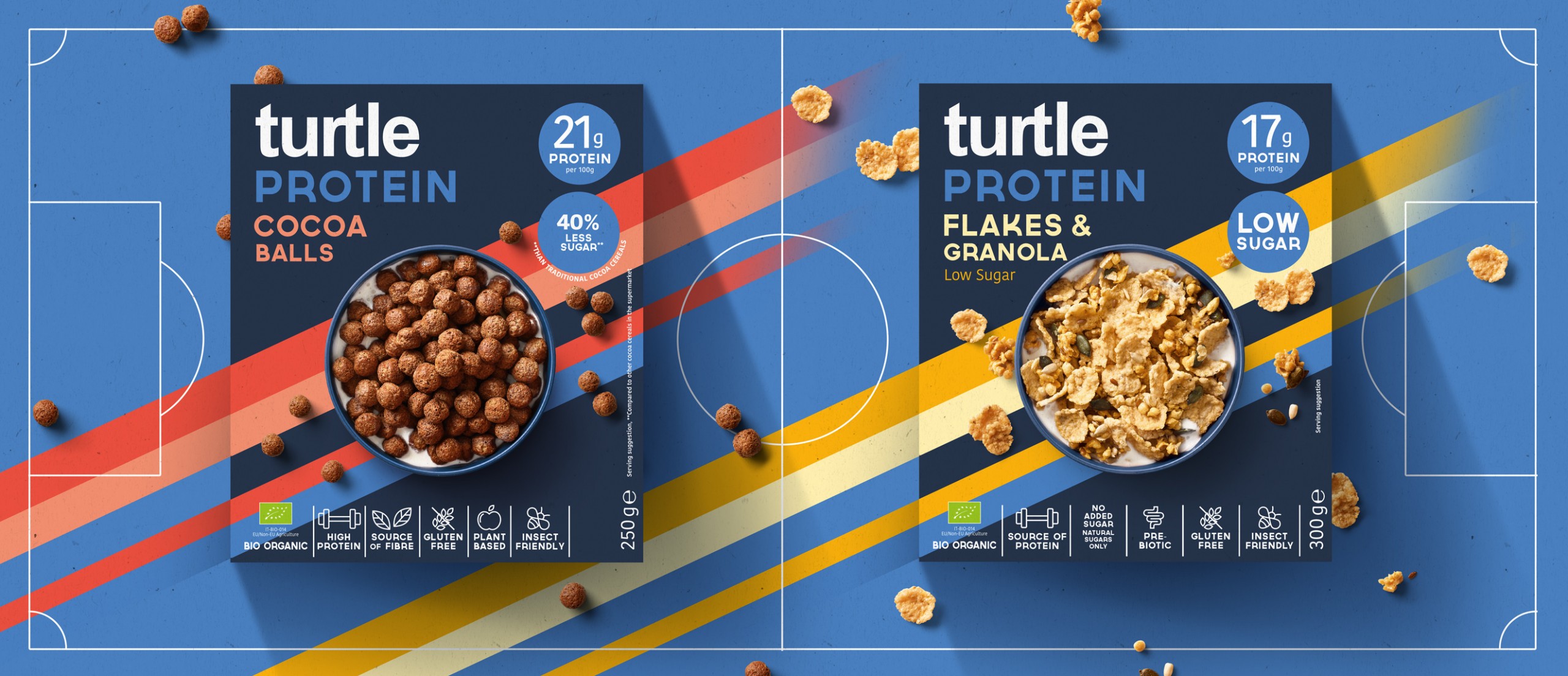
Protein Cereals for TURTLE
A pack all about performance.
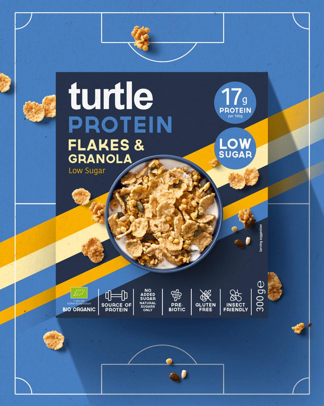
Our visual identity for Turtle Cereals has been growing for many years. As our client grows and expands their product portfolio, our identity needs to grow with it to accommodate their passion for the development of new innovations, unlocking and catering for new needs in the market.
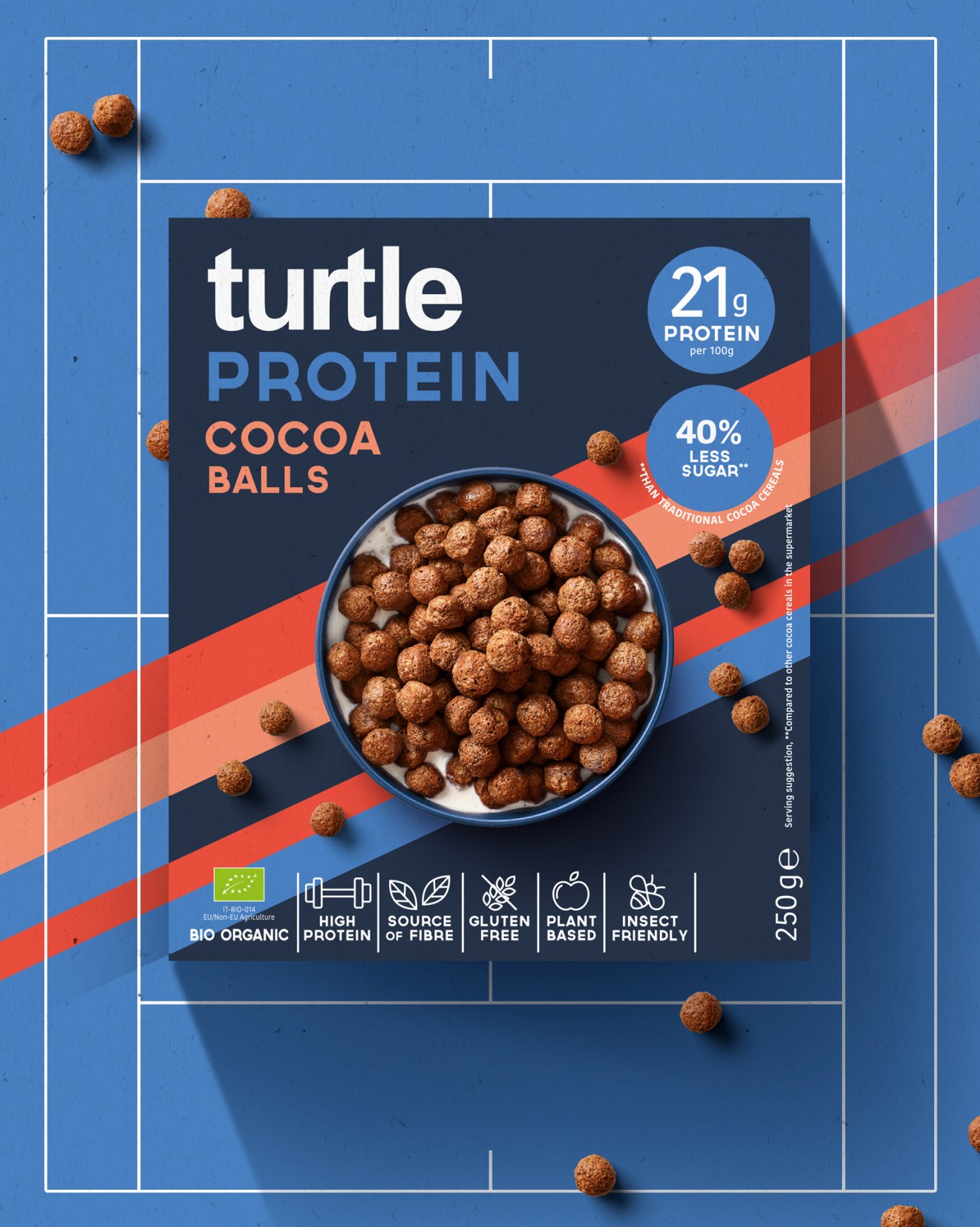
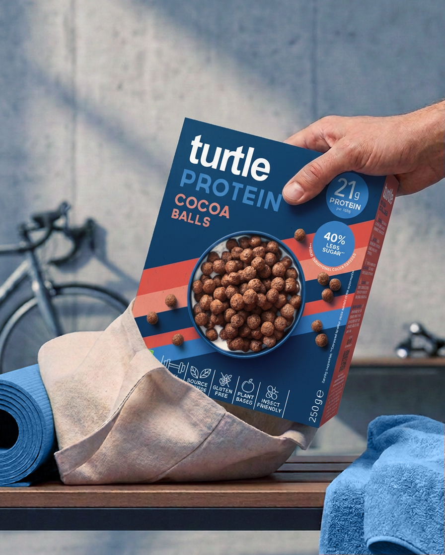
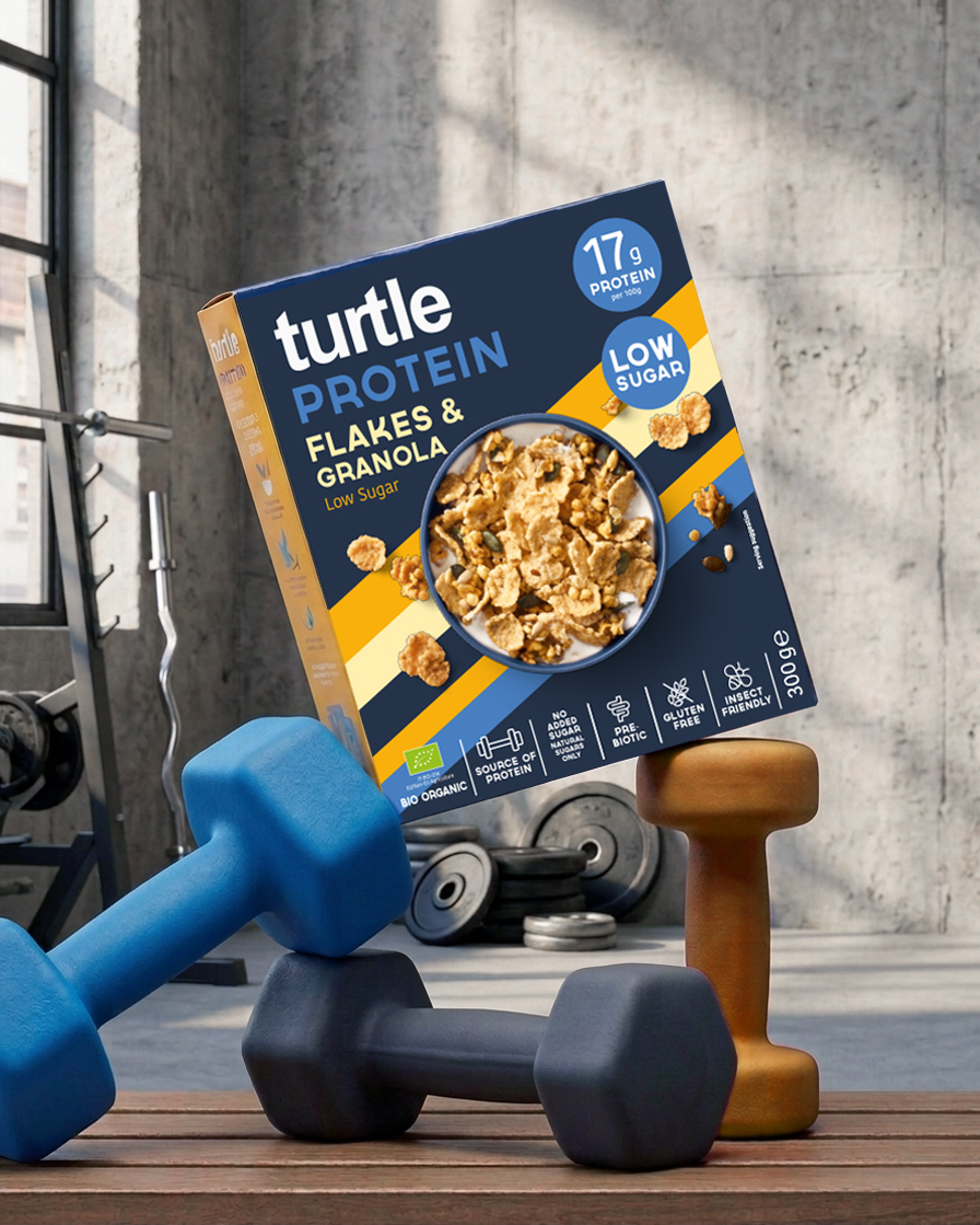
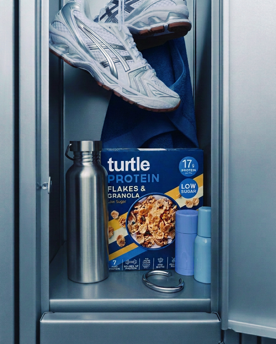
You’d kind of have to live on Mars not to notice how the demand for protein rich products has been absorbed into every category across ours stores and beyond. The world of breakfast cereal is also no stranger to this trend with our client jumping aboard this train with their new protein enhanced flakes and choco balls. Mainstream products with a key functional benefit that needed to be amplified to the max. It would be easy to fall into the trap of making a simple adaptation and no one really noticing anything has changed. This gave us the focus required to bring the product story home loud and clear. Gone are the conventional Turtle natural illustrations and fresh colours, replaced by a disruptive blue range colour and dynamic performance stripes. A visual DNA that binds these two niche products into a powerful family look that articulates their positioning from shelf.
Design to reach goals and you won’t be disappointed.