RESTYLING for Yokuu
Let Nature Clean Your Home.
Yokuu invites you on a journey that looks to put the world of household cleaning and hygiene on its head. Extracting natural bacteria from the Belgian Ardennes ( 15 million to be precise ) and condensed into a powerful cleaning pearl, all you need is to add water to activate this unique cleaning revolution. This ground-breaking innovation introduces a new way to clean by inviting nature into your home and reverses the trend that dictates that bacteria are harmful. Yokuu not only cleans but purifies your home by forming a positive cycle of healthy bacteria that help support your immune system. This innovative creation uses no harmful chemicals, sources its materials locally and due to its ‘just add water’ refill strategy, has a dramatically reduced carbon footprint.
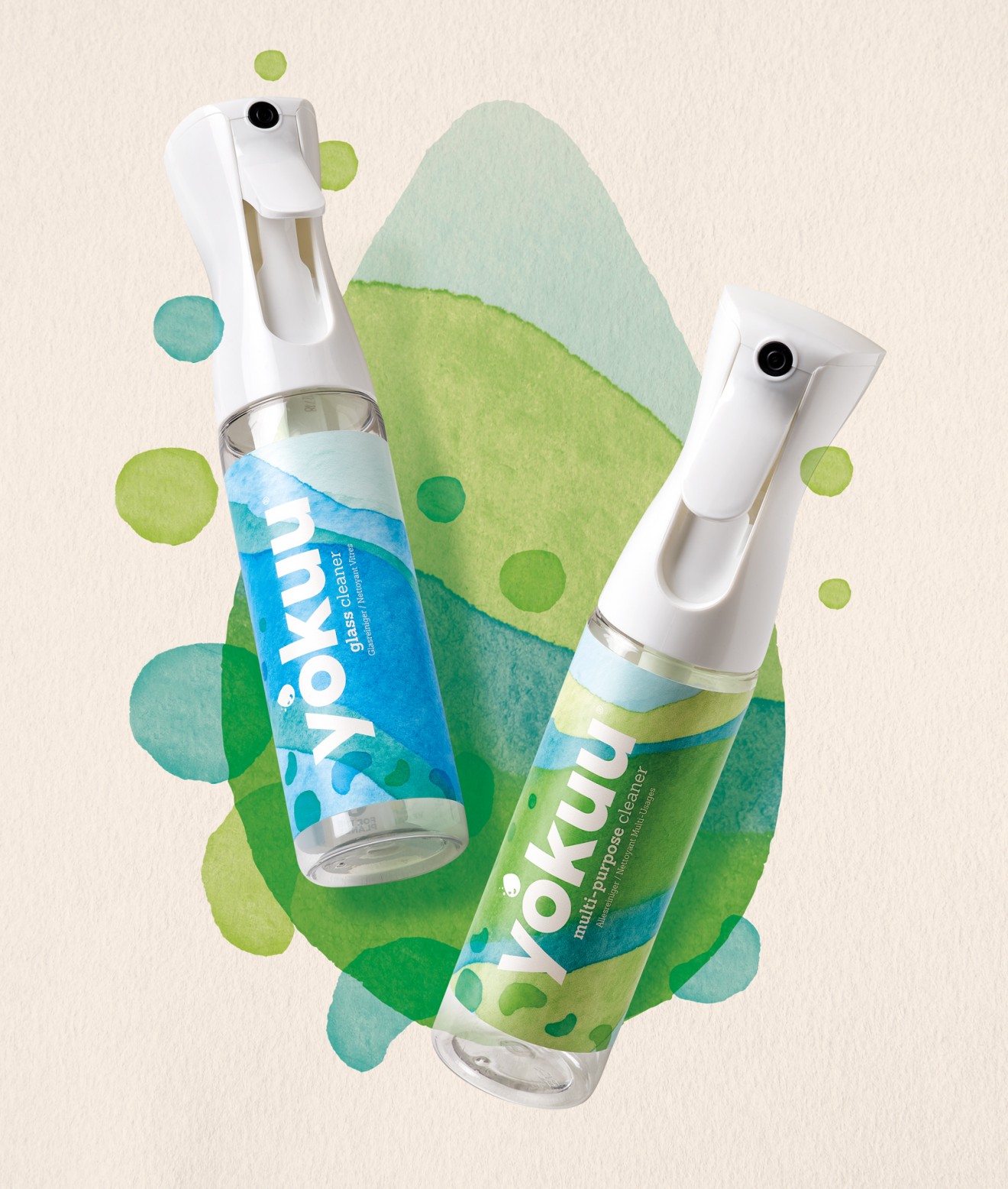
With this game-changing product in mind and a passion to help support sustainable alternative lifestyle choices, we threw ourselves into the green world of Yokuu and its engaging brand story. Knowing full well the kind of competition they would be up against but also keen to tap into the early-adopting consumers most likely to buy Yokuu, we dove deep into the complex product story in order to bring it to life.
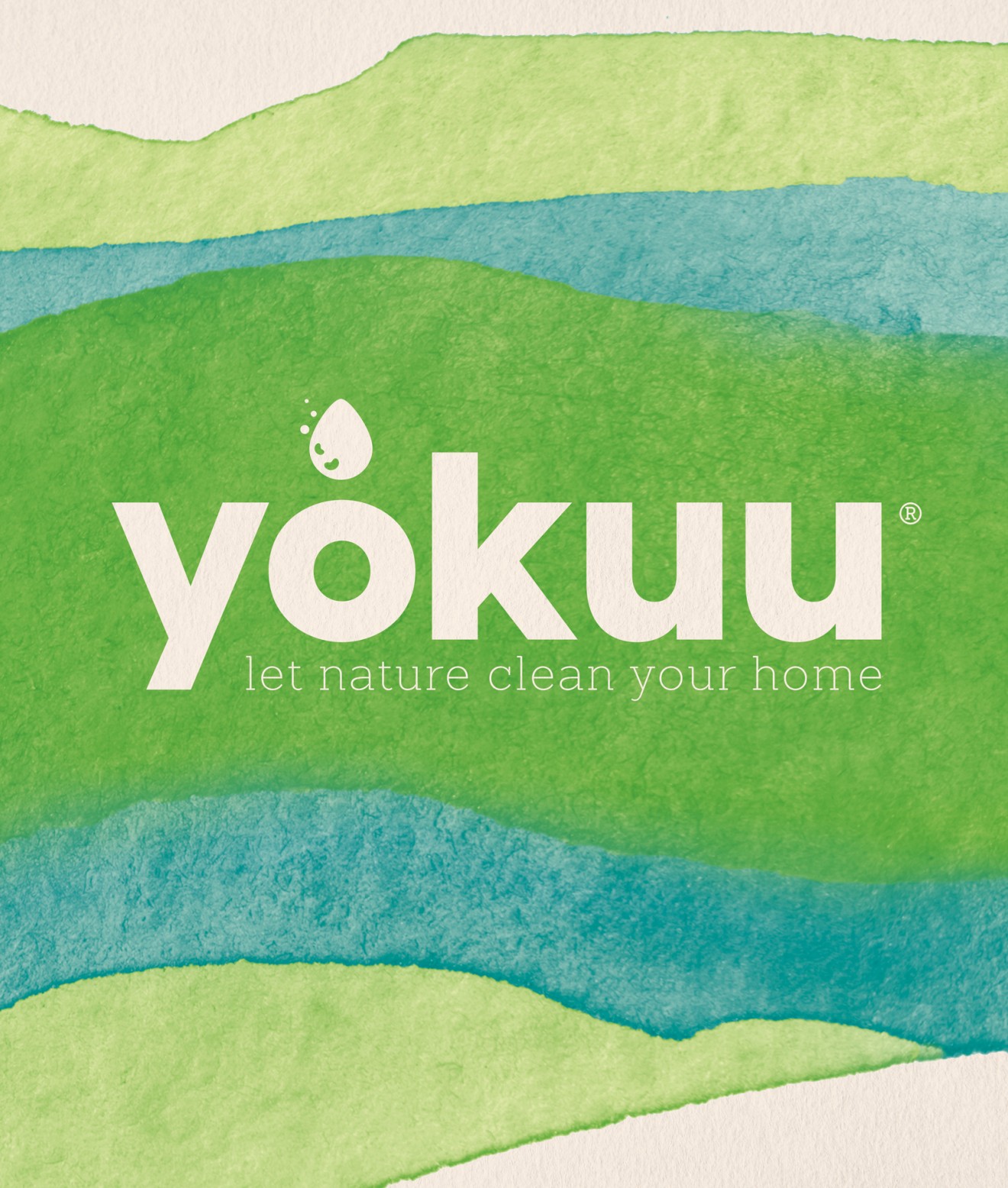
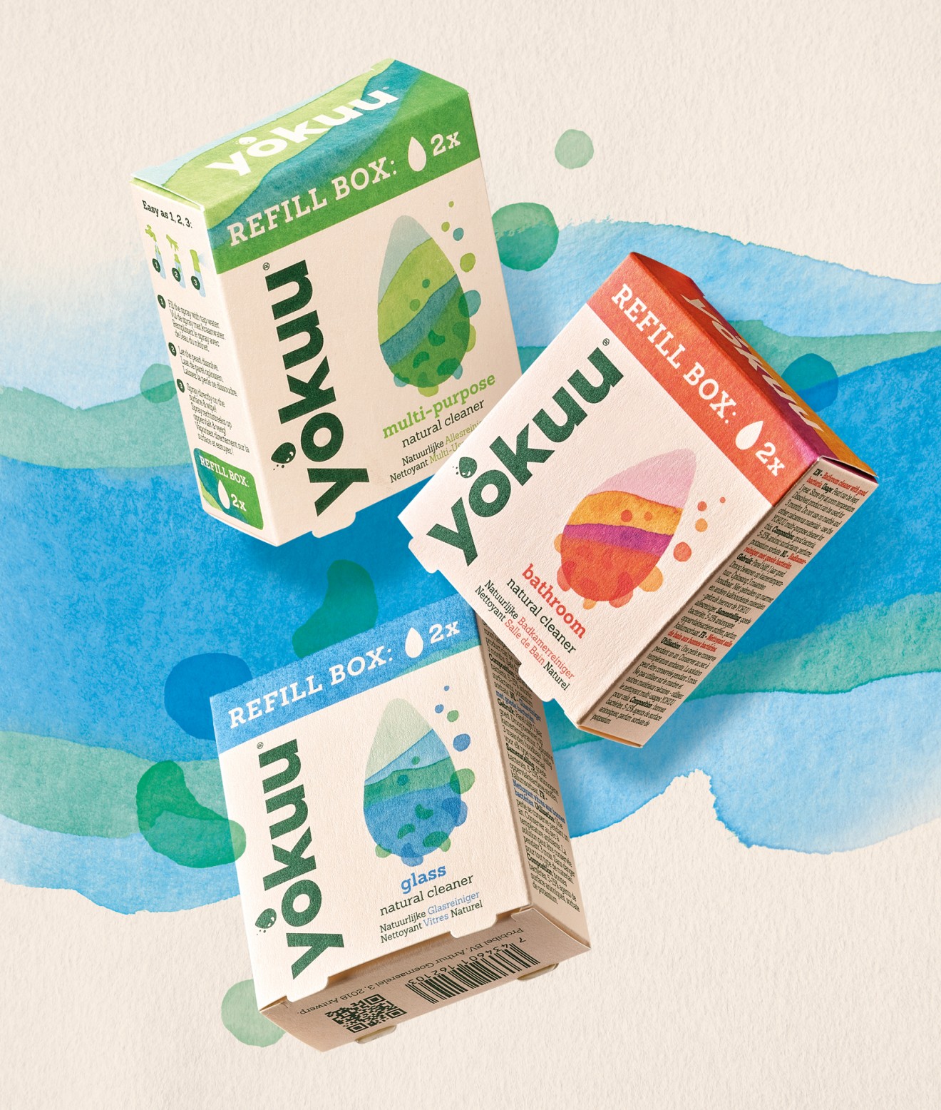
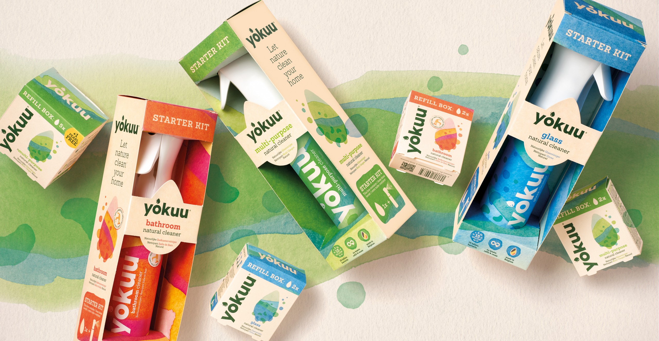
Above all, although the science may be tricky for some, we still felt that there was a consumer intuitive way to articulate the cleaning process and employed our Yokuu ‘Pearl Key Visual’ as a visual device that connected the bacteria with the product. This key visual carries the identity look & feel that employs tactile watercolour textures and layers that both reflect natural cleaning and the bacteria’s Ardennes origins. This watercolour texture and alternating colours were used to help differentiate between the different products throughout the range whilst forming the glue that ties the family together.

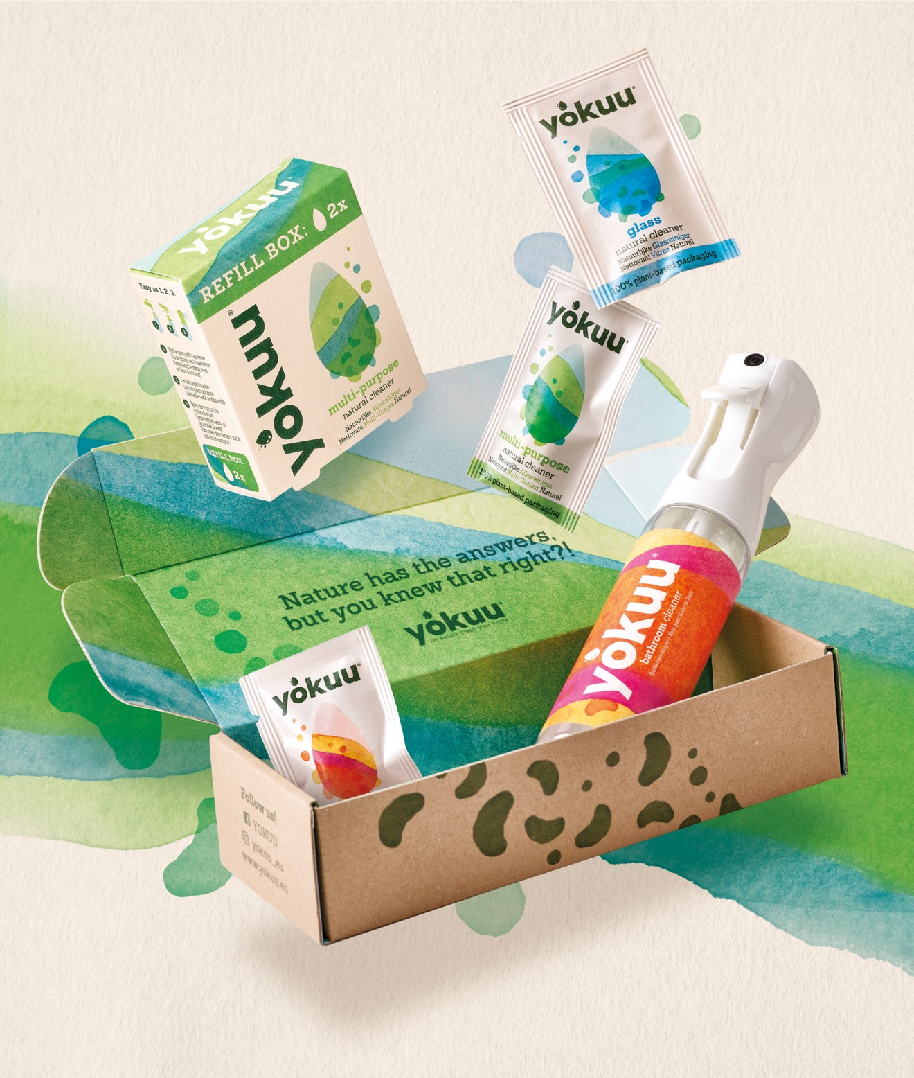
An additional effervescent pearl symbol was also integrated into the branding, whose deep green brand colour symbolizes the link to nature and acts as a powerful contrast to the earthy beige background. Alongside, but no less important to the brands look & feel was the on-pack product information and benefit communication. Care was taken to guide consumers through multiple layers of product storytelling, explaining visually through infographics the diverse array of benefits and reasons-to-believe.
Next to the long-life refill spray bottles, recycled carton and paper was used for the remaining packaging to maintain the brand’s green values and appeal to conscious minded consumers alike.

