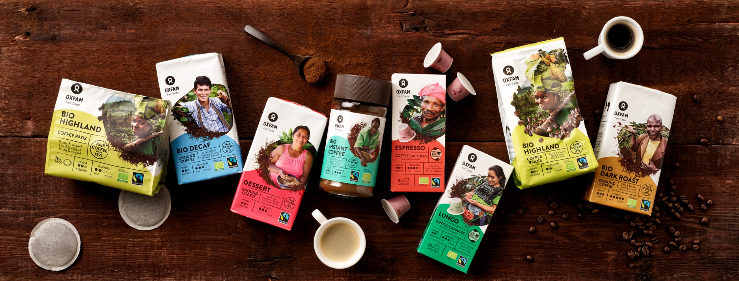
Restyling for OXFAM FAIRTRADE
Design with a human touch.
In the year 2010 – grateful for the chance to redesign the branding and packaging of this fairtrade pioneer – we uplifted the core identity of OXFAM FAIRTRADE Belgium by giving a chance to the real-life farmers to present their real story. Now – more than 10 years later in 2022 – the message stays and still delivers, but the design itself was in need of an even bigger focus on the OXFAM partners and a refreshing re-engagement with their stories.

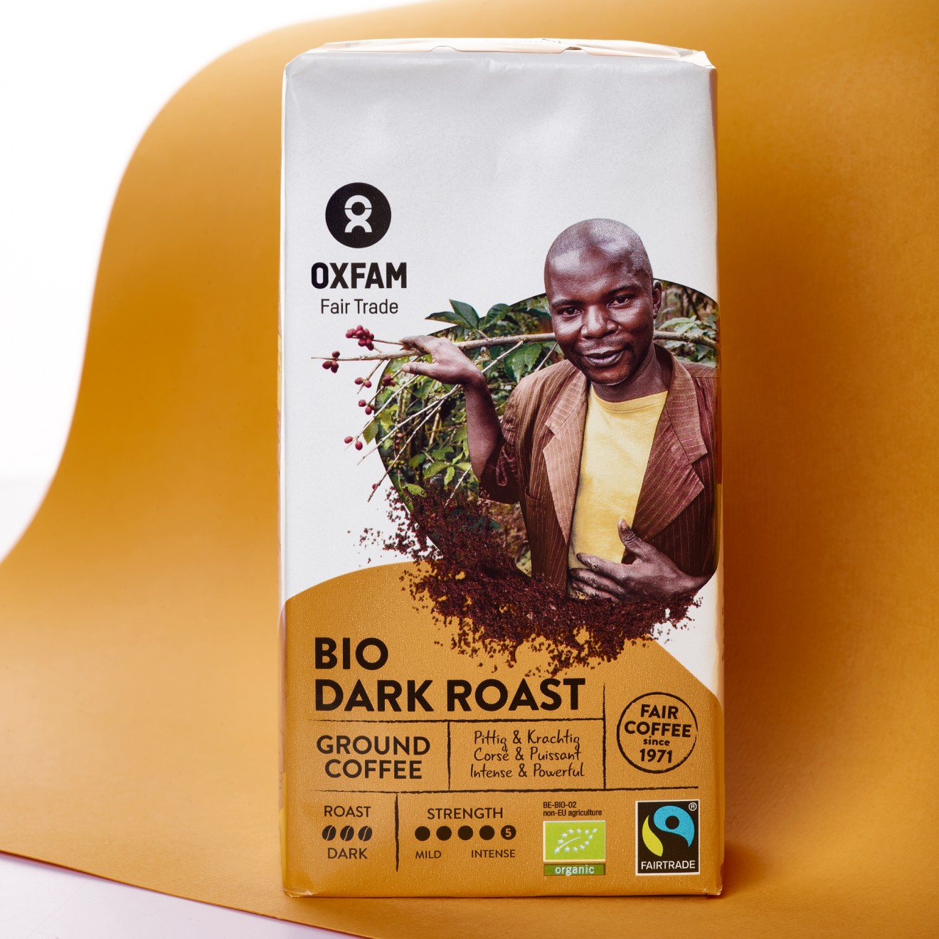
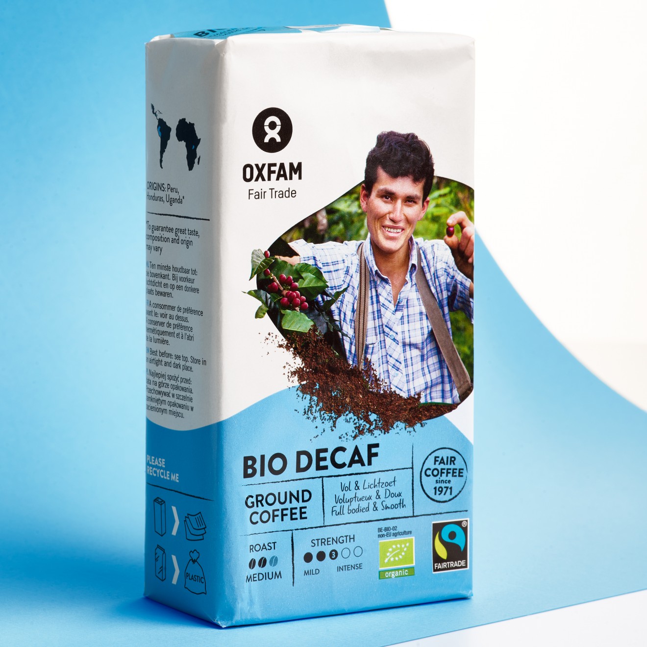
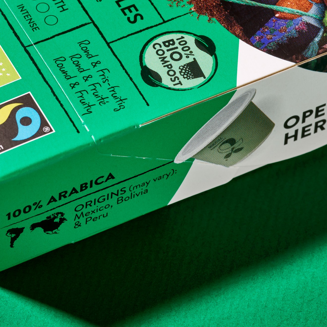
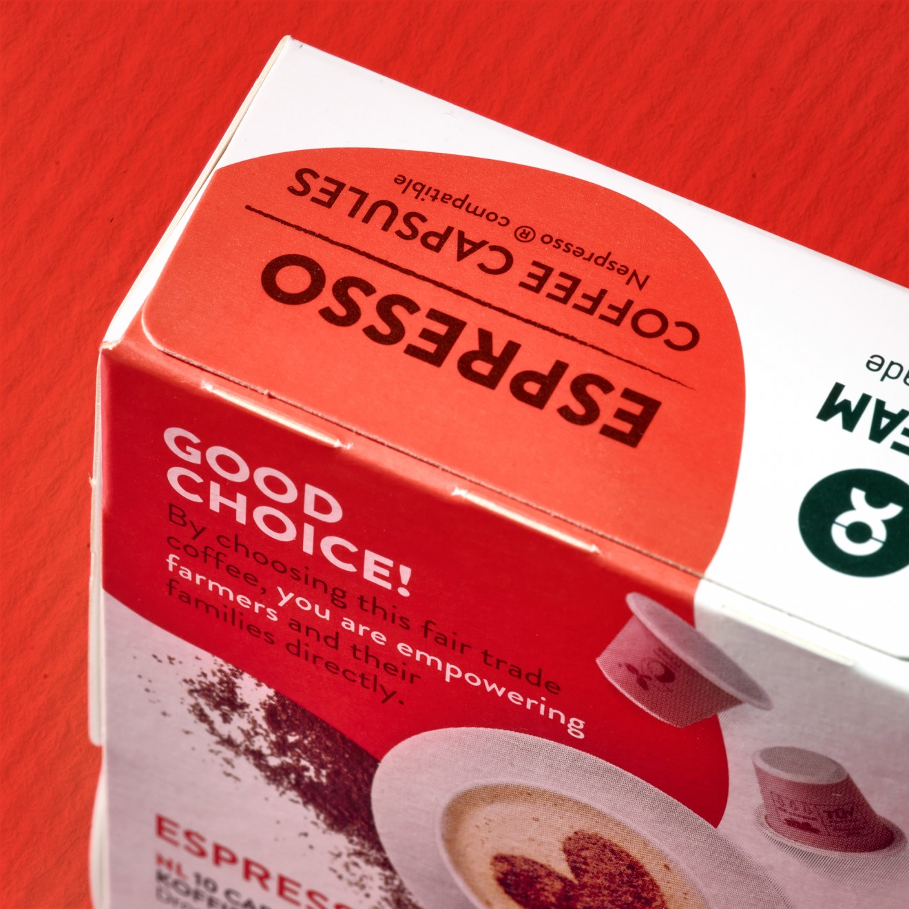
To achieve this, we focused on creating a clear architecture through inviting photography and crisp colors. The direct interaction of our partners with the products they sell and the pack itself brings a dynamic modernity that helps shift our beloved client into the present.
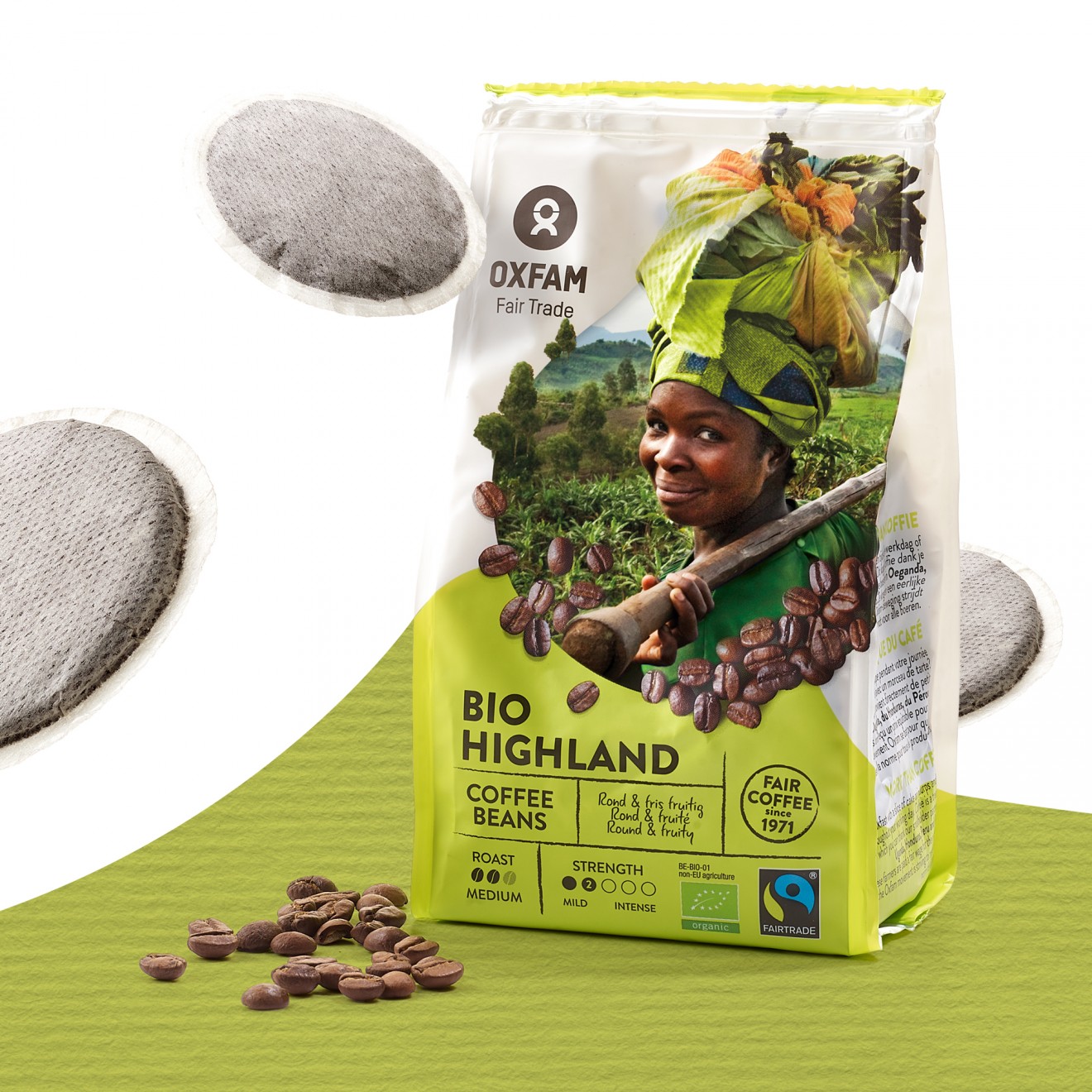
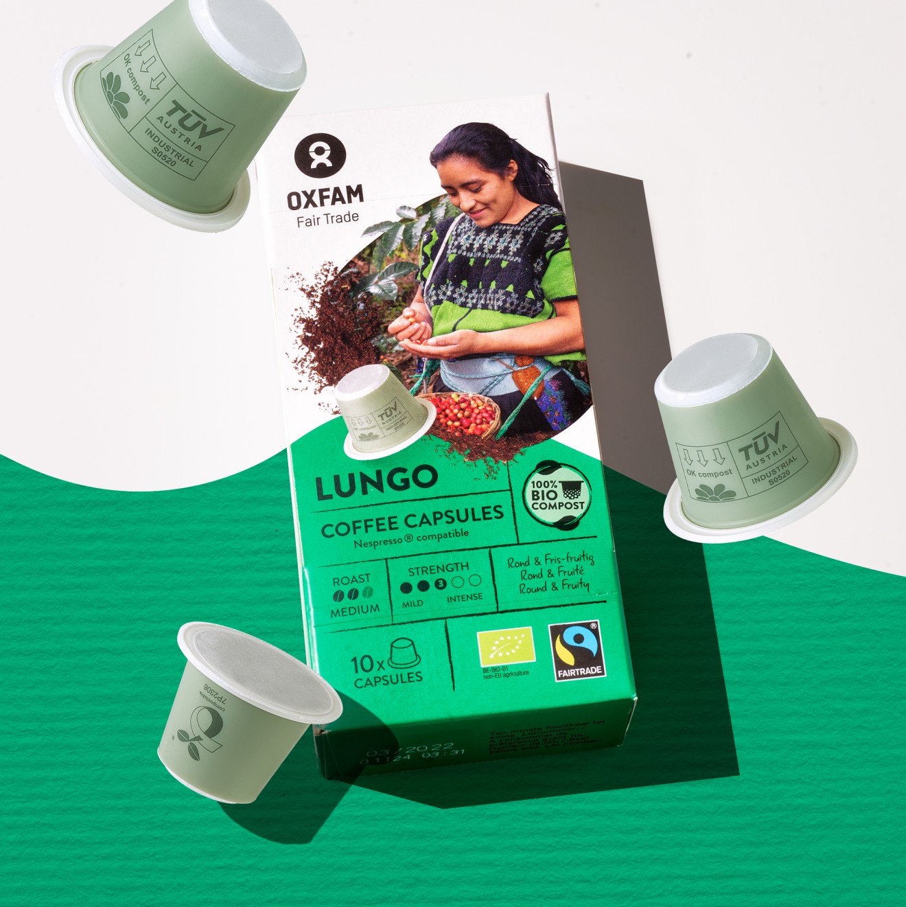
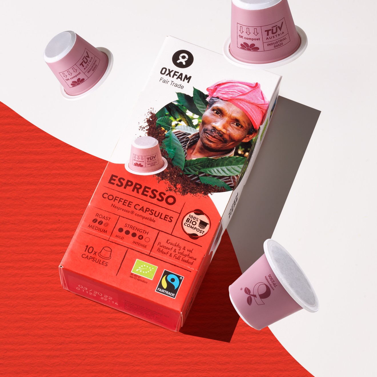
Our process of change begins with their core product: coffee. Throughout the array of different packaging shapes and products of this range, the architecture already proves itself to be flexible and engaging. More than necessary for a wide range of products that includes tea, chocolate, juices, crisps, nuts, marmalade, olive oil and much more.
Get ready to be charmed by these very human packs as they smile back to you from the shelves.
[IMG]
[IMG]