RESTYLING for Etixx
Design that helps achieve your goals.
Etixx sports nutrition has been at the centre of the sport nutrition and supplement category for many years now, acting as a well-established and respected player in the market. Despite this success, the new introduction of additional competitive players in the market and the increasing demands of an evolving category has resulted in a situation where Etixx felt it was being a touch left behind. So true to any brand who wishes to remain top-of-mind and relevant for consumers, a brand refresh was required to boost Etixx back to the top.
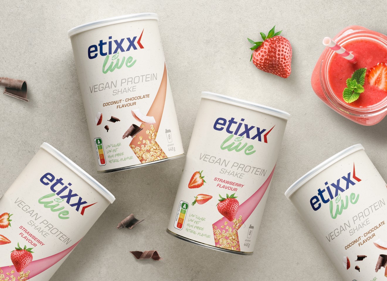
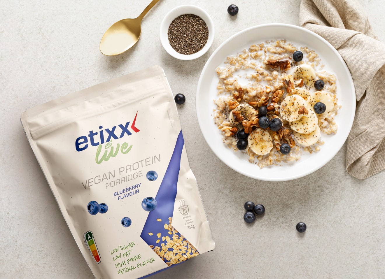
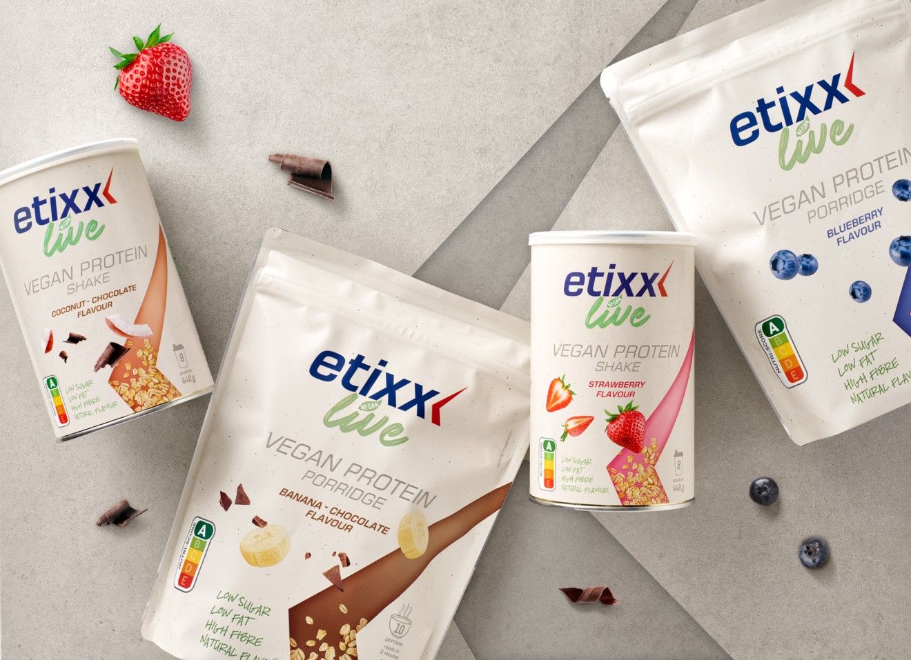
As much as the current design had delivered in the past, a reinvigoration was required to help consumers re-engage with Etixx and cement their positioning as experts in the field of scientifically endorsed sports nutrition. Developed by athletes for athletes, Etixx is a brand that empowers you to reach your goals and deserved and brand and packaging design that reflected these values. With a product portfolio that spans across sports nutrition, muscle nutrition and sports supplements, the brand also decided to add a family of ‘meal-replacement’ solutions that are part of a growing trend in modern nutrition.
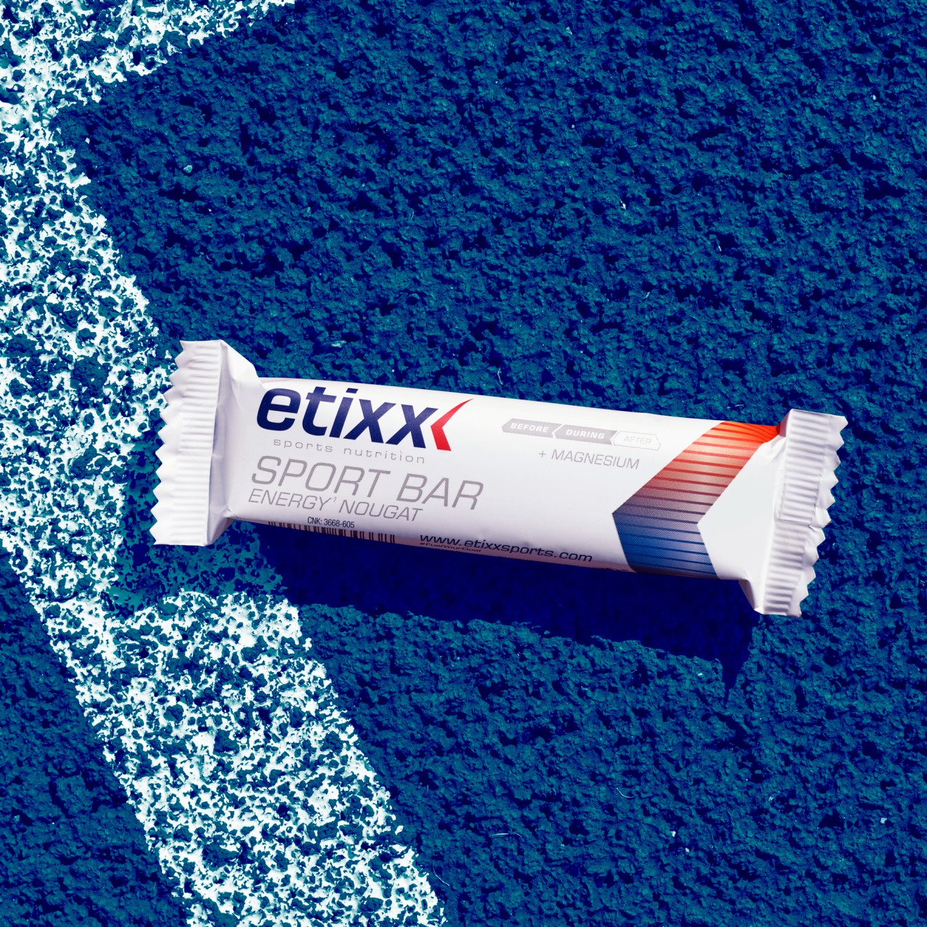
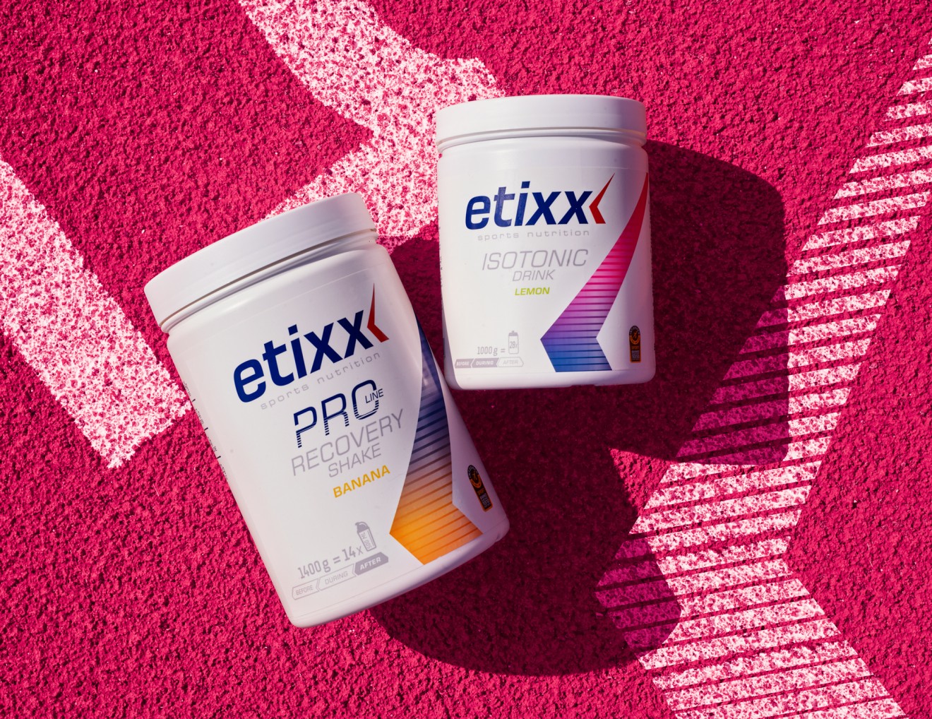
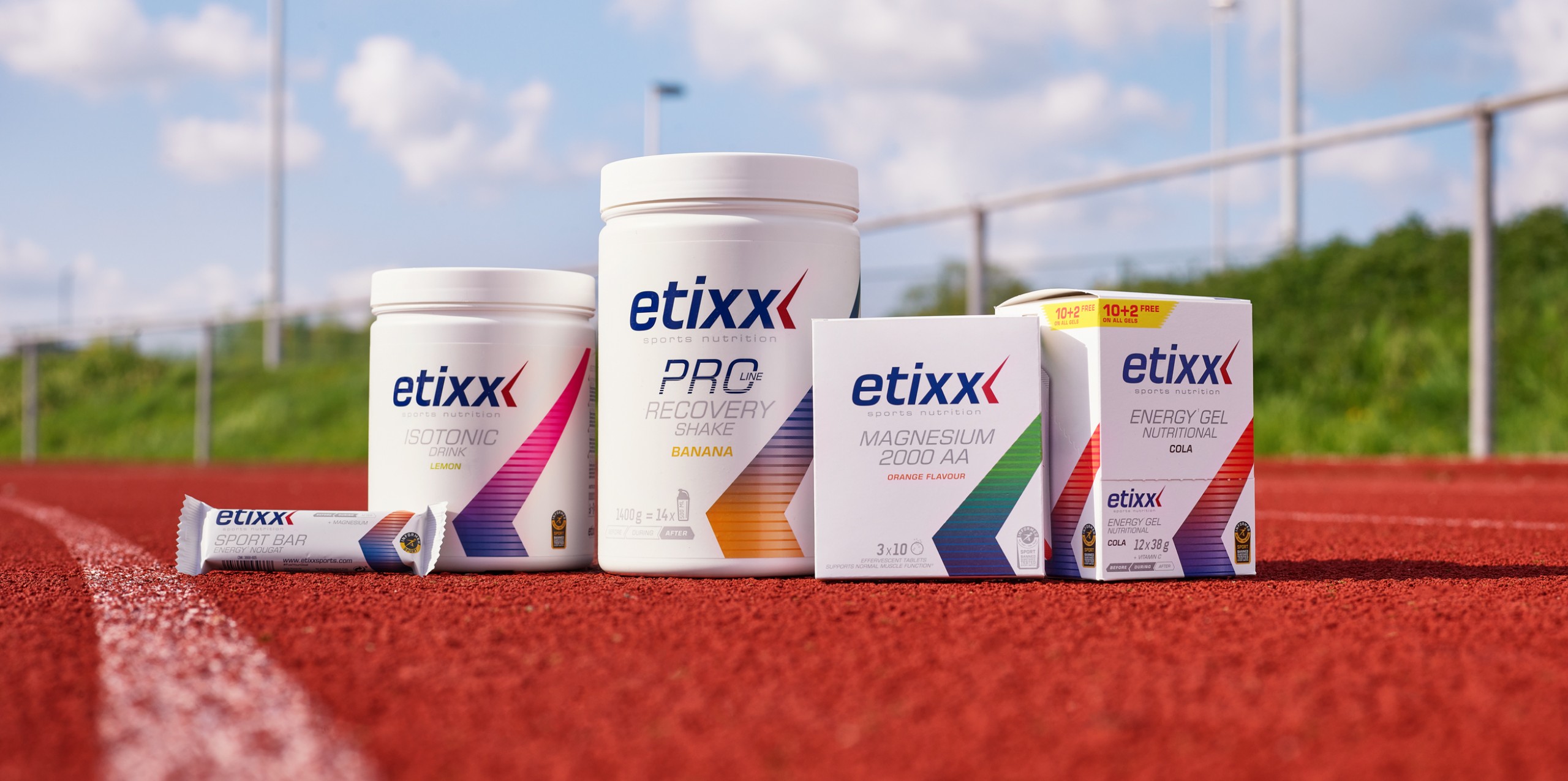
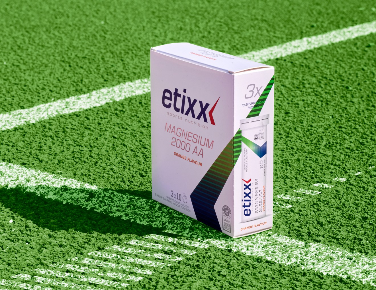
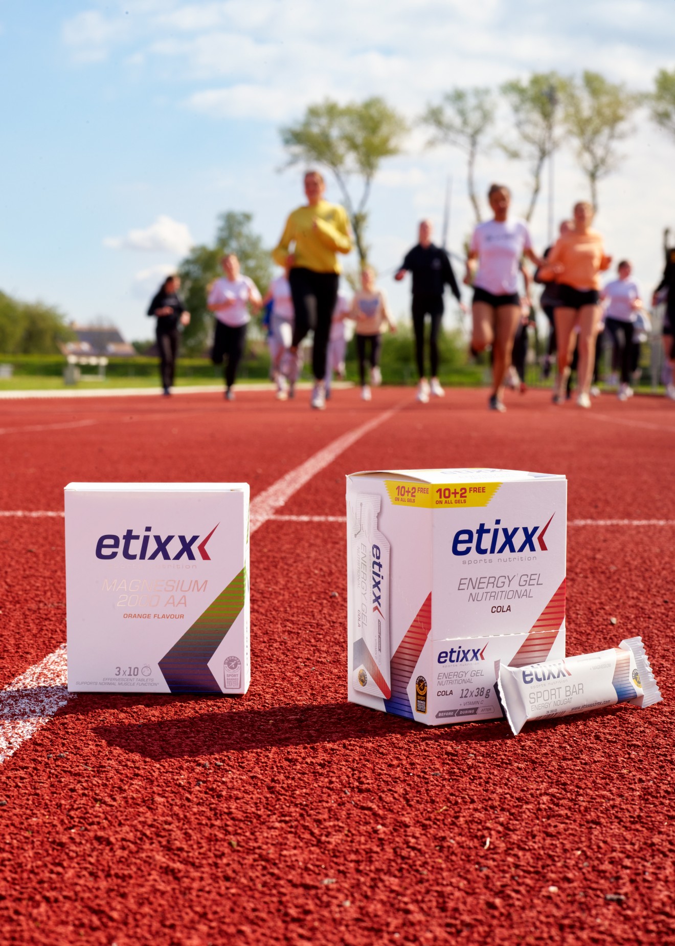
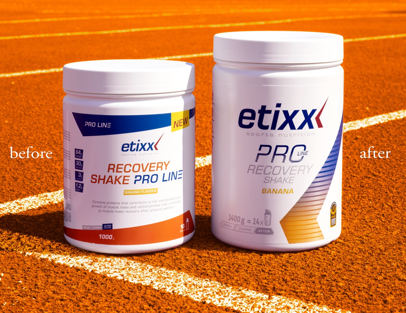
Our approach was simple. In order to convey an impression of performance and efficiency we decided to strip the brand back to its essence and focus on the values the brand expresses. Using the brands existing ‘peak’ brand symbol we built an identity that shone a spotlight on this device and its powerful properties. This bold symbol of power carries the energy the brand needs and became our iconic device that glues the packaging identity together. This ‘peak’ was also put to work to carry the necessary product colour coding that helps guide consumers across the product categories. The products powerful properties are also reflected in the colour gradation and energy level stripes that rise through the symbol. The brand design in general became far more branding focused, underscored with a simple hierarchy of product info listed in silver on the brands pristine white background.
A fundamental difference between regular sports nutrition and muscle nutrition is signified through its dark blue background but it’s with the Etixx Live range that we pushed for even greater differentiation. This family of natural meal-replacement products was designed to cater for the ever-growing trend that sees a push for quicker, more efficient and controlled nutritional intake as part of a healthy lifestyle. So here our challenge was to convey the necessary appetite appeal and naturalness in combination with the brands new iconic brand identity and the role the ‘peak’ brand symbol plays.
So when reaching for the best, keeping things simple can be the boost your brand needs.