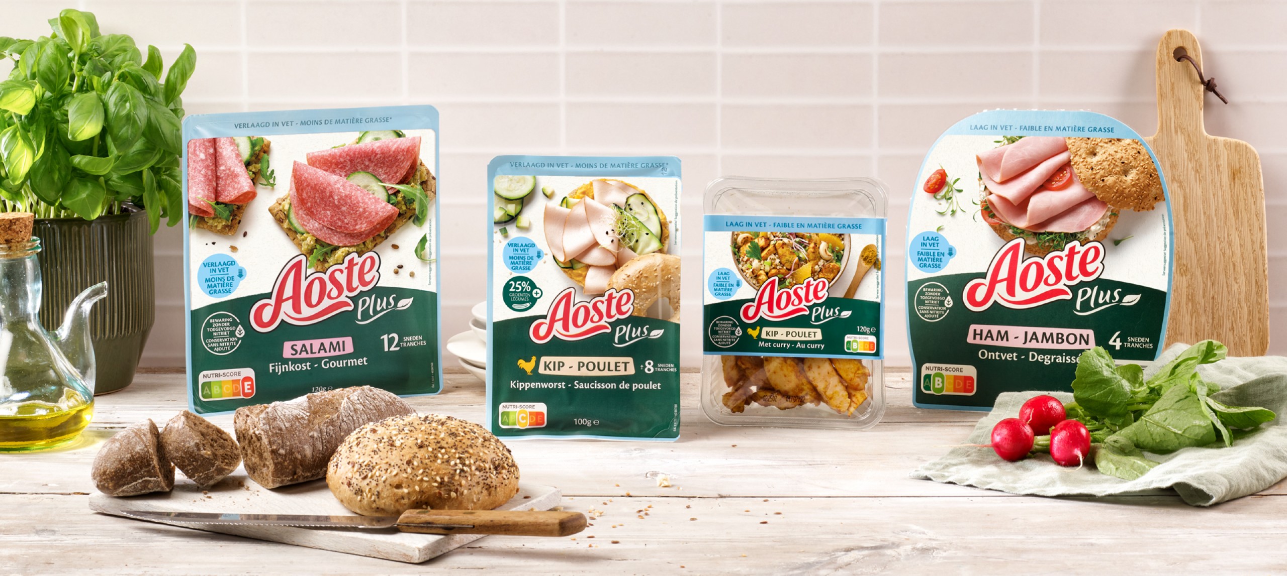
AOSTE + for Imperial
Charcuterie with added value
Often when working for well-known and established brands, we’re asked to help support the evolution of design identities surrounding the positioning of new product innovations in the market. This was no different for our work for Aoste Plus, their health orientated range of reduced fat charcuterie with added vegetables.
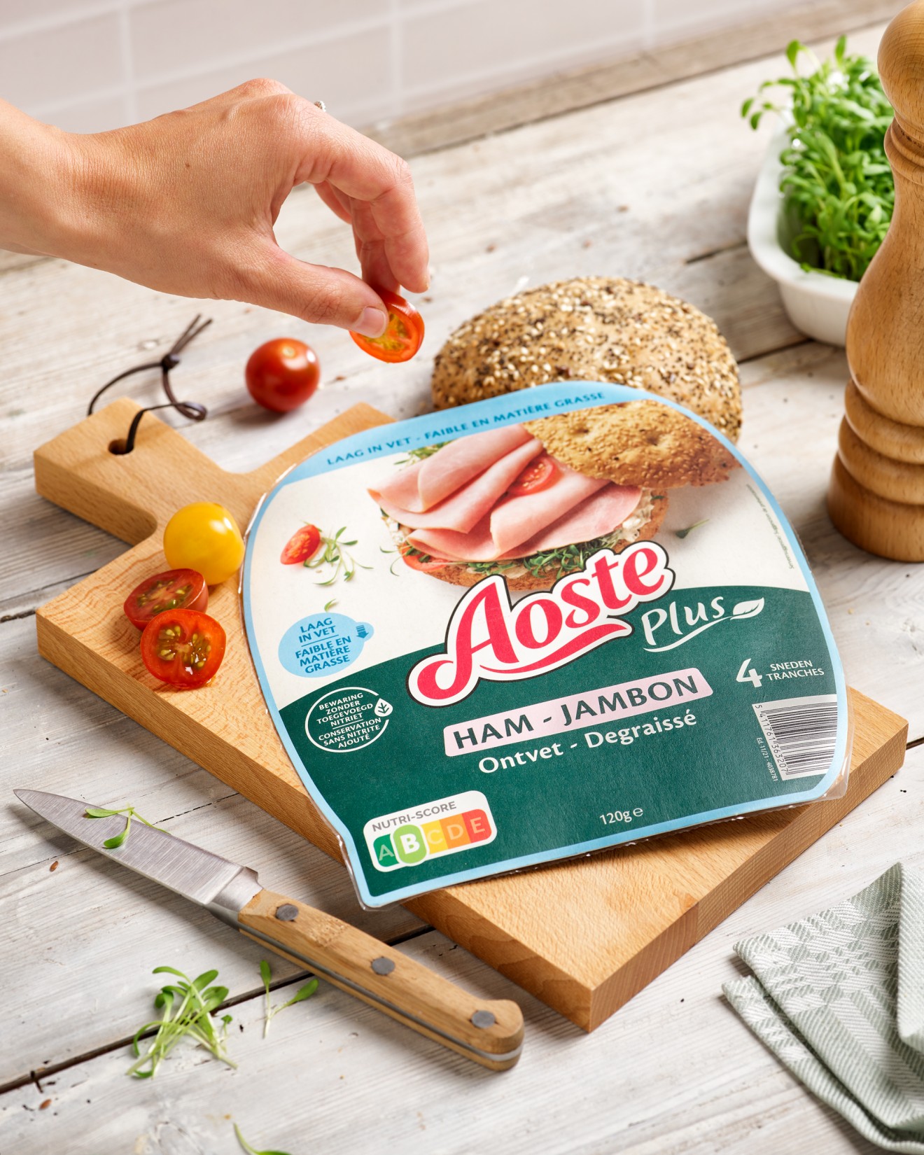
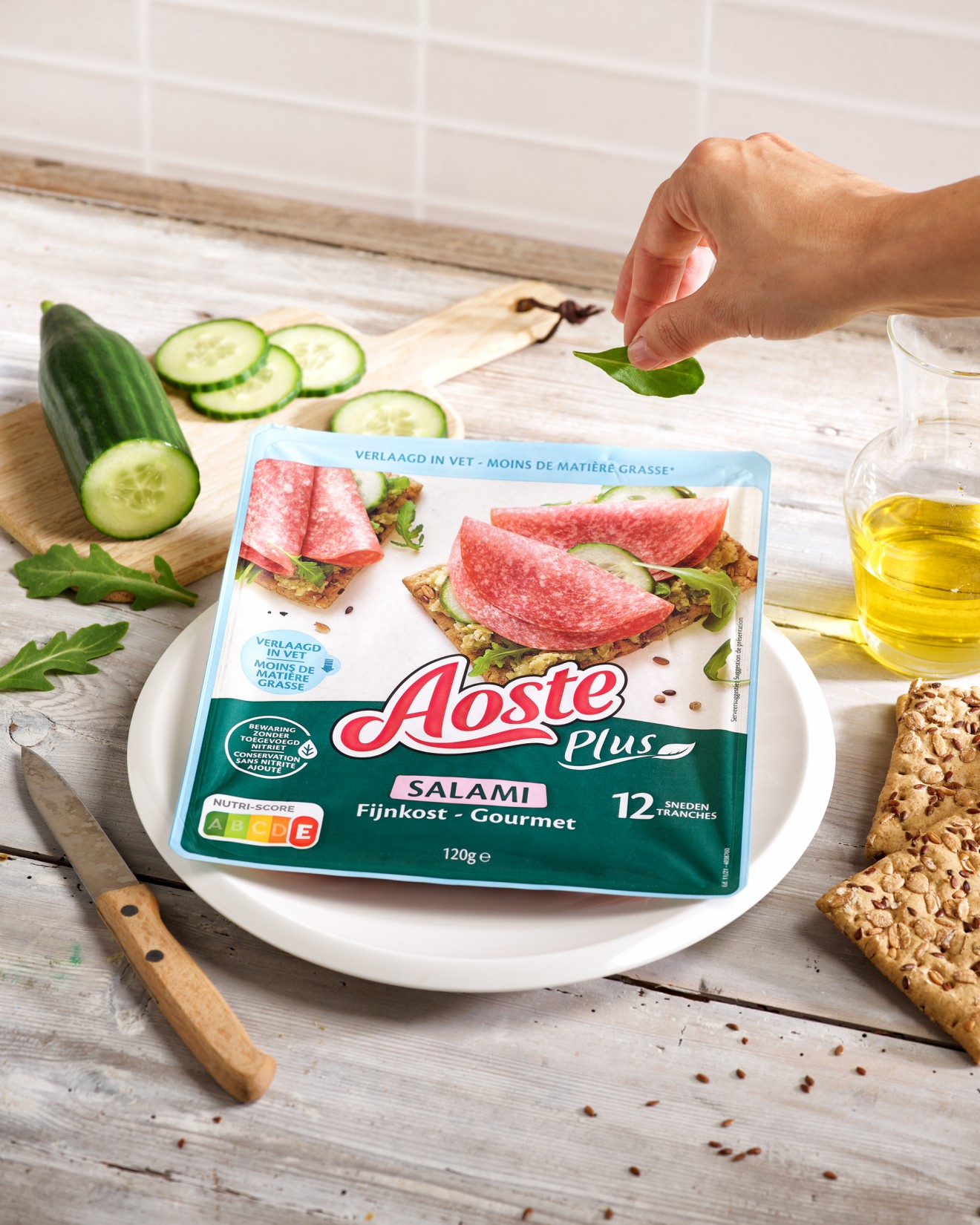
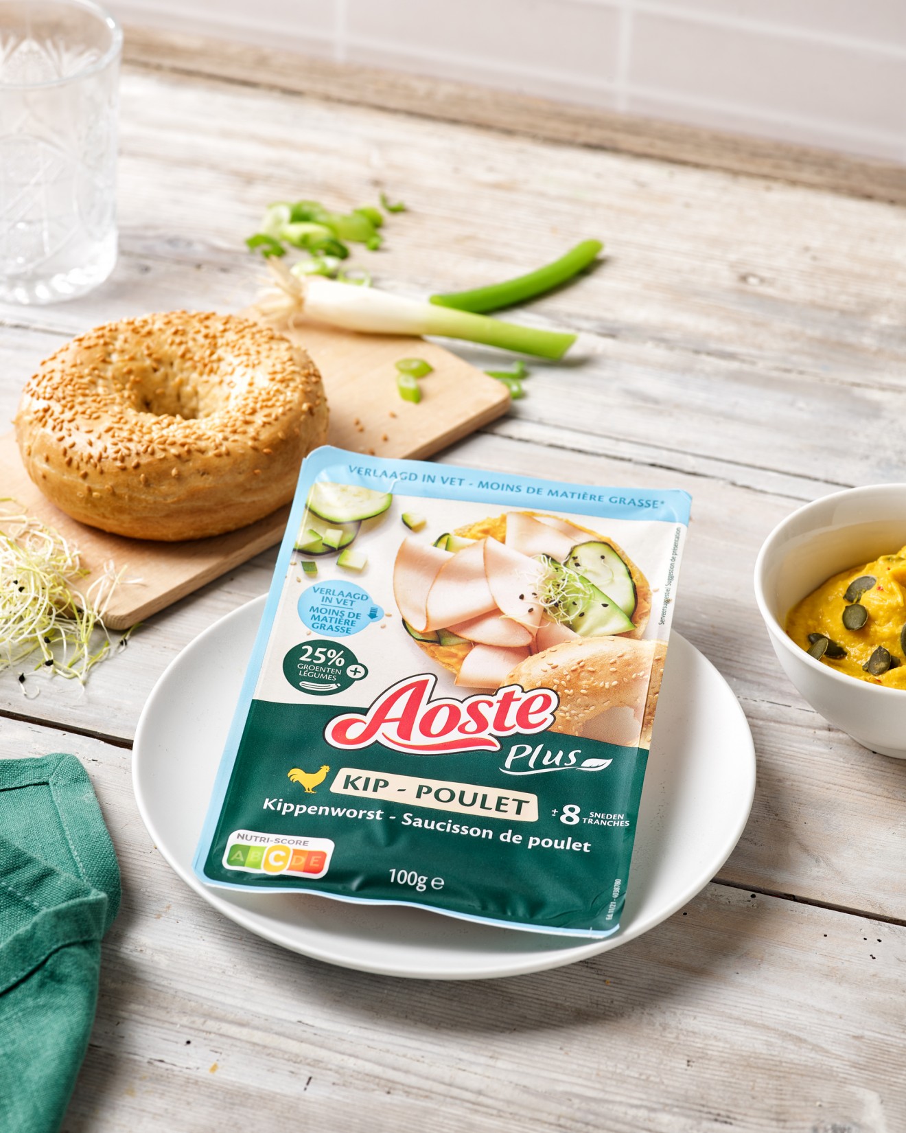
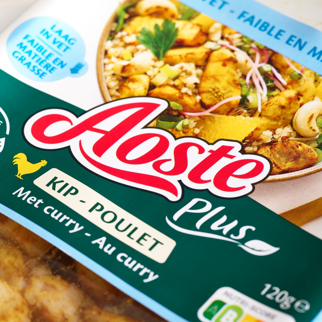
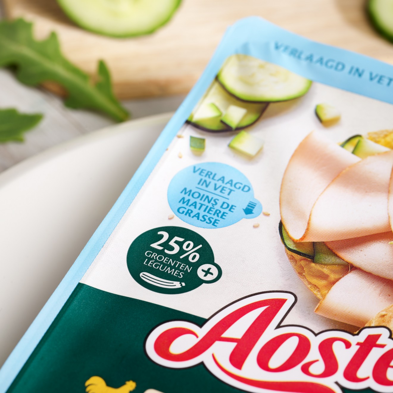
Whilst respecting the Aoste global identity we helped formulate a packaging system that separates the Plus range from the rest of their portfolio whilst clearly communicating the products key nutritional benefits. A deep green texture replaces the Aoste red and together with the Plus sub-range logo we introduced bold icon communication and colour coding that clearly highlighted each products unique benefits. However, it was through the product food photography that we really made the difference. To clearly showcase the products deliciously healthy qualities and variation of consumption moments, we introduced a refreshingly modern approach to Aoste photography. Each product shot is designed to entice and inspire consumers to be creative with Aoste Plus charcuterie and conveys through their styling that Aoste is a modern brand in-tune with consumers need for healthy alternatives.
Take your lunch to the next level.