RESTYLING for Betty & Albert
Joyful jungle vibes
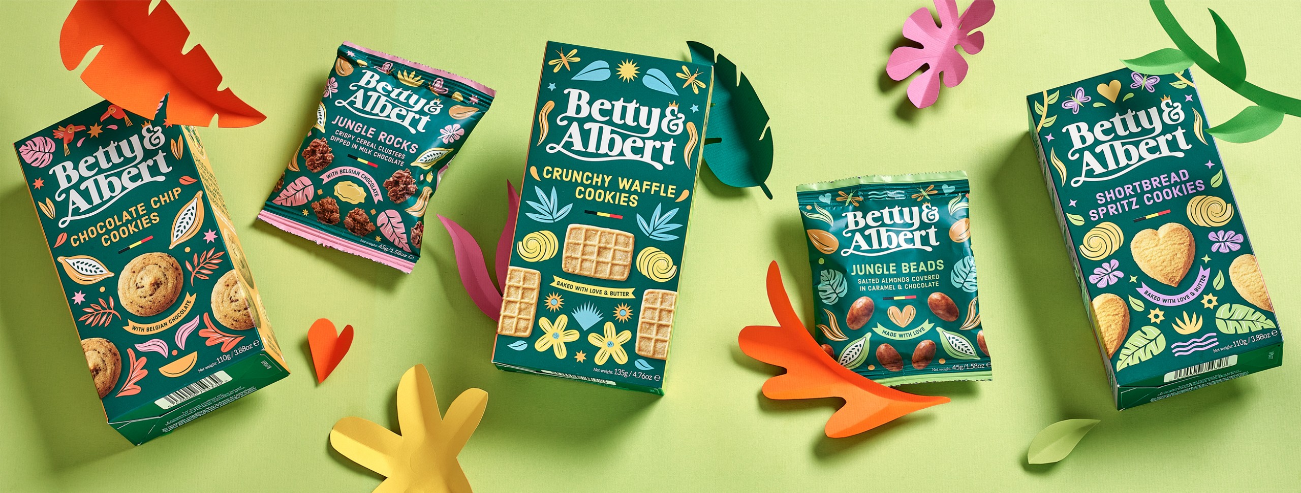
Our friends at Betty & Albert have been putting smiles on faces ever since they launched their range of delicious biscuits and sweet snacks. Despite the gorgeous impact of their initial design, dominated by those cheeky illustrations of their brand mascots Betty & Albert, the brand seemed to be perceived as being for kids and a touch too childlike. So, in order to broaden their audience, we were asked to paint a fresh face for the brand that incorporates their happy-go-lucky playful attitude alongside their gorgeously indulgent product stories.
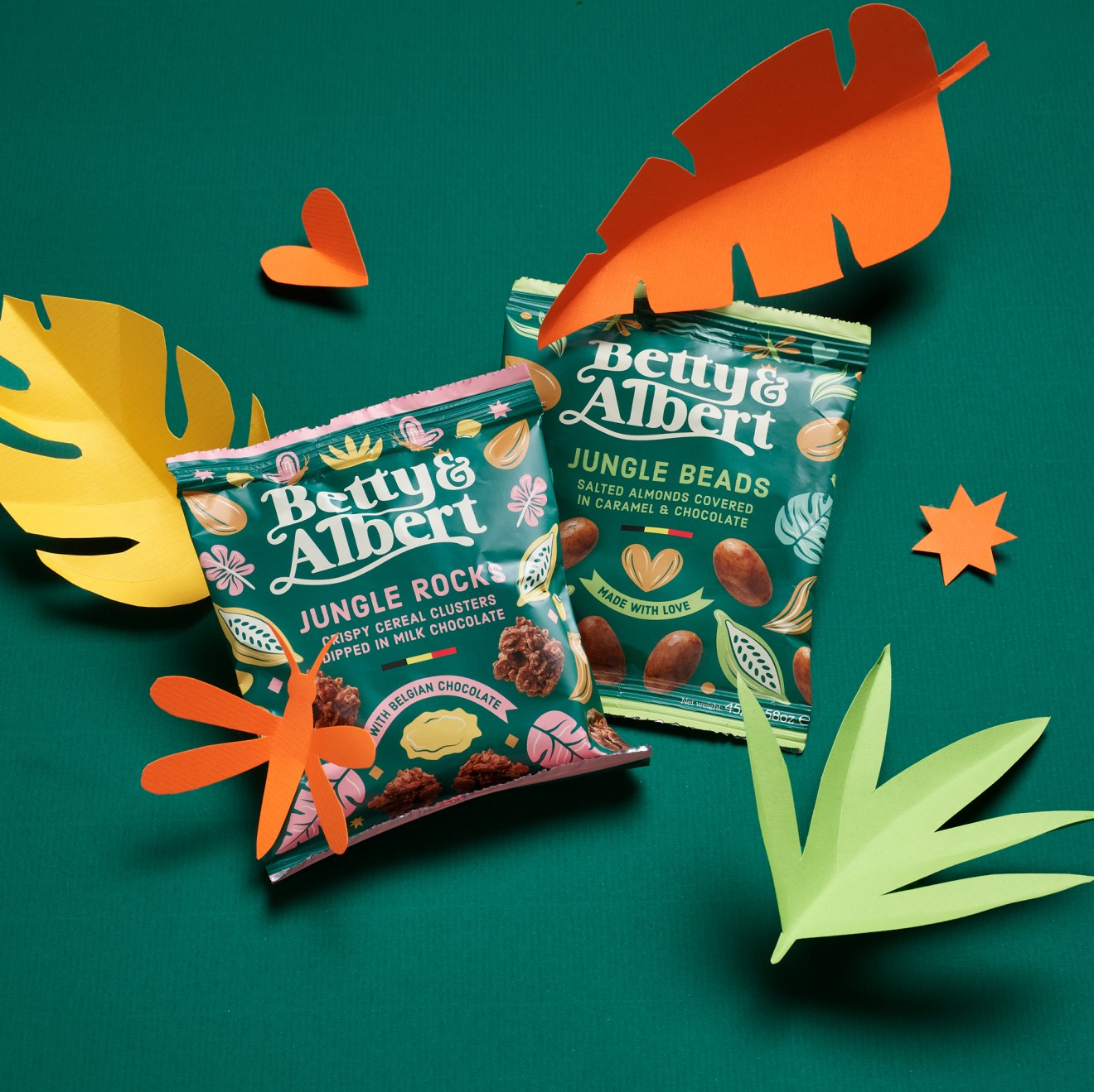
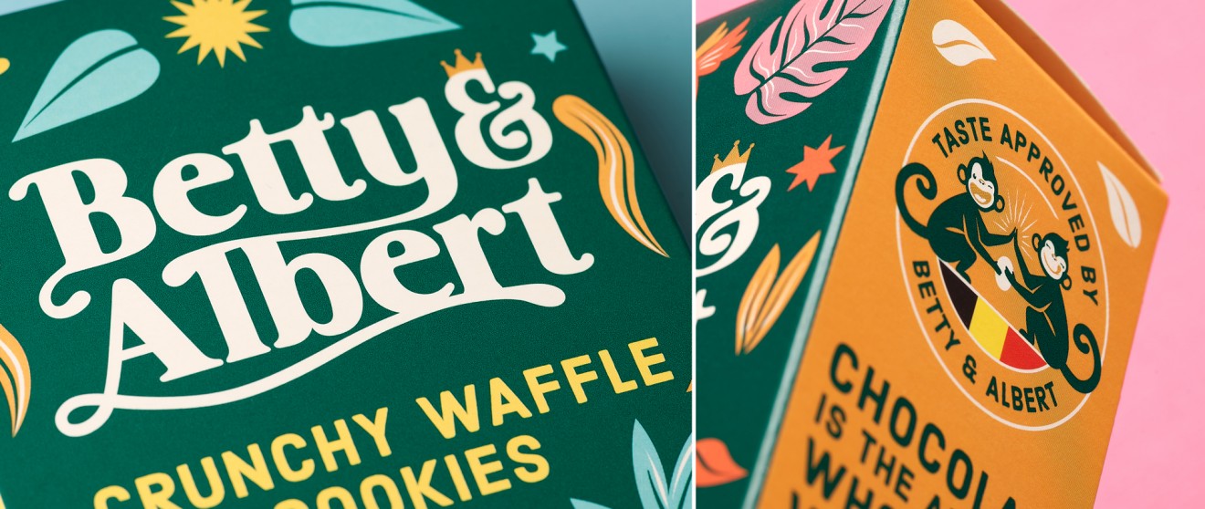
Simply put it, we decided to allow Betty & Albert to get lost in their own deep green joyful jungle, lusciously bursting with yummy goodness and delightful surprises. This provided an illustrative platform to a visual identity designed to respect the brands mascots whilst creating a whole new impression. A modern new logotype was crafted with subtle references to Betty and Alberts flowing tails, surrounded by punchy colours and a vibrant attitude that supports this super positive brand.

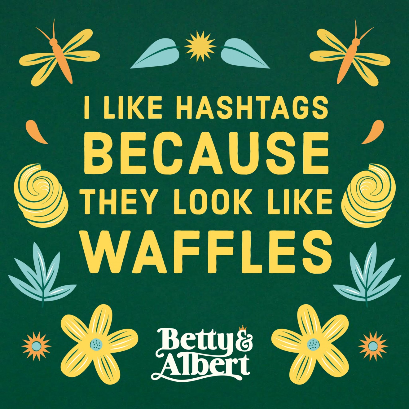
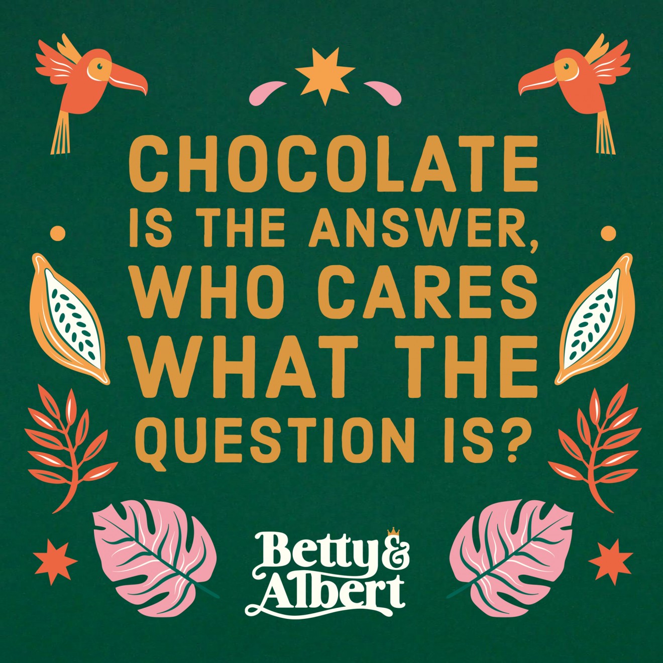
Overall, it was the ‘don’t take life too seriously’ tone of voice that really inspired our fun-loving approach for this new identity. As the brand often says; when trying hard to eat healthily most of the time, don’t forget to relax every now and then with something truly scrumptious. And if it means accidently scoffing the whole pack ( a snack’ccident ), then so be it ;-)