REBRANDING for Libeert
True Belgian Chocolate Creativity
For as long as anyone can remember, Belgian culture has been built on a love affair with culinary craftsmanship and passionate enjoyment of chocolate like no other. Since 1923 the Libeert Family has been the embodiment of this passion and has focused in recent years on the creation of joyful chocolate figurines, consumed with great excitement during the festive periods throughout the year.
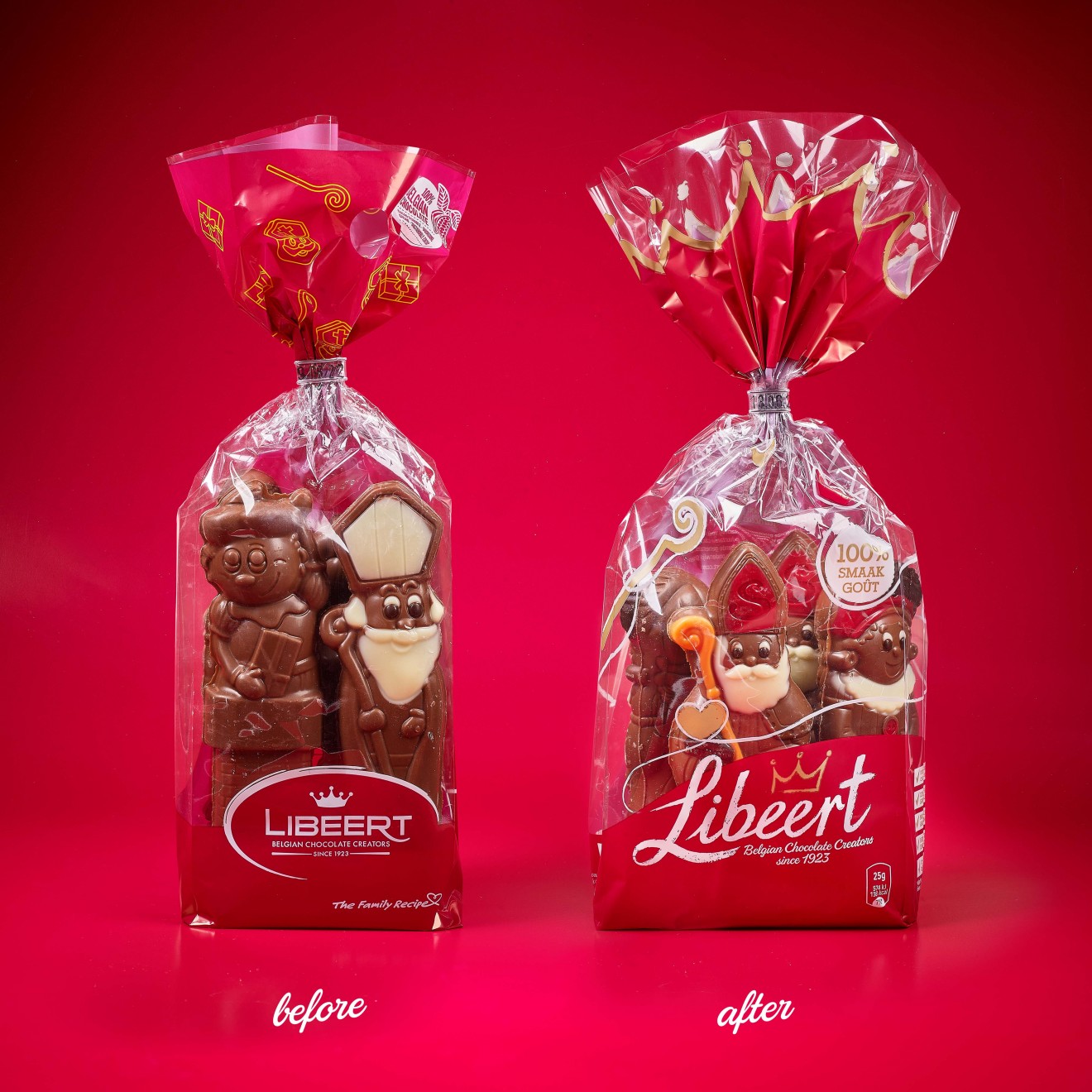
Our design challenge was to offer support to a retail product, although intensely loved, was mostly only present in consumers’ minds during the temporary moments of Sinterklaas, Christmas, and Easter, and suffered only a loose vague association with the Libeert brand. Awareness indeed was low despite the popularity of their products and the obvious buying enthusiasm during these periods. The timely ritual of children across the region writing a note to Sinterklaas in the hope that the next day he would have left oranges, presents and of course chocolate figurines, is a story so intertwined with the Libeert product promise, it was often easy to lose sight of the brand. At the same time of course, multiple competitors plus private labels are all doing the same, and are all exploring and exploiting the same themes and trying to communicate the same message. It is within this context that our client wished to strengthen its competitive advantage and re-engage consumers with who they are and why these festivities would never be the same without them.
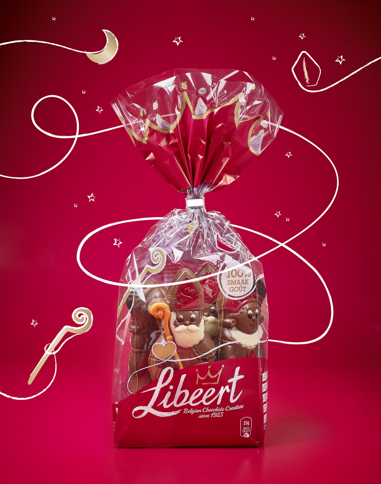
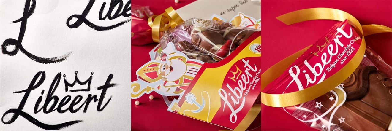
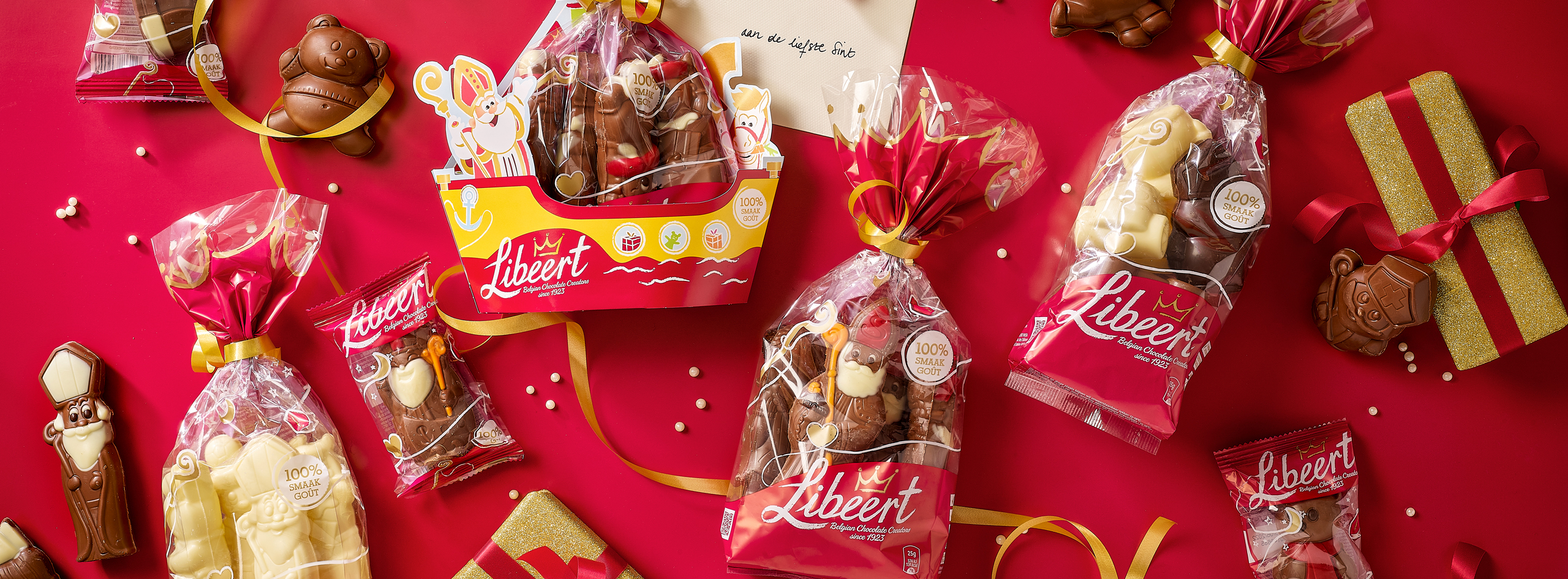
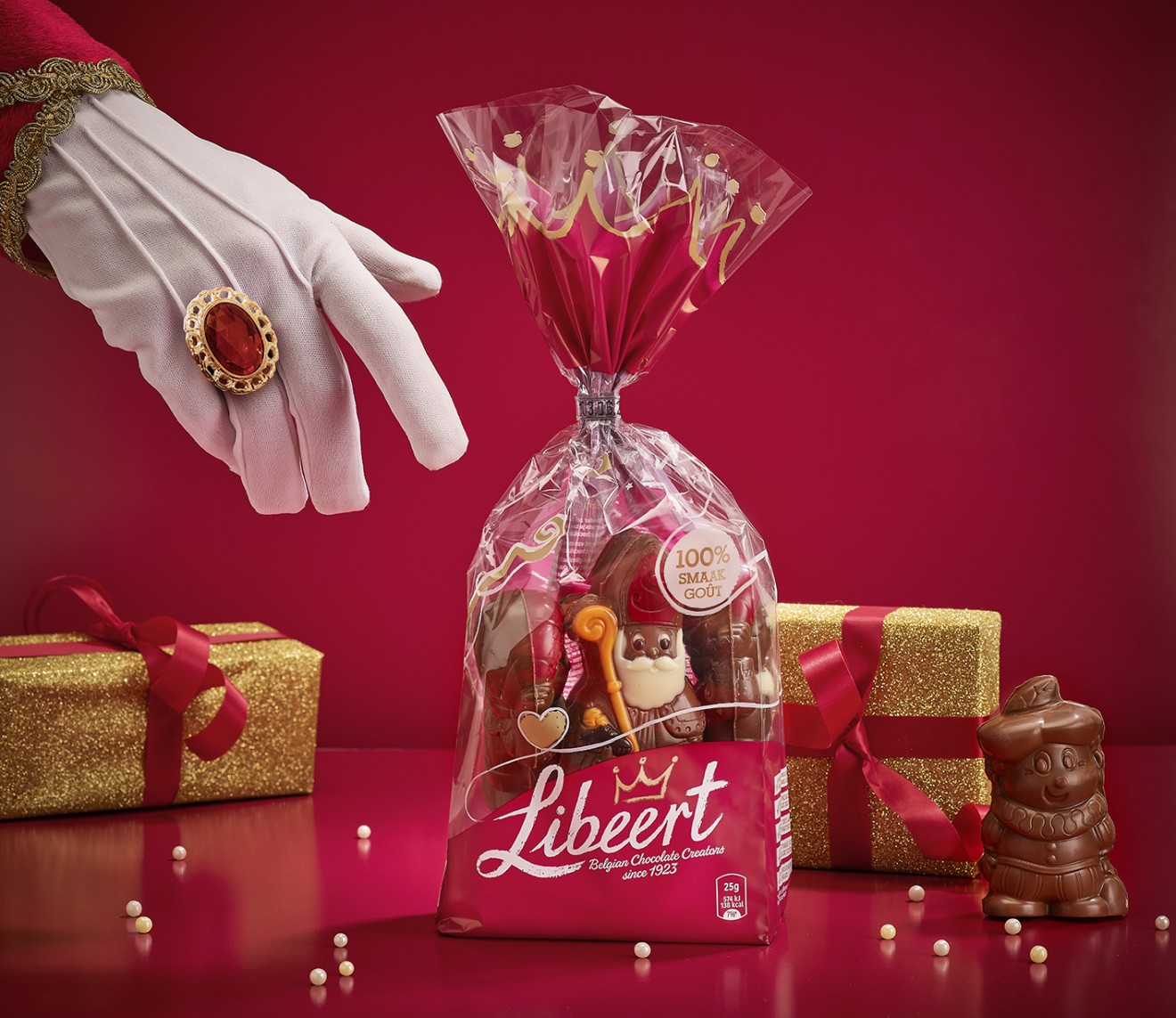
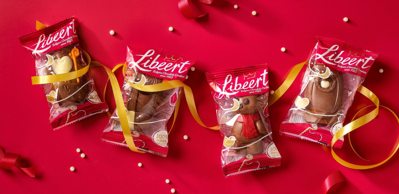
Our client had a family of countless chocolate figurines of unbeatable quality and yet no branding and packaging design to help set this brand apart from the rest. Our task was to breathe creativity, passion and craftsmanship into their identity and develop and brand and packaging design that was worthy of the quality expressed by their master chocolatiers. We began with the branding with which we applied a human-touch, creating a hand-written signature, a flamboyant sign-off of quality by the Libeert master chocolatier himself. With this same creative brushstroke, we decorated each pack with festivity inspired illustrative details, designed to support each theme, and support a feeling of fun and enjoyment. Wrapped around each pack this creative stroke continues the Libeert story, ending at the top of the sack where our crown of quality puts the finishing touch on each chocolate creation. Recognising how the product should always remain the hero and respecting the brands DNA colours of white, red and now also gold, our design development was employed to offer a memorable support and enhancement to the Libeert brand that not only succeeded to bring Sinterklaas to life but will be soon seen gracing the shelves at Christmas and Easter.
Not only that, this bold evolution has also empowered the brand off-pack and across all communication needs. We’re proud of a brand design that is more than just copy-paste. A dynamic identity that can help bind a brand, celebrate its qualities, and tell a story that can help put smiles on consumers faces.
Now have we been good little boys and girls this year?