PREMIUM SALMON by Klaas Puul
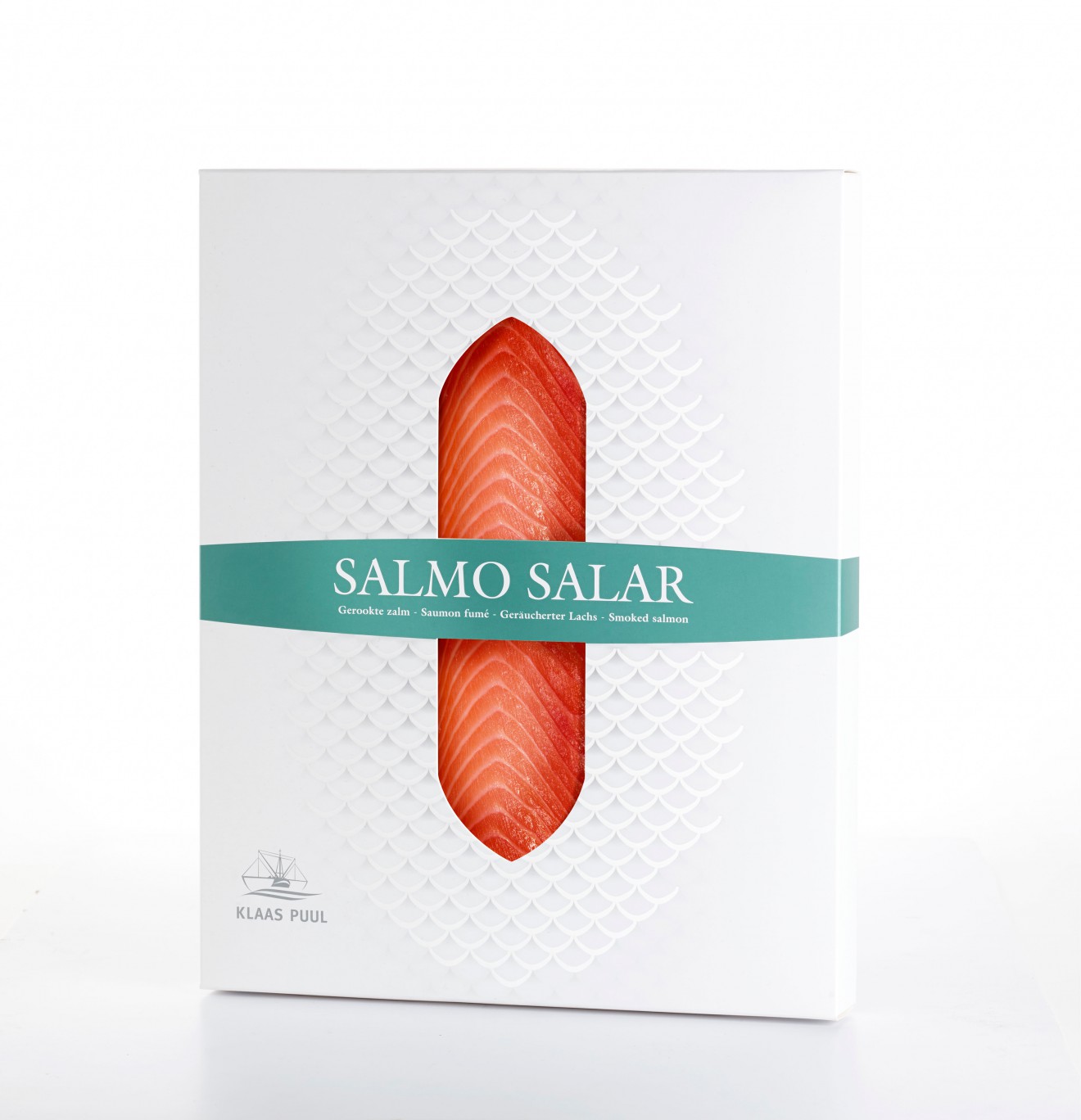
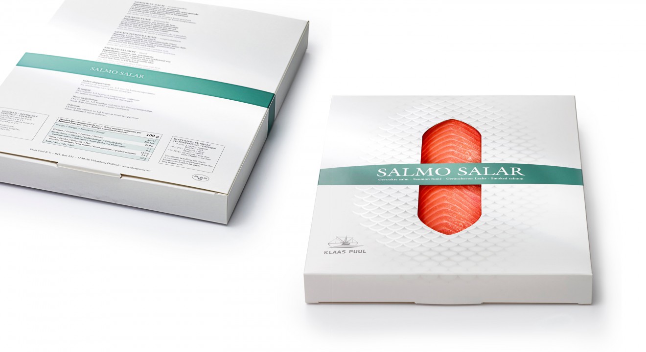
A single premium package for smoked salmon.
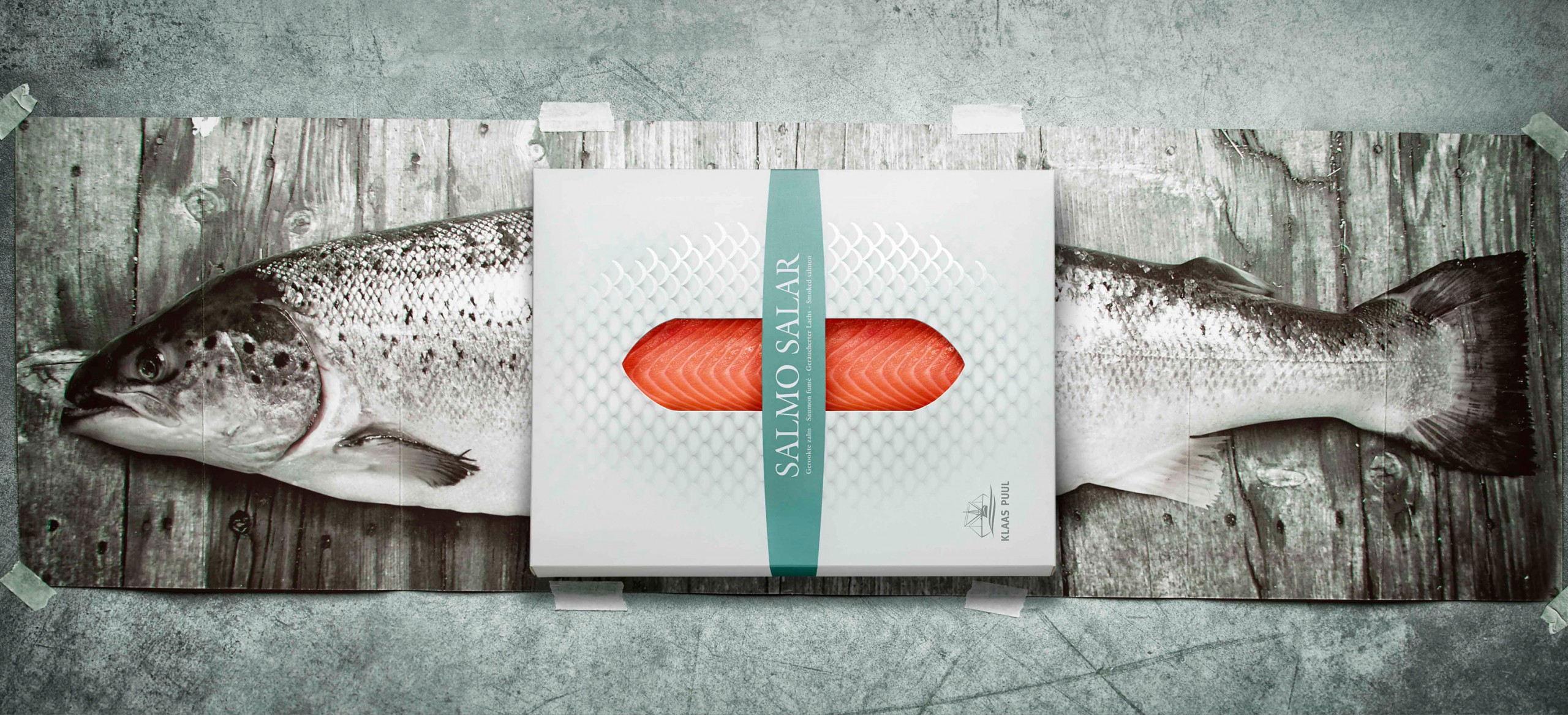
Why make it complex if simple can do the trick? So we took this idea for the Klaas Puul smoked salmon pack as literally as possible.
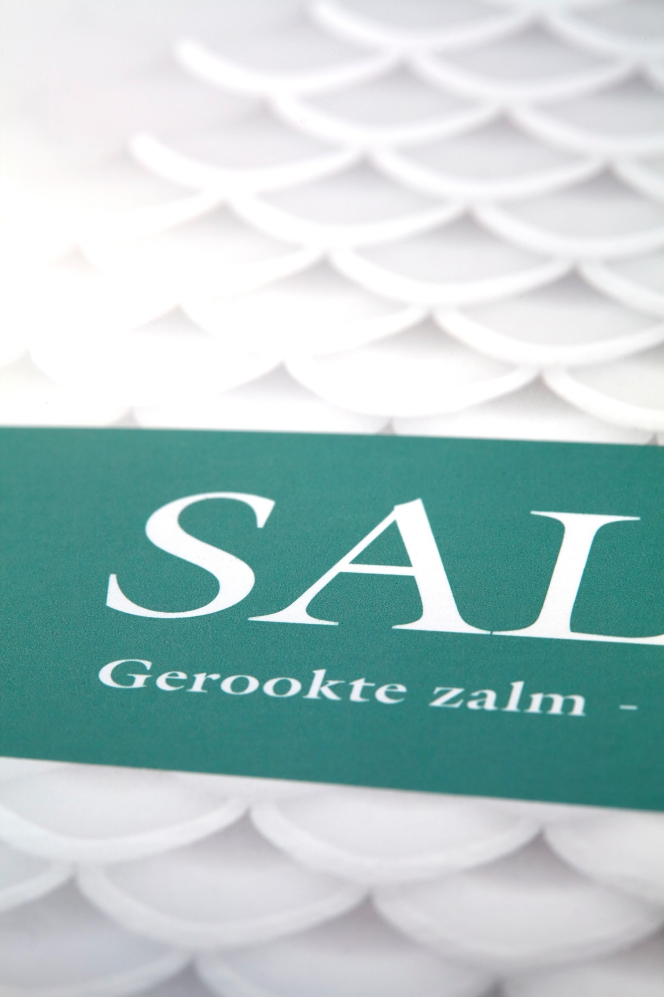
We imagined the scales of the fish as the packaging of the salmon and that’s exactly what we did with the design of this pack. On the outside we visualised the scales of the fish by creating a good balance between a pure graphic pattern of scales combined with a subtle partial shining varnish to give them an extra dimension. An elegant window in the middle of the pack shows the inside and focusses on the qualitative and tasty salmon. The brand logo is used as a simple sign-off, emphasizing the best quality and premium feel of the packaging. The classy typography was the final touch.
Pure and simple! Don’t you agree? A qualitative product should be allowed to speak for itself and that’s exactly what we did: a pure design without any distracting elements and with an honest focus on the product.