Weight Watchers strategy
A cross-category range of healthy food with a focus on enjoying life
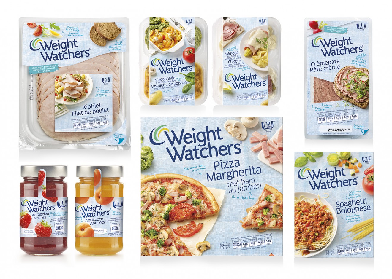
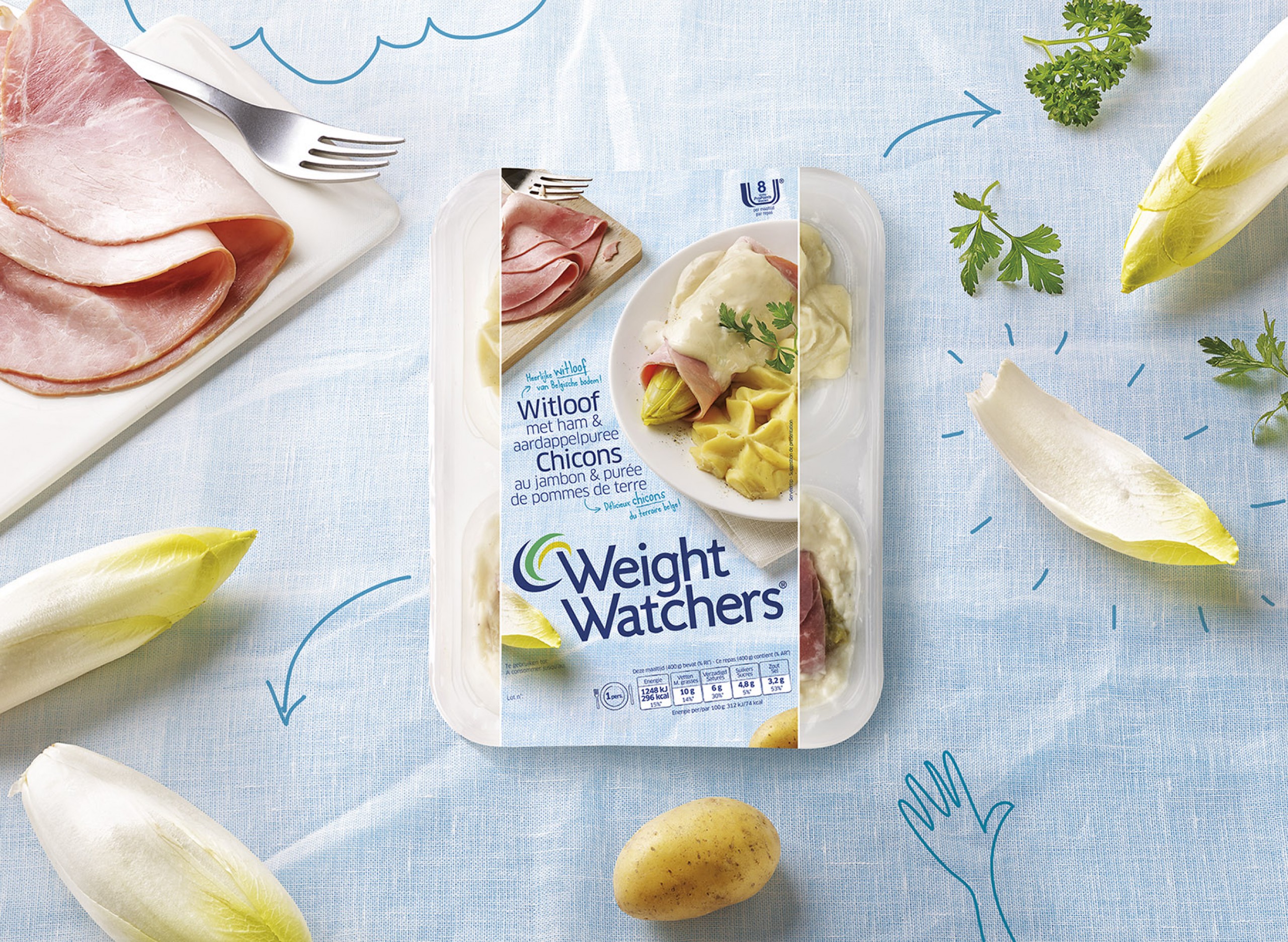
Due to WeightWatchers strategic switch from focusing on functional dietary needs to a healthy product range positioning based on enjoying life, a refreshing redesign was necessary to communicate these new brand values. Emphasizing a delicious taste experience using appealing photography on a light blue canvas, we captured a sense of good and healthy living.
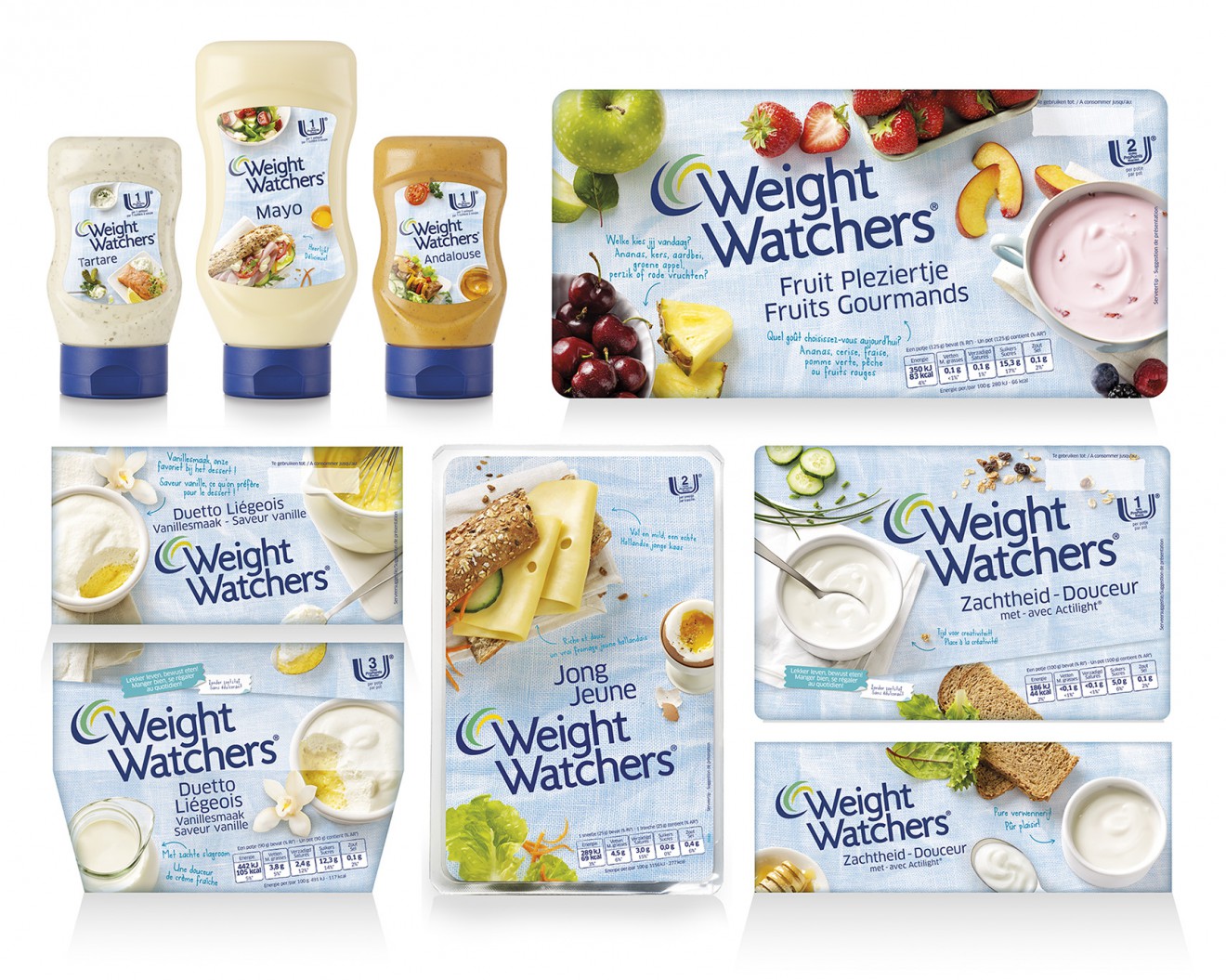
The vibrant 7° angled layout with the canvas wrapped around each pack, together with the touch of humor in the written messages and the sparkling illustrations appearing all over the pack, keep surprising the consumer and invites them to look for more. The redesign liberates the consumer from feelings of negativity and strengthens its impact on shelf, this resulting in a welcomed increase of the brand’s popularity and improved sales.