Brand Redesign for GANDA HAM
Take time for what counts.
Not many people know that you don’t need to look far to find high quality dry-cured ham here in Belgium. Many associate this delicacy with Southern Mediterranean countries and are unaware that the craftsmanship and expertise has been practiced in Belgium for generations. At Ganda Ham they know this only too well. A passionate family business, run with a steadfast respect for tradition and uncompromising quality, Ganda Ham is a benchmark for high quality dry-cured ham respected across the country.
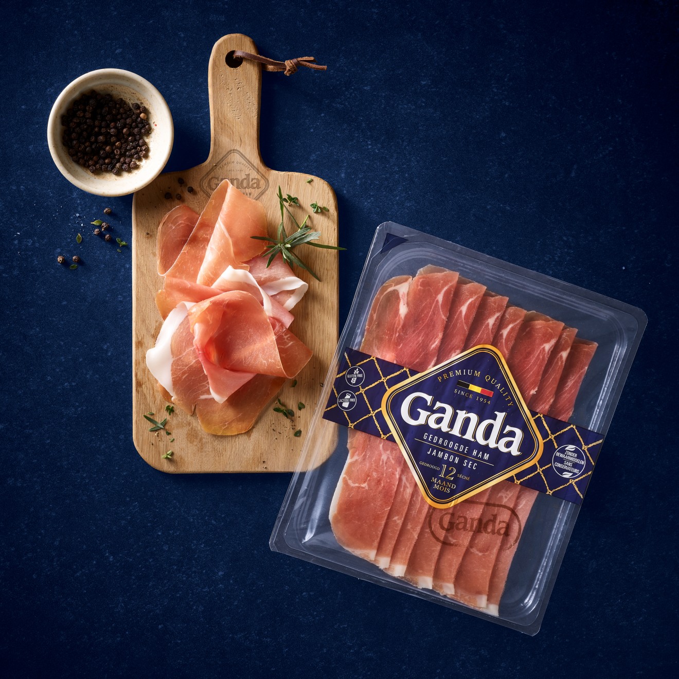
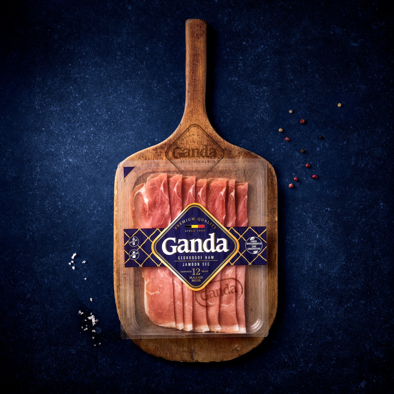
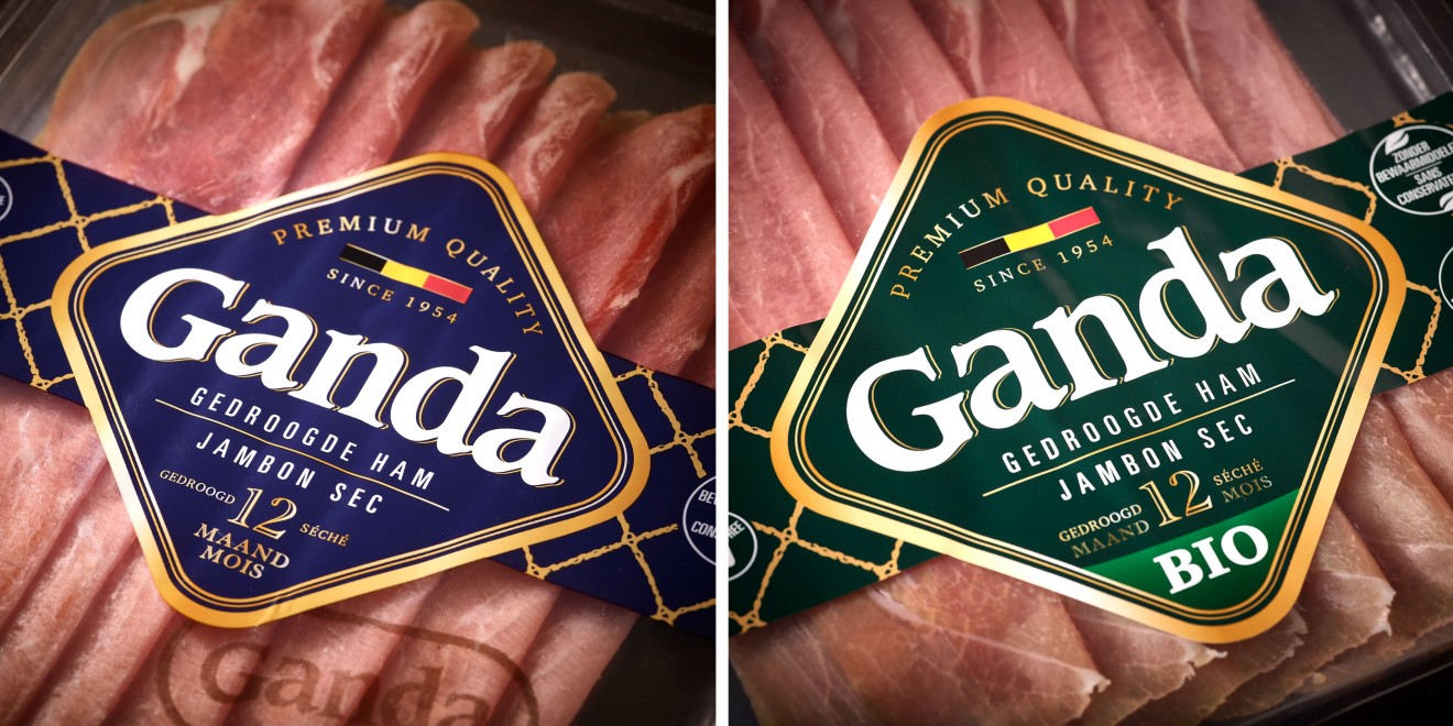
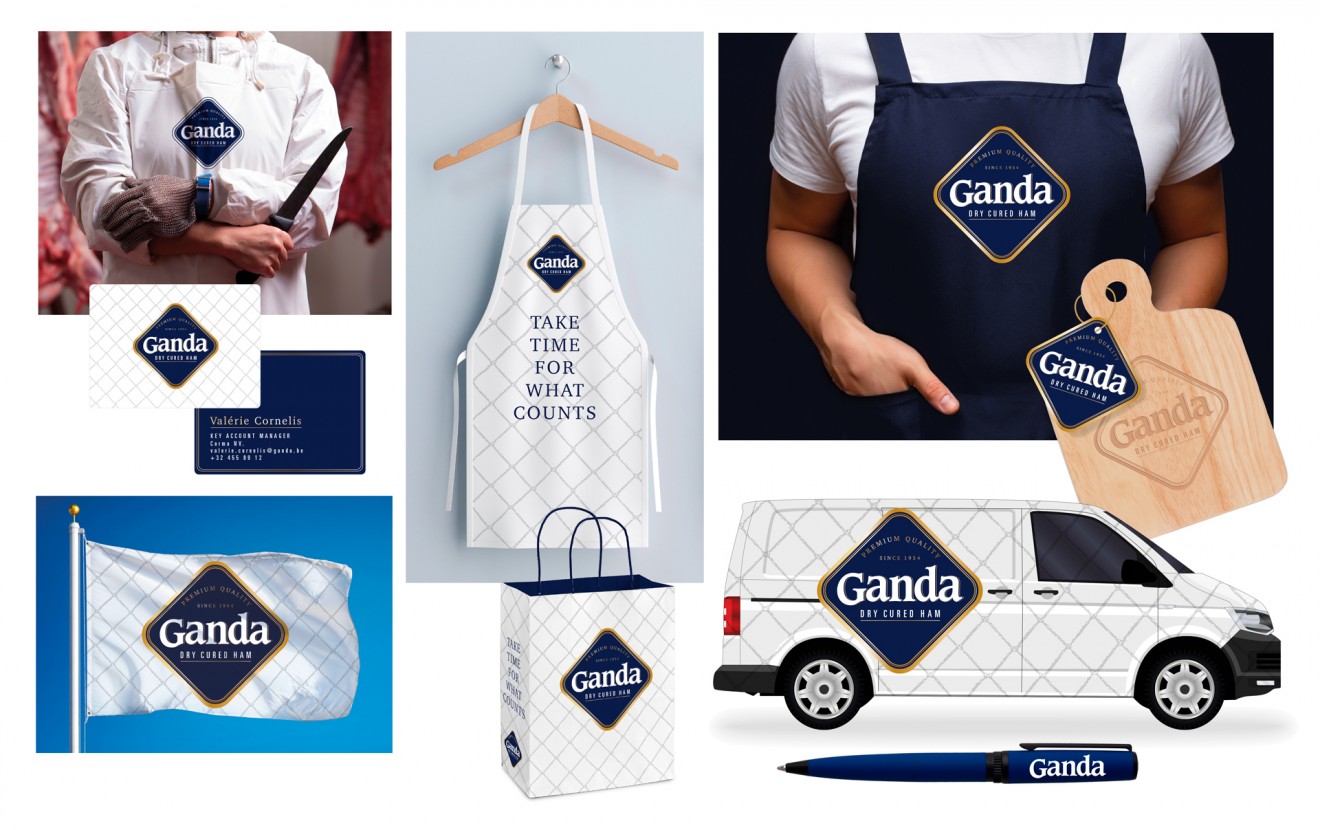
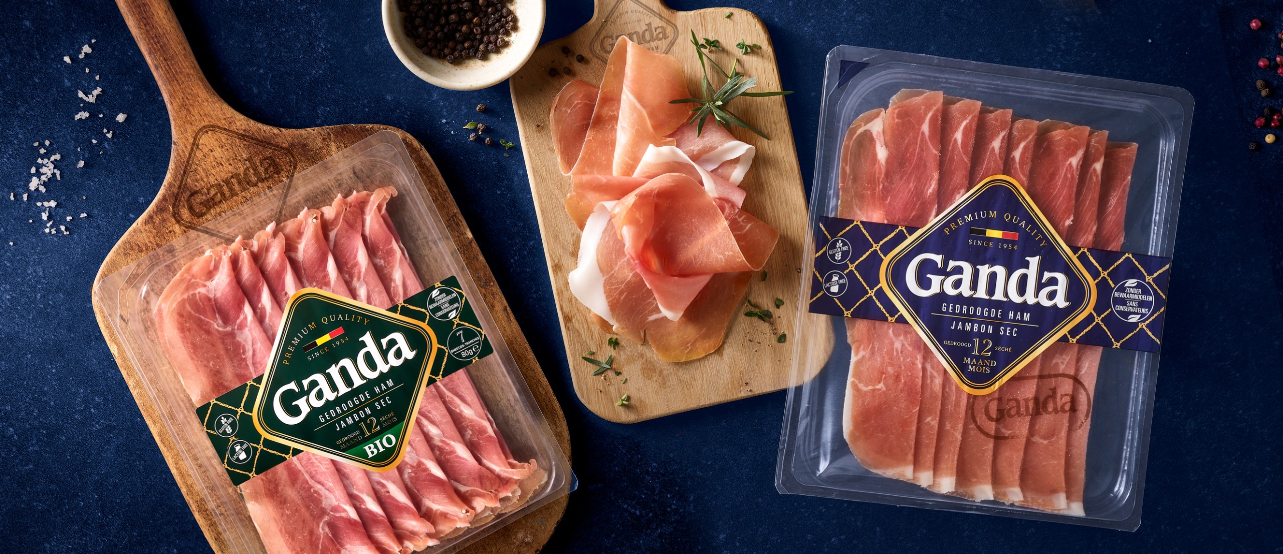
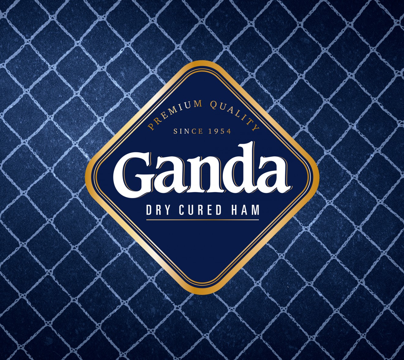
Despite their success however a decision was made to take the brand and packaging identity to new heights and ensure its quality reflects the nature of the brand and the product. Taking the necessary time to mature this new vision, an identity grew from the decision to make a branding statement. The new branding symbolizes a seal of approval and represents a simple but memorable assurance of quality. Knowing product transparency is the key to purchase for consumers, we kept the packaging identity to a minimum. We added only the Ganda Net as graphical language that mirrors how historically each ham was packaged and hung in butchers across the country.
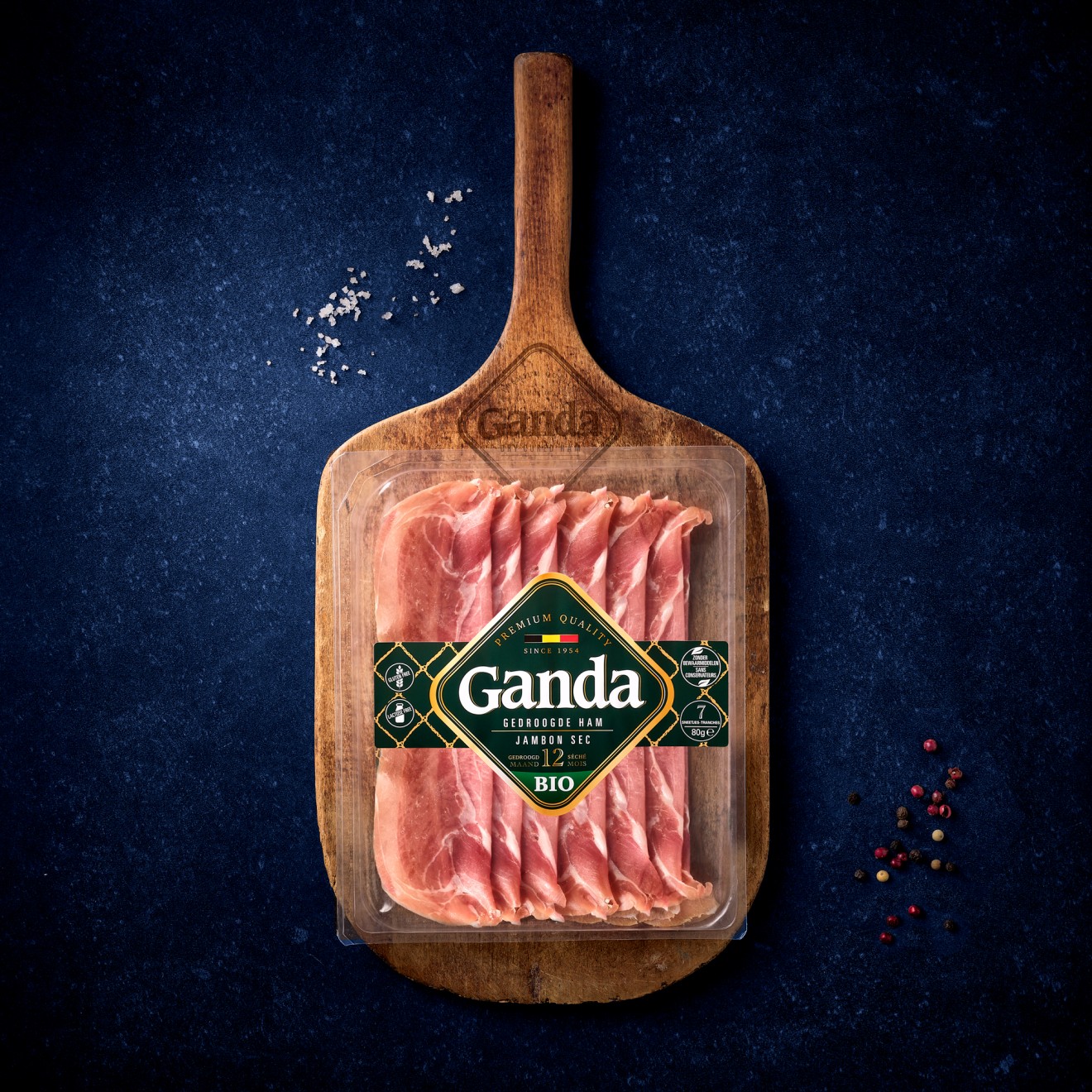
Brand identity colours of a deep royal blue, white and gold refinement are used to glue the brand together with exception made with the BIO variant to convey its organic nature.