Brand Redesign for WARNEZ POTATOES
Growing quality since 1950.
The Warnez family has been passionately providing pleasurable potatoes for generations. Grounded in trustworthy traditions and yet innovating within a dynamic and competitive market, the Warnez brand showed bold ambitions to grow and reach a wider audience.
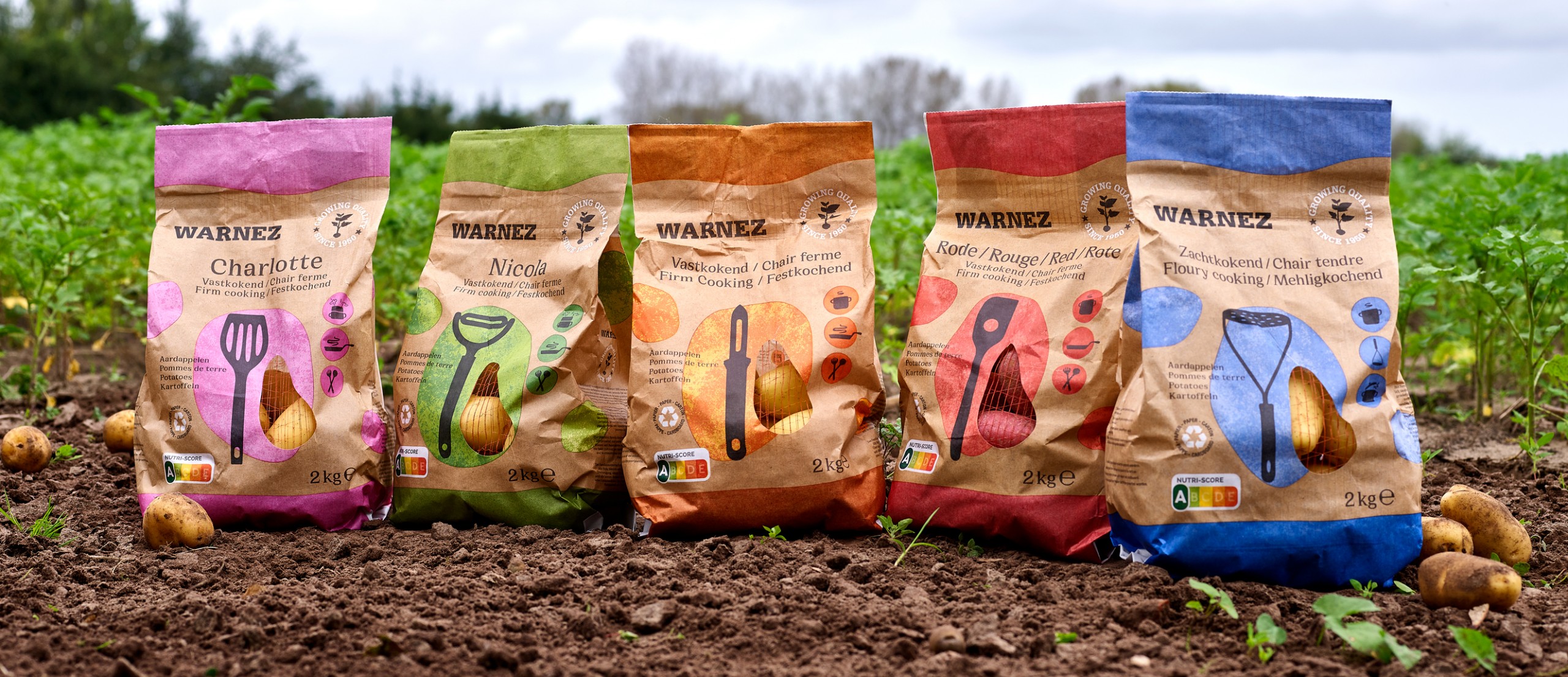
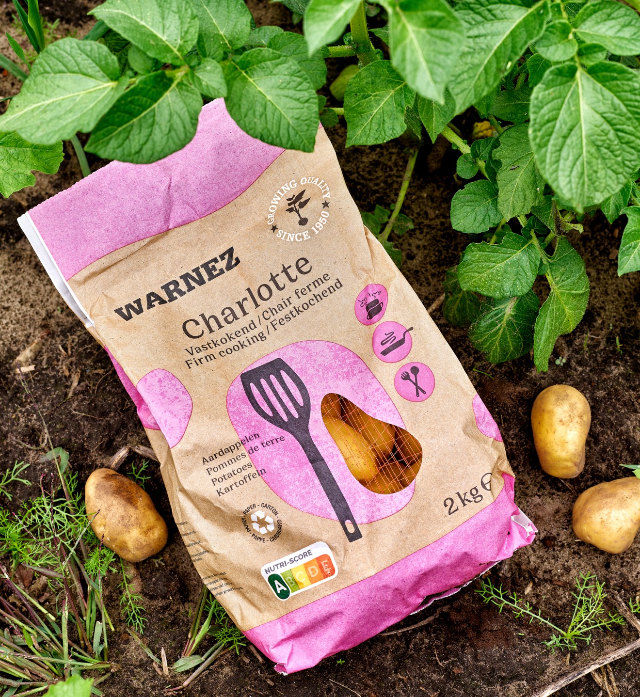
These ambitions required a refreshing new brand and packaging identity to help Warnez stand-out from competition and make a statement in the market. Packaging design in this category is traditionally straight-forward and business like, dominated specifically by private-labels, who provide a basic commodity for consumers. Time for a brand proposition to enter with a differentiated approach.
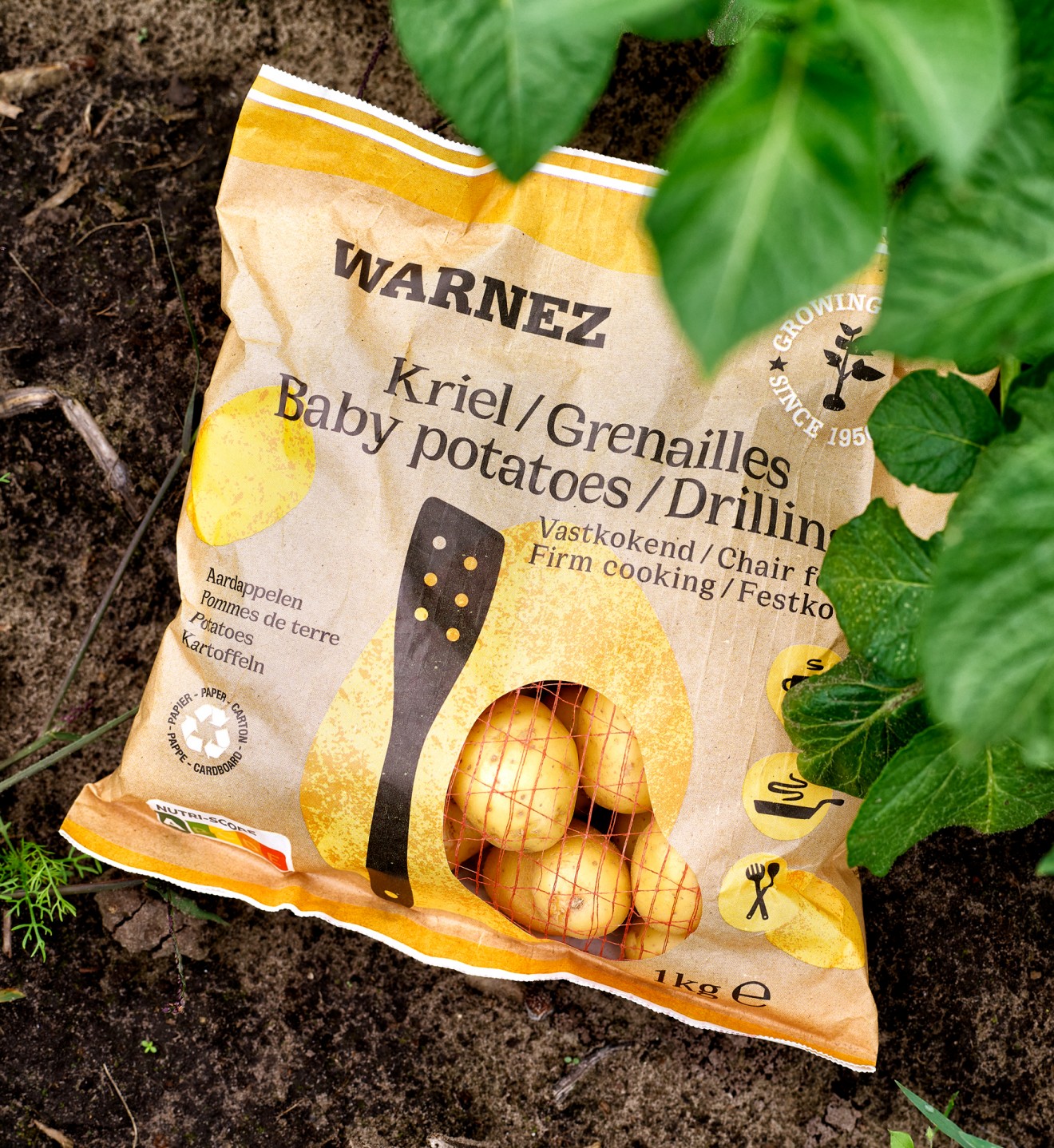
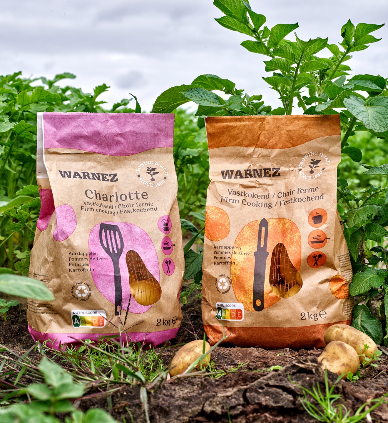
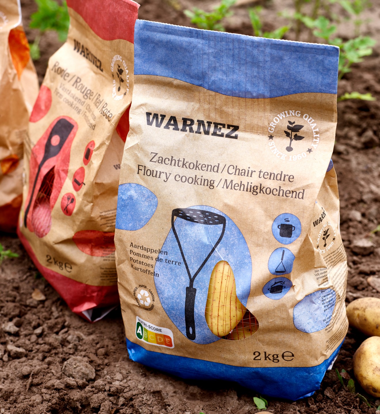
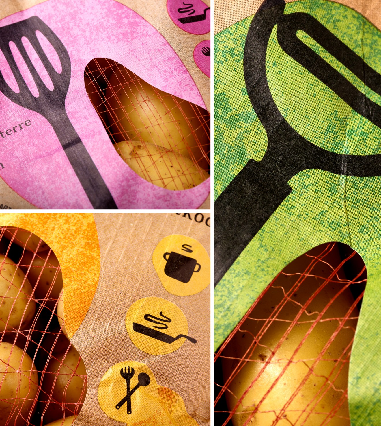
Still very much product focused, this visual identity looked to reflect the natural nature of the brand, passion for potatoes and their delicious variations. Potatoes of all types and all usages, this earthy tactile look and feel coupled with key colour coding and functional tool icons, succeeds in setting the brand apart in shelf and dares to be just a little different.
Get ready to get potatoed!