BRAND & PACKAGING REFRESH for Daelmans Stroopwafels
Daelmans Authentic Dutch Stroopwafels
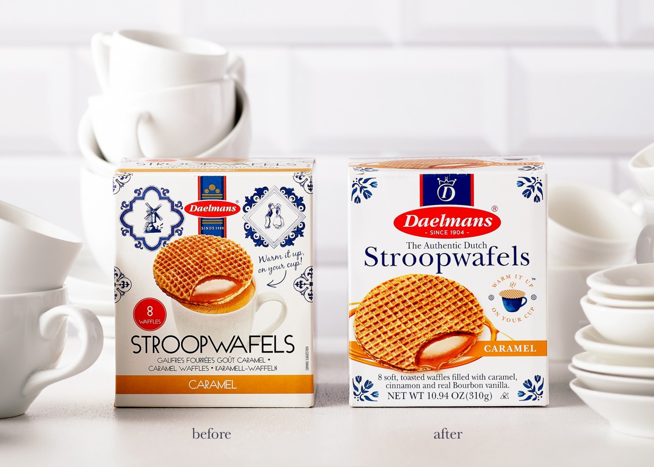
Almost nothing is more addictive than a deliciously sweet, crunchy waffle biscuit, slightly warmed up, to get that gooey stroop all sticky and nice. Our friends at Daelmans Stroopwafels knew this only too well and were riding the wave of enthusiasm surrounding this authentic Dutch classic that was becoming increasingly popular, not ope but also in the US and across the world. Thanks to this ever-growing popularity and the unsurprising competitive pressure brought on by other stroopwafel brands, the client decided a brand and packaging design re-fresh was required to help solidify their position as a modern leader in this category.
Although the current design had become seriously dated and stuck in the past, we were conscious that brand recognizability was still of paramount importance and whilst modernizing the brand, we shouldn’t lose sight of our Dutch heritage and authenticity. This required a revitalizing face-lift that strips away unnecessary clutter so as to focus on the essentials and develop a simple and elegant identity that remains clear and concise for consumers.
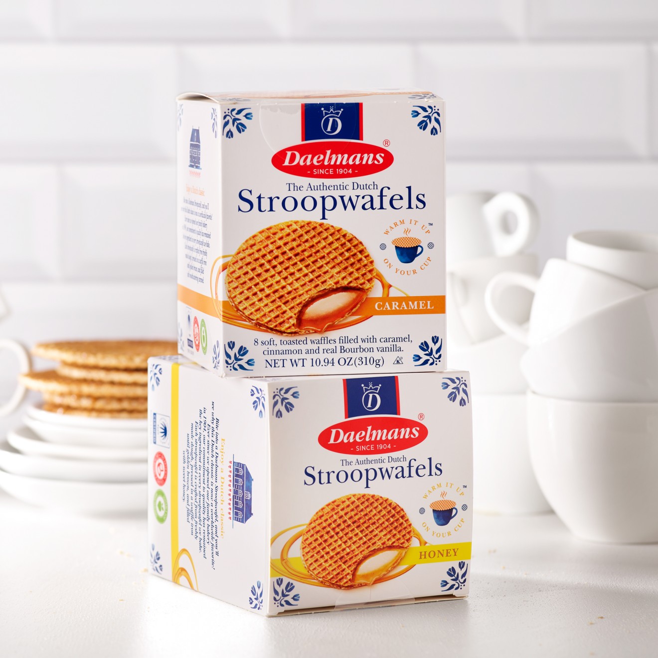
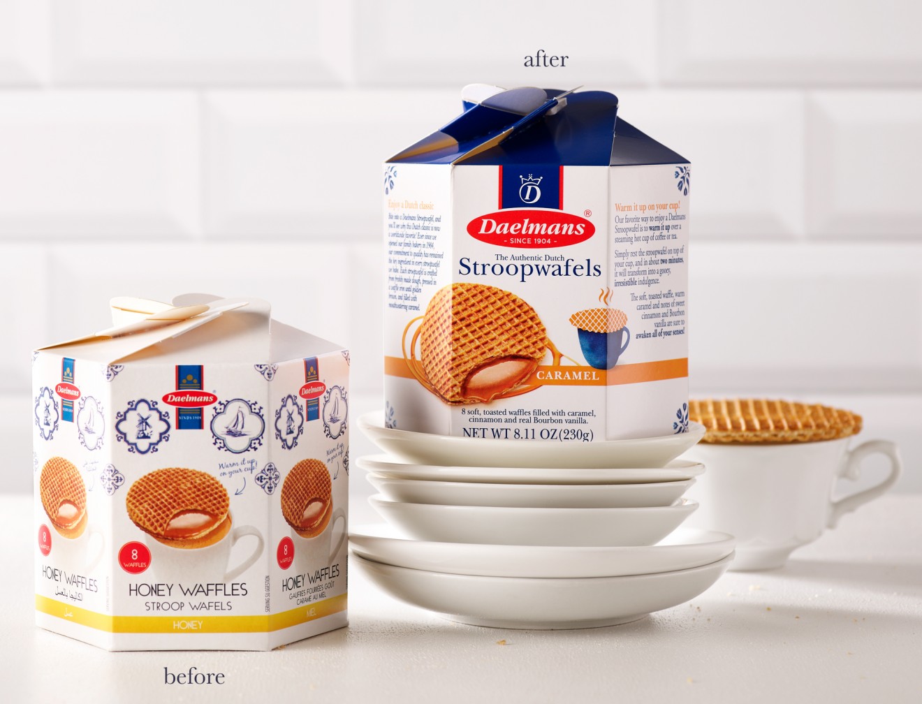
Branding a usual was a great place to start, where we simplified the assets in order to optimize impact on pack. Additionally, we created an extractable ‘D’ symbol and crown so as to convey our qualities whilst giving us an extra design tool to play with. The Daelmans look & feel is based on a strong balance between pristine white and deep blue, whose origins were born from the iconic Delft Blue tile illustrations that we subtly maintained in the corners of each pack. This new modern interpretation of the Delft style was continued throughout our storytelling illustrations that decorate the packaging identity and inspired the brand communication off-pack.
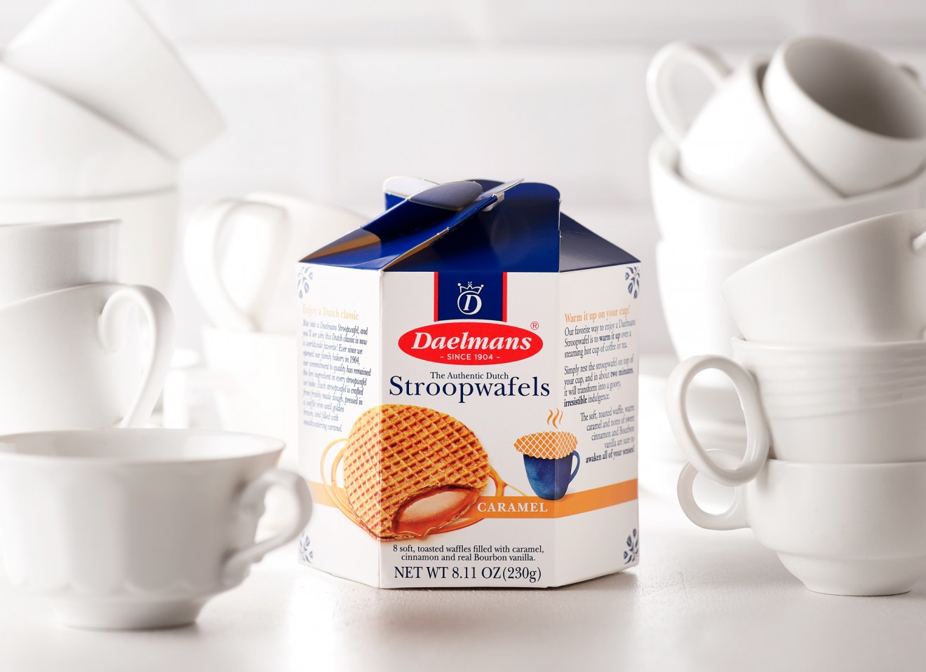
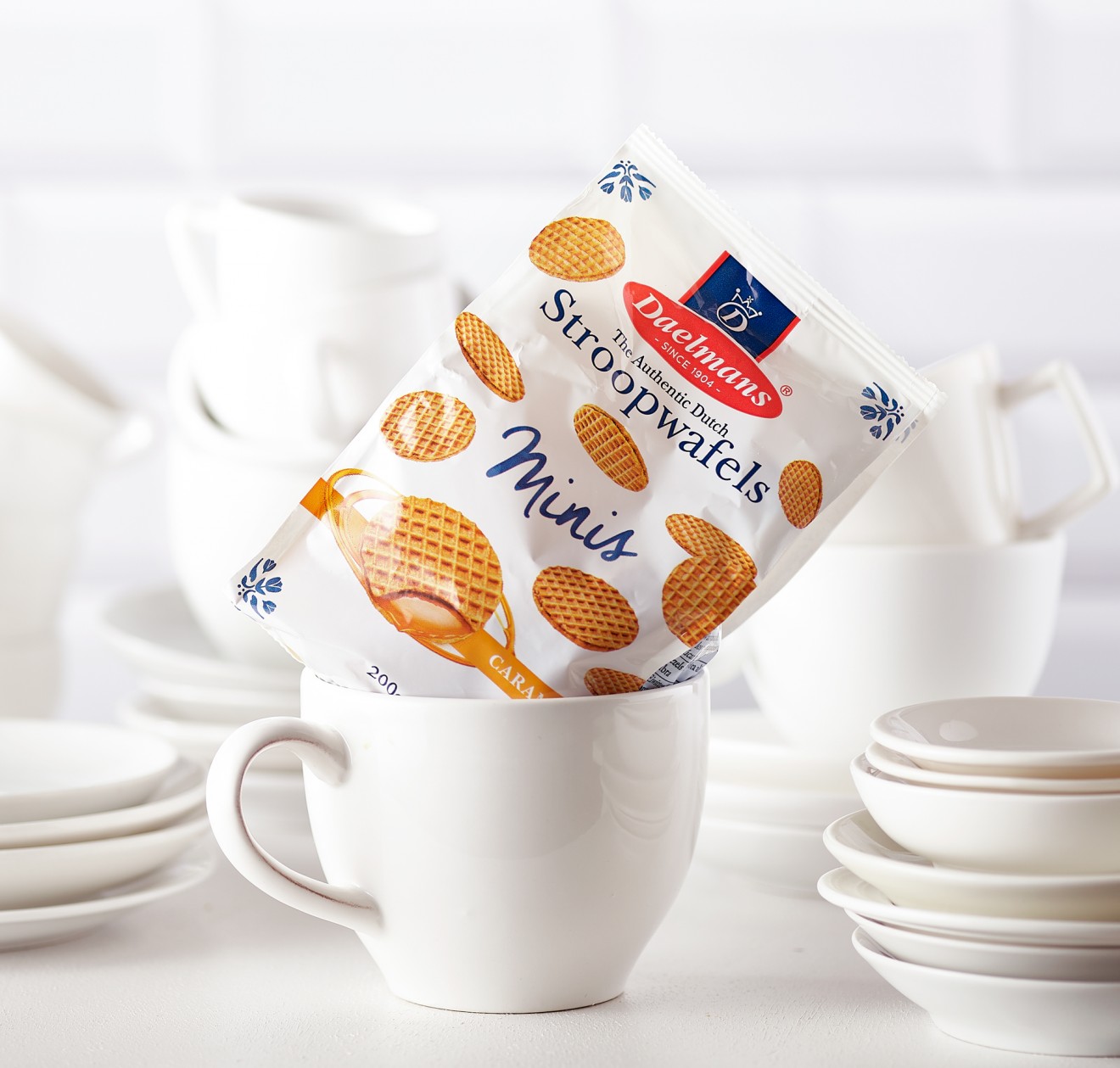
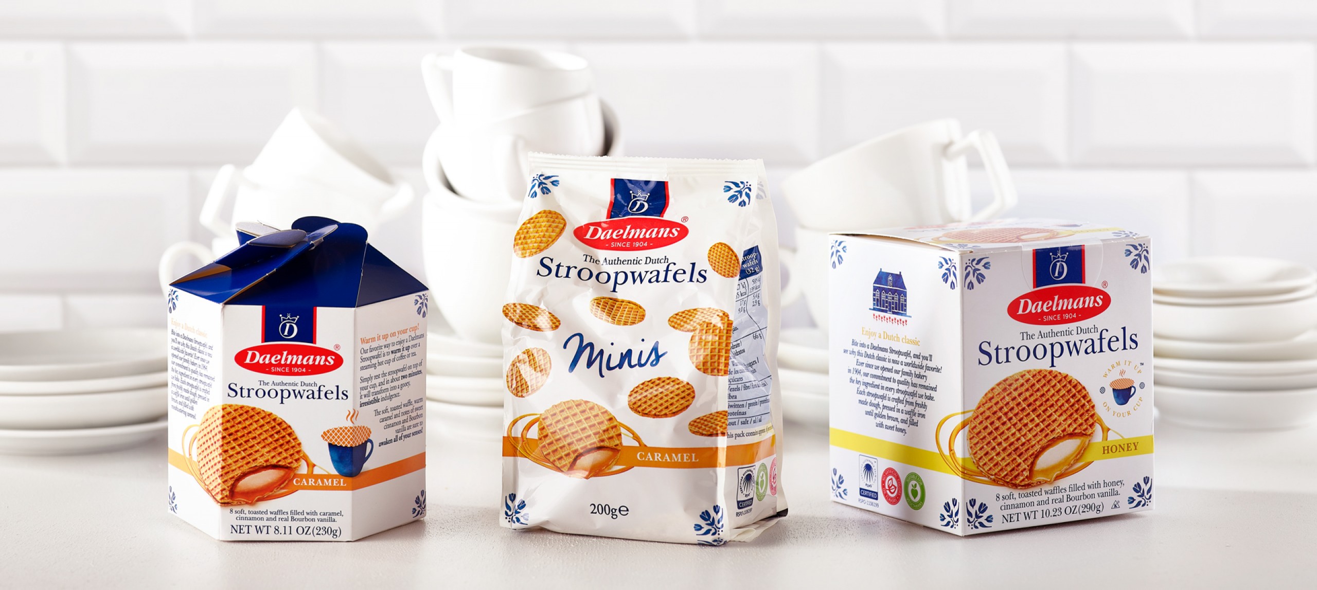
True to most packaging systems our design was required to accommodate not only the full range of flavour differentiations and biscuit sizes but also multiple packaging formats from carton boxes to flow packs, from seasonal limited editions to special gifting tins. This required a flexible design identity that optimized branding, appetite appeal and product communication, stretched across a wide range of necessities.
So warm it up on your cup and get that stroop flowing.