BRAND MAKEOVER for Entre Deux Monts
A fresh design for cool climate wines.
Situated at the heart of Belgium’s ‘Heuvelland’, between the ‘Zwarteberg’ and ‘Rodeberg’ ( Red & Black Hills ), winemaker Martin Bacquaert, representing a third family generation of wine makers, harvests his grapes and blends his creations. With an upmost respect for nature and climate, he is passionately driven to make only the finest wines and to proudly plant Belgium firmly on the map of respected, quality wine regions.
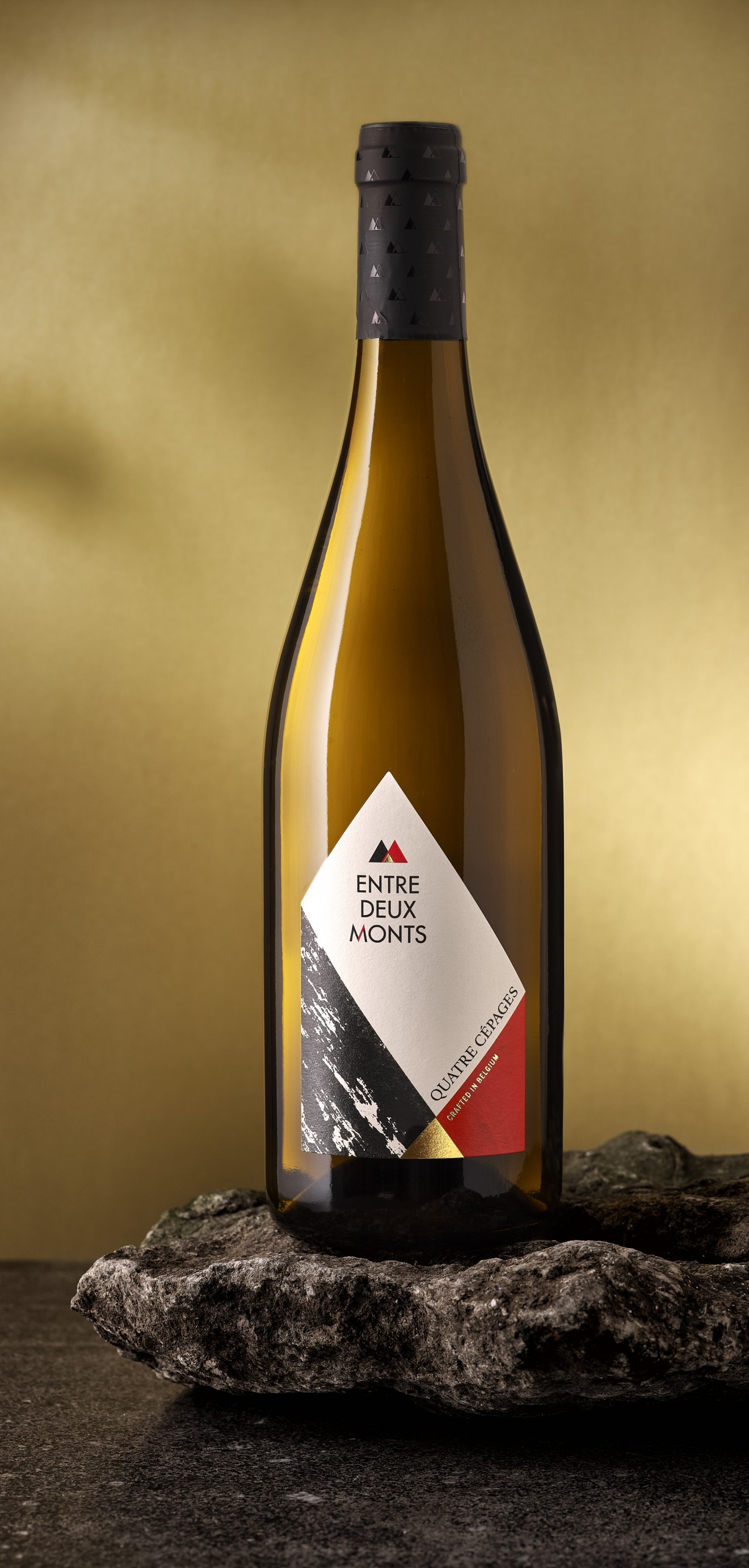
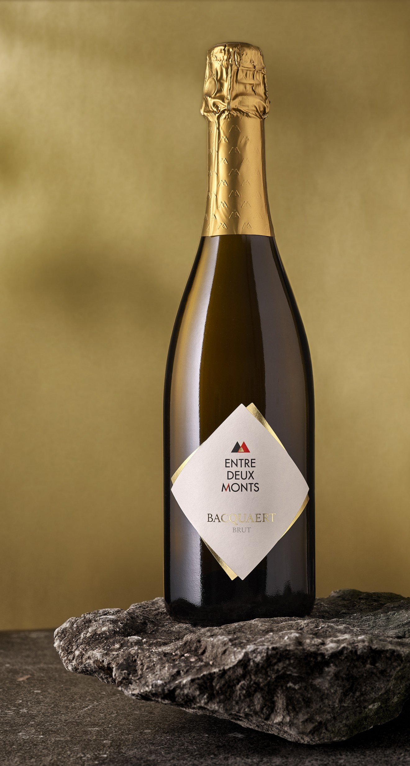
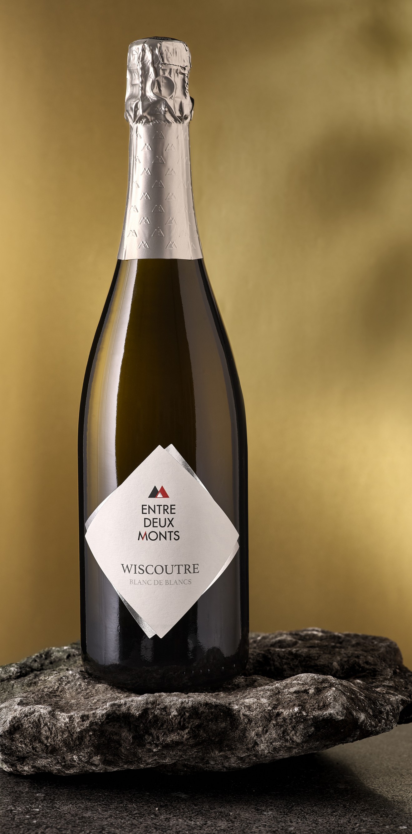
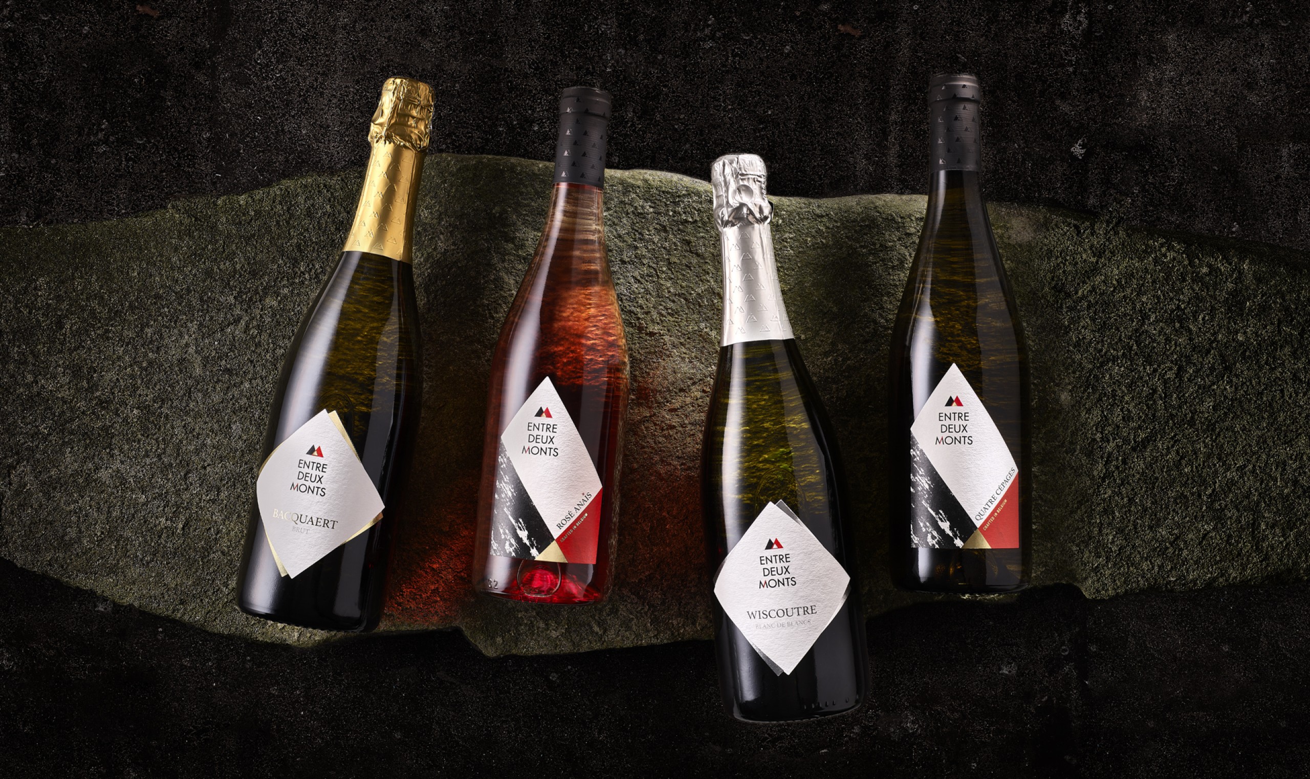
To elevate his wine to the status it deserves and enhance its quality perception in the minds of consumers, Martin knocked on our door to help revitalize his branding and packaging. We brought the iconic ‘Entre deux Monts’ location to life by incorporating the ‘Zwarteberg’ and ‘Rodeberg’ into the branding and emphasizing the duality of passion & craftsmanship and humbleness & quality at the core of his brand and his business. Lying at the heart of these two hills lies the gold, the wine that is derived and cultivated from this unique terroir.
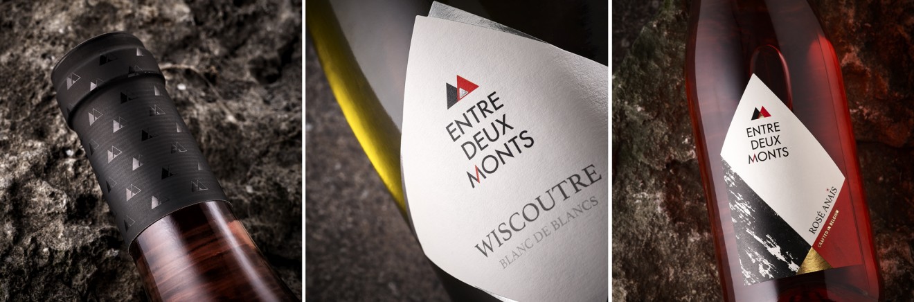
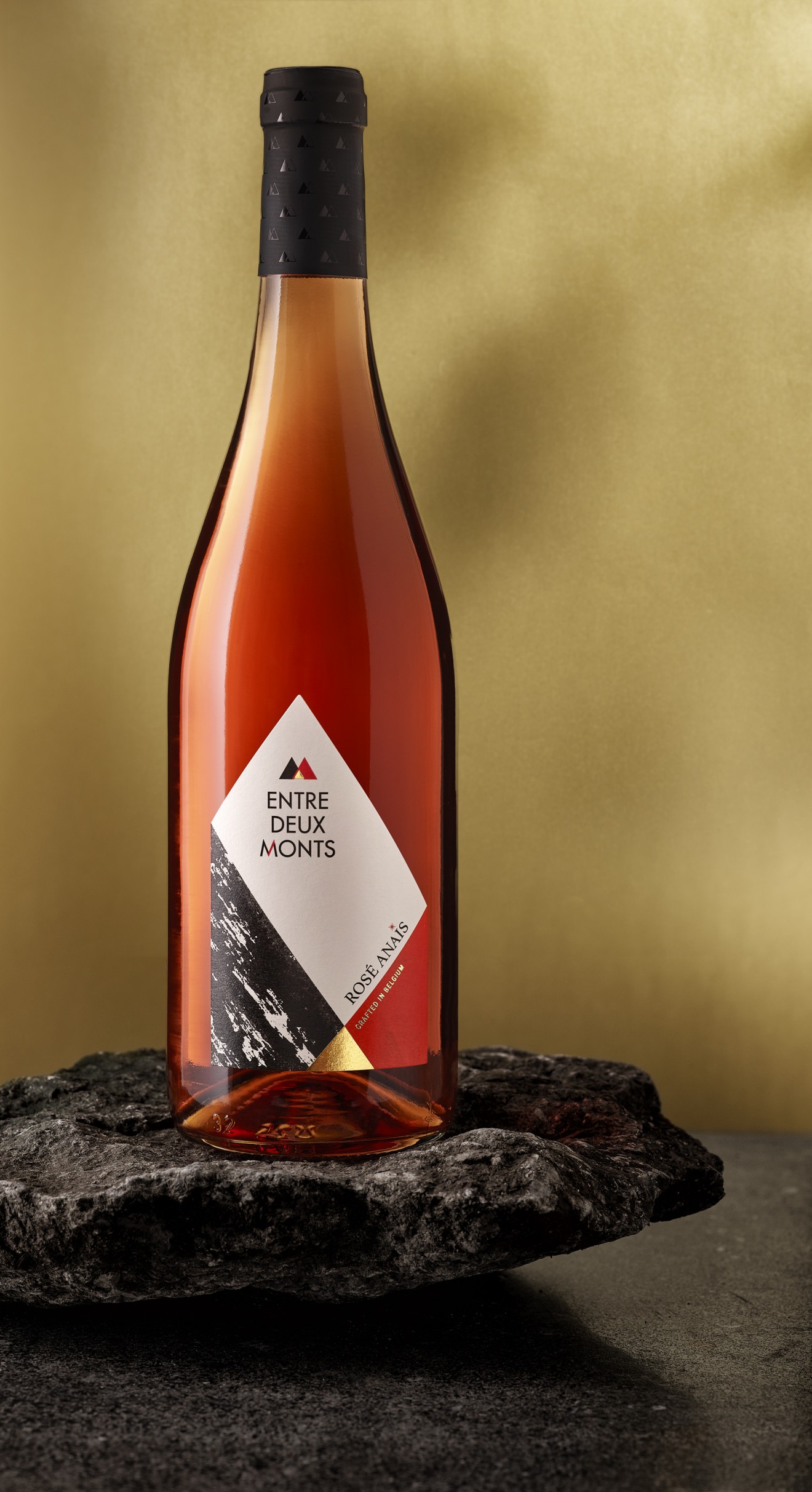
To further highlight this duality and the relationship with the land we created a customized label shape that shows the textured black terroir crossing with the passionate red craftsmanship. Placed perfectly at the labels peak our bold branding provides a balance to the design. Additional template branding is applied to the bottle tops along with a delicate pattern that decorates the bottle seals. In order to signalize a clear differentiation between regular and sparkling wines a new label shape was devised, and an eye-catching use of metallic silver and gold helps support a feeling of premium exclusivity.
Bold beauty meets refined quality……….cheers!