BRAND MAKEOVER CHAPTER 2 for Duvel Moortgat
The Devil is in the Details
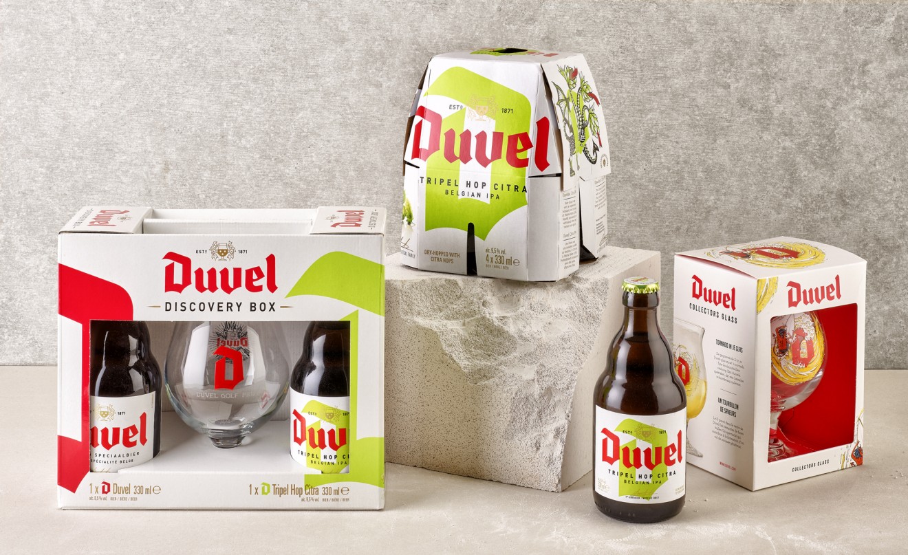
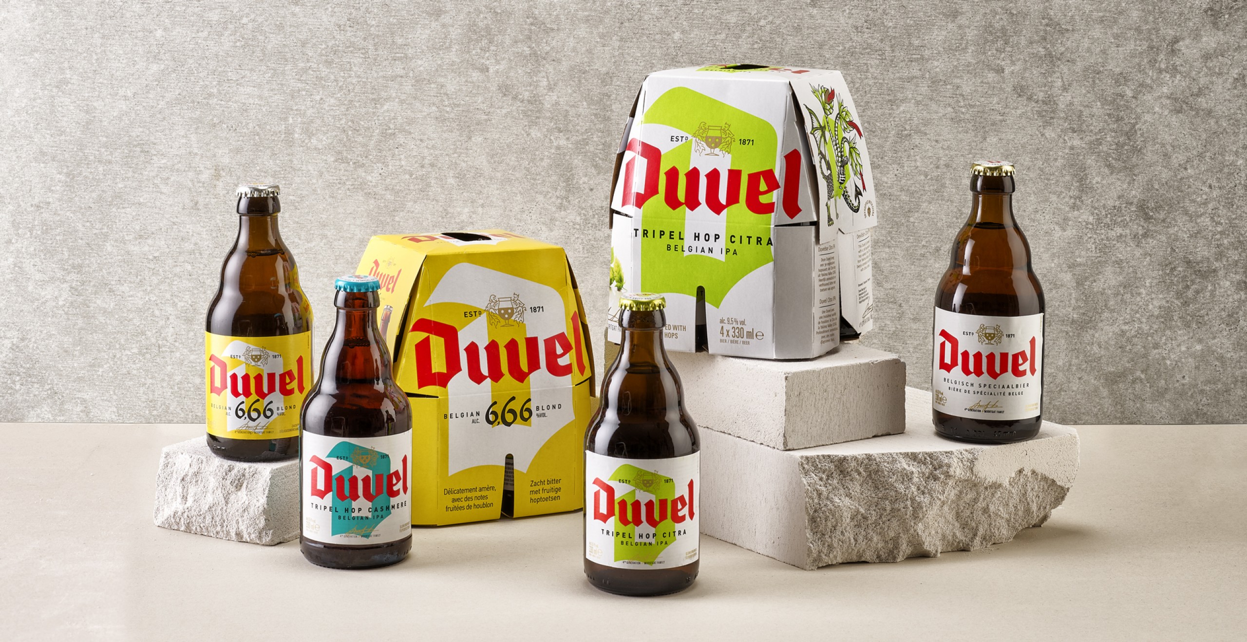
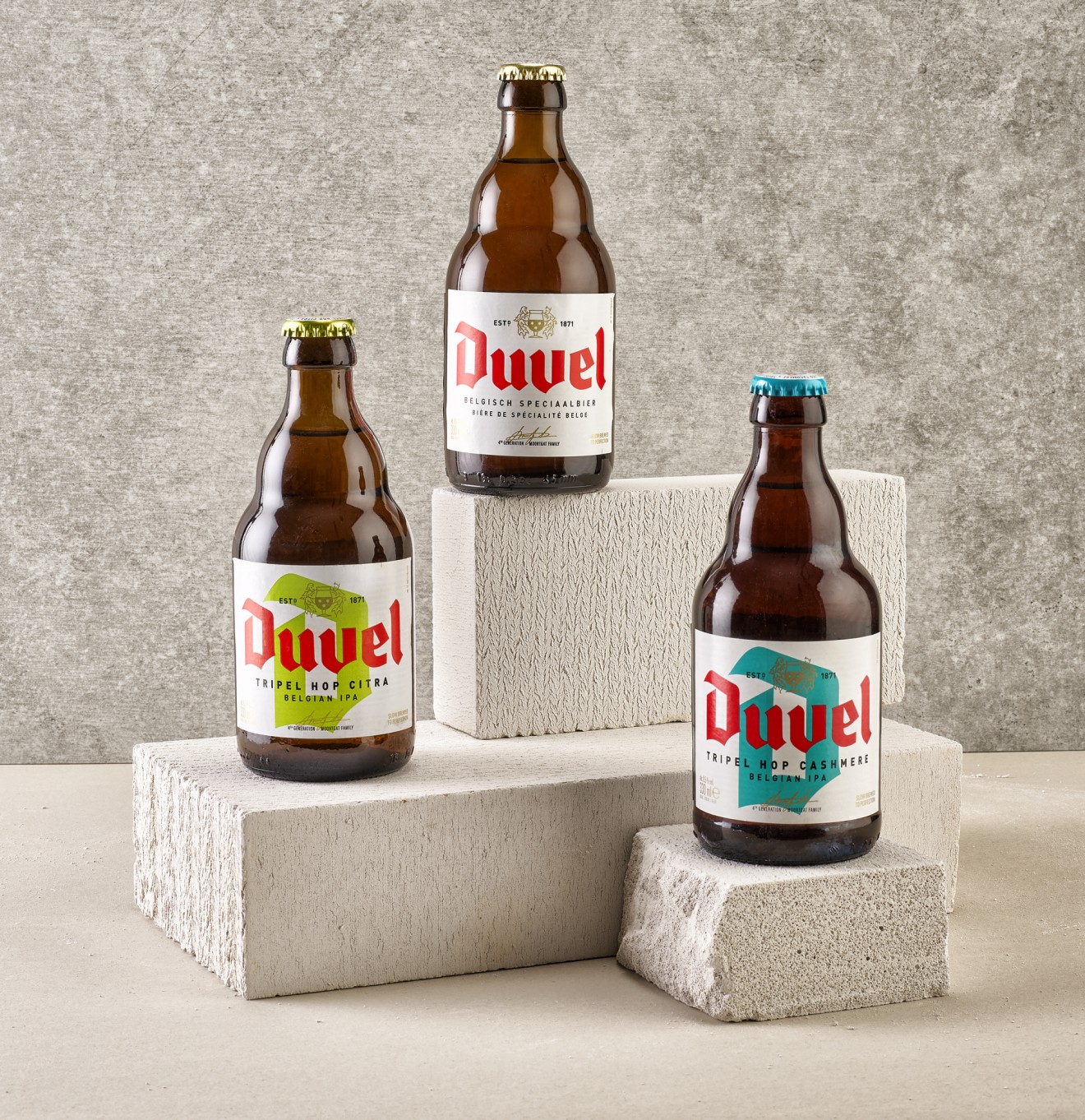
Like the patience needed to slow brew this Belgian golden ale to perfection, the packaging design evolution for Duvel was a process long in the making. Building on the work first established through the bottle and label designs, this iconic brand identity needed to breathe quality and modernity whilst strengthening the brands key assets. With a keen focus on our brand colour DNA of bold red, clean white and gold refinement, we stripped down the identity to its bare essentials.
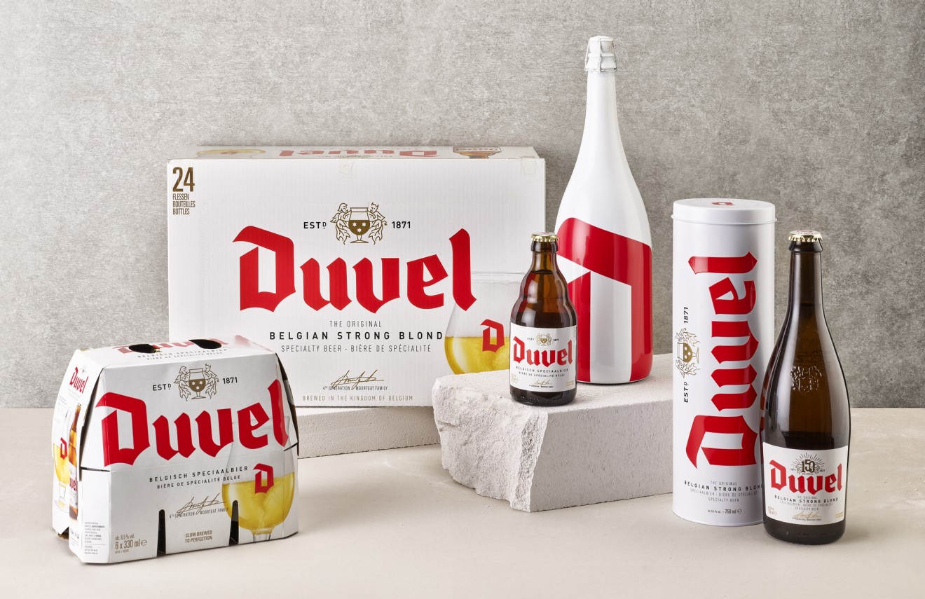
A strategic emphasis was unsurprisingly put on Duvel’s iconic ‘D’ that was engineered to provide stopping power and unmistakable brand recognition. This powerful device was also put to work to help differentiate the new players to the Duvel product portfolio and bring that diversity but strong unity to the design. Flexibility was also required to ensure an engaging dynamic across the line-up that was more than just copy-paste and facilitated adaptations to multiple product and pack variations.
‘Keep it simple stupid’ as we’ve often heard is what brand building is all about. This is how brands make those simple connections with consumers and help deploy a universal packaging and branding image across multiple retail channels and regions.