BALANCE for Klingele
Balanced chocolate range
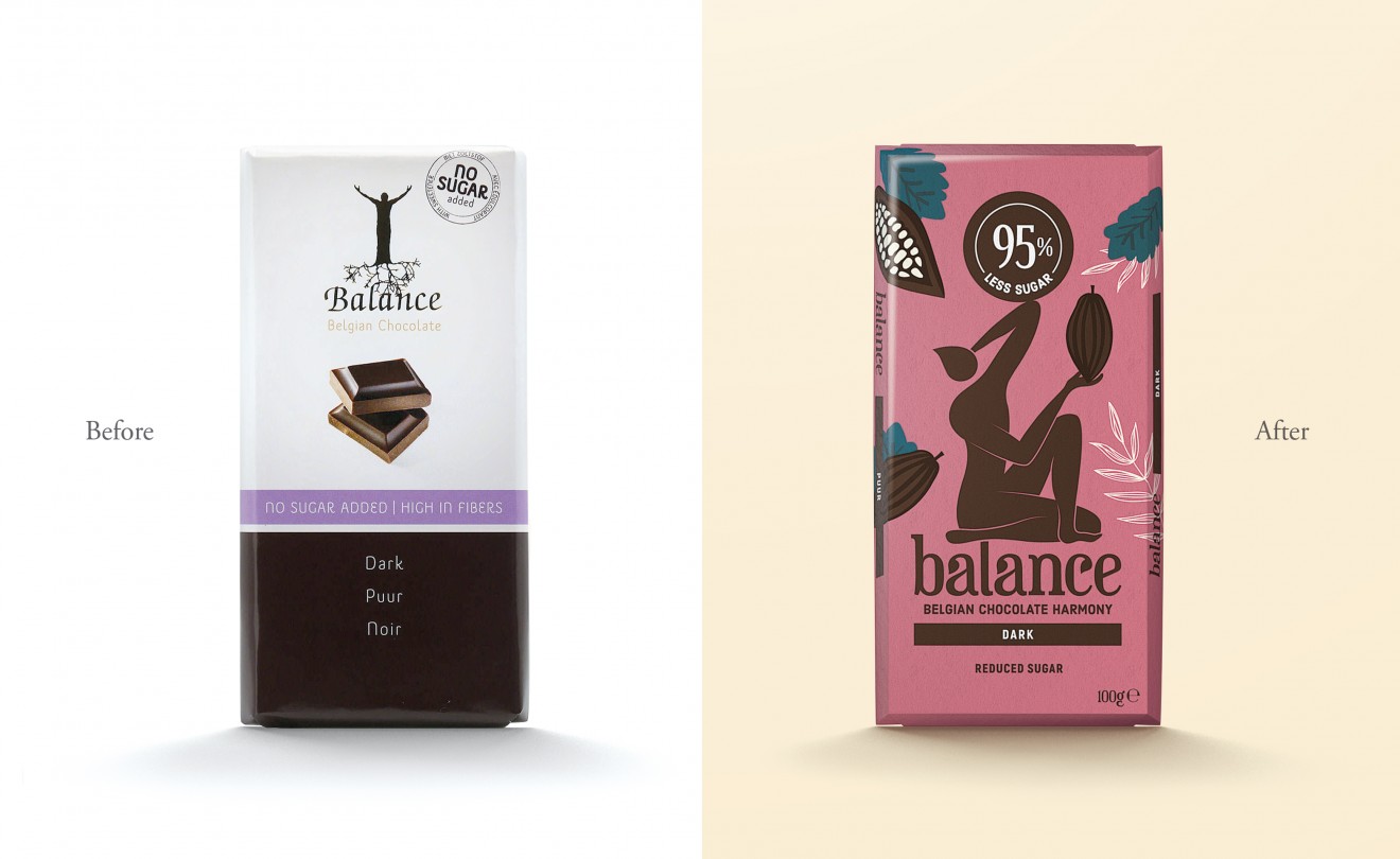
Balance Chocolate has for many years positioned itself as an authentic Belgian Chocolate brand with a deep relationship with the natural world and promises a harmonious balance between delicious indulgence and a healthier lifestyle. Thanks to their alternative natural, root-based sweeteners, this reduced sugar confectionary brand had found a market of health-conscious consumers, retailing through organic specialist stores. Despite this perfect match, there was a growing old-fashioned perception around diet related products and the brand felt that it wasn’t reaching a broad enough audience and had ambitions to enter the mass retail world.
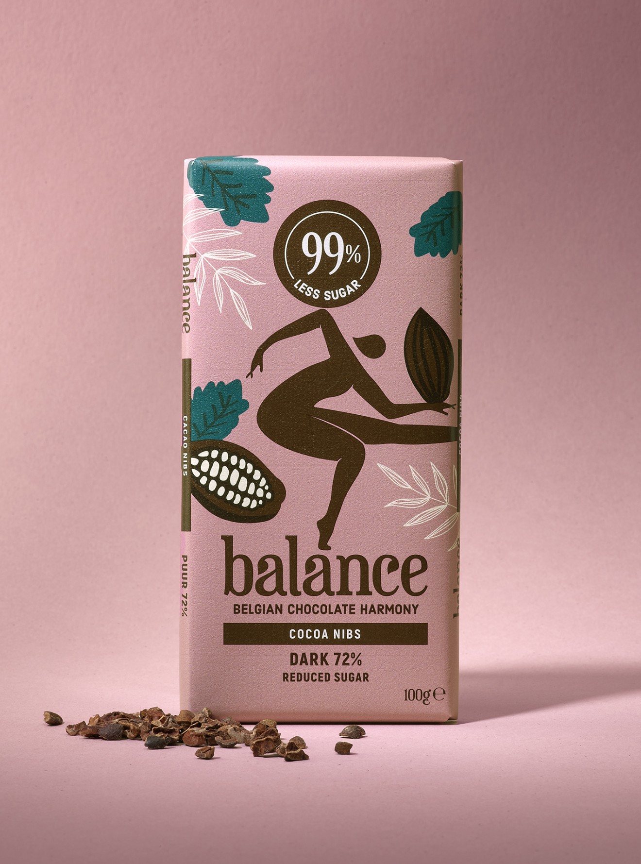
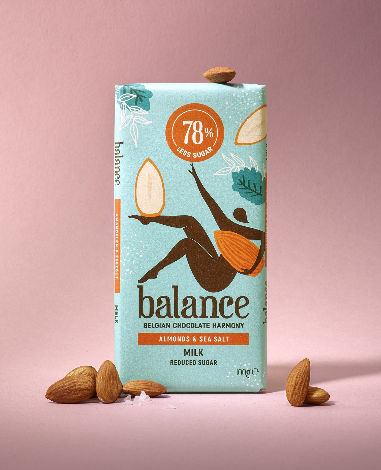
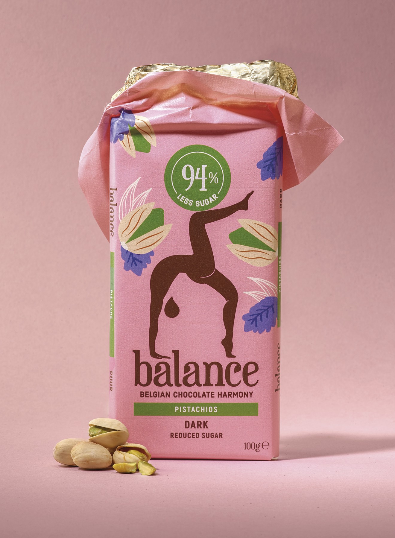
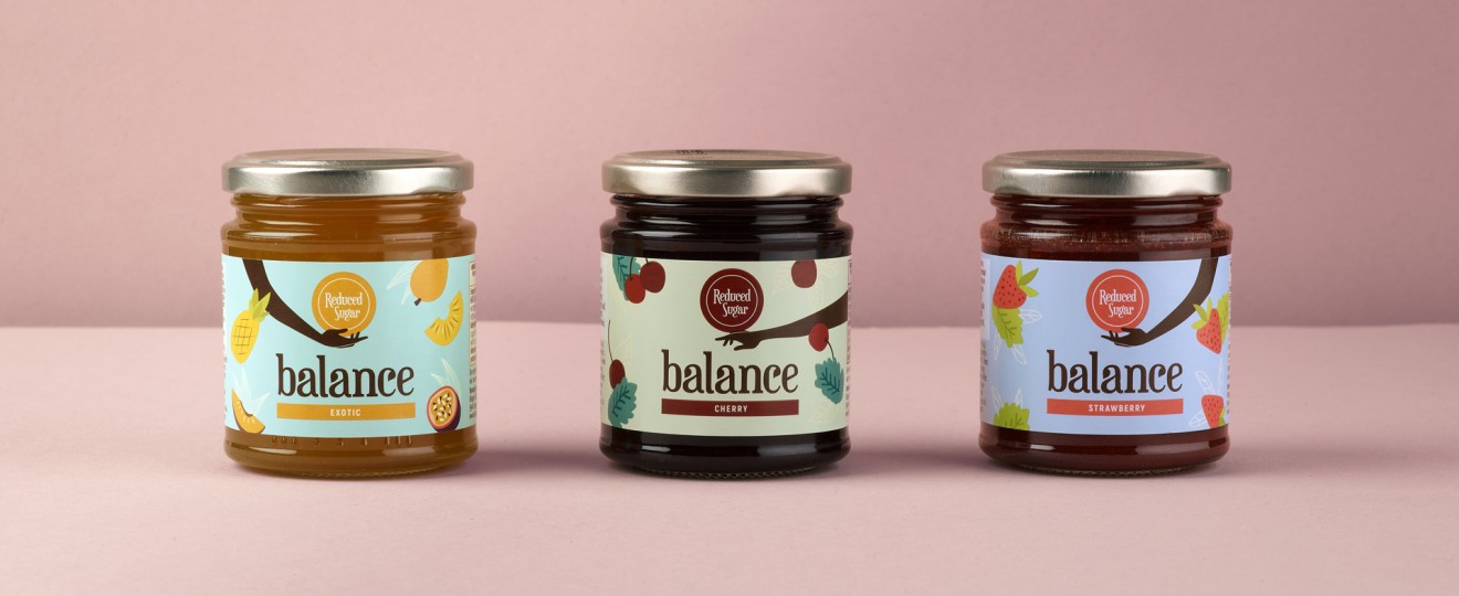
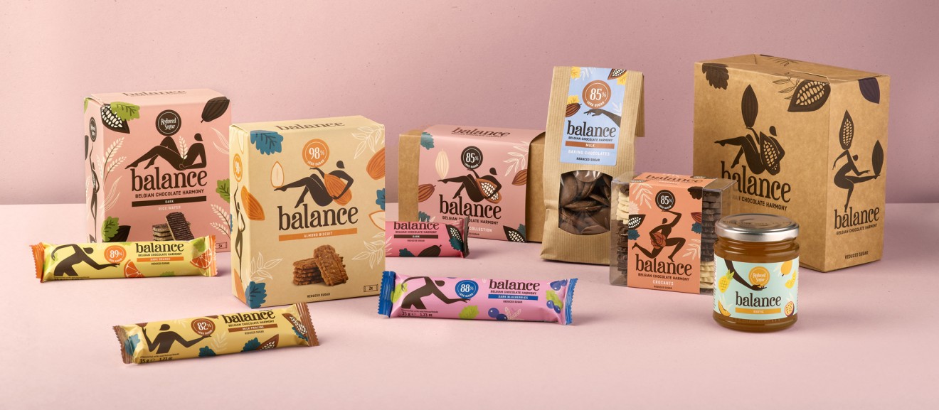
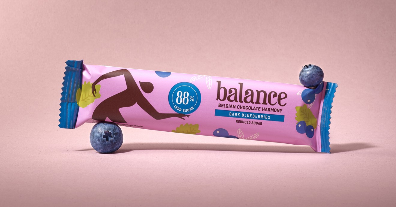
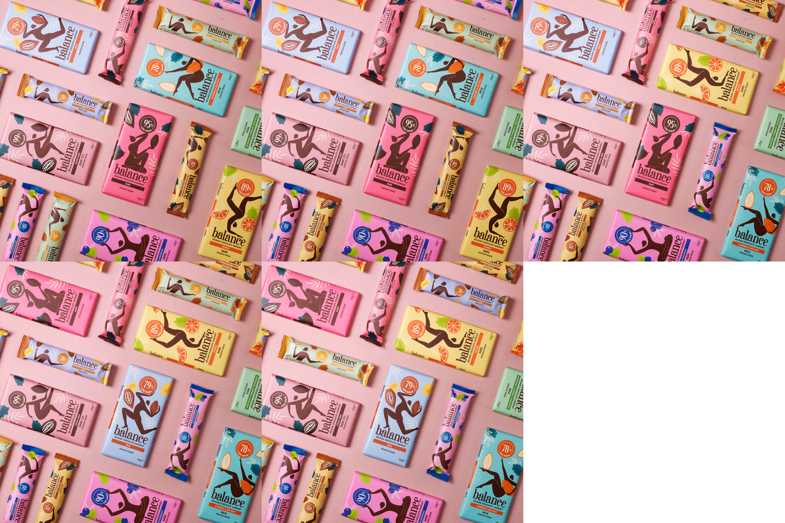
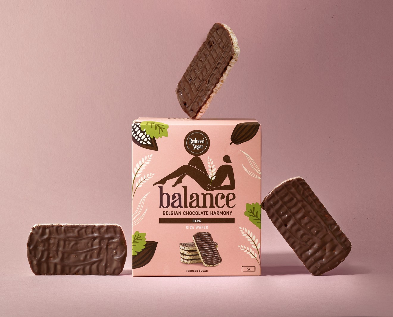
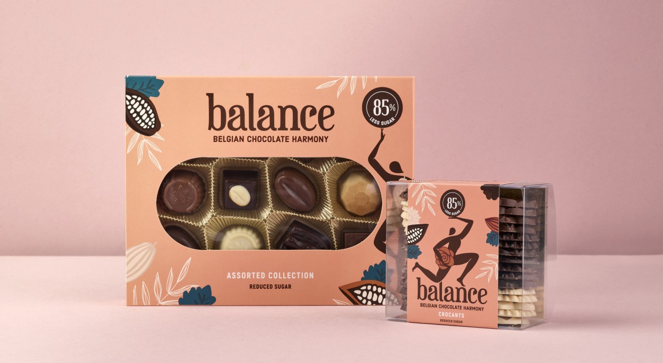
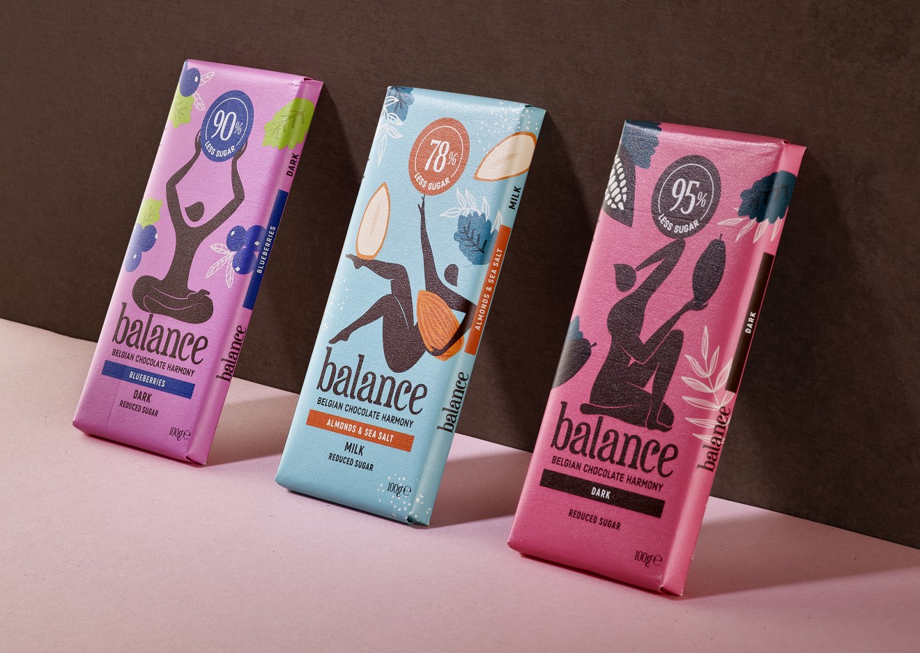
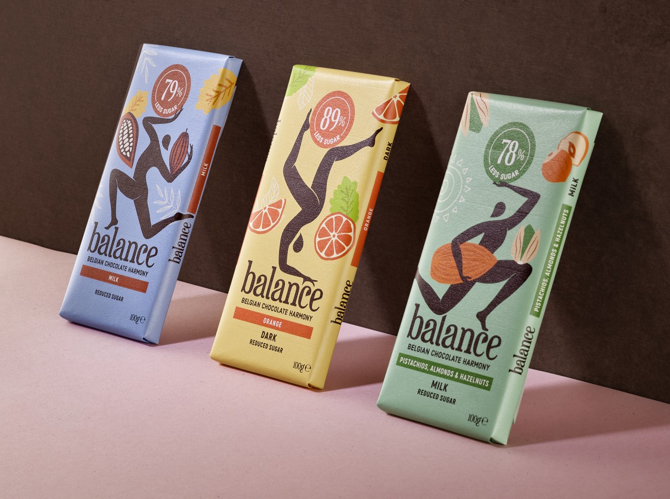
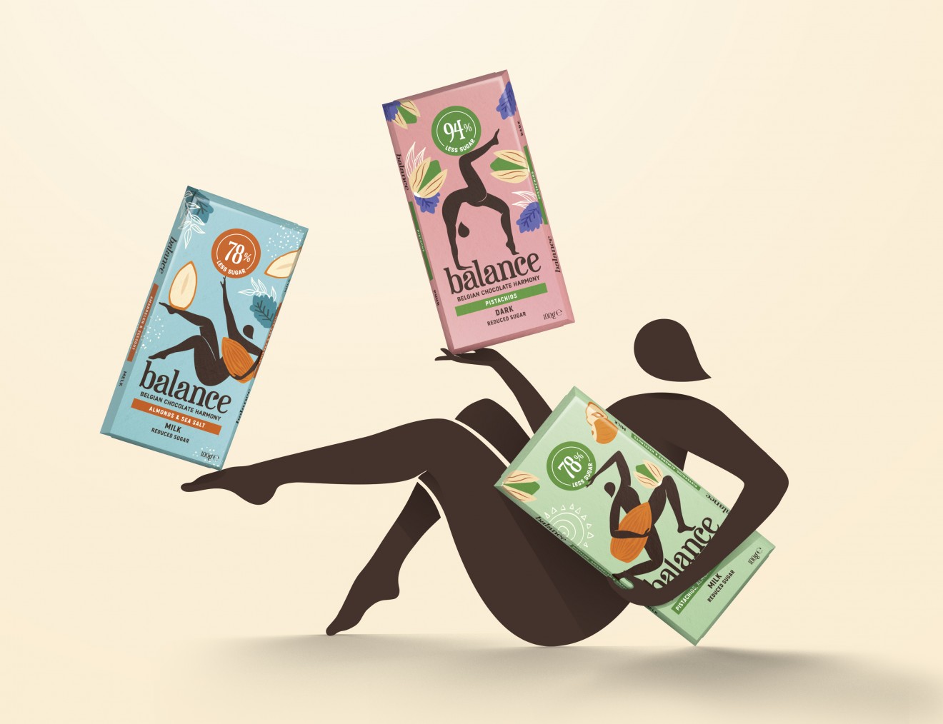
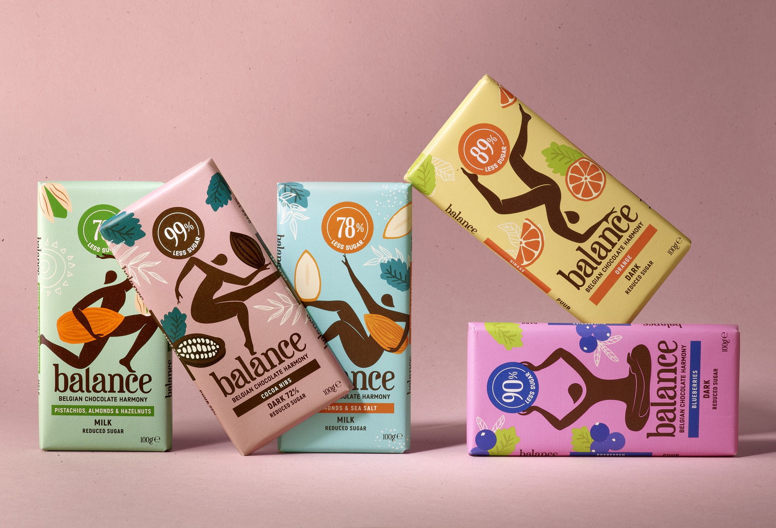
Our challenge was to break convention and negative perceptions around reduced sugar products and to elevate Balance into the modern world of chocolate. Dropping their existing identity, we boldly proposed a fresh approach that utilises a flexible range of figures, each in search of their own personal balance, worked together in harmony with the brands benefits. Forming a natural foundation to the balancing figures is the brand logotype, that organically maintains the brand roots with the natural world. Our focus was clearly to bring the brand’s core benefit to life in a human centric manner, that places the consumer needs at the heart of this dynamic identity.
