GRANOLA'S for The Jordans Company
Grow with nature and nature grows with you
Jordans breakfast cereals, originating from the UK, has been a major presence on Belgian supermarket shelves for generations. Often quoted as being one of the pioneers of the granola craze, the Jordan brand has maintained a solid position in the minds of consumers for many years but has recently become stagnant in its development whilst multiple new and more contemporary challengers enter this growing category.
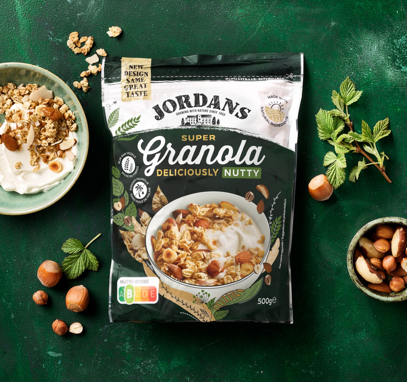
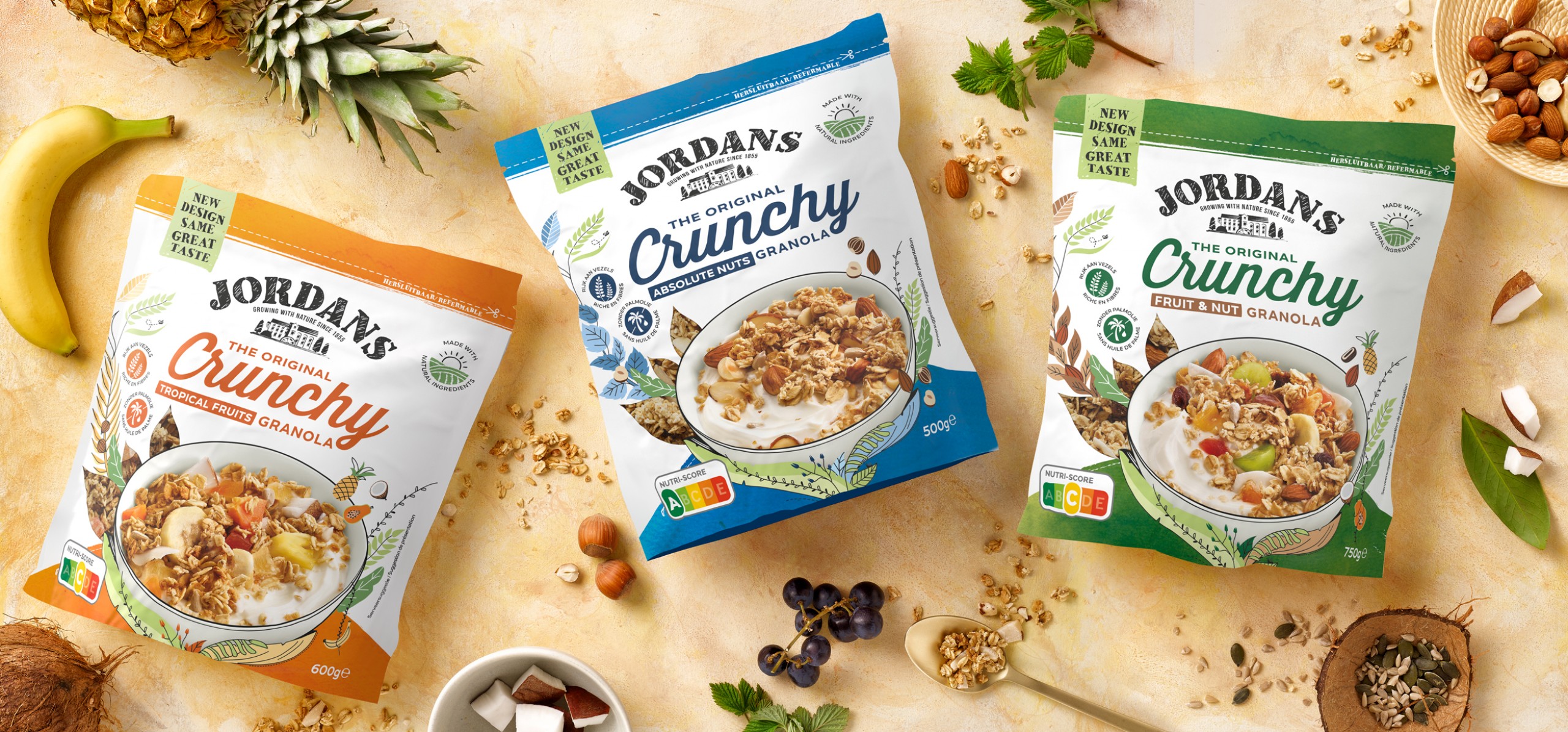
Jordans realized the necessity to reawaken brand awareness and to reclarify a consumer intuitive reason-to-buy and fall in love again. This by creating a revitalized, compelling new packaging identity, that through an impactful and memorable story, helps deliver on the fundamental necessities of; ‘mouth-watering appetite appeal’, ‘nutritional values & goodness’ and a ‘tangible bond with nature’. We were required to do this whilst strengthening unity across the product portfolio and guiding consumers clearly through their diverse product range, differentiated through flavour and nutritive benefits.
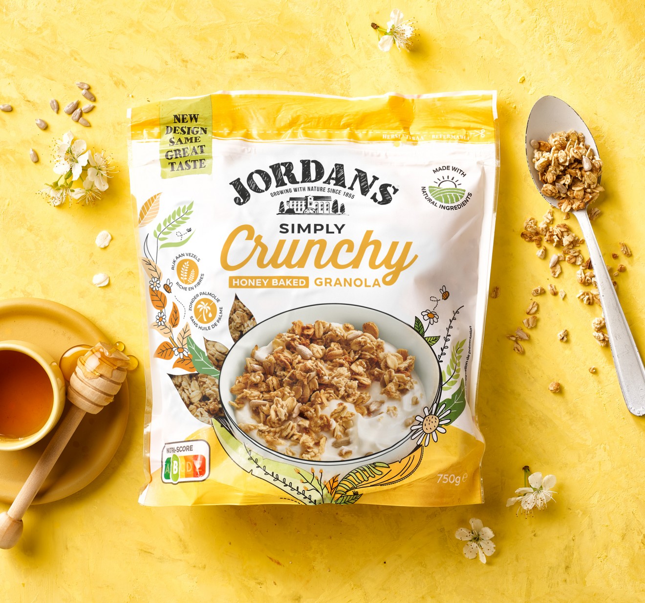
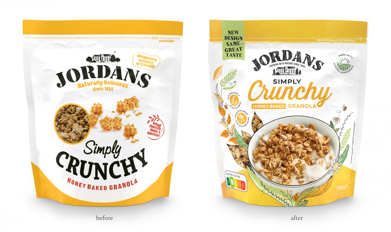
The current identity was an acceptable functional design that did a simple job but failed to elevate the perception of appetite appeal to the required level and lacked a visual relationship to the natural origins where all product ingredients came from. With this in mind, we illustrated a living, growing environment that reflected our natural source and put nature playfully to work in presenting a delicious product offering to consumers. Raised up invitingly to the consumer we displayed a delicious serving suggestion, created through photographic styling, that reintroduces Jordans into the modern world of granola consumption.
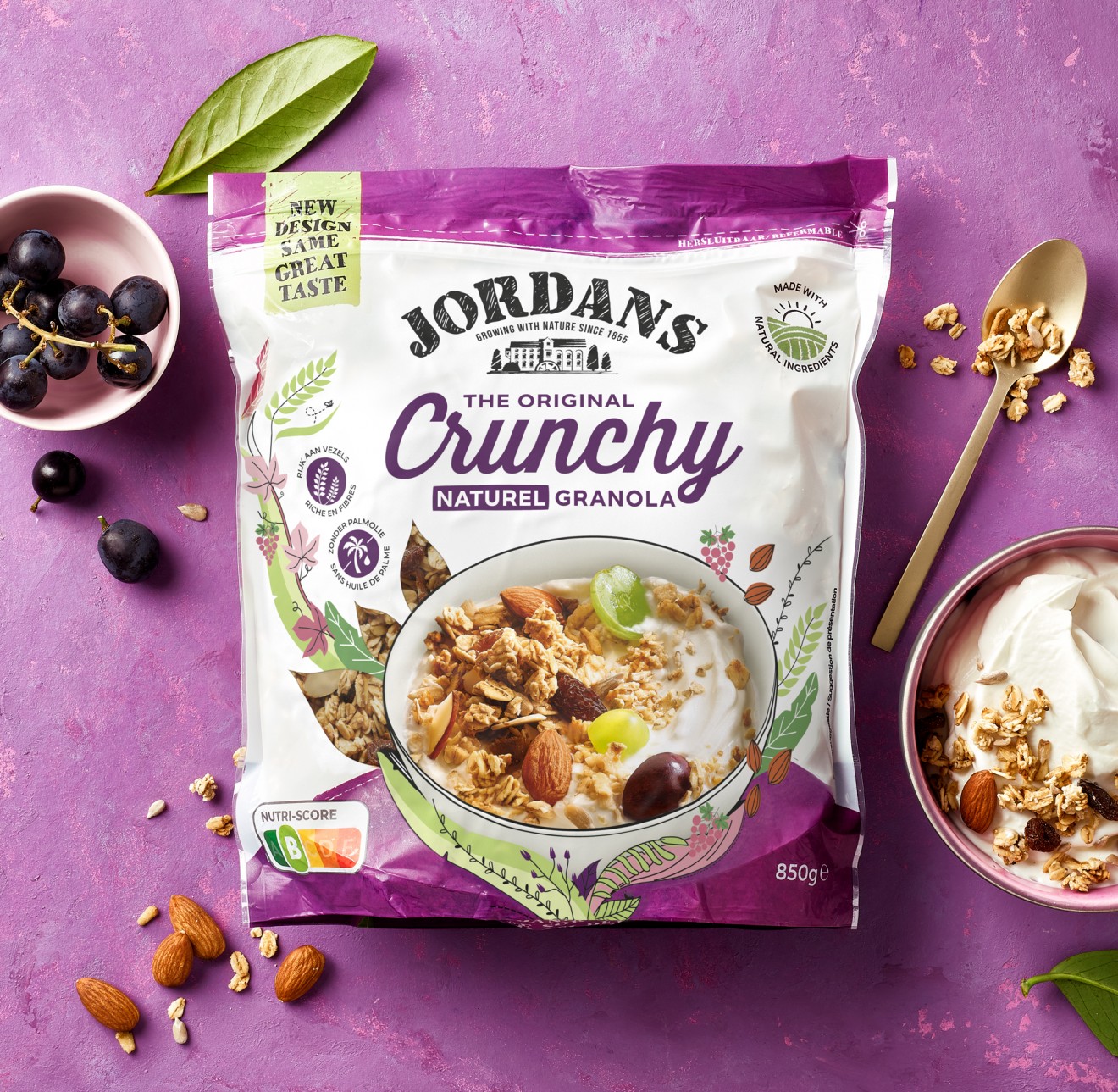
Navigating consumers throughout the Jordans product range, we developed a packaging system that helps differentiate the granola flavours from the Low Sugar alternatives, the Premium Granola offerings and finally the Muesli. This supported along the way with nutritional benefit communication captured in a range of intuitive icons and a meaningful brand and product story articulated on the back of pack, that finally puts our intentions into words for all to understand.
Thanks also to the optimism this new brand identity brought to Jordans, we were also given the freedom to add a human touch to the branding, opting to hand sketch the logotype and famous Jordans Mill. Enhanced with the new ‘Growing with Nature Since 1855’ baseline, the Jordans branding was now fully integrated into its own natural world.