
EOY 2020 for Philip's Biscuits
Warming hearts this winter with Philip's Biscuits.
Philip’s Biscuits is a premium biscuit bakery located in the heart of the Belgian ‘Koekenstad’, Antwerp. Their dream began many years ago by crafting an honest yet inspirational, artisanal biscuit. Their creative spirit displayed how experimenting with flavours and traditional methods could give birth to an honestly delicious biscuit with a familiar home baked feeling. No frills, no fuss, just really, really good.
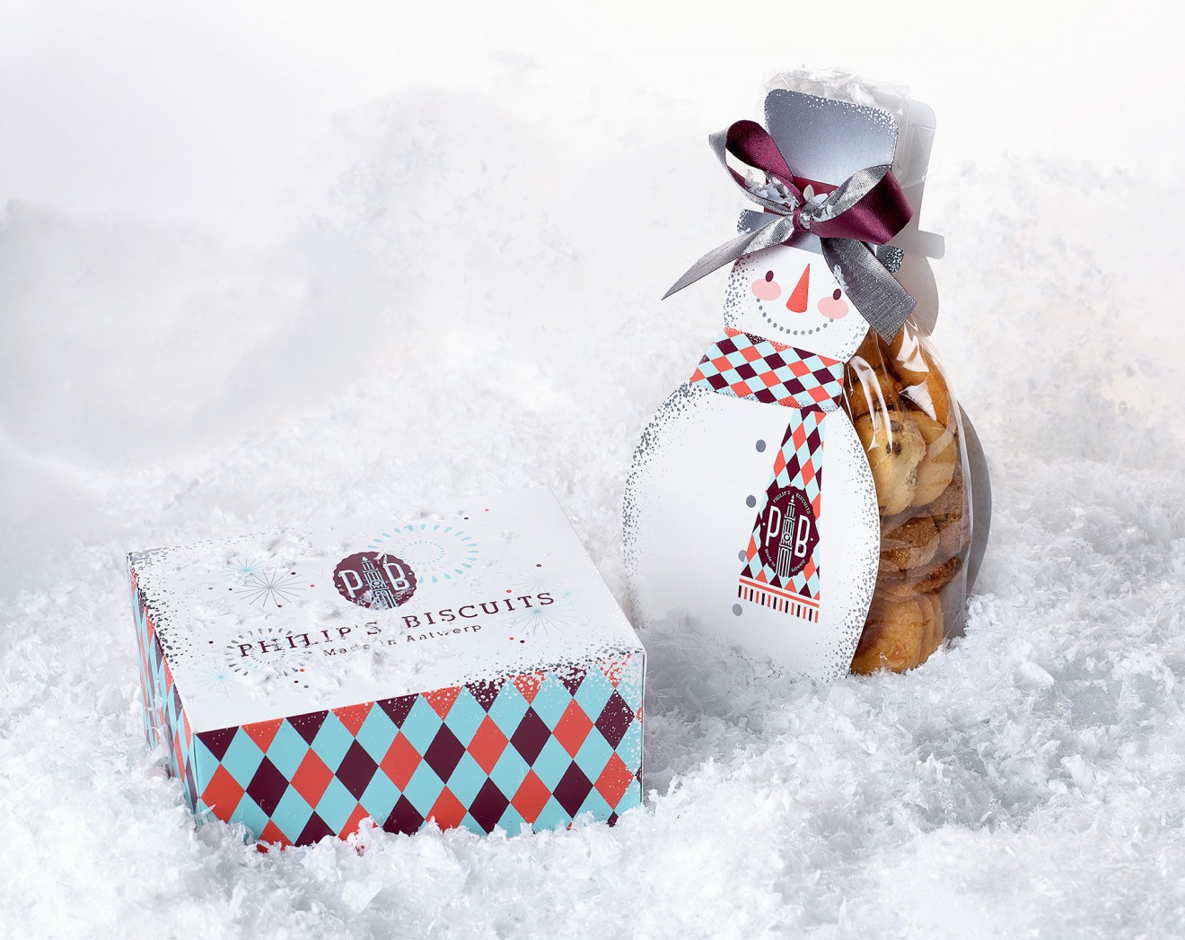
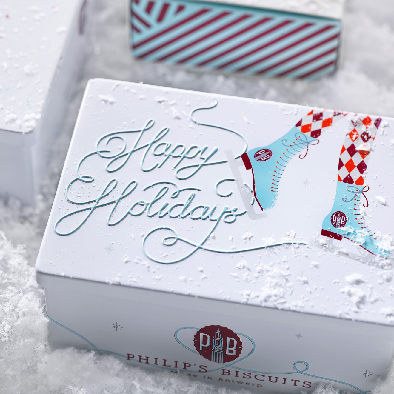
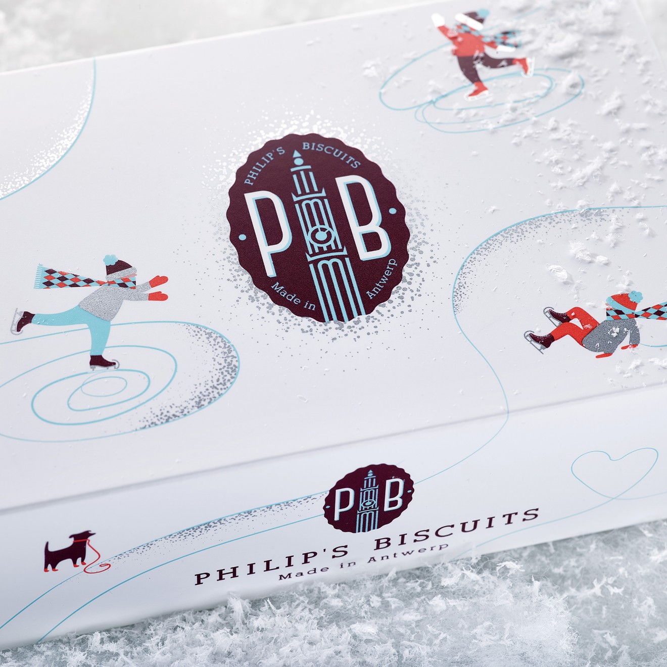
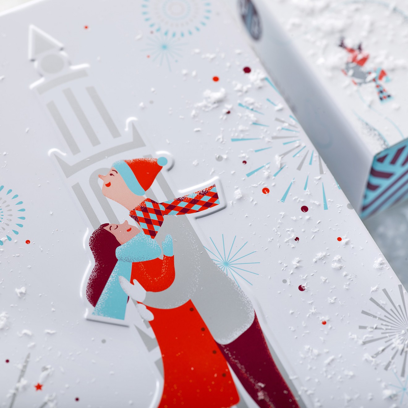
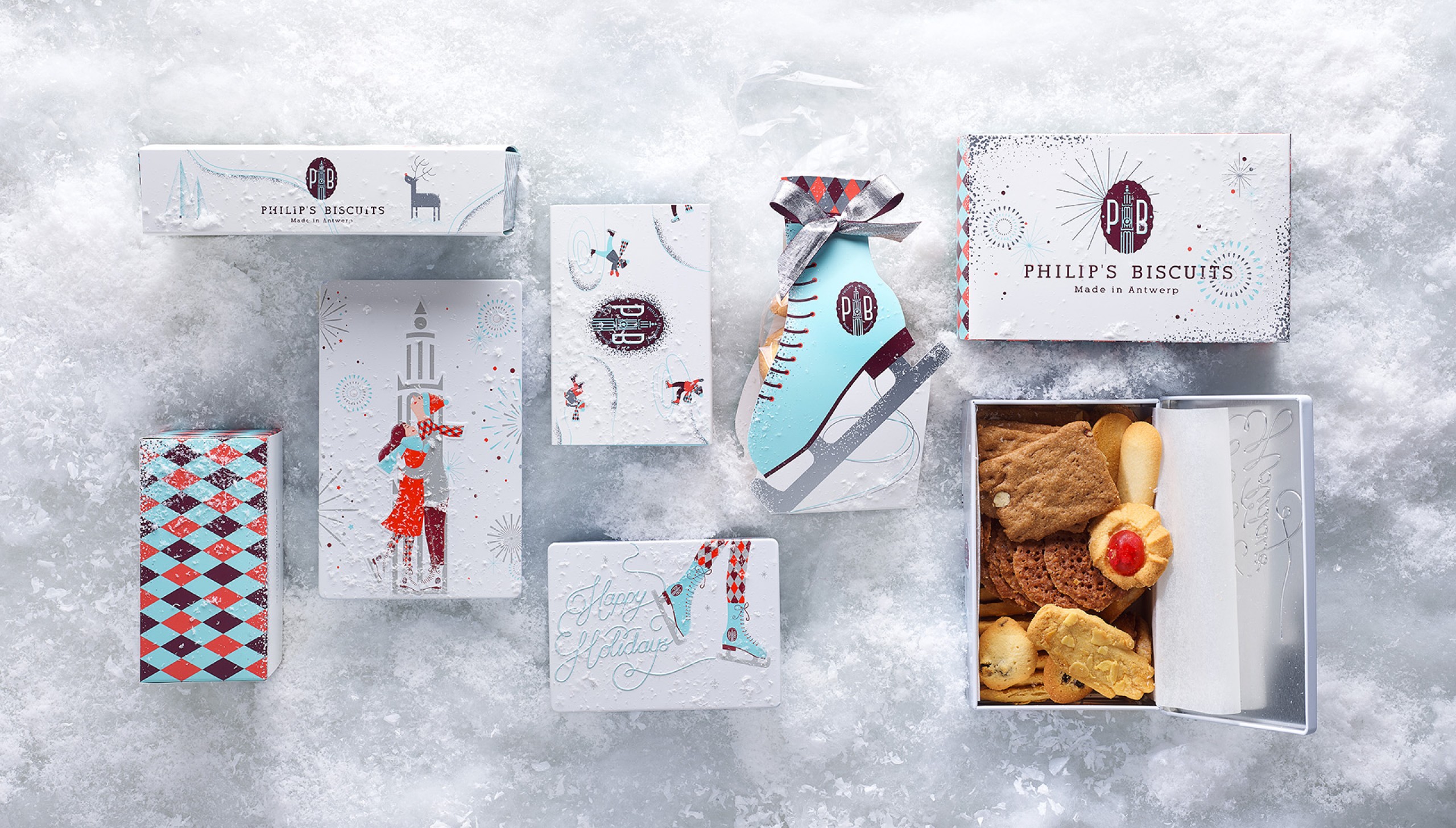
After redesigning the Philip's Biscuits brand & packaging design their seasonal packaging was our next challenge. As this brand has a high gifting value, the end of year season is not to be missed. To help celebrate the charm and warmth of the end of year festivities we created a winter wonderland inspired collection with fireworks and loveable ice skaters. By adding a decorative with a winter inspired pattern and colours to the already premium Philip's Biscuits style, we added a vibrancy and authenticity to this collection. The romantic illustrations bring warmth and smiles, whilst the skaters skate their celebratory end of year message.
Happy Holidays to all!