END OF YEAR 2014 by Biscuiterie Jules Destrooper
A limited edition for the End of the Year of Jules Destrooper's fine biscuits
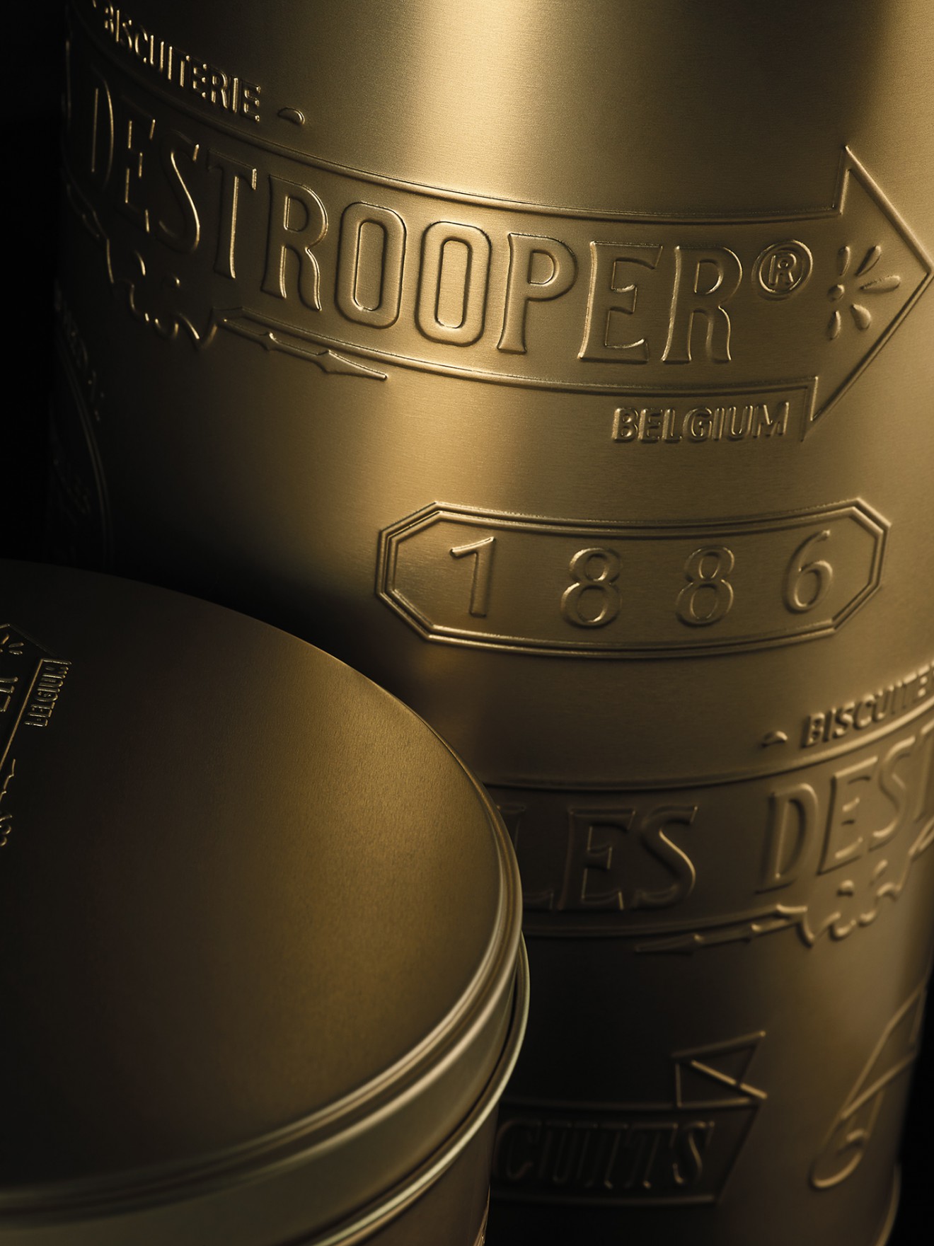
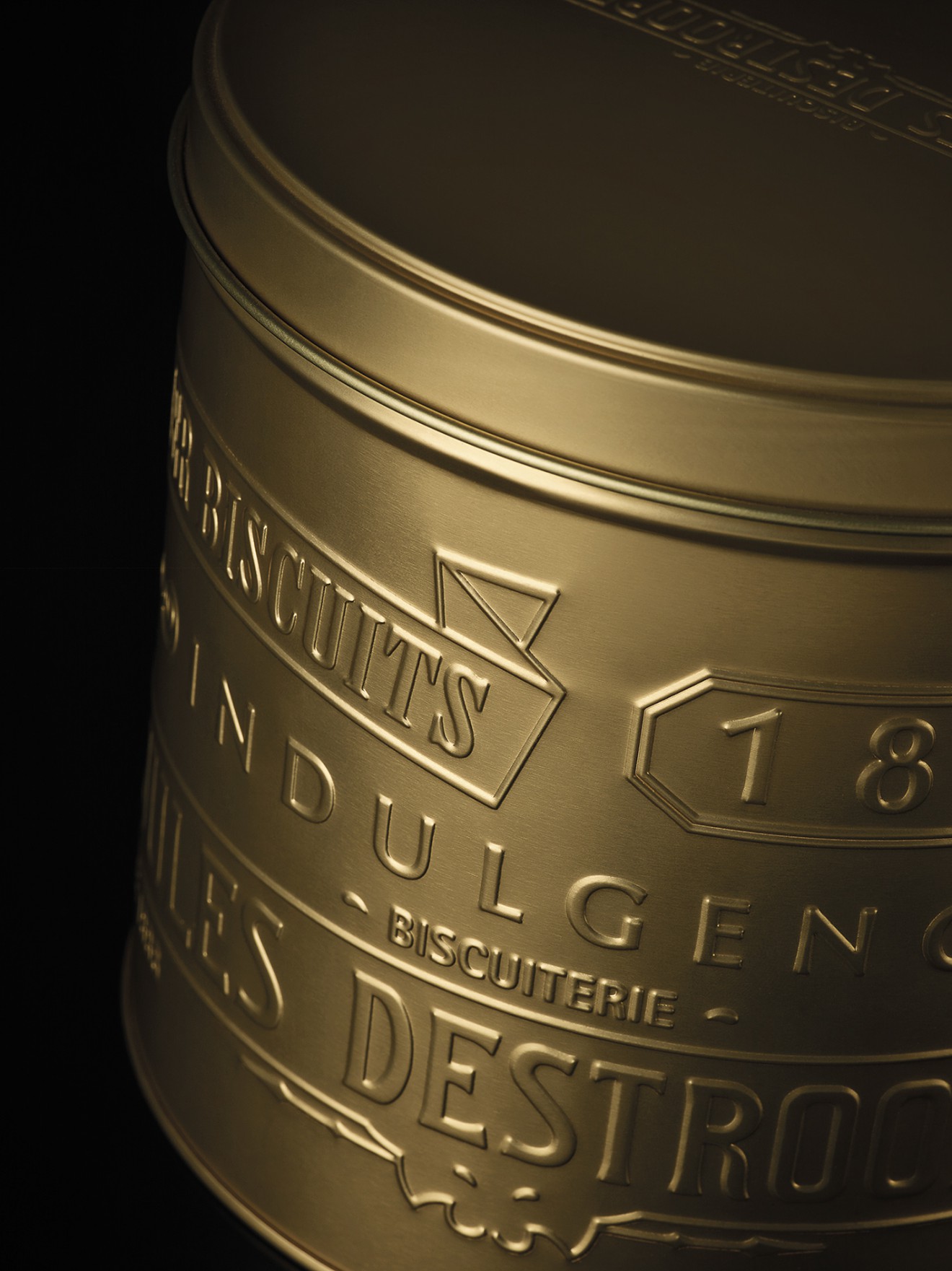
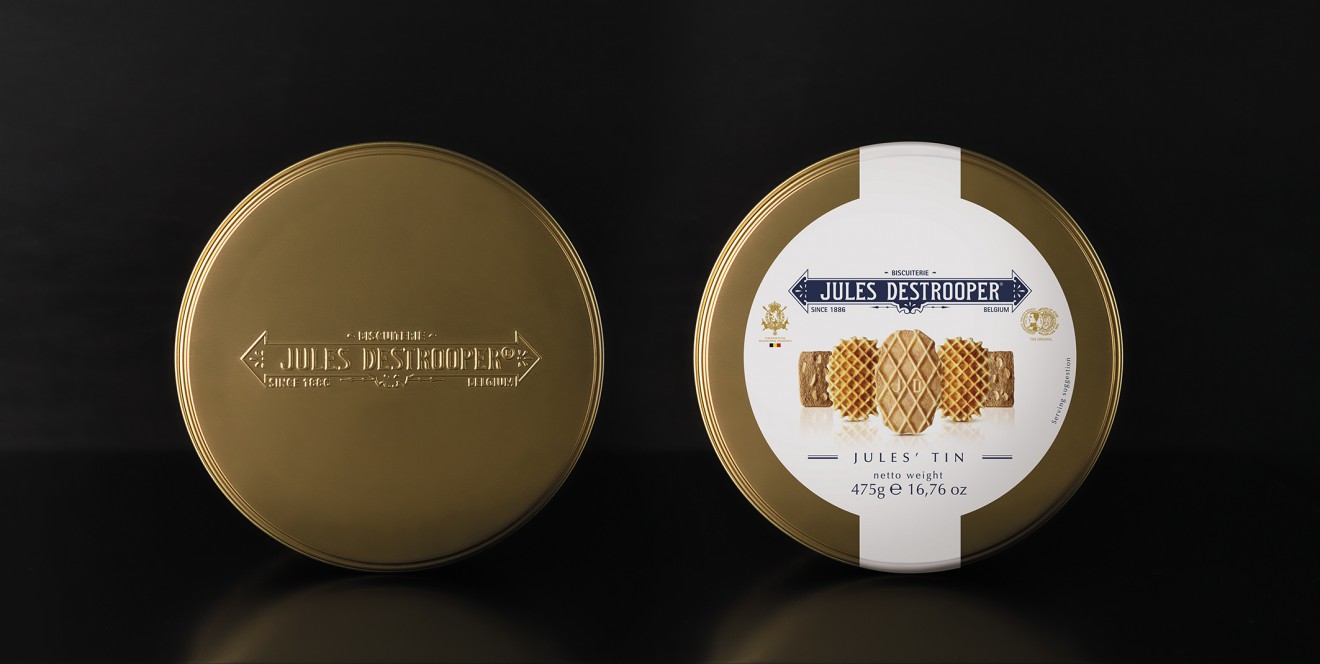
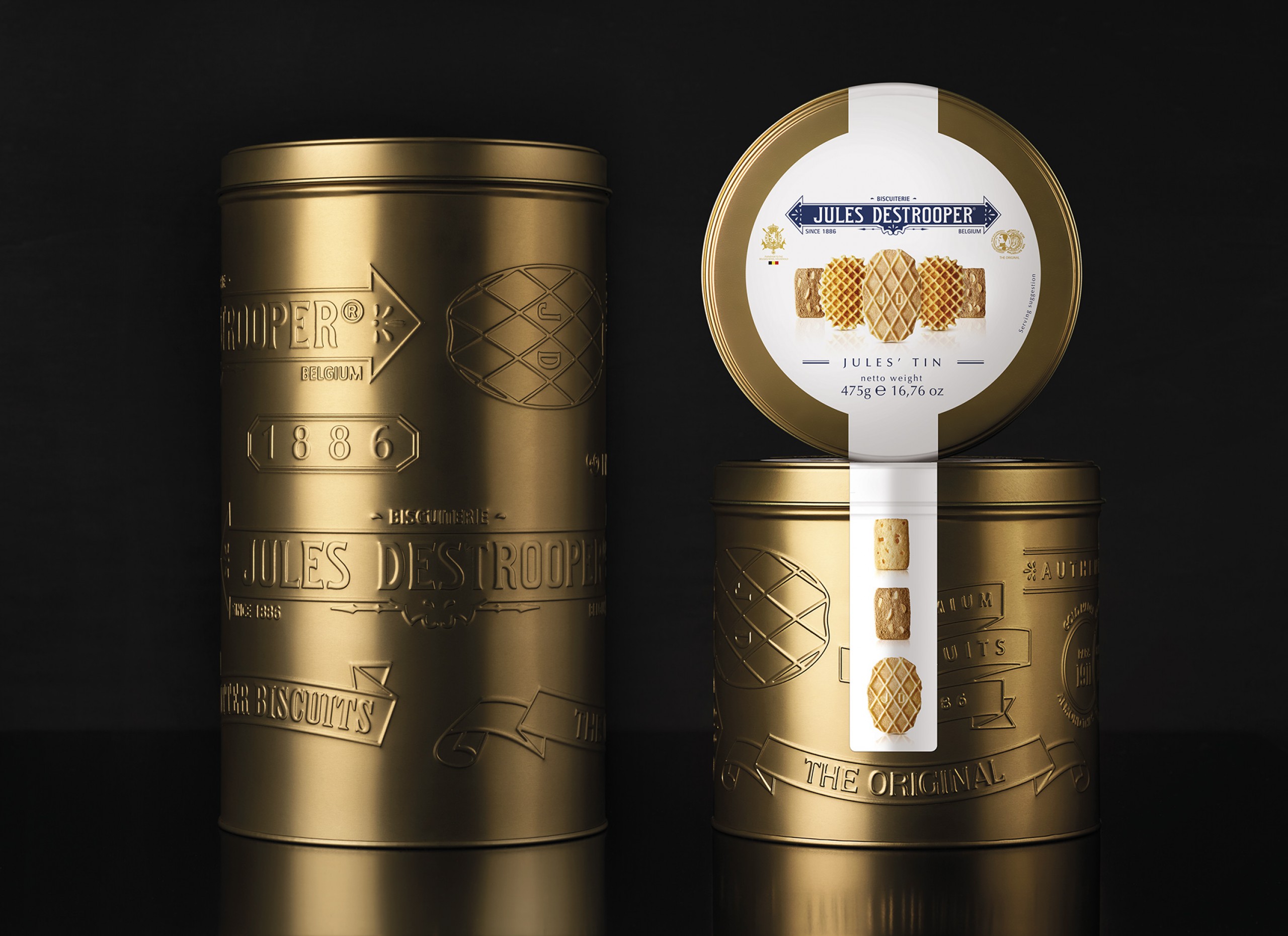
Every year Biscuiterie Jules Destrooper wants to indulge their consumers with a special edition packaging, filled with the most delicious and finest biscuits. Appearing in specialty shops all over the world, the package needs to communicate quality and luxury but it also wants to narrate about the inspiring heritage of the brand. A precious golden tin box was created with embossed stamps, telling the story of Jules Destrooper as the purveyor of their biscuits to the Belgian royal household and keeper of the 'Médaille d'Or' for its exceptional taste.
The refined design of the label showcases the biscuits proud next to each other, ready to conquer the world with its magnificent taste, the logo accompanied by in hotfoil finished emblems, all of this evoking a great gifting value.