CHARLES QUINT for Brouwerij Haacht
A beer full of pride
‘Charles Quint / Keizer Karel’ is one of the very well known heritage beers from the Haacht Brewery in Belgium that has been a familiar face on many a café table over the years. Found here in Belgium and many markets across Europe such as France and Spain the ‘Charles Quint / Keizer Karel’ brand tells a story of a legendary figure whose love of beer has been passed down through the ages.
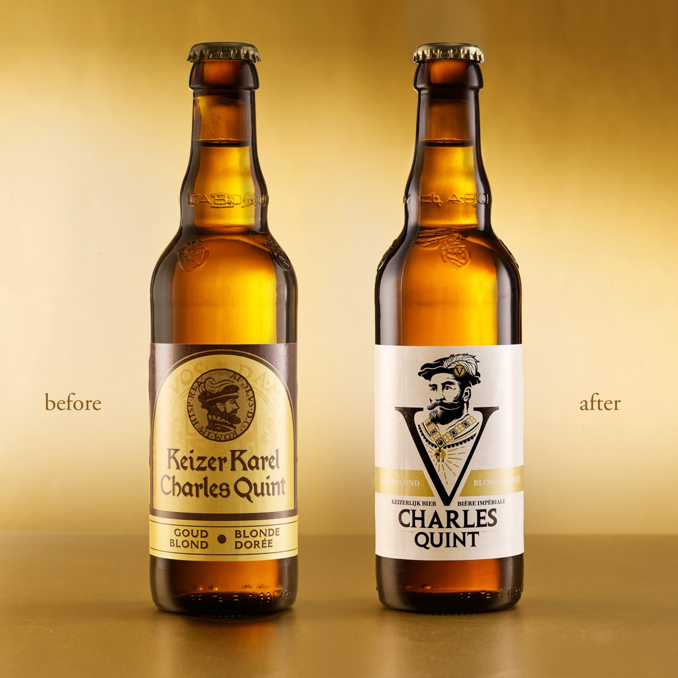
Despite the brands bold character and long-standing history, it had failed to really evolve with the times and keep pace with today’s ultra-competitive beer category. The design appears dated with a branding that doesn’t convey the brands character as it should. There was also the complexity of the dual brand name, first developed to serve Belgium’s bilingual consumers, that no longer appeared relevant and added only confusion and unclarity.
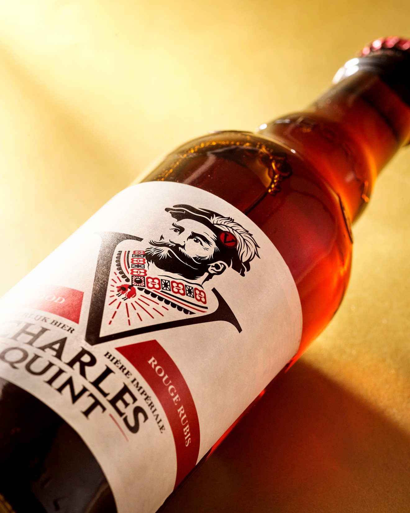
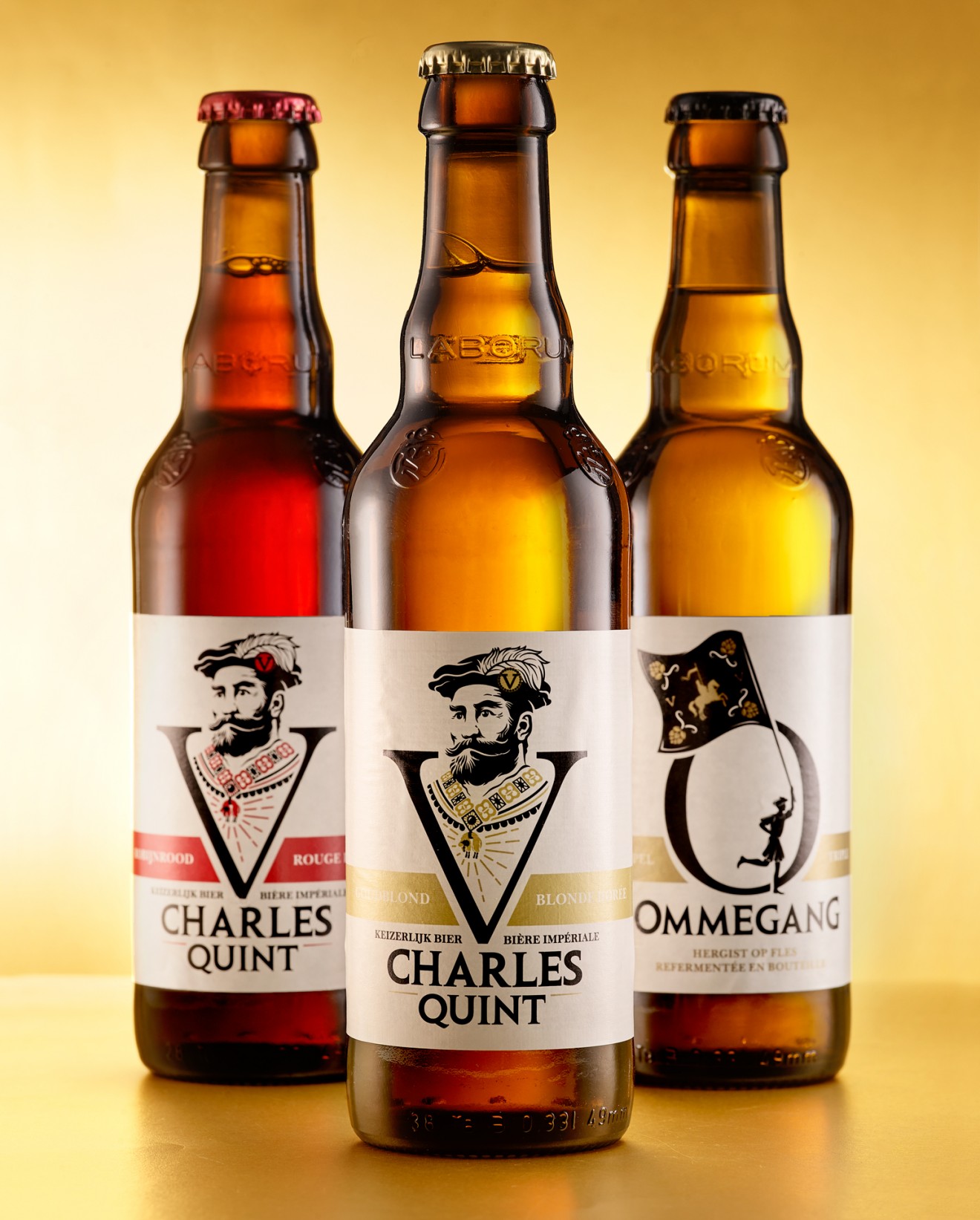
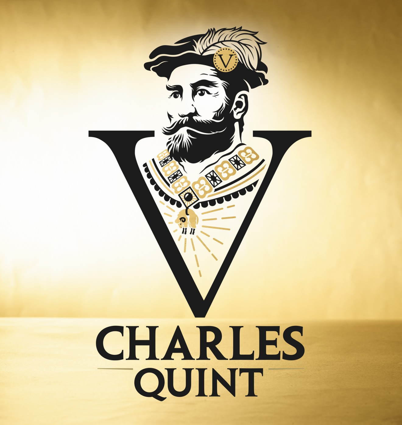
Step one was pretty simple, the brand became simply Charles Quint, with only one name necessary to universally appeal across a wide European audience. Step two was to radically alter how the Charles Quint brand character engages consumers by turning his side profile to look out of the pack and display the real face of the brand. This new engaging portrait, decorated with all the historical characteristics of the real Charles V, Holy Roman Emperor, but infused with the bold and intense character of this beer brand, is presented within the roman numeral V (5) forming a powerful symbol to jump out from the shelves. Supported by a foundation of the Charles Quint logotype and backed with a beige brand colour, this is all the design needs to make its point.
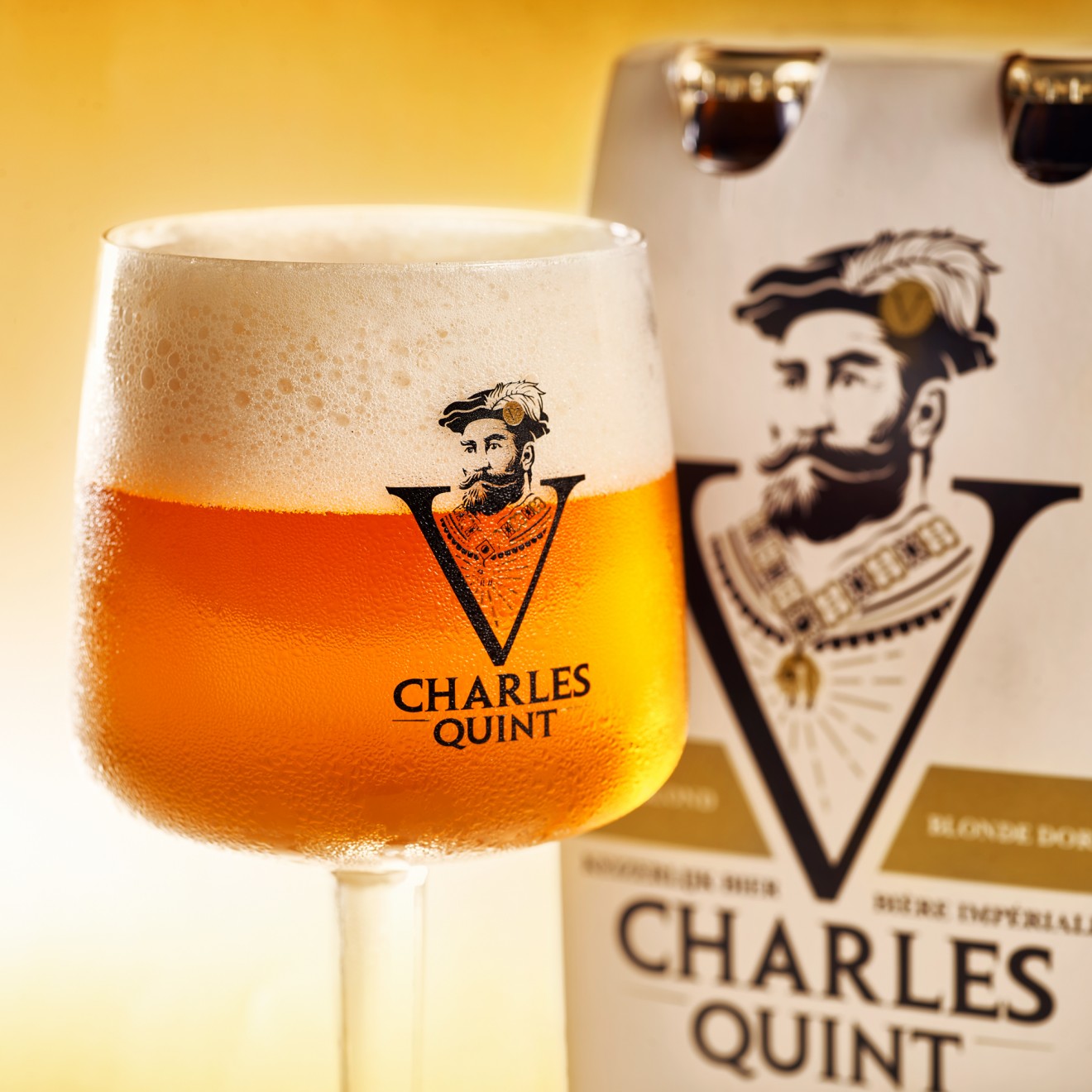
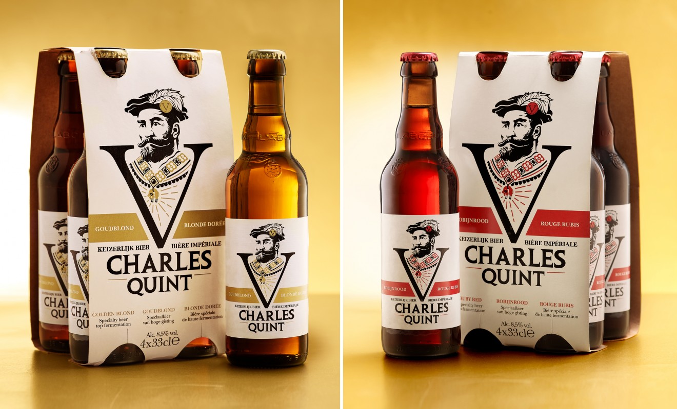
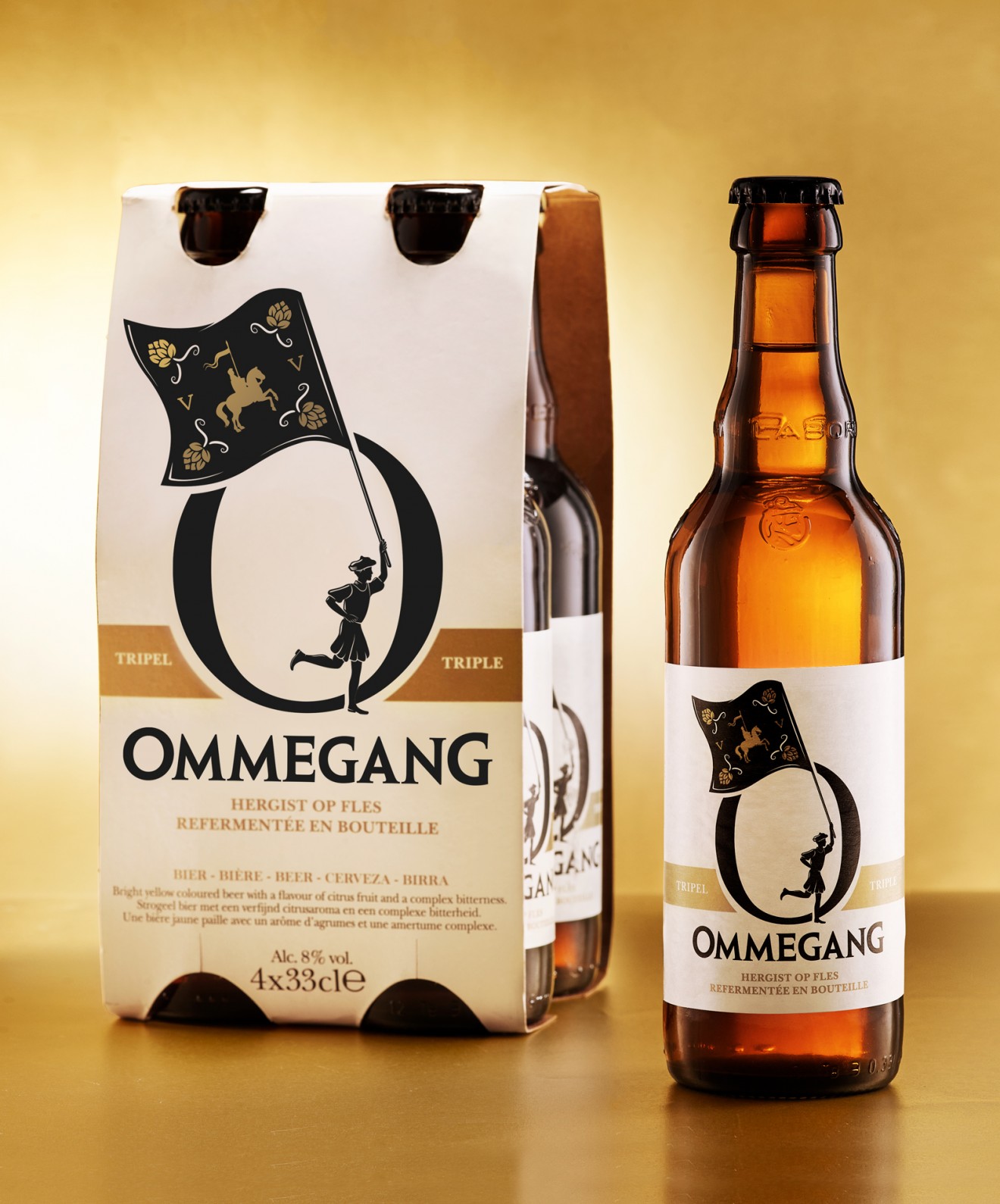
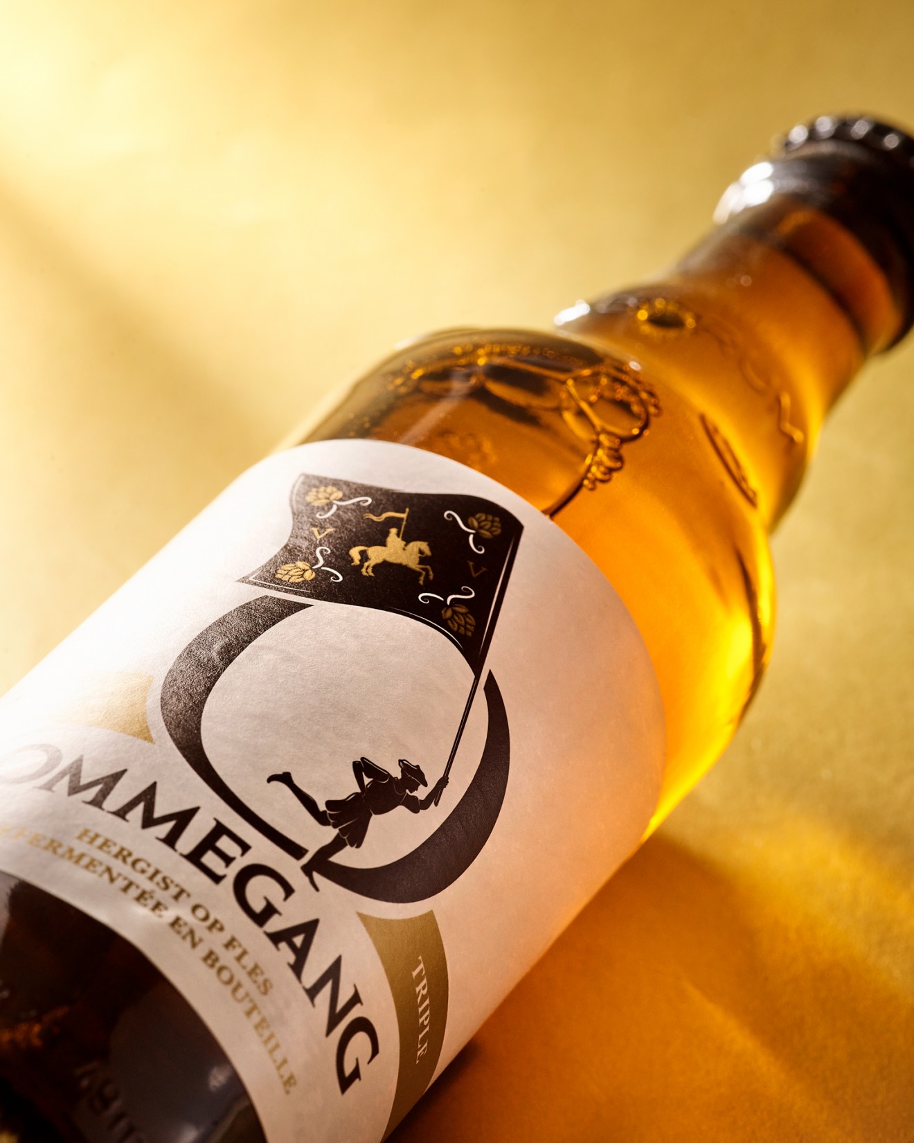
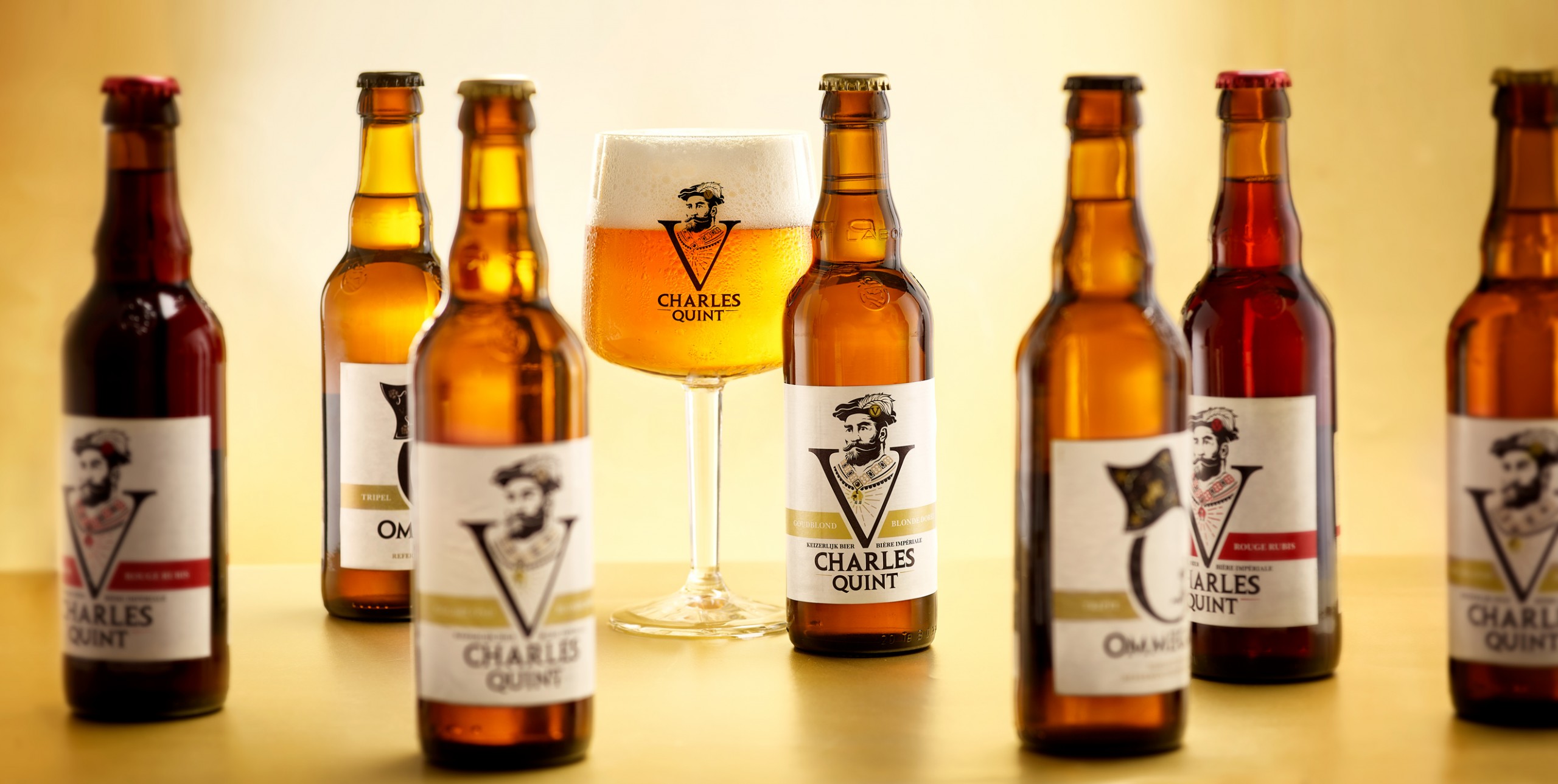
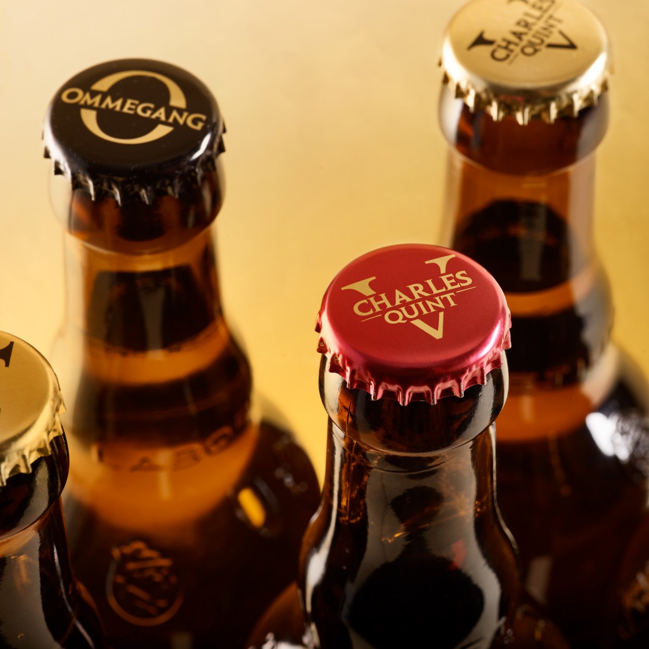
Using subtle colour alterations to help differentiate between the blond and ruby beers, this set of clearly defined brand assets was all we needed to help glue the brand together across the full pack line-up. For its sister brand Ommegang, also a part of the Charles Quint family but very much its own thing, we decided to adopt much the same approach. The Ommegang is a national folklore festival that celebrates Charles Quint first ever official visit to Brussels, once the capital of the Low Countries. True to the spirit of the festival we replace the V with an O, out of which steps a typical medieval character waving a traditional flag decorated with an emblem of Charles on his horse.
So, let’s raise a glass to the man himself and salute his timeless place in Belgian beer history.