Brand Redesign for HOPOPOP
Once you hop, op, op, you can’t stop.
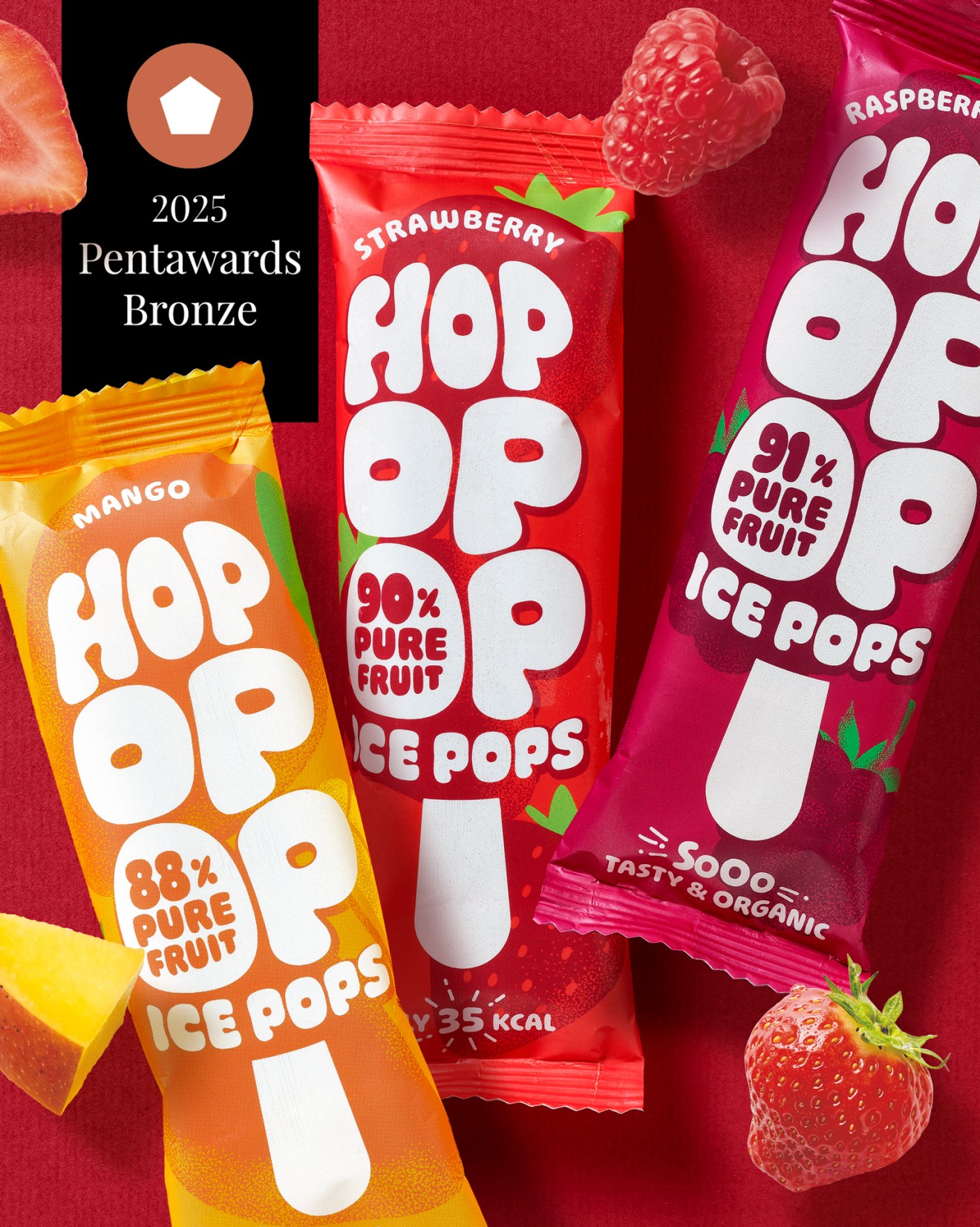
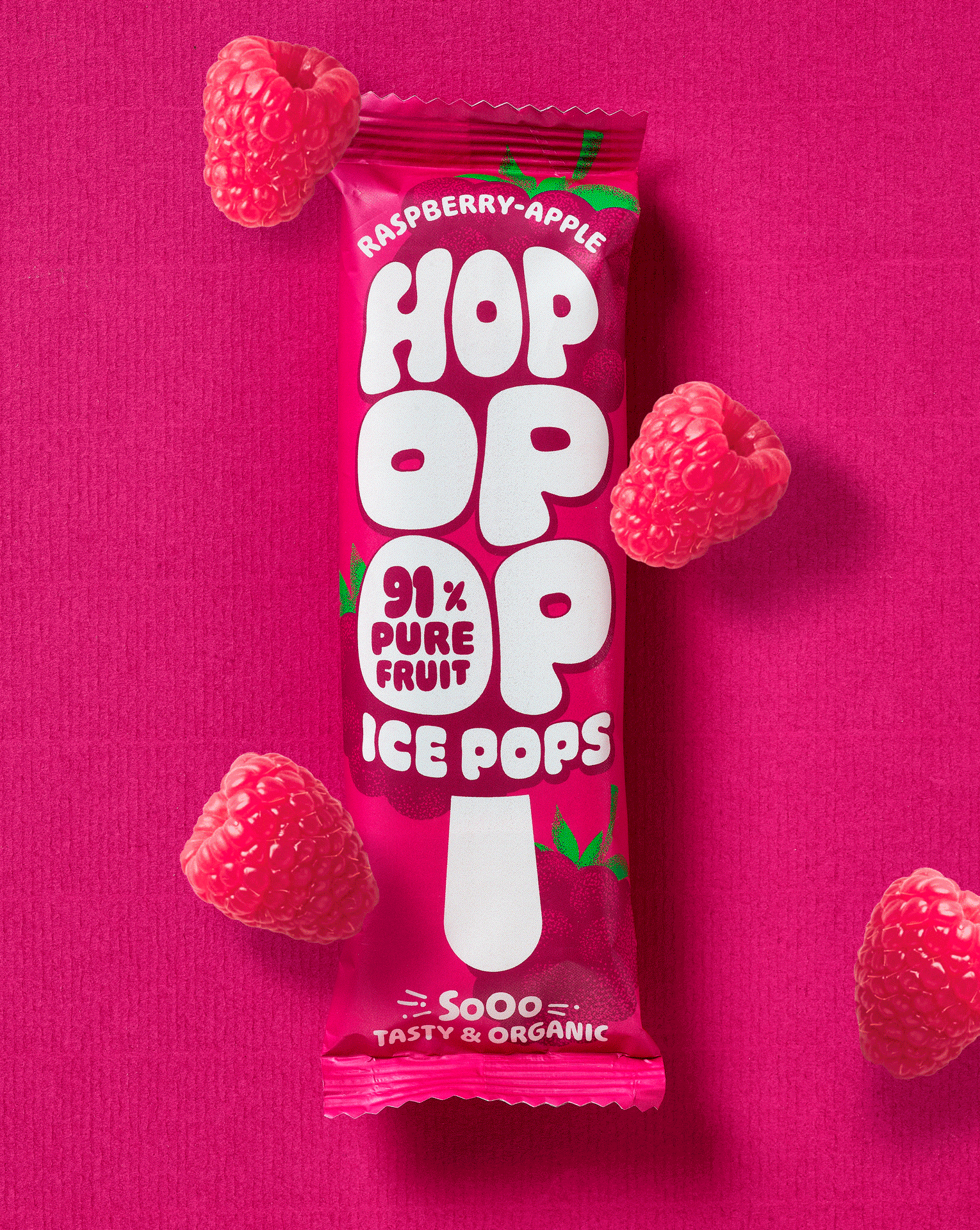
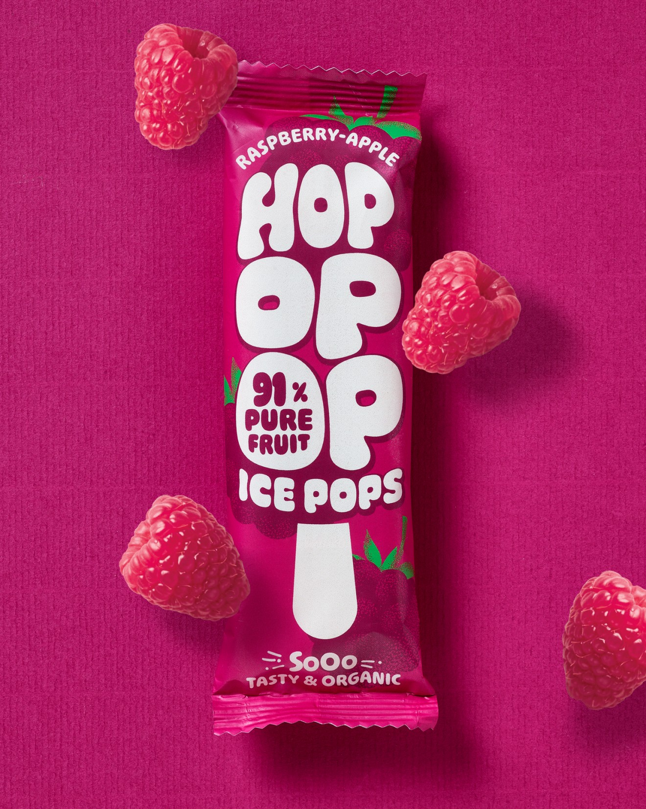
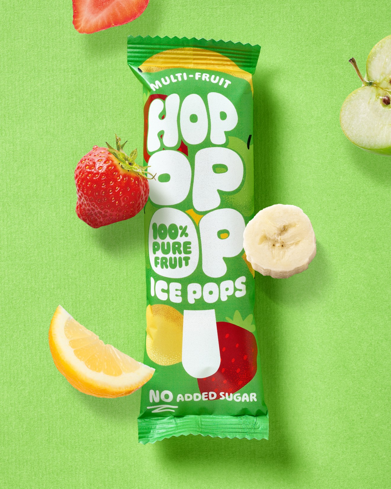
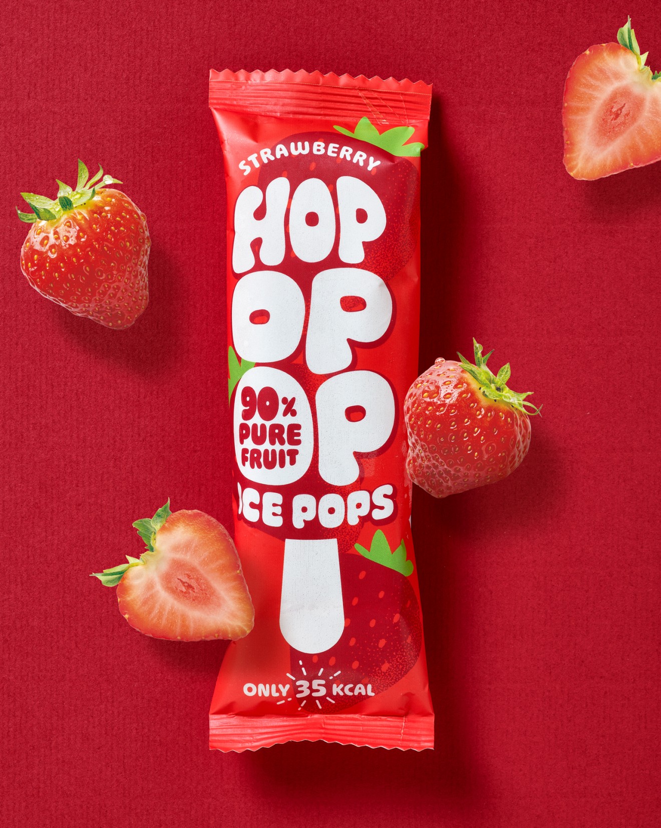
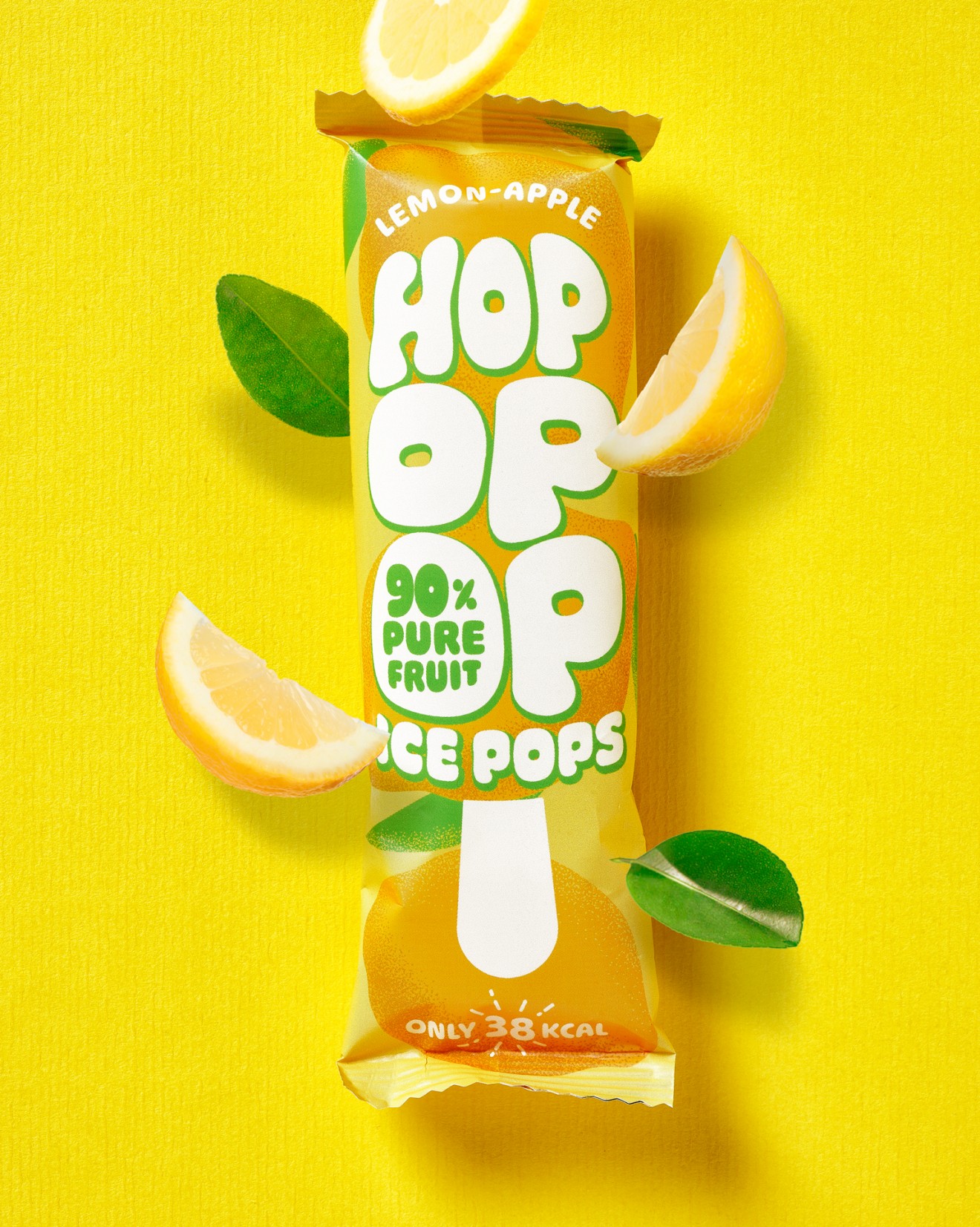
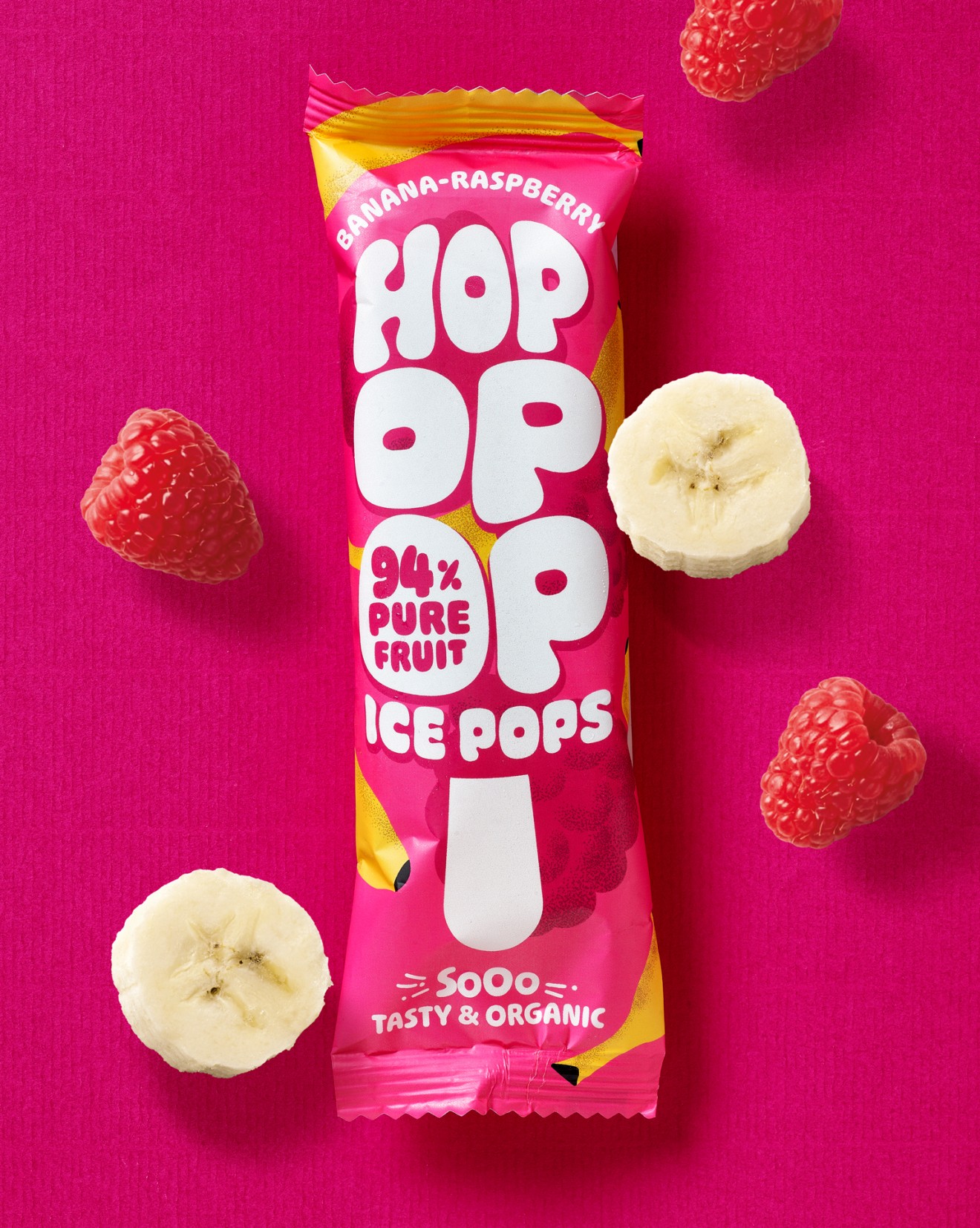
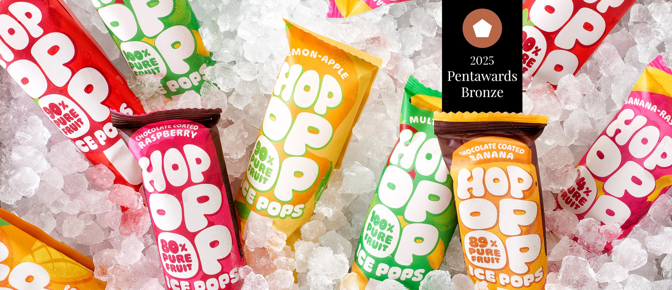
Hopopop is a range of refreshingly mouth-watering ice pops with a delicious difference. Fulfilling an ever-growing consumer demand to be able to indulge without compromising on health, the people at Hopopop dreamt of a world where ice pops were packed full with real fruit instead of sugar and artificial flavours and colourings. Redefining exactly what fruit-packed can actually mean, they crafted recipes with up to 90% and more of real fruit and nothing but the good-stuff.
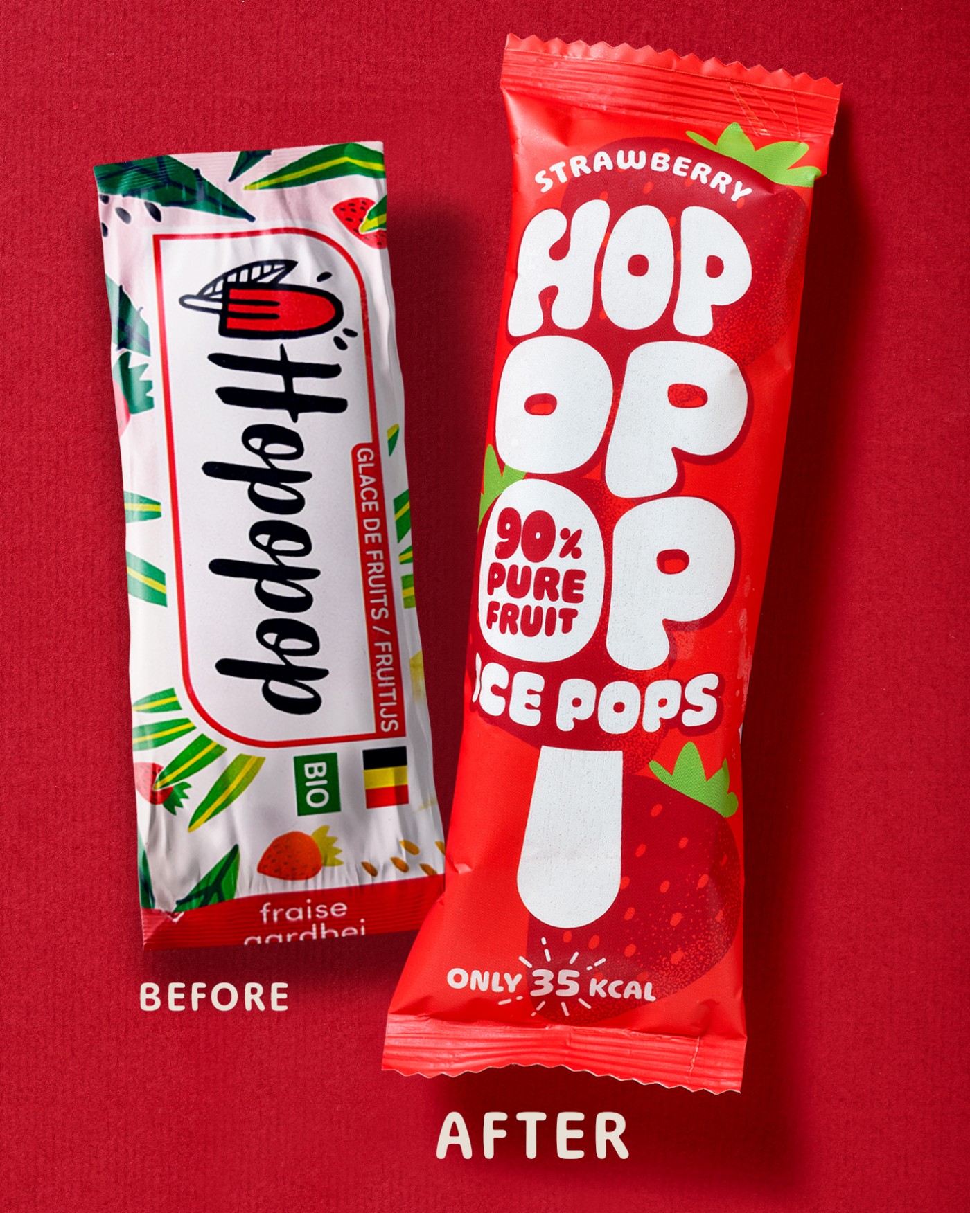
Competing head-on with big name commercial brands and their over-promising and overly sugary products, Hopopop was determined to deliver on an unbelievably natural experience that puts consumer well-being at the heart of what they do. So, taking one look at their dated visual identity but thoroughly inspiring and unforgettable brand name, we knew instantly where our focus should lie. Hopopop like its product, should be a brand bursting with character with its name being the epitome of all it stands for. This resulted in a typographically driven design that pops like the product and a branding that takes on the shape of the product itself. Packed with both real fruit and an unmissable personality, Hopopop is a brand you won’t forget in a hurry.