Scroll downBack to overview
SUPERFOOD by Biover
Range of convenient superfood
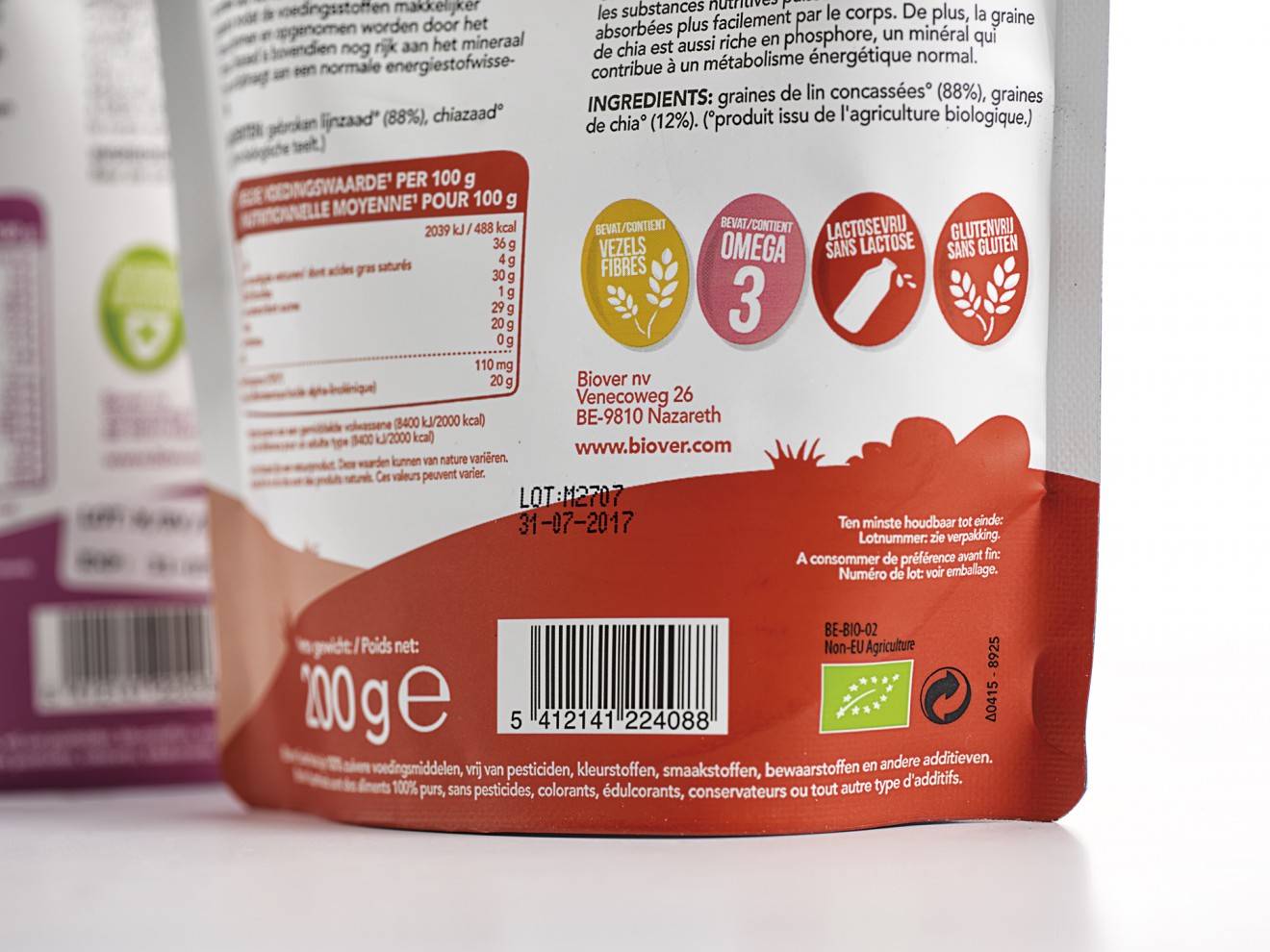
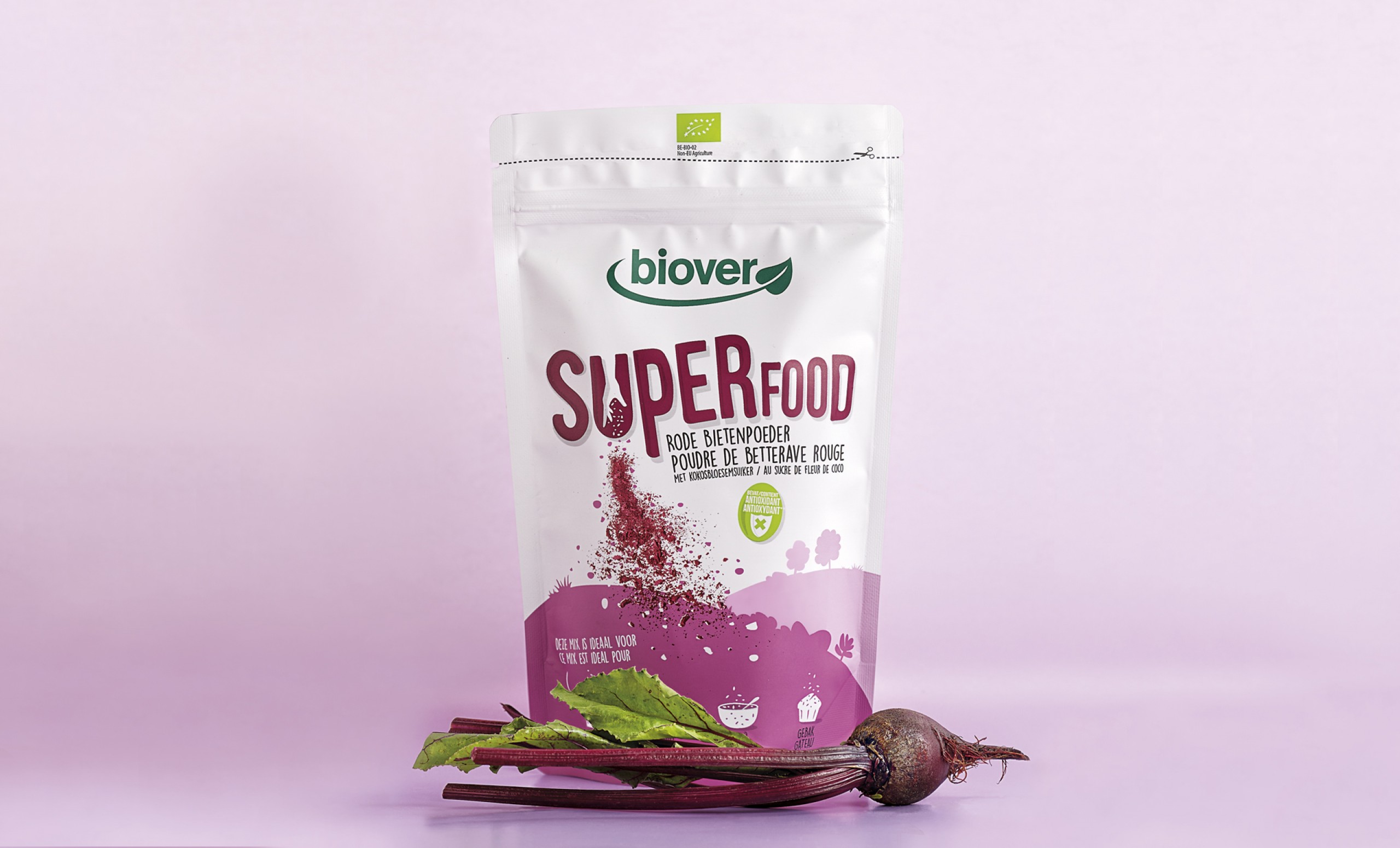
Surfing the ‘Raw Food' wave, Biover decided to launch a range of organic mixes, seeds and berries to boost your body’s strength and immunity! Seeing how the ‘Raw Food’ trend is relatively new in a retail environment, the key was to focus on convenience and usage for the consumer.
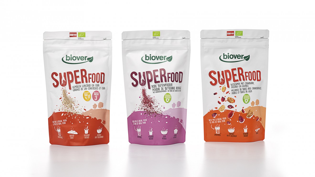
While designing we kept in mind Biover's ‘True by Nature’ brand character and created an organic, down to earth, look and feel. By adding a sprinkling hand into the logo we created an immediate link with the convenience and honesty of the product.
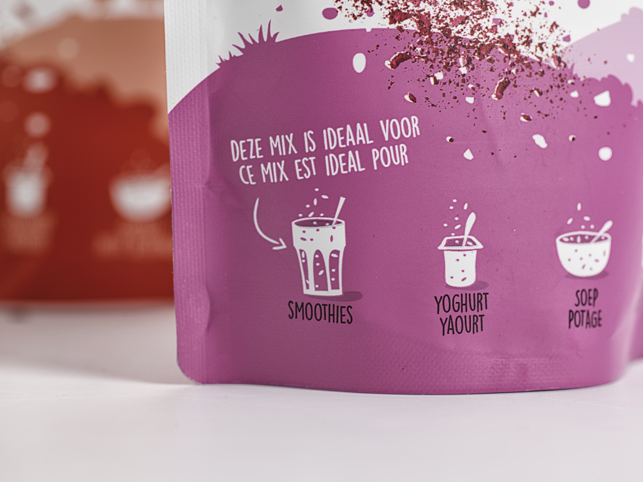
Each product has its own individual ‘Superpower’, simply add it to your yoghurt, smoothie, soup and GO!