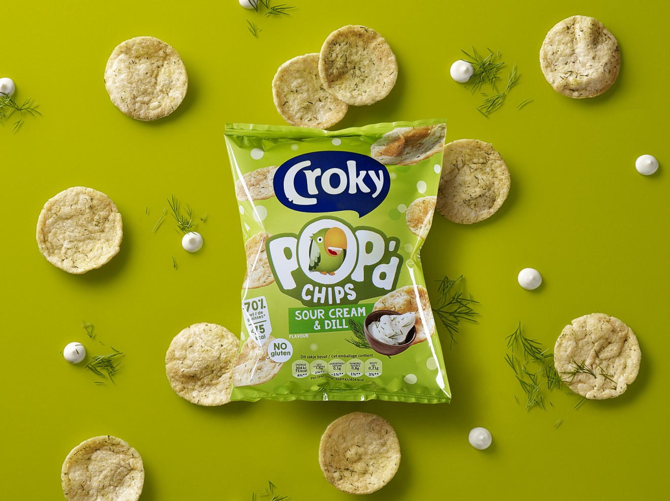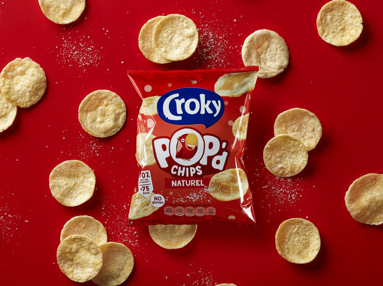
POP'D for Croky
Get Pop’d.
When Belgian household name Croky came knocking at our door we couldn’t wait to jump at the chance to bring our creative twist to this much loved crisps snacking brand.
The popped crisps innovation is a growing trend that our client Croky of course had to be a part of. This popped crisp product concept is designed to appeal to consumers looking for a slightly healthier alternative whilst not compromising on fun and taste. Retailing primarily through snack machines and sport clubs, we were asked to provide an eye-catching, product concept supportive approach, that in an playful manner visualized a great tasting promise whilst respecting the key ownable assets of the Croky visual identity.
Our focus was to keep it simple, fun and brand building by purposefully wishing to integrate the iconic Croky parrot mascot into the product name itself. The category generic ‘popped’ product name was reduced to POP’d in order to generate differentiation and typographic impact on this small but mighty pack. With this as a central focal point, the rest of the pack was used to explode the taste sensation with dynamic food photography and knockout colours.