
Jeroen Meus - Golden Pentaward
A ‘personality’ branded range of pots and pans
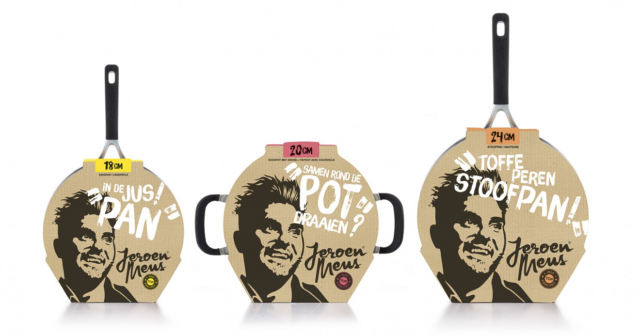
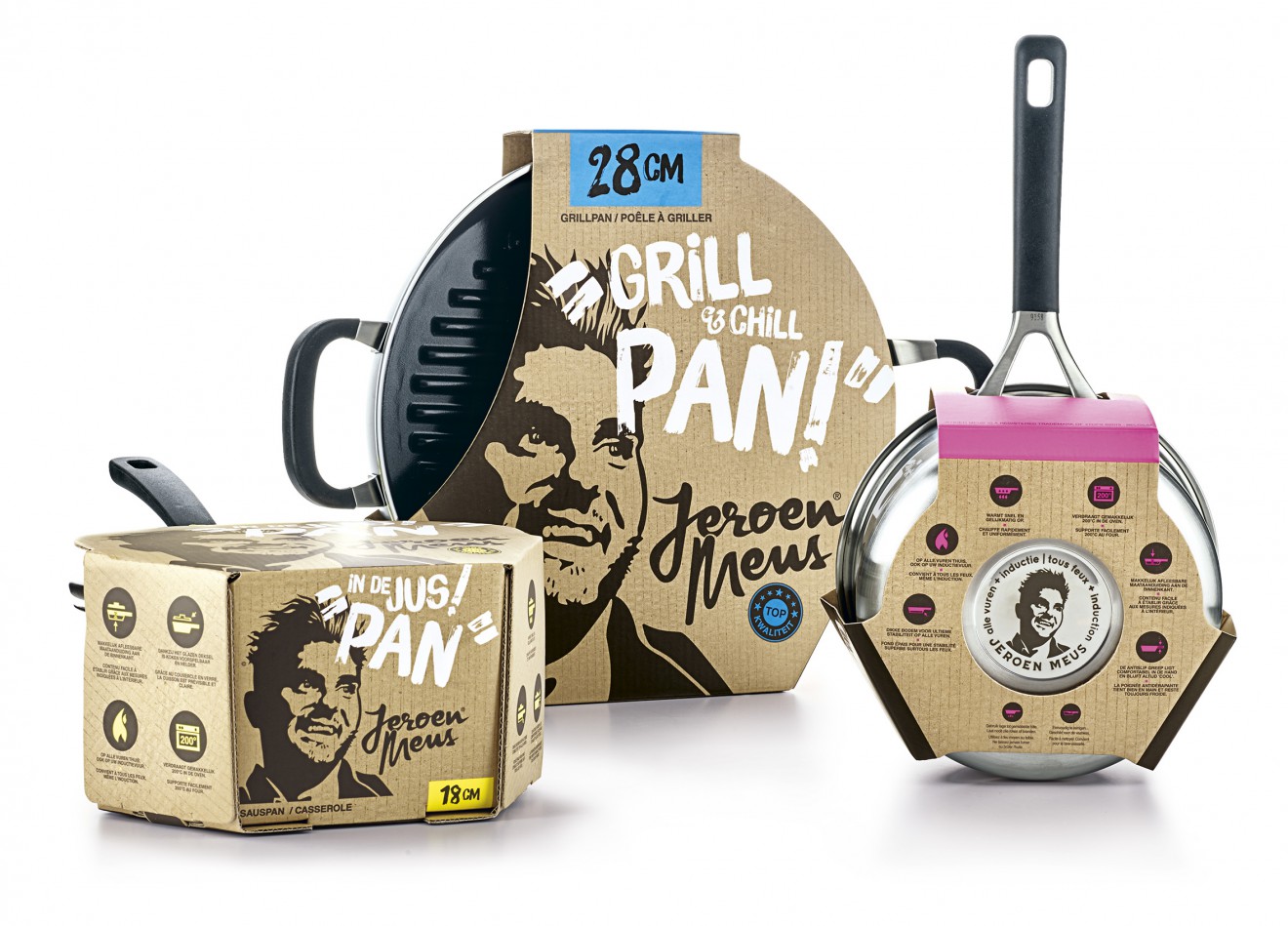
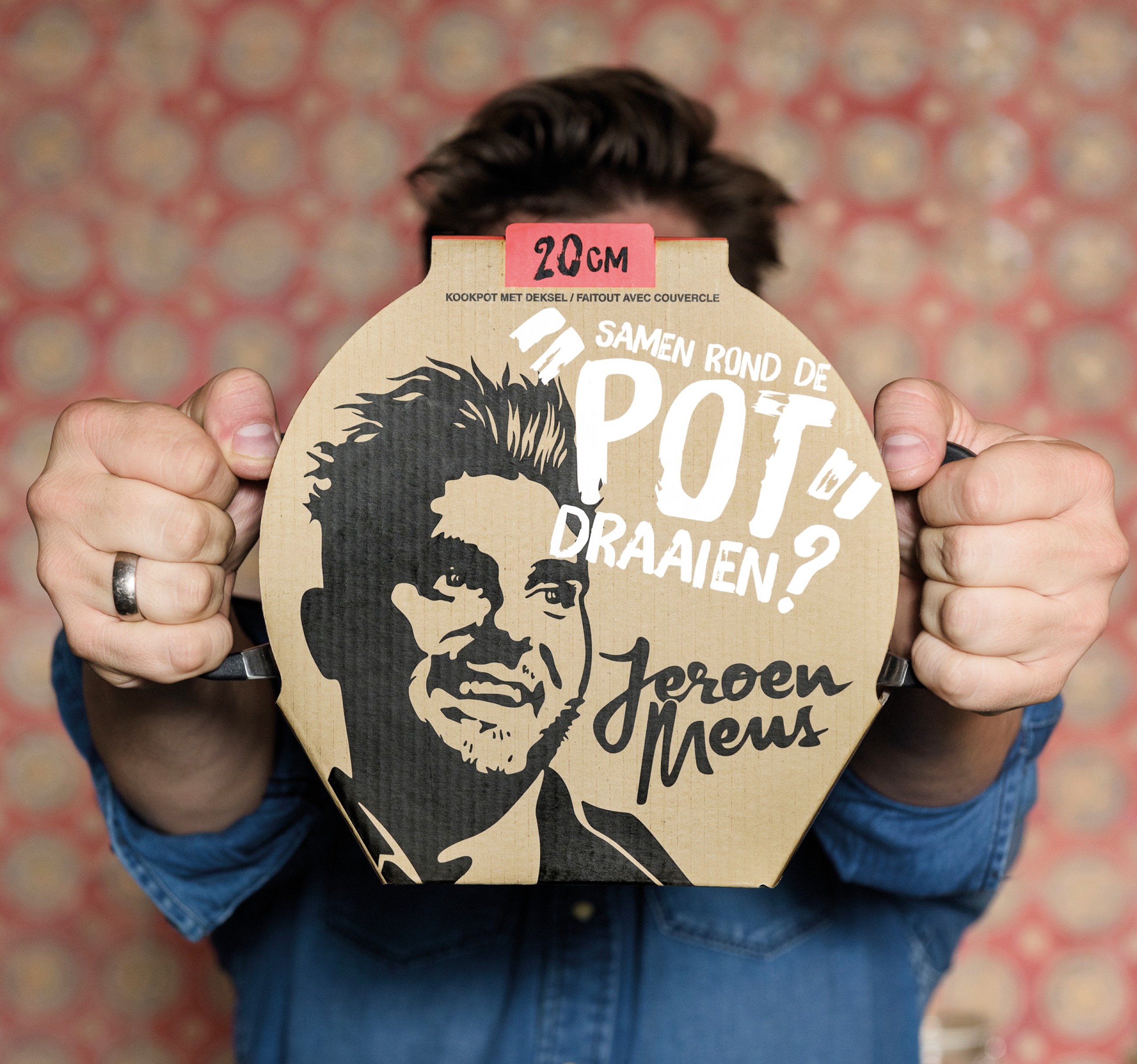
Jeroen Meus is a famous Belgian chef, passionate about food and bringing the concept of cooking in an inspirational and approachable manner to the people at home. His no-nonsense rock’n roll attitude, his hilarious one-liners and his unstoppable drive make him one of the most loved personalities in Belgium. We were asked to create an identity for his new range pots and pans which could reflect this unique personality.
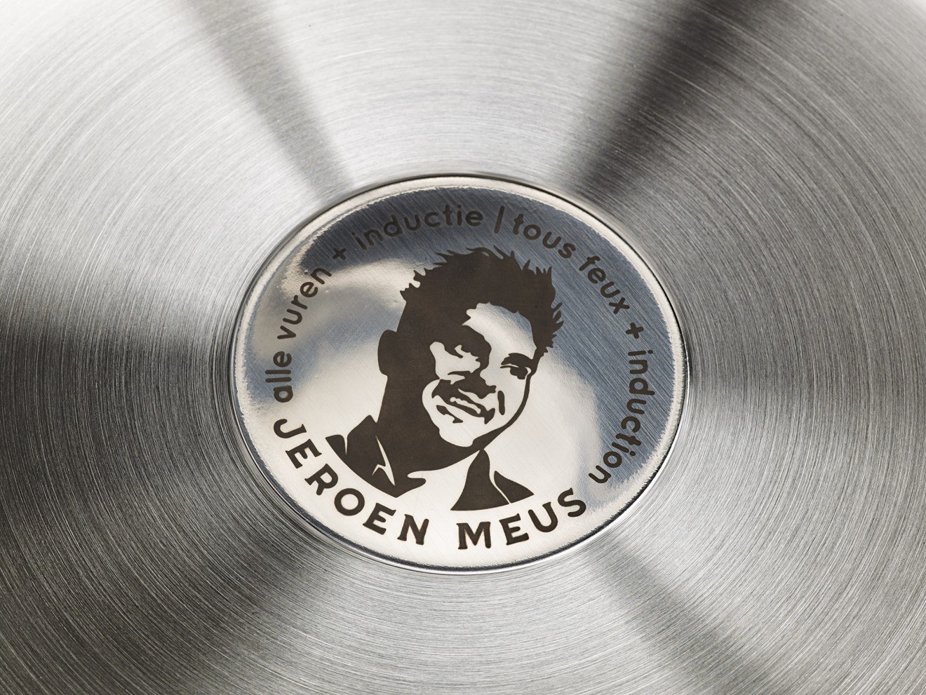
So we created an iconic brand image of Jeroen in its purest form, a black stamped stencil portrait illustration on a honest craft paper background. We visualized Jeroen in a way everyone knows him, with his everlasting smile, his nonchalant hairdo and his roguish glance, evoking his rock’n roll attitude and easy going way of life. In his own words we then let his character do the talking, using his typical humoristic one-liners to bring the news to pack in an eye-catching and iconic manner. Communication is key, his voice is his brand!
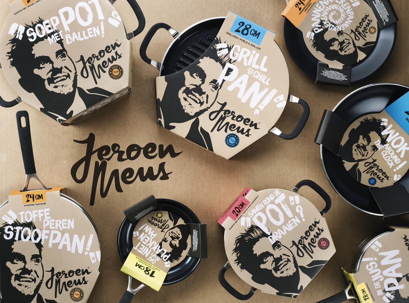
This branded emotional approach, the bold rough typo and the black and white graphics enriched with flashy fluo colour details on craft paper, make for an outstanding design in a category dominated by traditional ‘what-you-see-is-what-you-get’ packaging.
Who’s up for a “wok around the clock”?