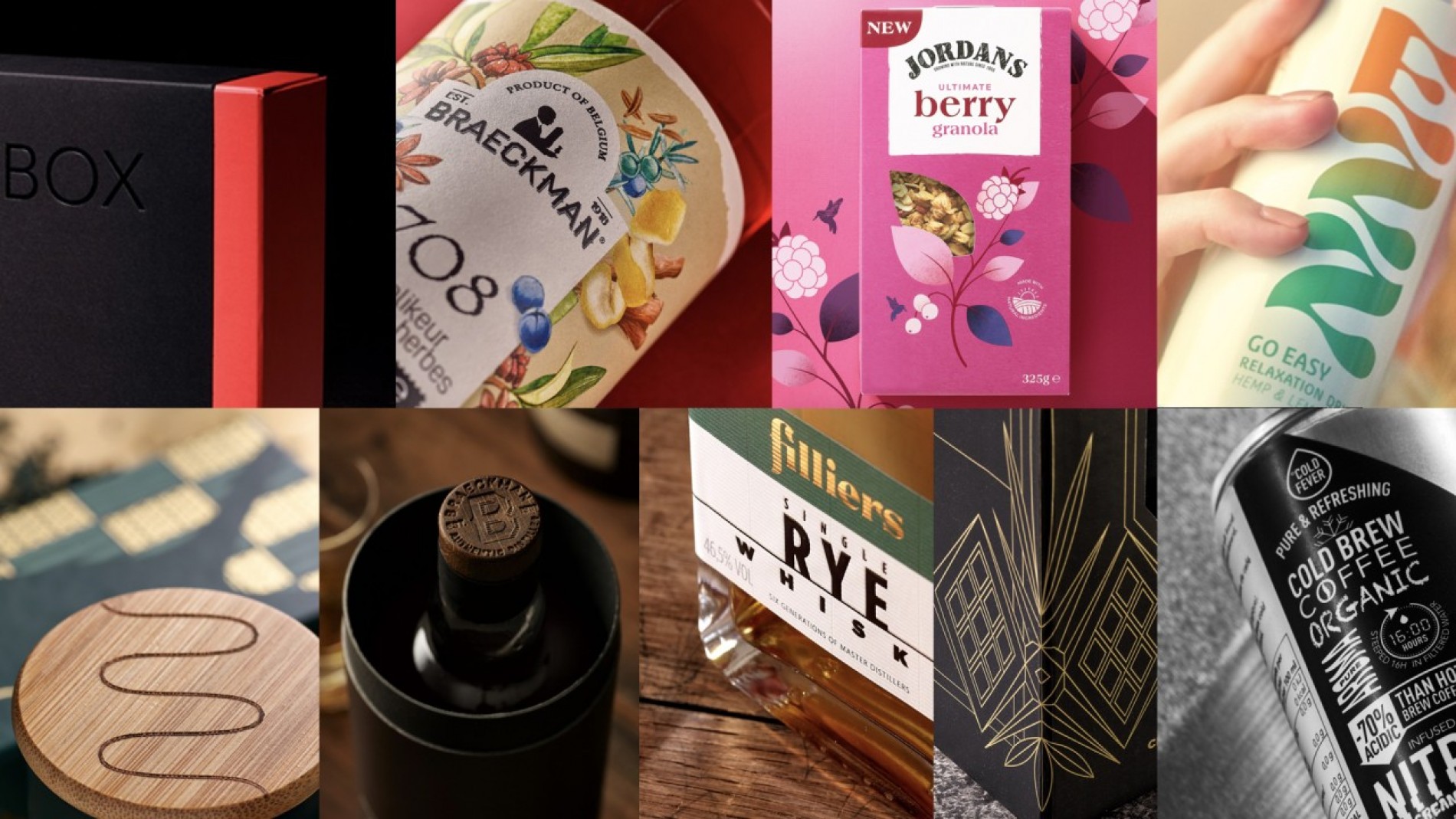
Packaging Design Trend Check '24
This year's packaging design trends reflect changing consumer tastes and offer a unique opportunity for brands and products to tell their stories in innovative, visually impactful ways.
Whether you're planning to revamp your existing packaging or launch something brand new, the trends of 2024 are ripe for inspiration. We’re curious to see how we can inspire your brand and packaging and help make a lasting impression on your consumers.
#1 Interactive Packaging
Smart brands are no longer just concerned with pushing their products; They focus their efforts on creating experiences. This is evident in every aspect of product marketing, and especially packaging. Nowadays, packaging is not just there to protect and inform, but is active and alive, delights the consumer and serves a higher brand purpose.
Smart packaging now comes in a variation of shapes and forms. The big idea is to make packaging multifunctional, allowing consumers to embrace the brand and product and communicate is characteristics with others. In 2024, jumping aboard this trend will become easier for almost any kind of business. Just choose a format that works best for your brand and your product; whether it is physical interactivity, sensory engagement, a technological integration or even environmentally friendly interactions, the right integration leads to a greater connection between brand and user.
Smart consumers are looking for brands and products that desire to create a positive impact on the world and prioritize their personal well-being. These so-called worshippers of neo-hedonism get a kick out of maximum experiences and choose brands and products with mood-enhancing properties. Neo-hedonism, personal well-being and emerging technologies will drive additional consumer spending in 2024.
Are you ready for 2024? We’re off to a flying start!
#2 From Hypercontrast to a Pastel Colours overload.
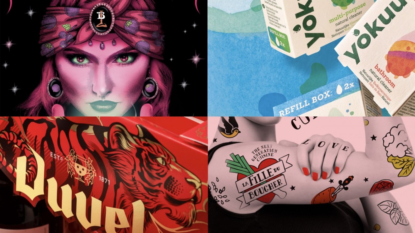
You won't believe your eyes... the evolution of interactive design into the world of augmented experiences, it is clear that packaging design in 2024 is not playing it safe. The next big thing in packaging 2024 is 'Hypercontrast'. Some perceive this as a drama that is actually unfolding. It's not just about the harsh colors and clean lines or shocking messages and images; it's about making them collide with each other in a purposeful way.
In a way, Hypercontrast is an equivalent of Dopamine Dressing (finding joy in the things you choose to wear). It is designed to attract attention and cheer. Because in today's world, first impressions don't just last; they must also echo.
From the daring playground of 'Hypercontrast' we are led into another equally striking, yet decidedly fresher arena of 'Saturated Pastels'.
Whilst 'Hypercontrast' plays with stark juxtapositions to grab our attention, 'Saturated Pastels' masterfully alters the conventions we've come to expect from these kind of colours. Traditionally soft and subdued, pastels have been taken up a notch and now embody a vibrancy that is both playful and powerful.
They form a nuanced mix: softer, more youthful, but no less impactful. The essence of this trend lies in its paradox: the colours remain sublte and yet they scream for the necessary attention. You are what you radiate.
Are you ready for 2024? Now we’re getting warmed up!
#3 ‘Brutalist Typo’, and its countermovement ‘Discreet but Luxurious’.
After the vibrant colour clash trends of 'Hypercontrast' and 'Saturated Pastels' make their mark in 2024, 'Brutalist Typo' appears as a stark contrast. With this trend, the name itself is central to our understanding. They’re reminiscent of monumental architecture where simplicity and grandeur meet. Picture you’re standing in a store, some distance away from the shelf and amongst an array of decorated packages a striking, and eye-catching font calls out to you. That is the essence of brutalist typography. It screams, LESS IS MORE.
By minimizing the frills and focusing solely on typography, brands make a statement, challenge convention, and stand out. The limited colour palette – often muted or subdued – ensures that the product name or message is not lost among busy images.
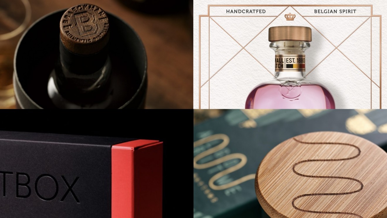
Continuing our discovery of the beauty of simplicity in the brutalist style, the design world is flirting with another more subdued trend, ‘Discreet but Luxurious’. In an age where everything seems designed to scream attention, this trend whispers – and it's the allure of that whisper that draws you in. It is special for those who love the high expectation followed by the slow moment of discovery. It's the art of storytelling through packaging: each layer removed reveals a new chapter and encourages the consumer to keep going.
Discreet yet luxurious, the art of hiding treasures inside and creating a memorable product experience between the brand and its customer. When everything is out in the open, a touch of secrecy feels almost revolutionary. It's a testament to the fact that true luxury is thought through and makes everything feel special. It seems that 'quiet luxury' is still in fashion. It may be discreet, but still impacts. Undeniably luxurious!
Are you ready for 2024? Let’s get this party started!
#4 Minimalism and a Return to the 50s.
This trend is all about clarity and simplicity. Think of clean lines and unadulterated colours. What started as a dominant force in the digital design space has gracefully transitioned into the world of packaging. We're talking about the revival of minimalism. It’s the embodiment of 'simpler is better', with clear illustrations combined with subdued typography and colour palette.
And why is this trend a winner? The minimalist charm doesn't just look fantastic digitally; it shines brightly and fits seamlessly into various packaging forms. It’s the quiet charisma in a market that is often overshadowed by noise and extravagance.
“I like the concept of simplifying something complex and expressing it in its simplest form. The beautiful and smart, with simple illustrations combined with expressive colours and simple yet expressive fonts. This style continues to gain popularity, both in branding and packaging.”
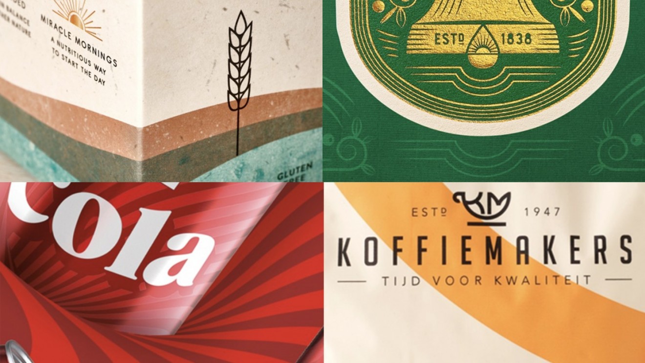
The seemingly banal graphics have made their mark, but they are not the only comeback that will make waves in 2024. If we turn back the clock even further, the era of the 1950s with its nostalgic charm and unique design language also returns to the packaging world. A return in which illustrations with simple line drawings from that golden decade are central. These designs dispel the severity and envelop you in a cozy embrace of familiarity. There's something inherently comforting about the retro vibe, especially when it's spiced up with a touch of contemporary aesthetics.
The result is packaging that is a visual treat, reflecting both the confidence of a bygone era and the allure of modern flair. Retro, revised and reimagined!
Are you ready for 2024? What are you waiting for!