RETAIL RANGE for Jules Destrooper
Jules Destrooper Biscuits Retail Redesign: Crafted for Real Enjoyment
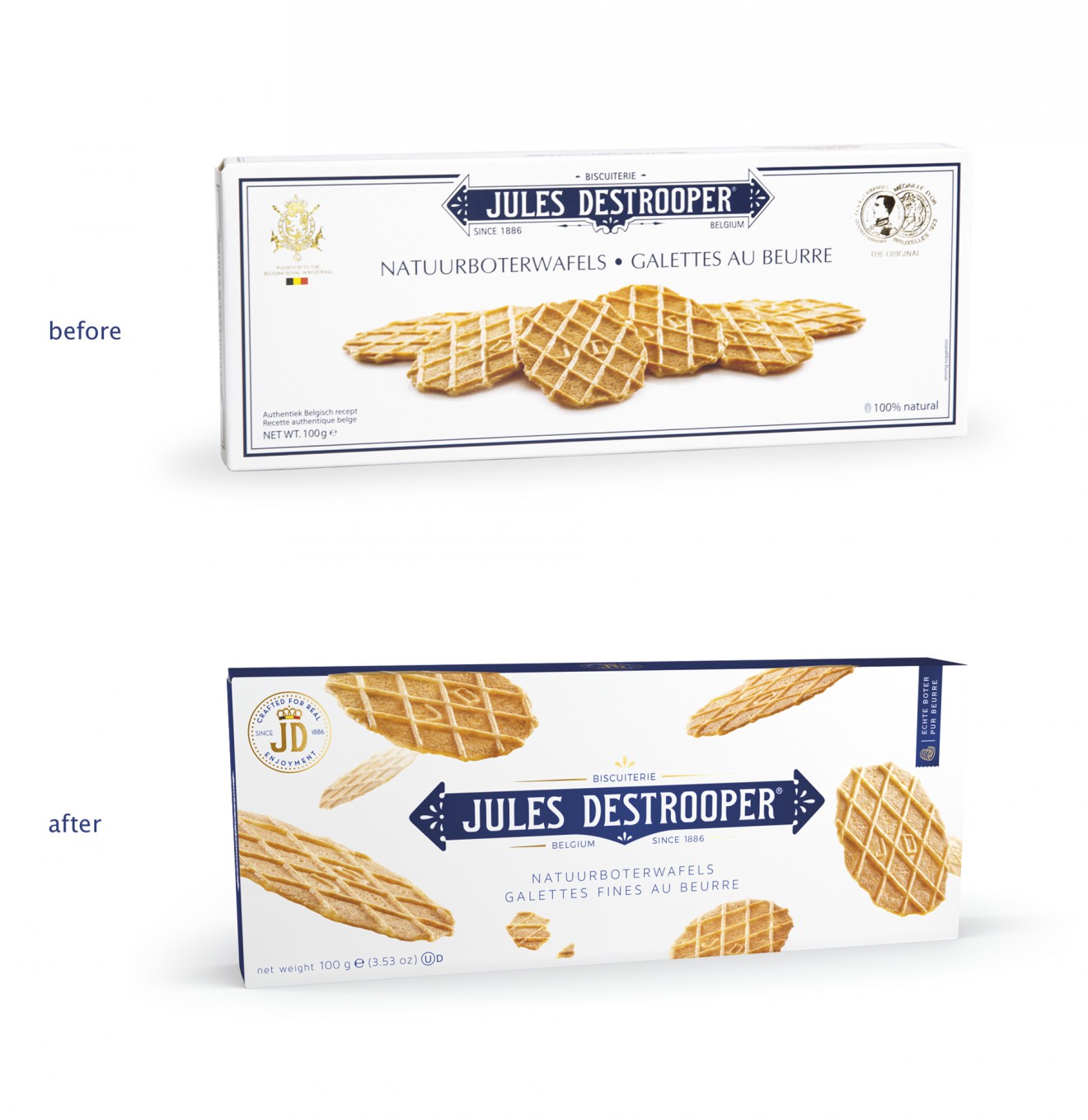
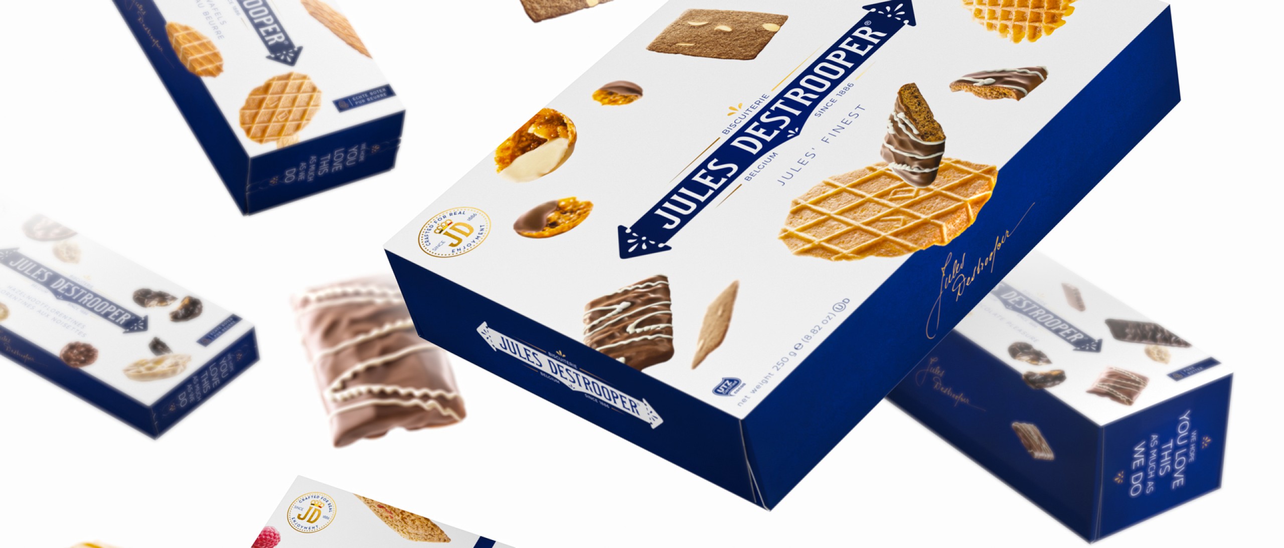
Jules Destrooper who since 1886 has been the purveyor of the finest in authentic Belgian biscuits, decided to undertake a refreshing modernization of its long-standing packaging identity for mainstream retail. This iconic brand who has remained largely untouched for generations, realized that their loyal consumer base was aging and that they struggled to connect with new prospective consumers.
Within an ever increasingly competitive biscuit market, the time was right to re-engage existing consumers with a newly improved brand image whilst attracting the desired young-professionals new target group. It was our task to marry the trusted values of real timeless quality and craftsmanship, together with a more expressive, enjoyment focused product experience.
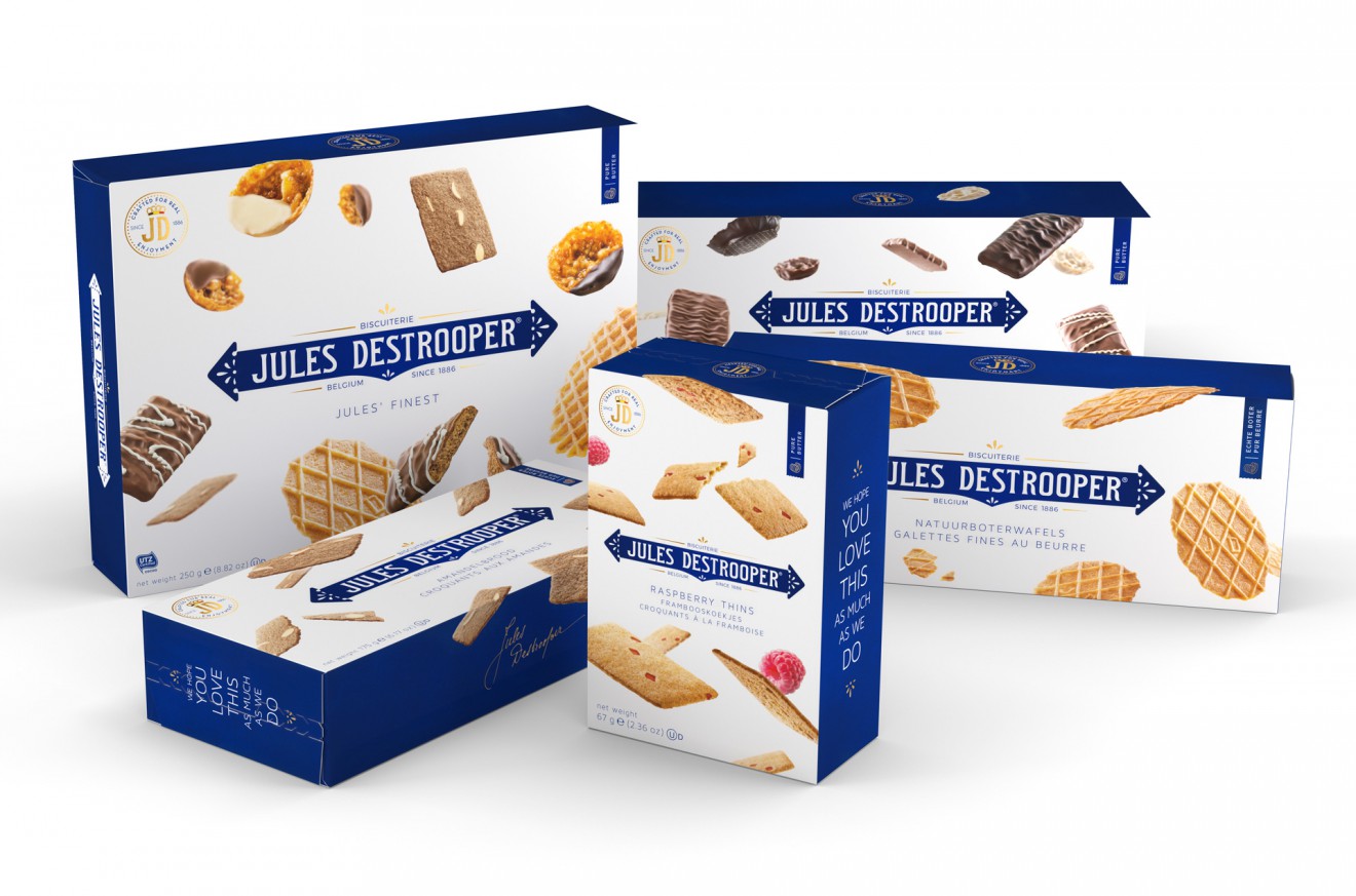
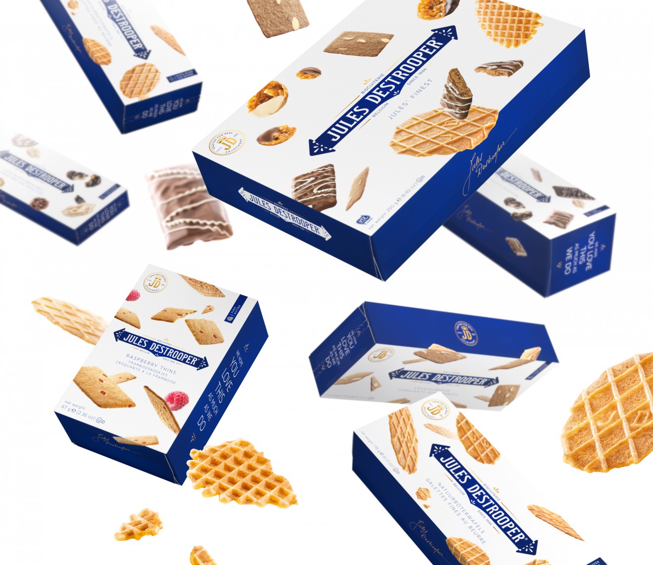
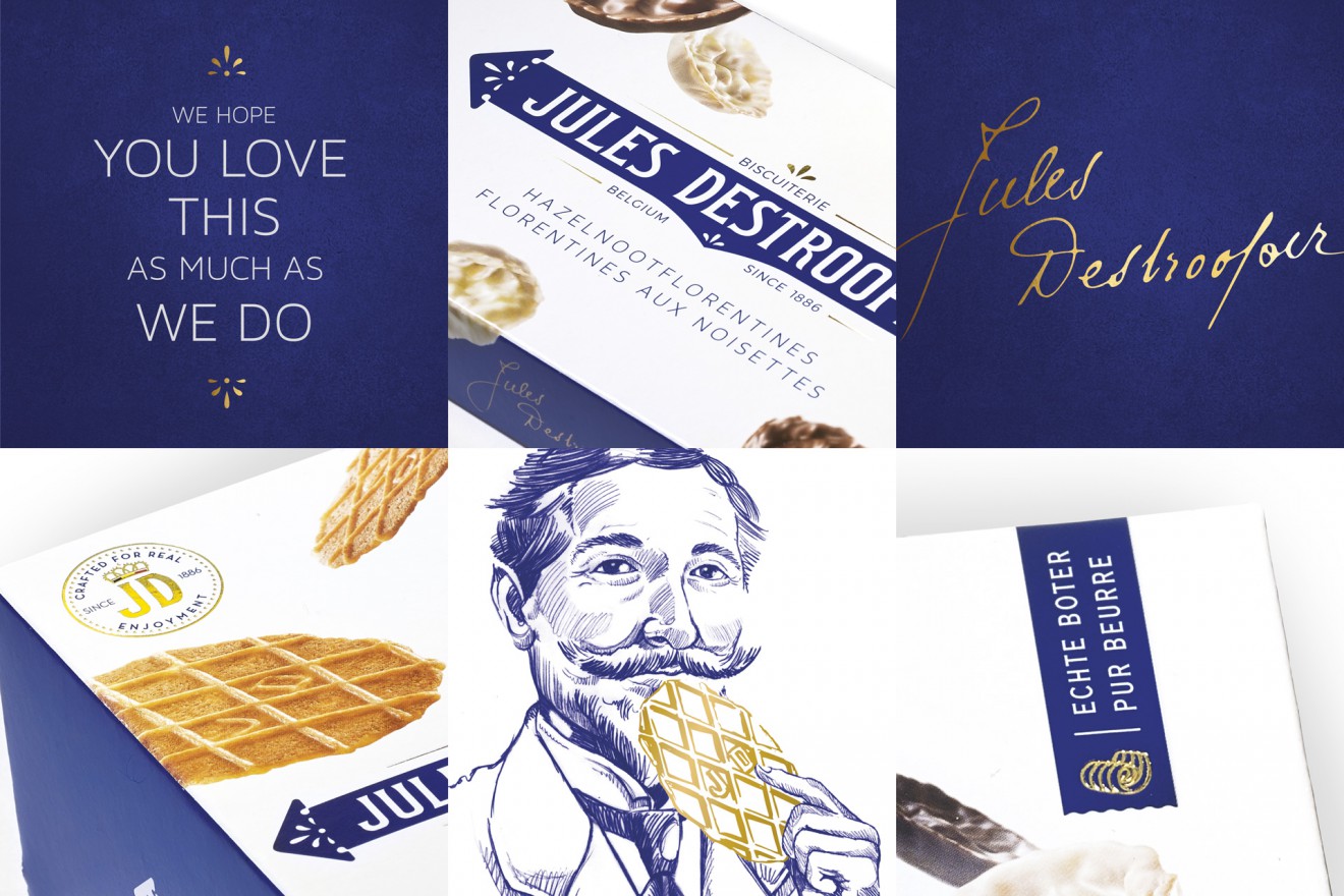
First and foremost, our approach was to centralize and optimize the awareness of the Jules Destrooper iconic branding. This within an invigorating and appetizing new biscuit promise. The dynamic falling biscuits bring a necessary, taste orientated energy to what was once, a static and cold design. This along with the central branding and blue side panels, forms an unmissable and powerful packaging system that glues a family of over 100 sku’s, distributed from the Benelux region to international markets world-wide.