FINEST RILLETTES for Bonrill
Designed with delicious intensity
The Vandromme family meat company is a highly respected player in the world of finely made, artisanal meat specialties for food service and retail. When Guido Vandromme, 3rd generation of a butcher’s family, tasted rillettes during a holiday in France he was inspired to bring this tradition back home to Ieper in Belgium and created his own unique recipe. Thereafter the BonRill rillettes brand was born.
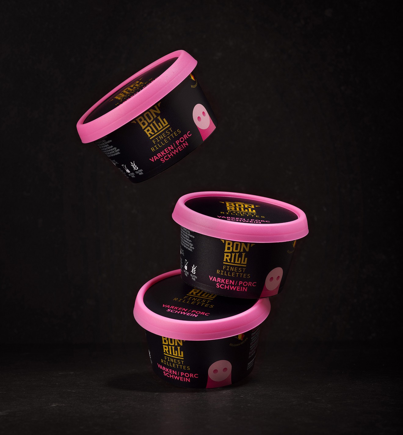
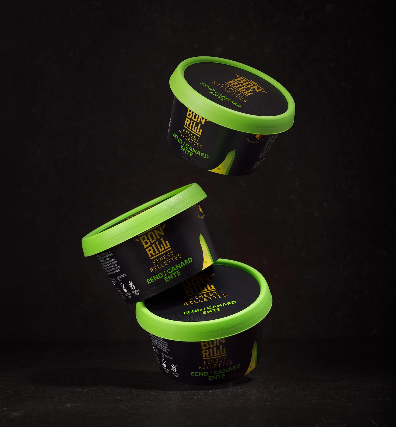
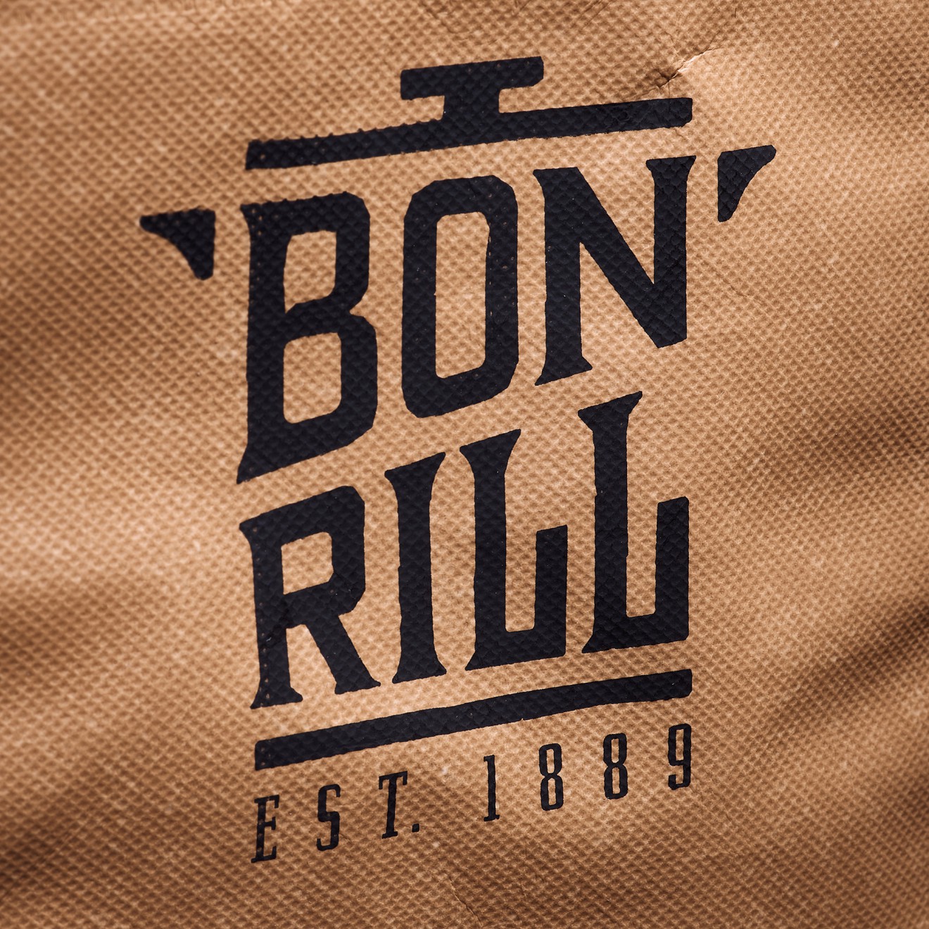
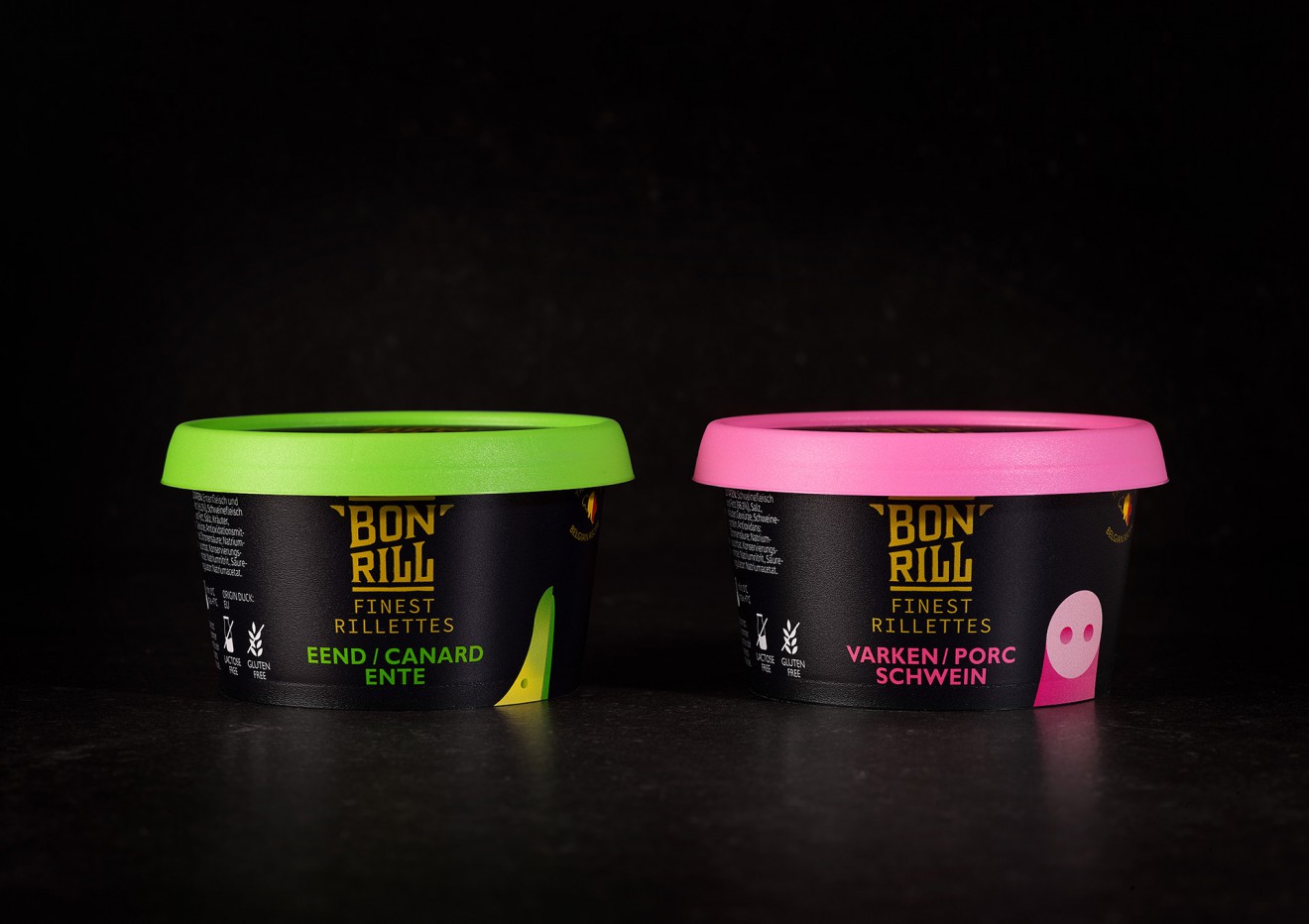
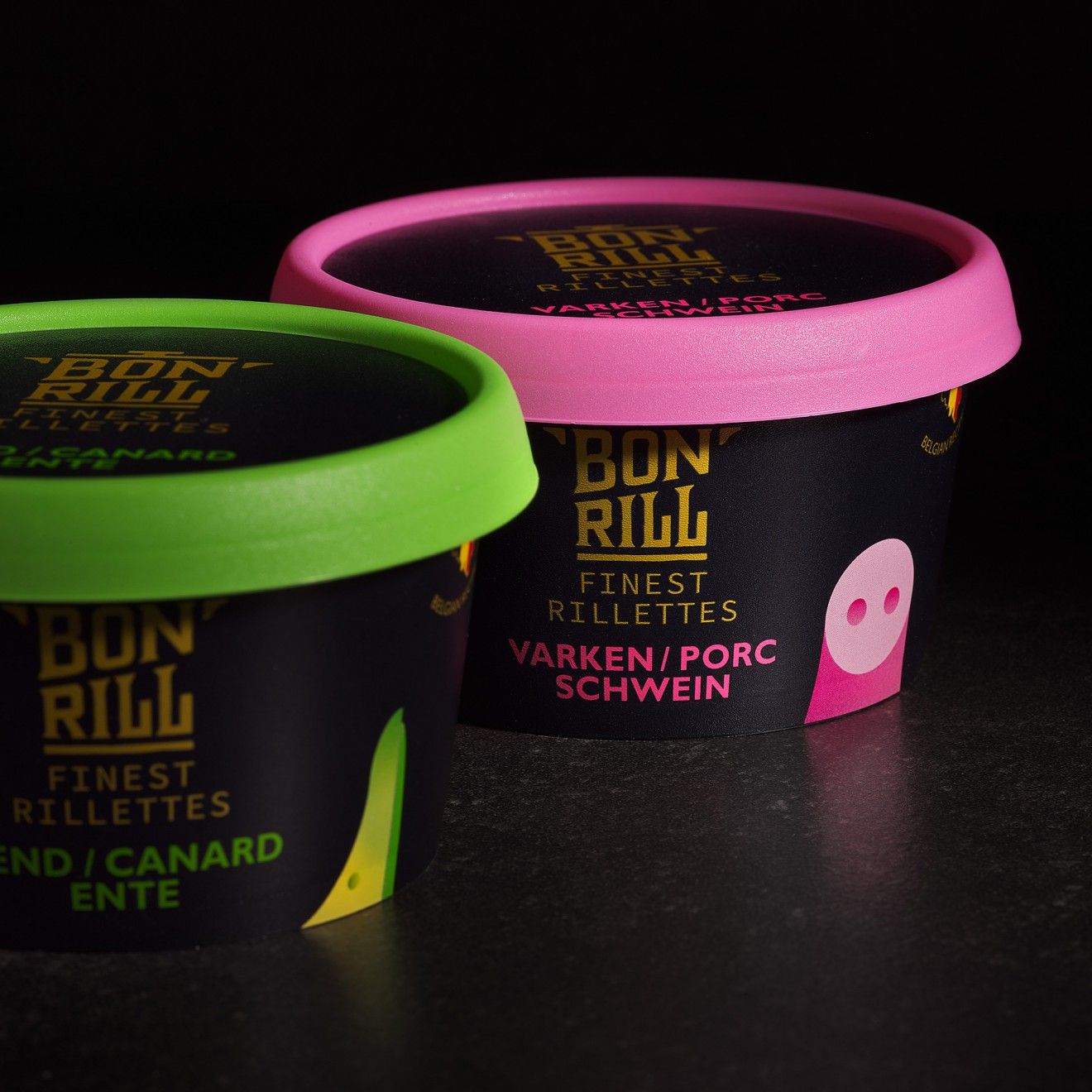
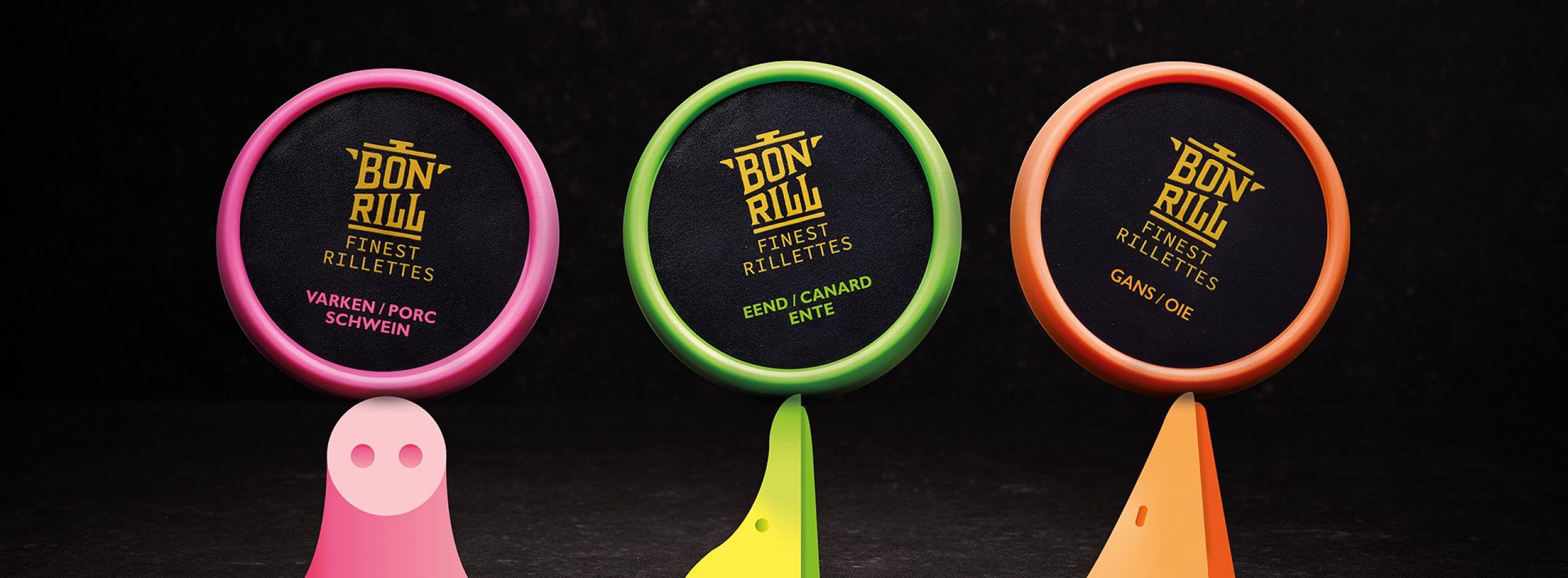
The BonRill brand required a bolder more brand driven approach to help develop awareness, impact and a feeling of true, authentic crafted quality. In order to set the brand at the heart of their expertise the BonRill logotype was placed in a golden pot and split into two lines to help recognisability and readability. The hand-crafted style was also used to help support a feeling of traditional heritage you can trust.
Set on a deeply dark background the golden branding contrasts intensely with the bright flavour colour coding that creates an unmissable signal in store. To further guide consumers to either pork, duck or goose rillettes, a playful illustrative touch of each animal was sneaked into shot. Less is more with only an iconic indication of beak or snout necessary to help confirm the product.
With rich flavours and a smooth styling, BonRill is an identity not to be missed.
More info: https://www.bonrill.be