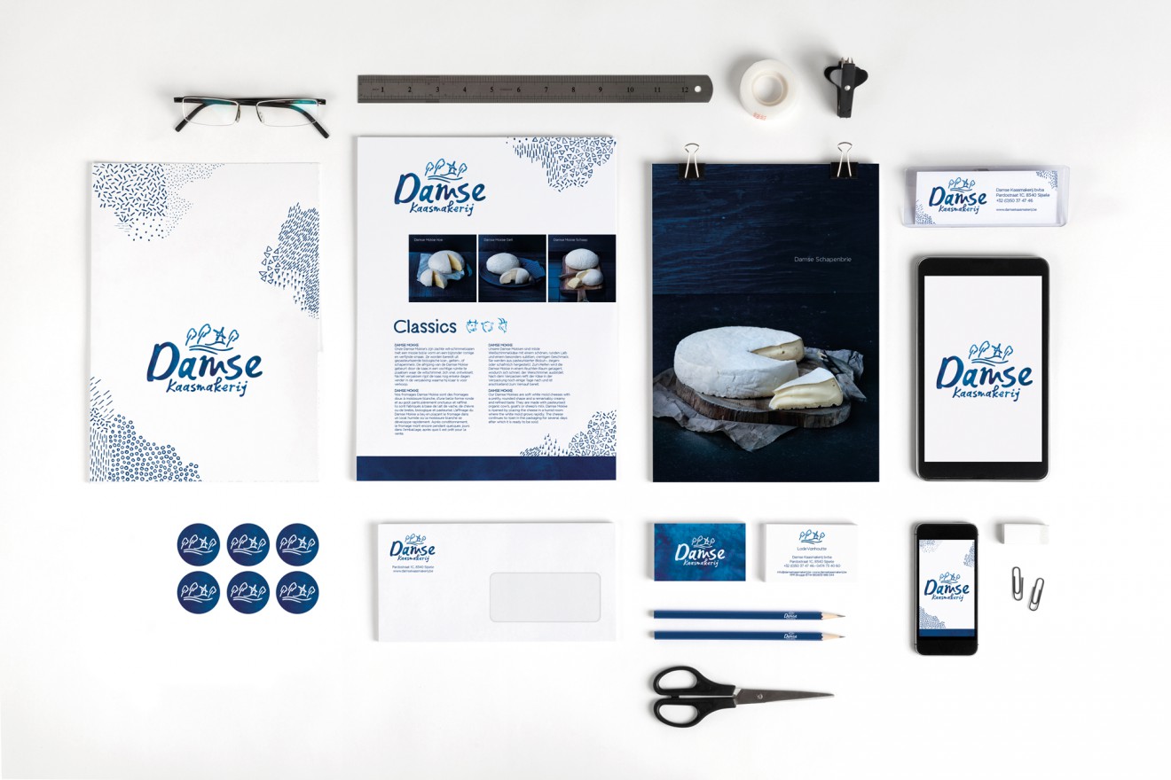
BRANDING for Damse Kaasmakerij
Classy make-over for Damse Kaasmakerij
The ‘Damse Kaasmakerij’ is a traditional producer of organic cheese, using only organic cow, goat and sheep milk. This cheese dairy was created in 1989 on the site of an old farm in Damme in the Polders region surrounding Bruges. In 1992 the cheese dairy moved to a new location in Sijsele.
After many years of growth and widening their range of organic cheeses, our long time client The ‘Damse Kaasmakerij’, felt a need to modernize their branding and corporate identity.
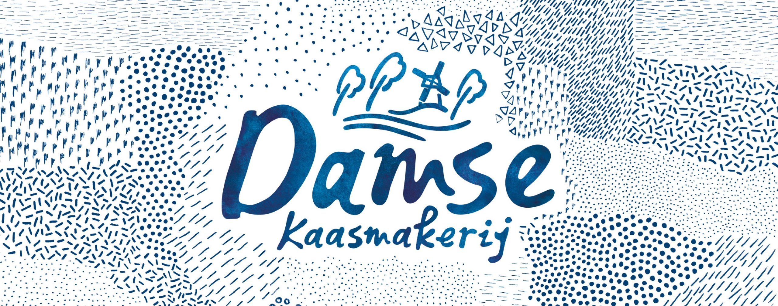
We updated the brand whilst keeping the recognizable Damse skyline with willow trees and windmill along the ‘Damse Vaart’. The Damse Kaasmakerij is still a small and local family business, who take pride in their knowledge and artisan working methods. To emphasize this, we created a unique hand drawn logotype with fluid shapes, a reference to the smoothness of the cheese. The organic corporate illustration is an abstraction of the Belgian countryside where cows, sheep and goats freely graze.
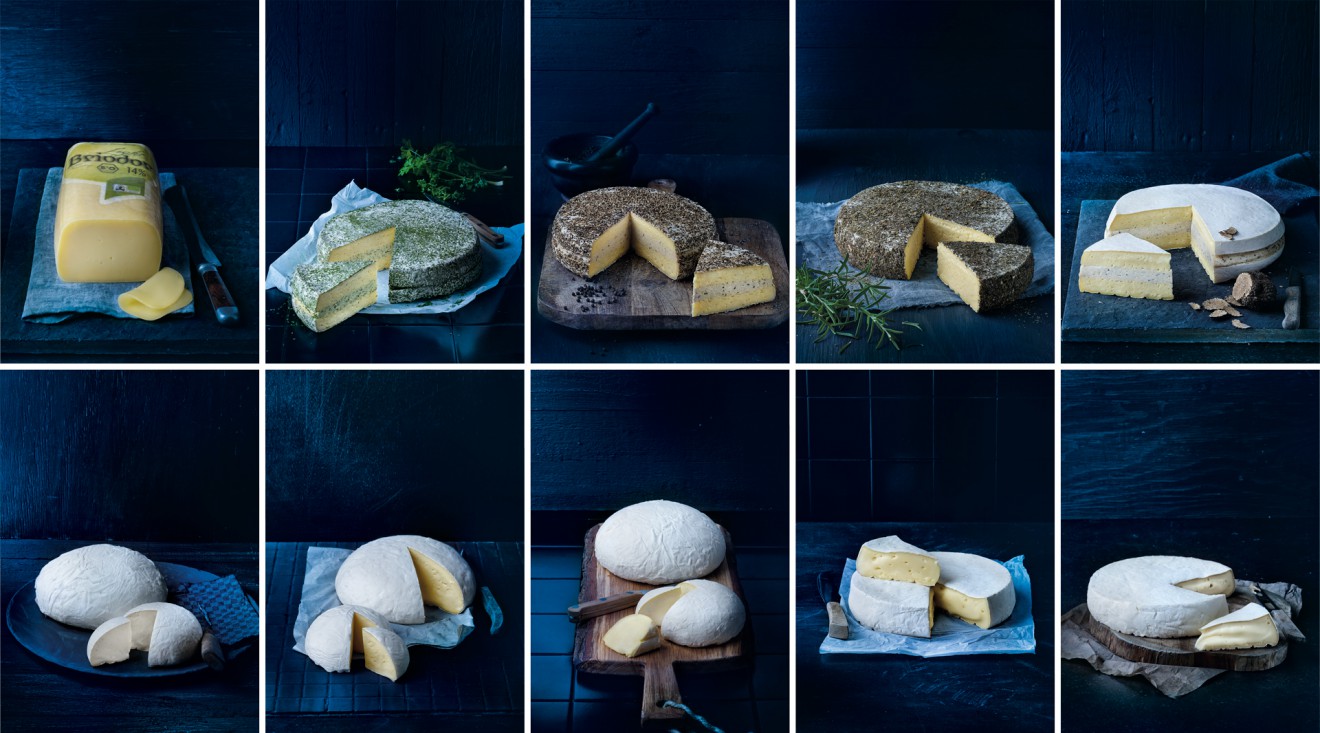
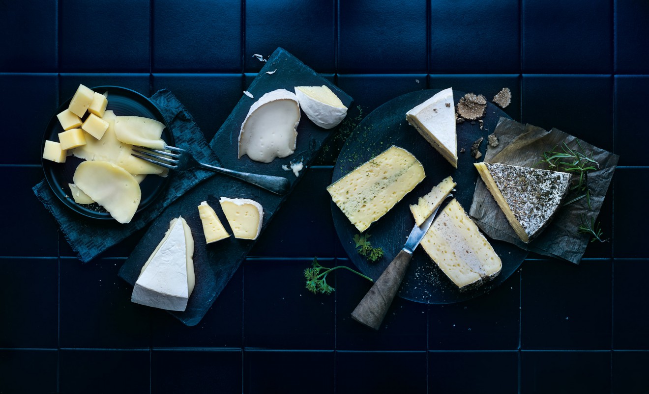
To match the new identity, our inhouse photostudio re-shot their photogenic cheese in a matching dark blue background setting. Rest assured, they taste even better than they look!