BRANDING & PACKAGING for Bru
Reawakening a Brands Natural Character
Bru mineral water, has for many generations, become an icon of the dinner table, intrinsically linked with fine dining and festive celebrations. Despite this exclusive, premium association, the brand in general had become lost in the forest of sparkling mineral water competitors and had struggled to remain top-of-mind or specifically recalled by consumers for its unique USP.
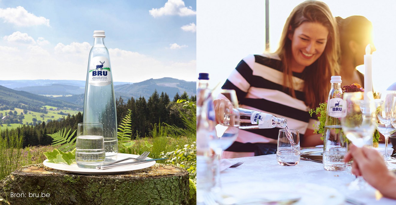
Bru is indeed ‘the’ original, pioneering, Naturally Sparkling Mineral Water, sourced deep in the Belgian Ardennes and yet despite this, the brand was becoming somewhat forgotten.
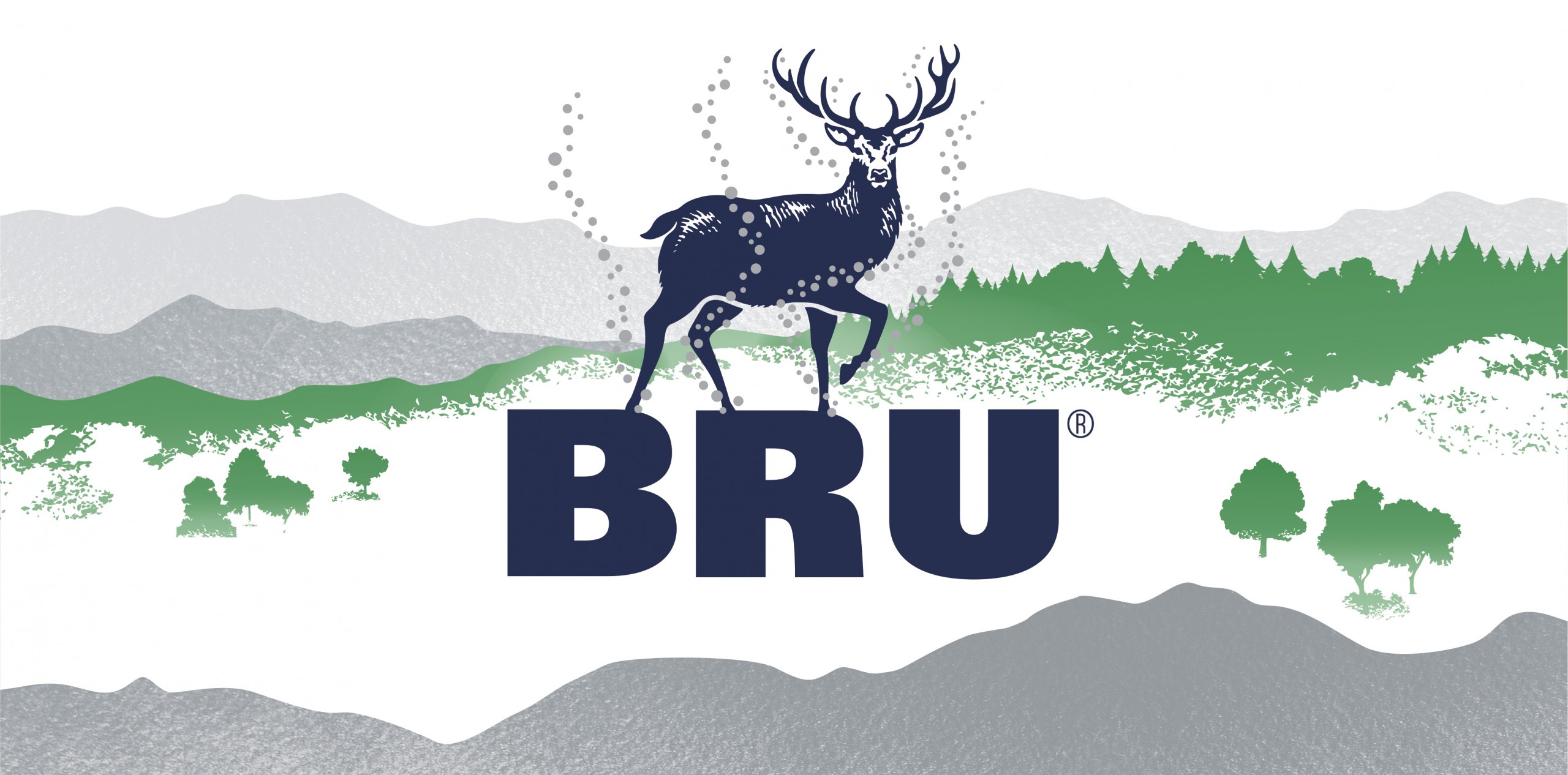
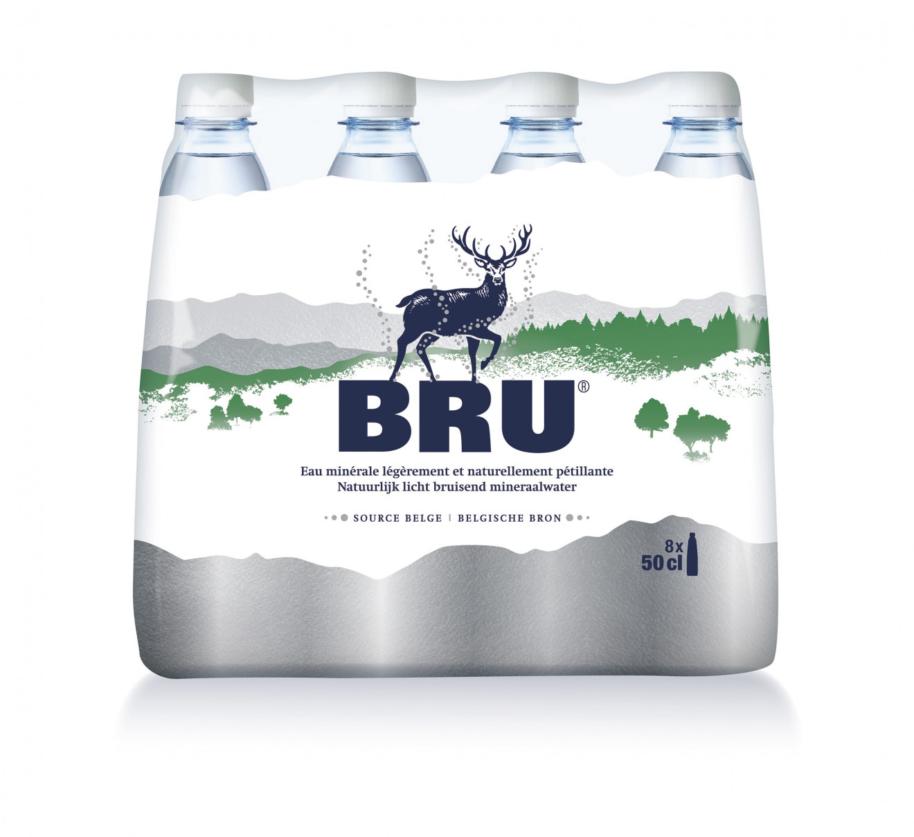
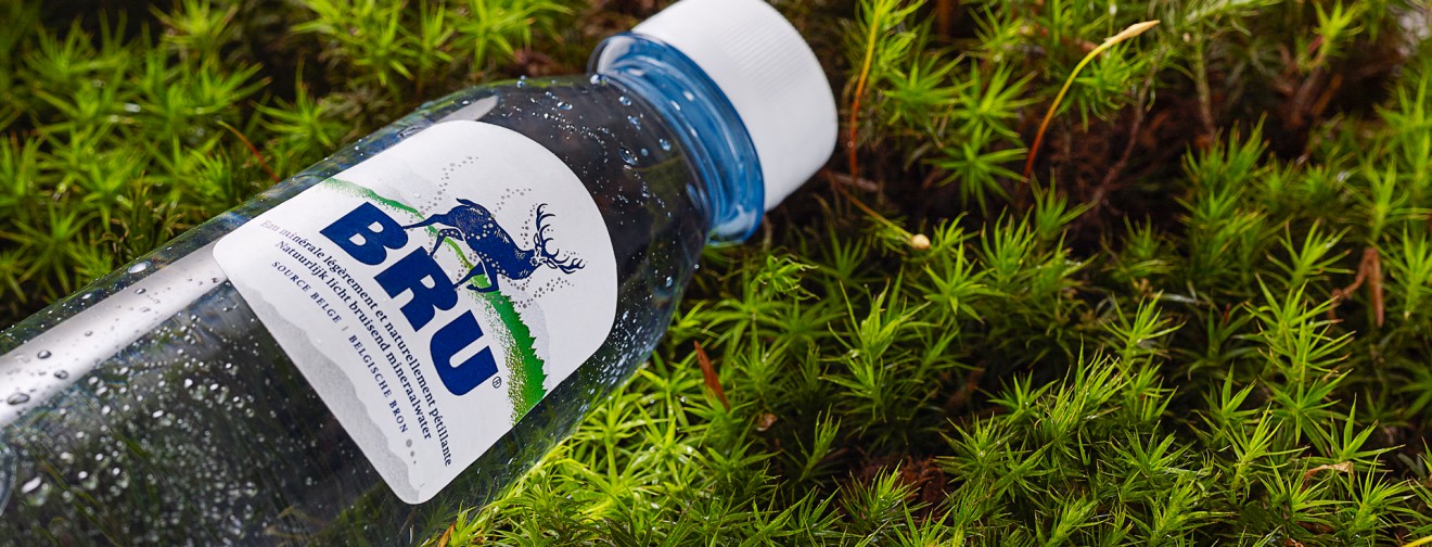
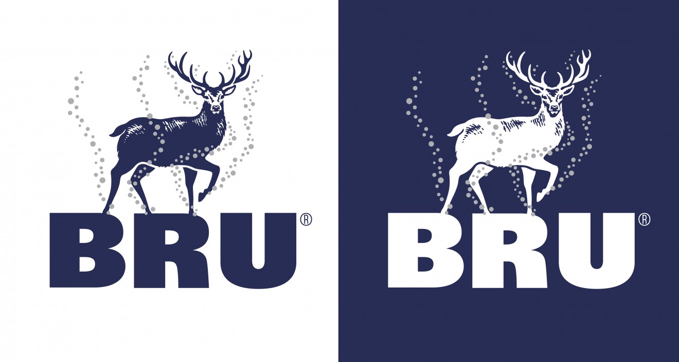
This, coupled with an inconsistent brand building history, resulted in a brand ripe for a refreshment and reimaging. True to form, we looked to reinforce and reawaken the real brand that was hidden but had always existed by identifying and focusing on its key assets; ‘The Stag’ mascot, its source in the ‘Belgian Ardennes’, the iconic and elegant ‘Bottle Shape’ and of course the pearlescent finesse of the ‘Lightly Sparkling Mineral Water’. Primarily we wished to engage consumers with this natural brand story whilst using ‘The Stag’ brand mascot as our main character. We purposefully moved away from the previous trophy head to a fully realized and realistic stag figure, seen striding majestically across the Bru logotype and through its natural habitat, deep in the forest of the Ardennes. Importantly, with every footfall, fine pearlescent bubbles rise, to emphasize the relationship between our mascot and the source, both living together in harmony.
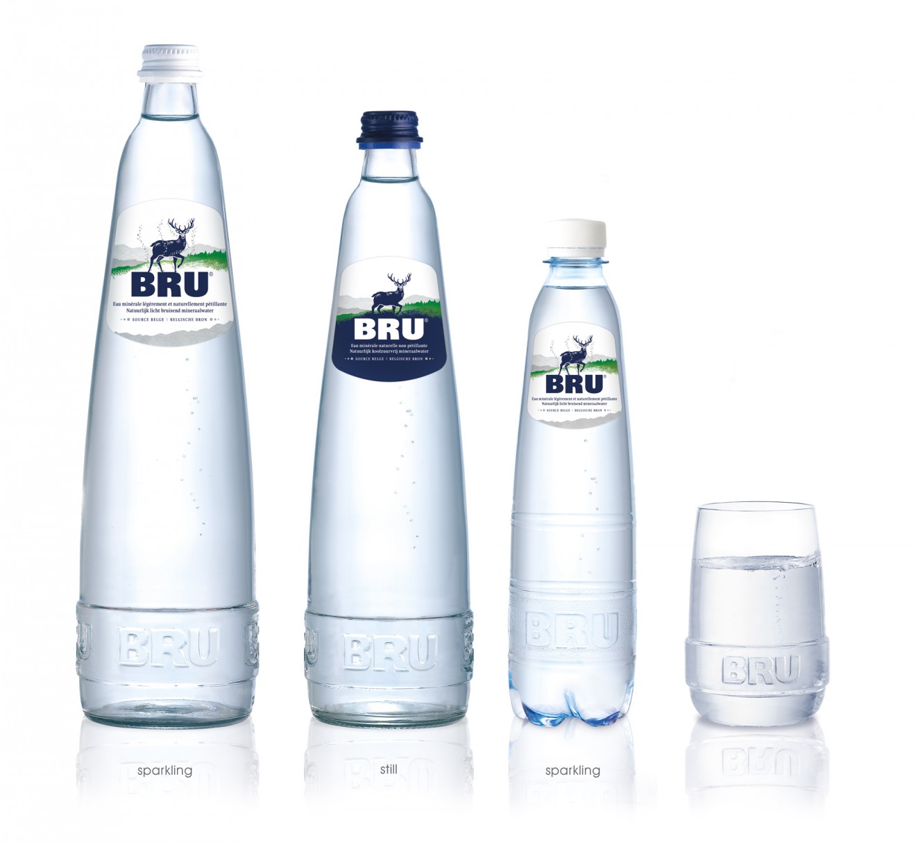
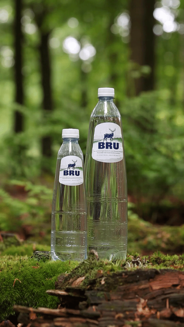
The Ardennes themselves are a direct link to both source and credibility and therefore were employed to wrap each bottle label and multipack with our origin and reason-to-believe. Using minerals inspired silver touches within the rolling landscape and rocky foundation, help refine the design with the necessary premium quality. Stretching from the B2B horeca world to regular retail, the design was adapted across multiple formats, from the regular lightly sparkling to also still mineral water.

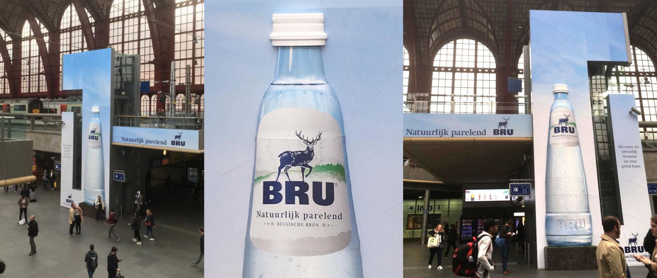
To help provide an unmissable platform to the relaunch of the new Bru, our packaging played a dominant role, taking center stage in an impressive billboard campaign, seen across the whole of Belgium.
Bru, a rebranding, larger than life!