BRAND MAKEOVER CHAPTER 1 for Duvel Moortgat
‘Duvels’ Design, Heavenly Taste!
Duvel Design Evolution - Chapter 01
Once again, a dream has come true to be honoured with the opportunity to make an impact on a truly iconic and world-renowned Belgian brand such as Duvel. Duvel as we know is the flagship brand from the Duvel Moortgat independent family brewery, whose almost 150 years brewing expertise has helped establish this exceptional Belgian specialty beer as an unmissable part of real Belgian culture.
However, despite this legendary status, Duvel as many other beer brands has felt the increasing pressure from an ever growing and competitive market, which displays an overwhelming choice for beer consumers today. Feeling the squeeze, the brand felt it was the right time to undertake a refreshing brand makeover, that would enable Duvel to remain contemporary and relevant in today’s ever evolving beer market and to ensure a connection with newer and younger generations of beer lovers.
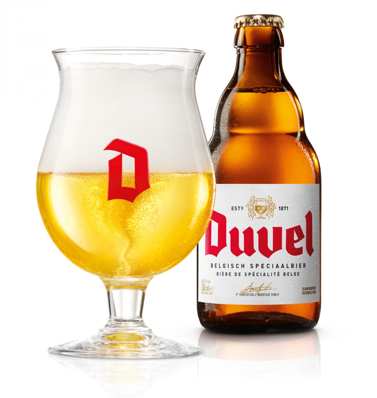
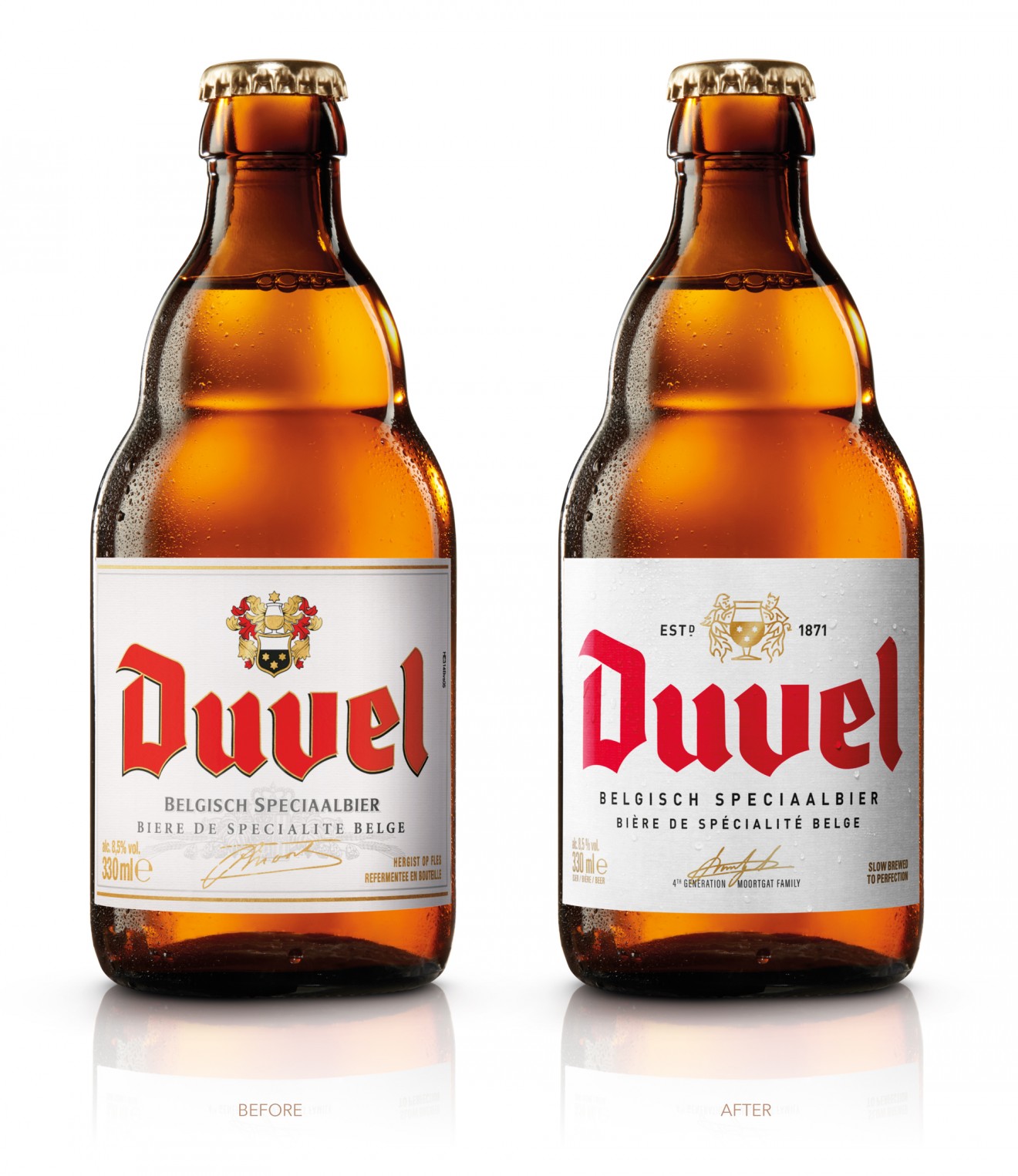
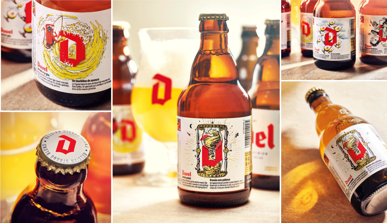
Chapter 01 of our Duvel packaging design story kicked off with a clear focus on the much loved classic Duvel. Building on the sterling branding work completed by the guys at Stranger & Stranger our task was to build a robust, premium and refreshingly modern packaging identity for the entire Duvel product portfolio. When tackling the bottle front label, we respected a conscious strategic choice to elegantly evolve the Duvel identity by purifying and stripping down design elements whilst maintaining a clear visual link with the current label that consumers have been used to for many years now. Reduced clutter and refined typography were supported by the slick new branding and singed off by the representative of the 4th generation of Moortgat family, Michel Moorgat himself. Not forgetting the design work for the beer cap where we clearly see the brands ambition to support the Duvel identity with it’s now iconic red ‘D’.
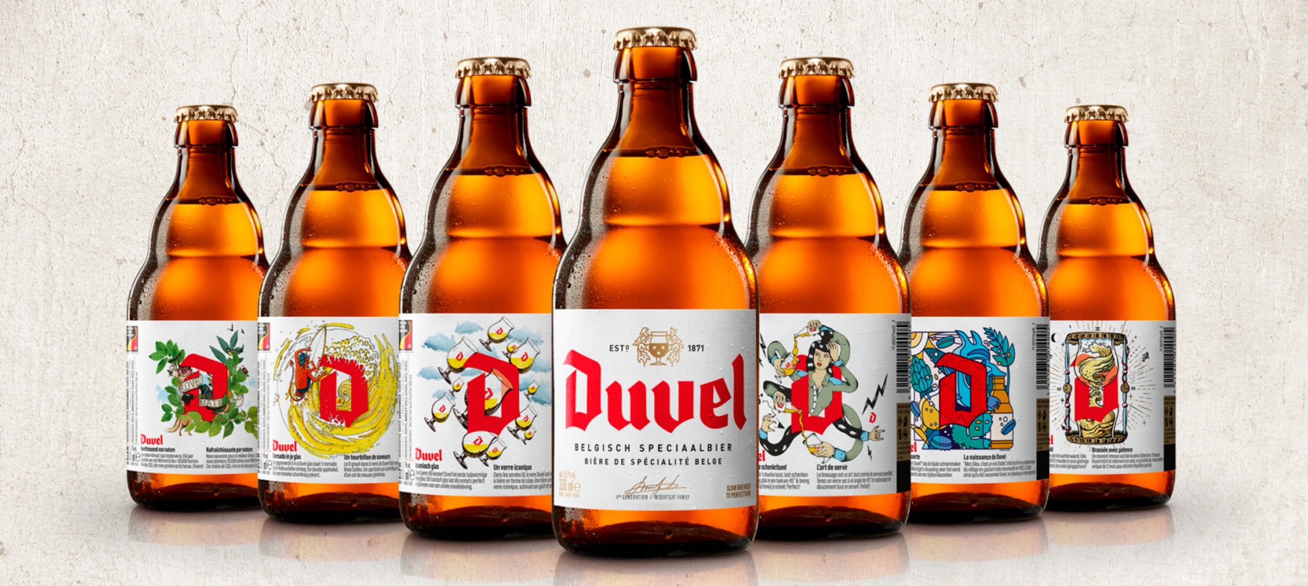
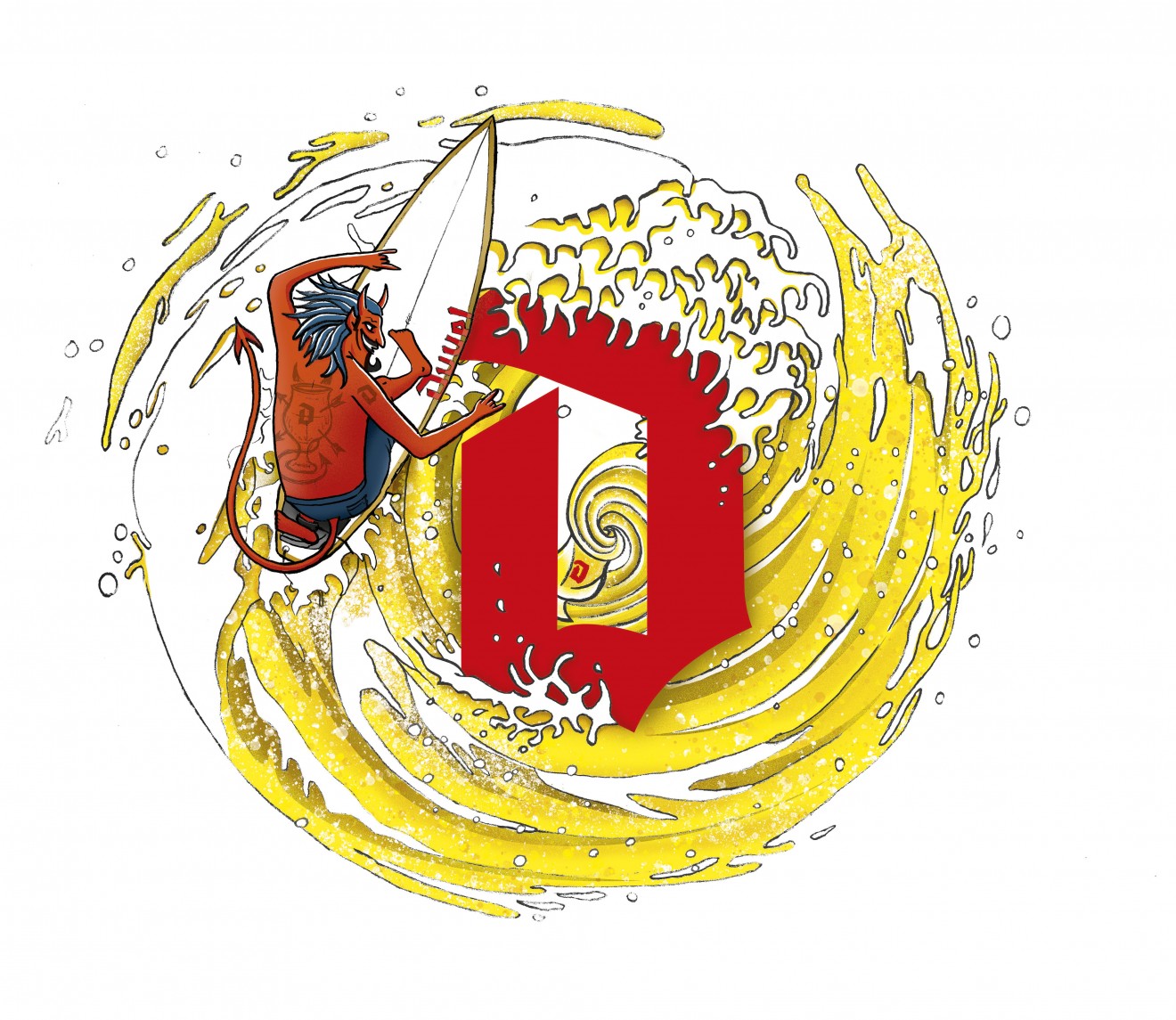
The back label however was another story. Duvel as many loyal followers know has a weakness for contemporary design trends, often using through their limited-edition glass collection and pack identity, the best that the illustration world has to offer. Our task was support and create, each in its own style, an eclectic range of brand story illustrations, each reflecting a unique aspect of the legendary Duvel experience. With the iconic ‘D’ as the centre of attention, members of our Quatre Mains design team were unleashed on this illustration challenge.
Tornado Surfer : Kobe De Keyzer
A key aspect of the Duvel experience is the tiny engraved D in the bottom of the glass that generates an intense tornado swirl once the beer has been poured. A devilish spectacle that results in a heavenly head of foam. As a passionate surfer used to riding mad waves, Kobe looked no further for inspiration whilst adding that devilish touch that we’ve all come to associate with the Duvel brand.
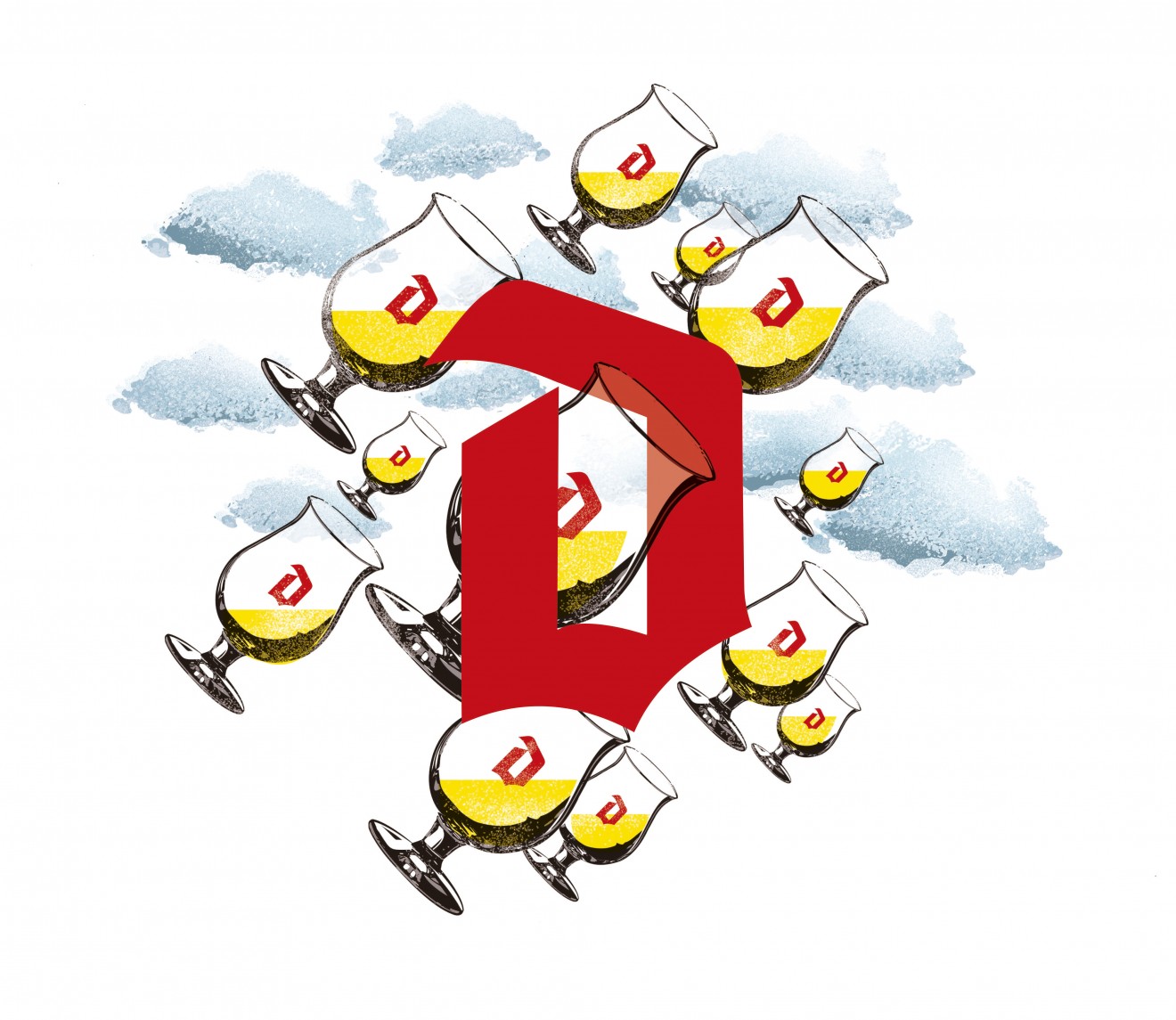
Heavenly Glass : Kobe De Keyzer
In the late 60’s Duvel launched the very first tulip shaped beer glass. This iconic glass perfectly releases all Duvel aromas to create a unique taste sensation.
Belgian surrealists inspired Kobe to put his head in the heavenly clouds and infiltrate ‘Duvel’s timeless soul.
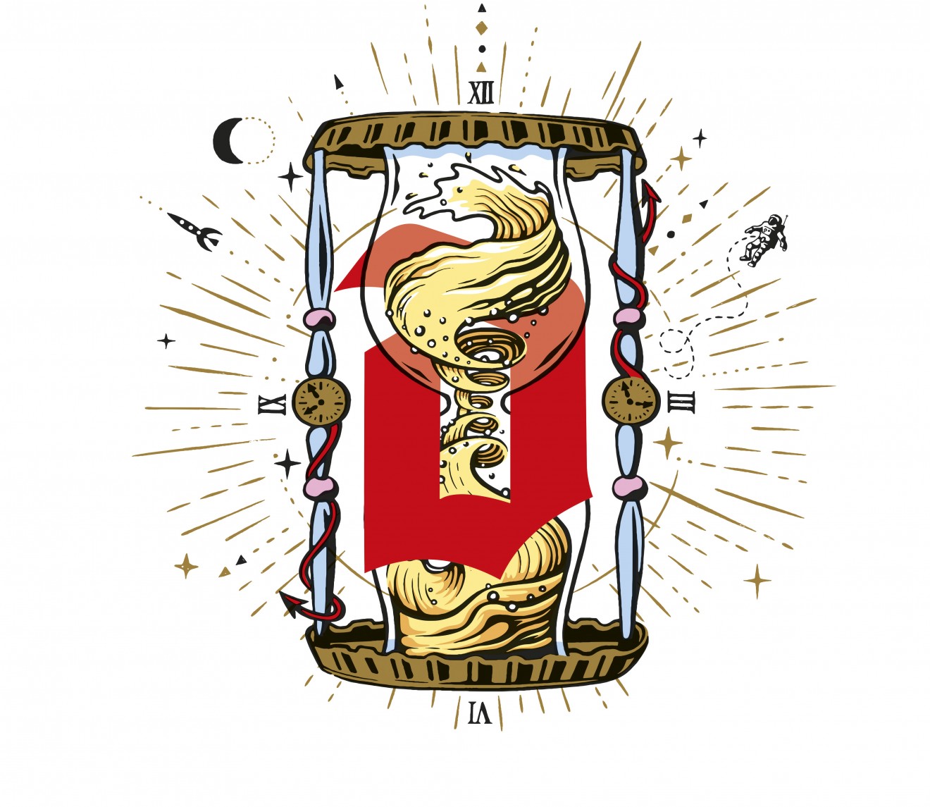
Slow Brewed : Joe Robinson
Intense moments are worth waiting for, with each Duvel ripening no less than 2 months in their cellars. Joe’s comic/graffiti inspired hourglass design is an ode to Duvel’s unique fermentation process and the time and patience needed to bring this beer to perfection.
Stay tuned for Chapter 02 of our Duvel design story coming soon and like a real Duvel, trust us, it’s well worth the wait ;)
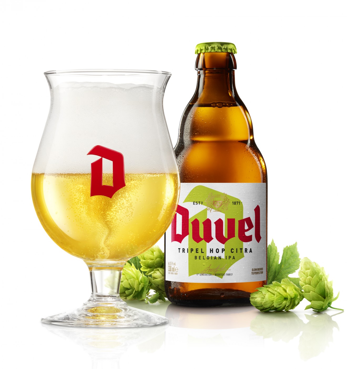
New relaunch of Duvel’s Triple hop beers - Chapter 02
Building on our desire to cement the Duvel ‘D’ as a true design icon, and making these triple hops stand out from the classic duvels, this device was used to signalize these beers unique character, loud and proud.
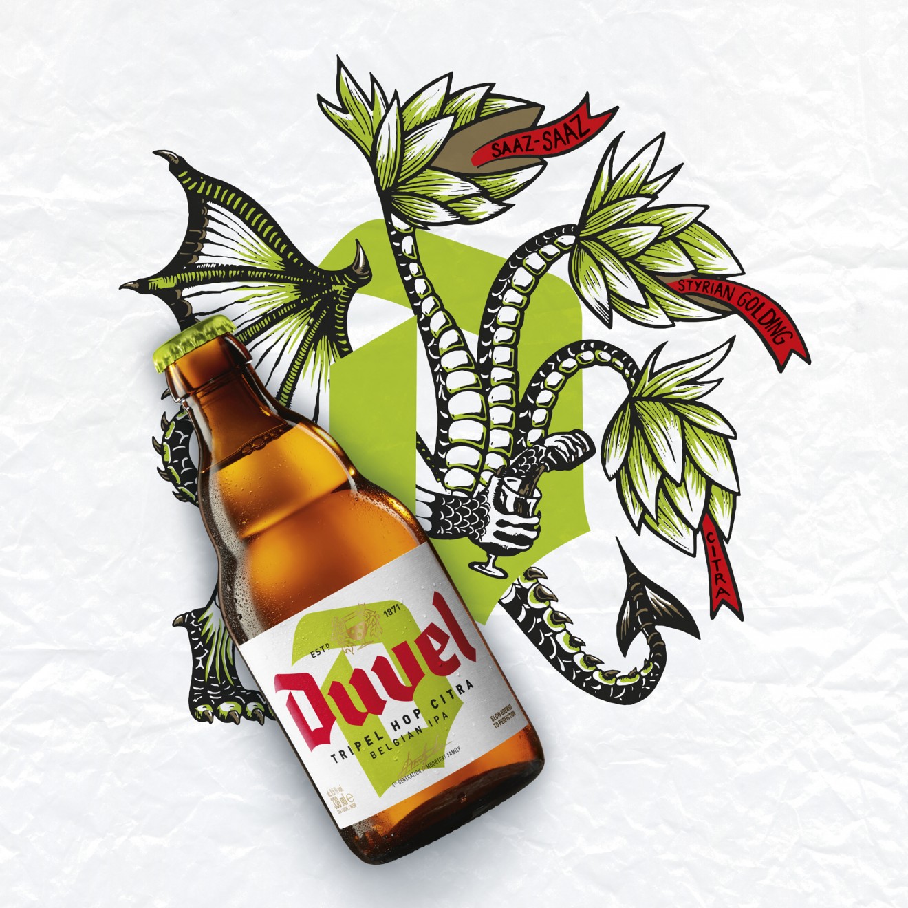
Three-headed dragon: Joe Robinson & Kobe De Keyzer
As a reference to the three types of hops that are used during brewing the new Tripel Hop Citra is illustrated by Joe and Kobe with a three-headed dragon.
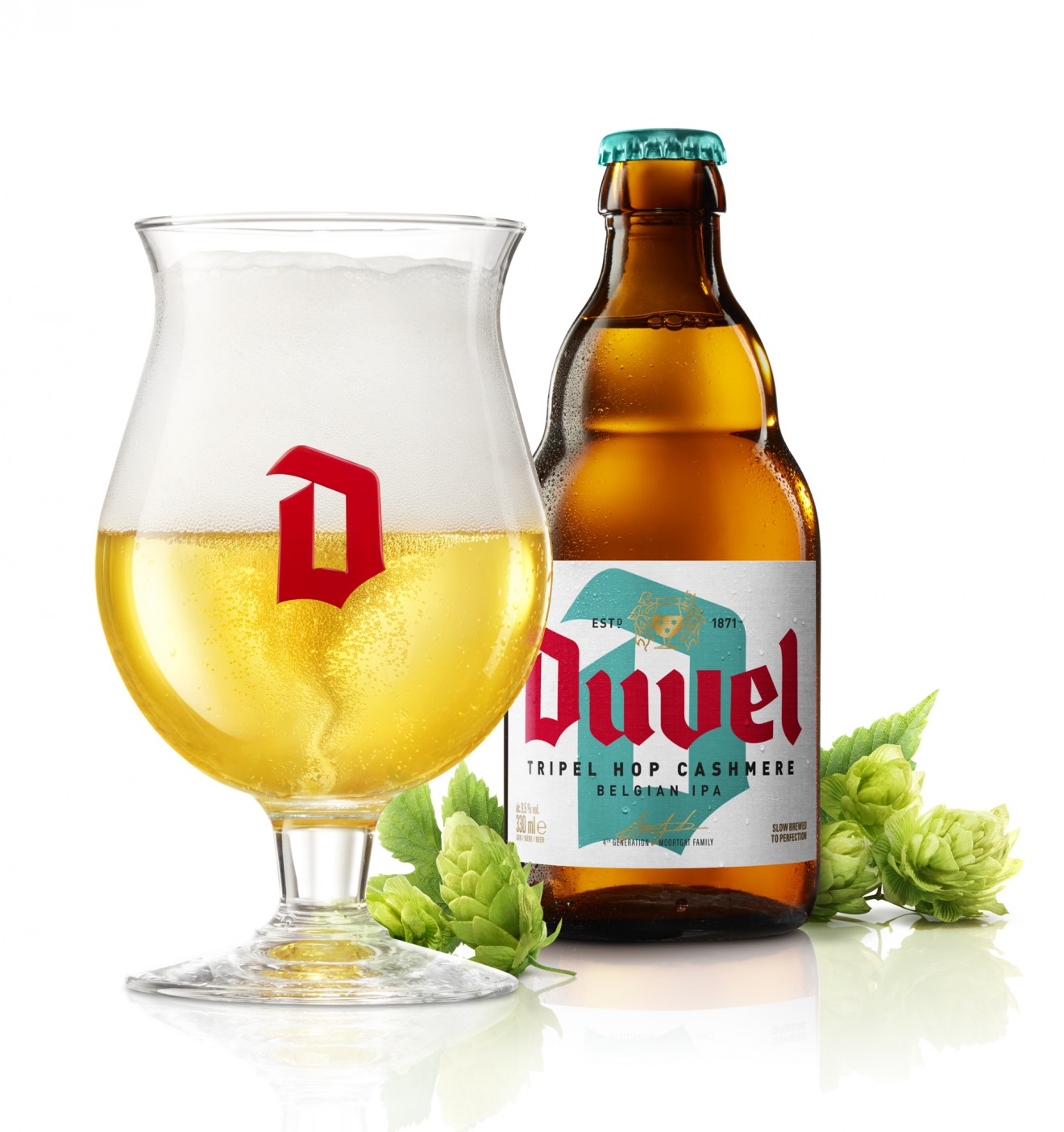
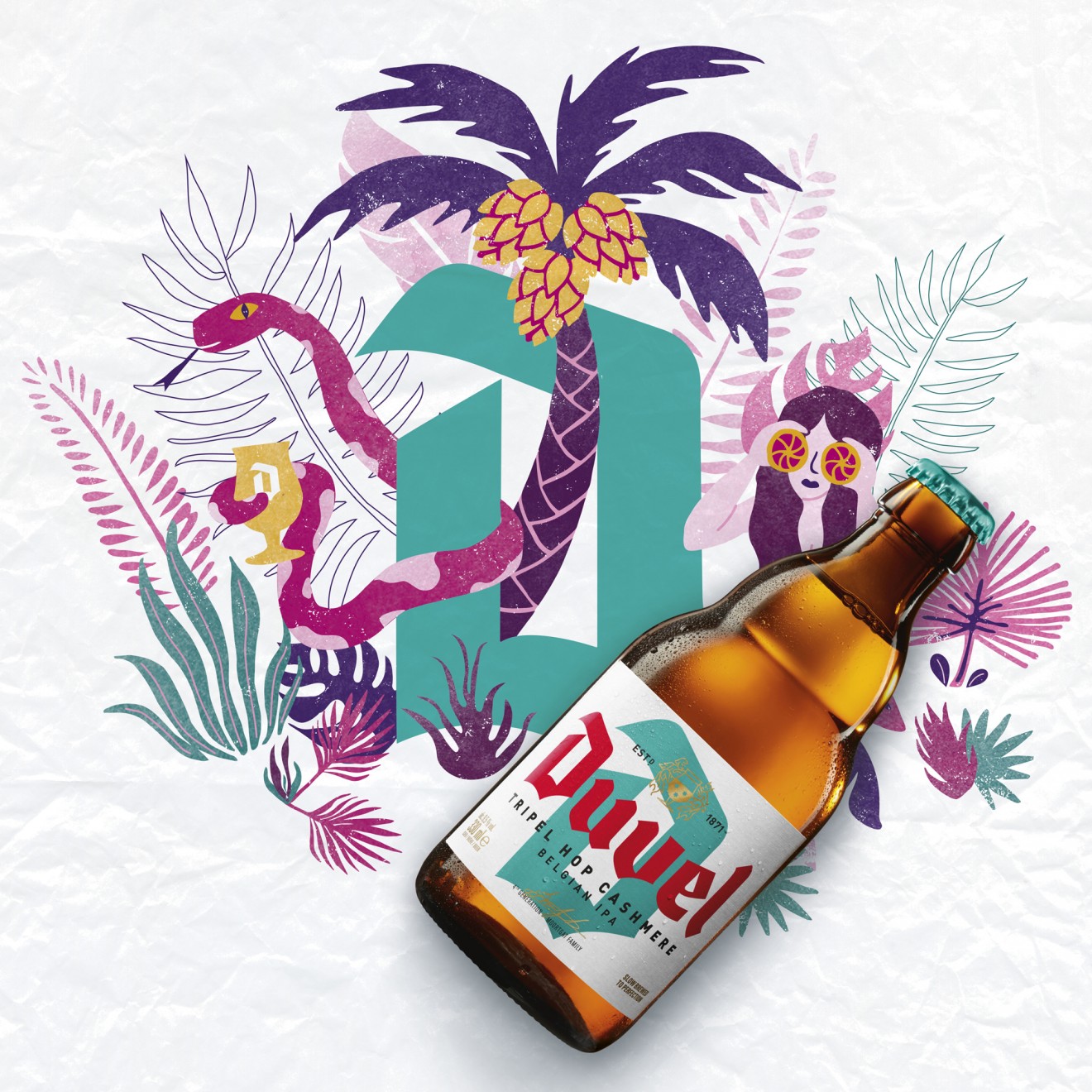
Garden of Eden: Gladys Roos
Duvel’s Cashmere is the result of crossing a female Cascade hop plant with a male Northern Brewer. The typical Duvel flavour palette is enriched with tropical touches of citrus, peach, melon and coconut. For her illustration Gladys imagined herself in the Garden of Eden, full of exotic and forbidden fruits.