TRUE TEA for Delhaize
Put your hands up for this new cold brewed tea
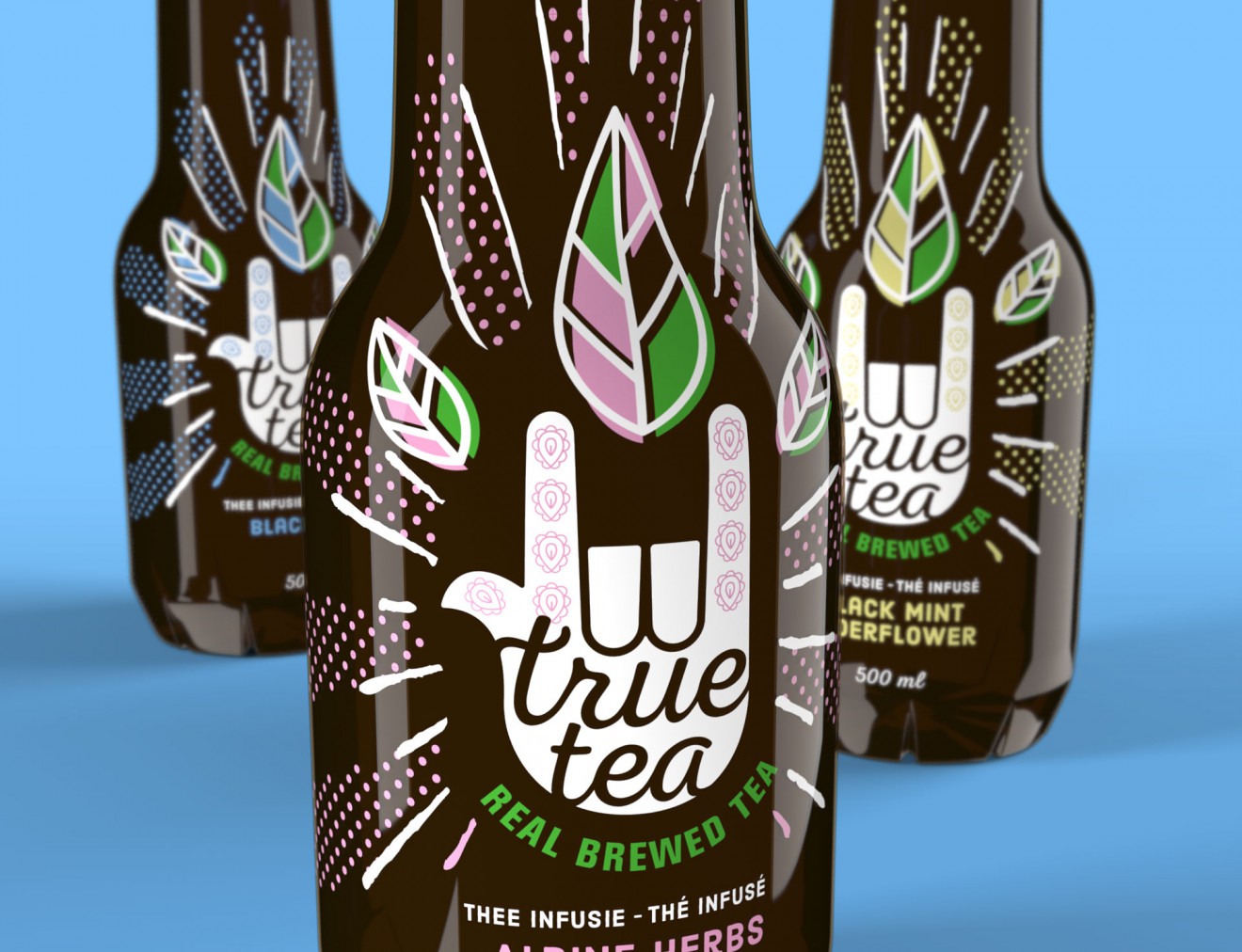
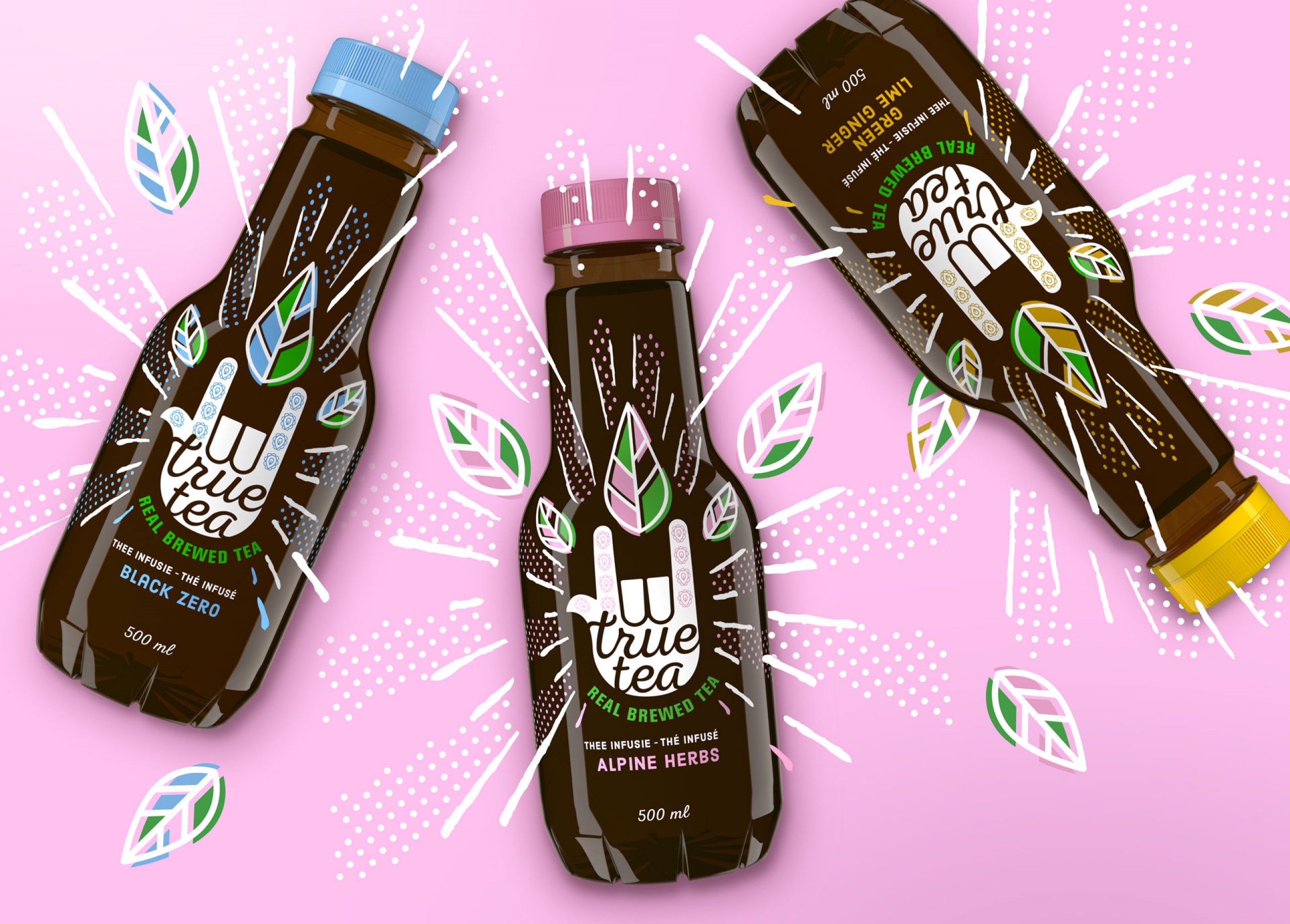
Delhaize asked us to develop a packaging design for a new range of ‘real’, ‘cold’ brewed ice teas. Our task was to create a refreshing and impactful brand design that attracts attention whilst directly communicating its inner product qualities. This range of new teas consists of ‘out of the box’ variants, healthier than most competitors on the market, with an accessible premium quality. It should attract young adults looking for a modern, healthy and authentic alternative in the soft drink world. In short; A perfect drink to quench their thirst.
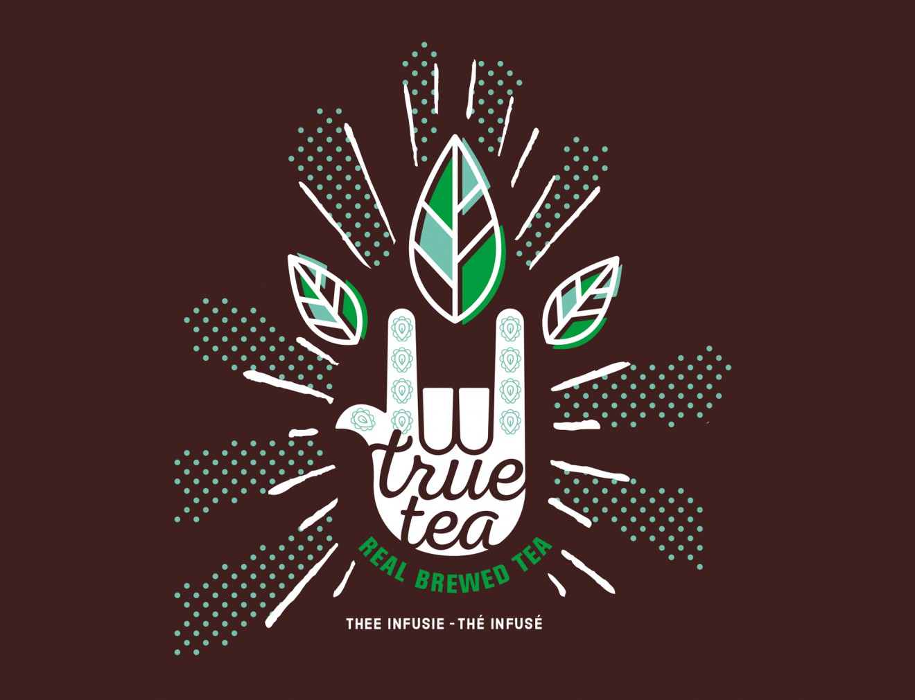
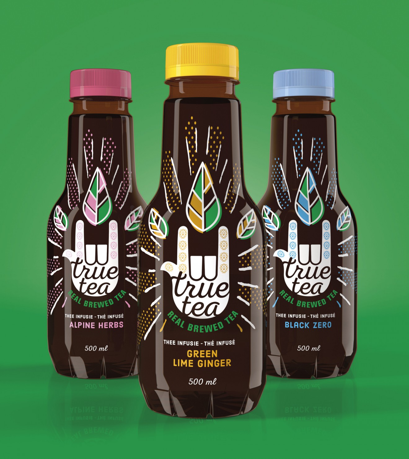
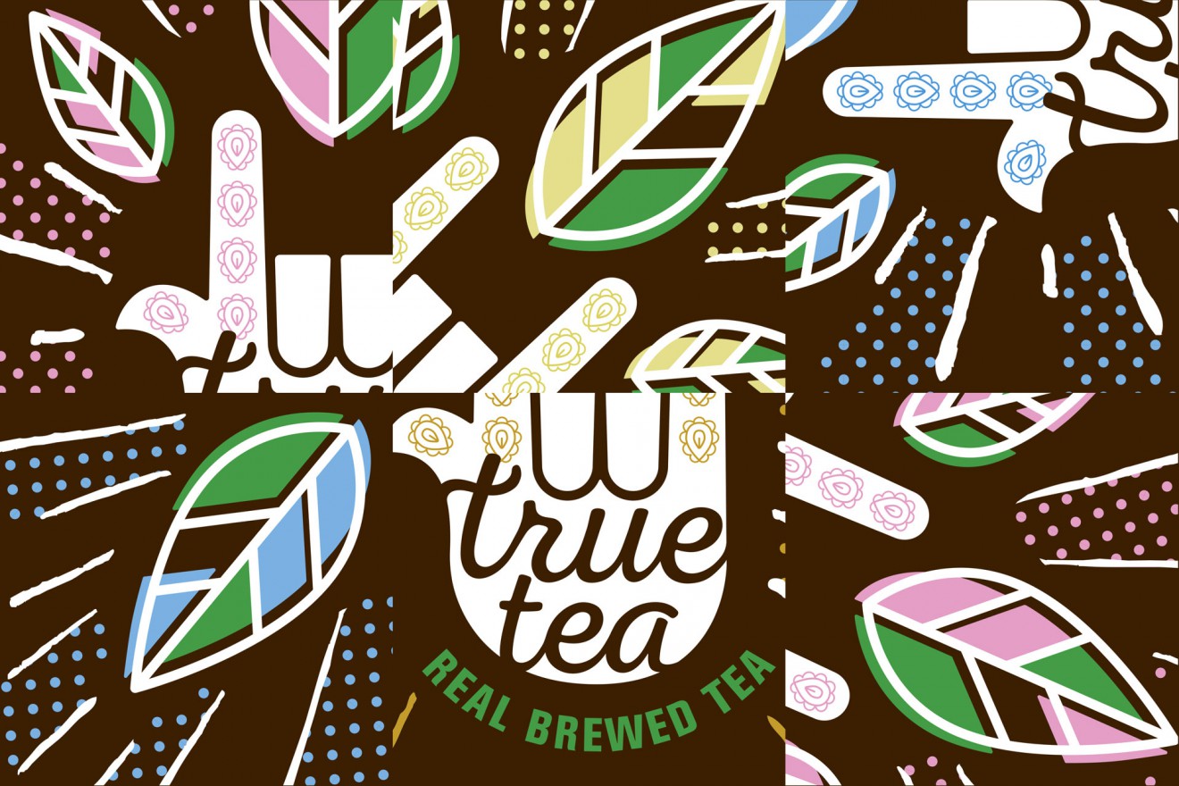
We created a symbol based design that reflects the true and real character of these unique teas. The symbol can be interpreted in a number of ways. It can be the unifying symbol for consumers standing strong behind their choices, as well as reflecting wellbeing and energy. An iconic radiating design, shining out with cold brewed and premium refreshment. This fun, tasty, alternative soft drink comes in 3 unique flavours: Black mint – elderflower, alpine herbs and black zero.
Peace out!