Spa product range rebranding
The rebranding and redesign for Spa’s variety of product ranges
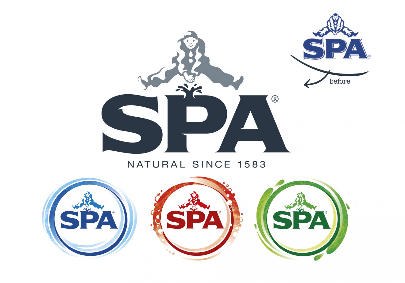
We believe in storytelling through design and the connections they can make with consumers. Stories that remain relevant and credible and are brought to life in an inspiring way. This is what inspired our iconic rebranding for Spa. Knowing every detail of its rich history, its personality and values, we introduced a strong simplified brand logo with deep connection to the brands roots.
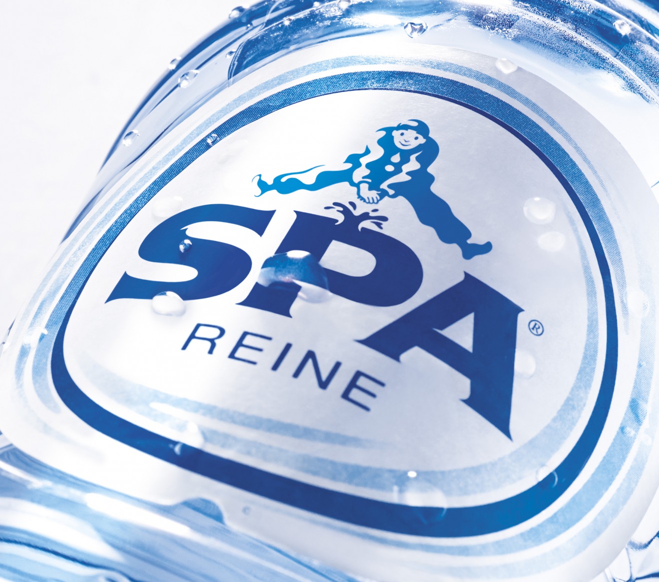
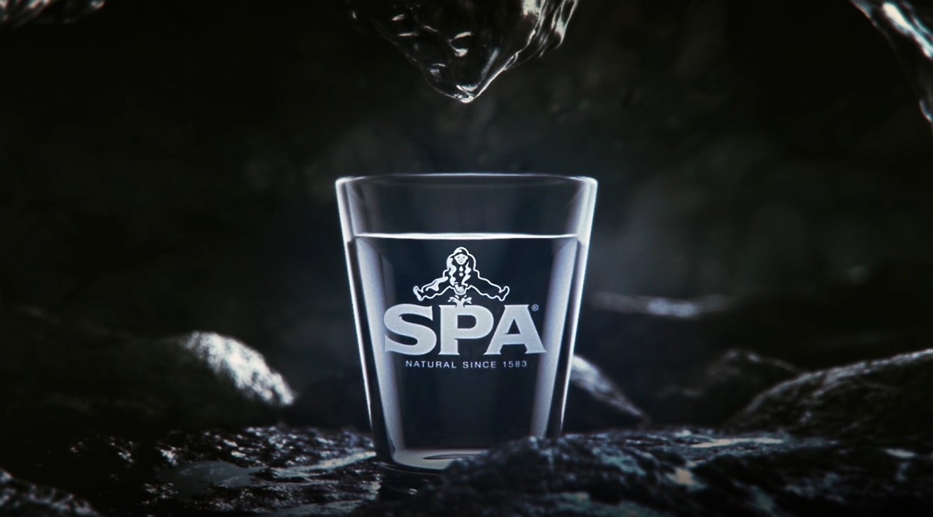
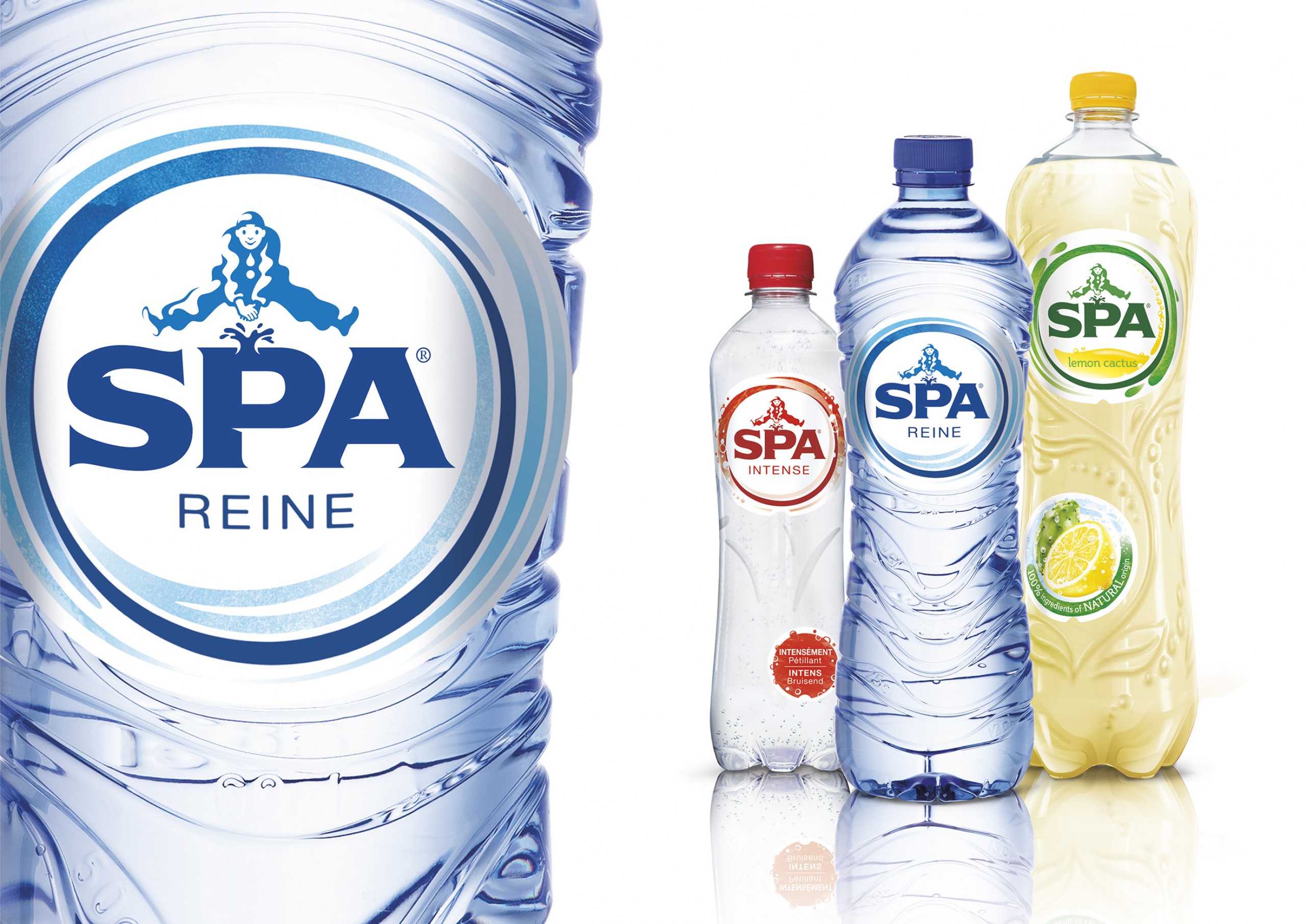
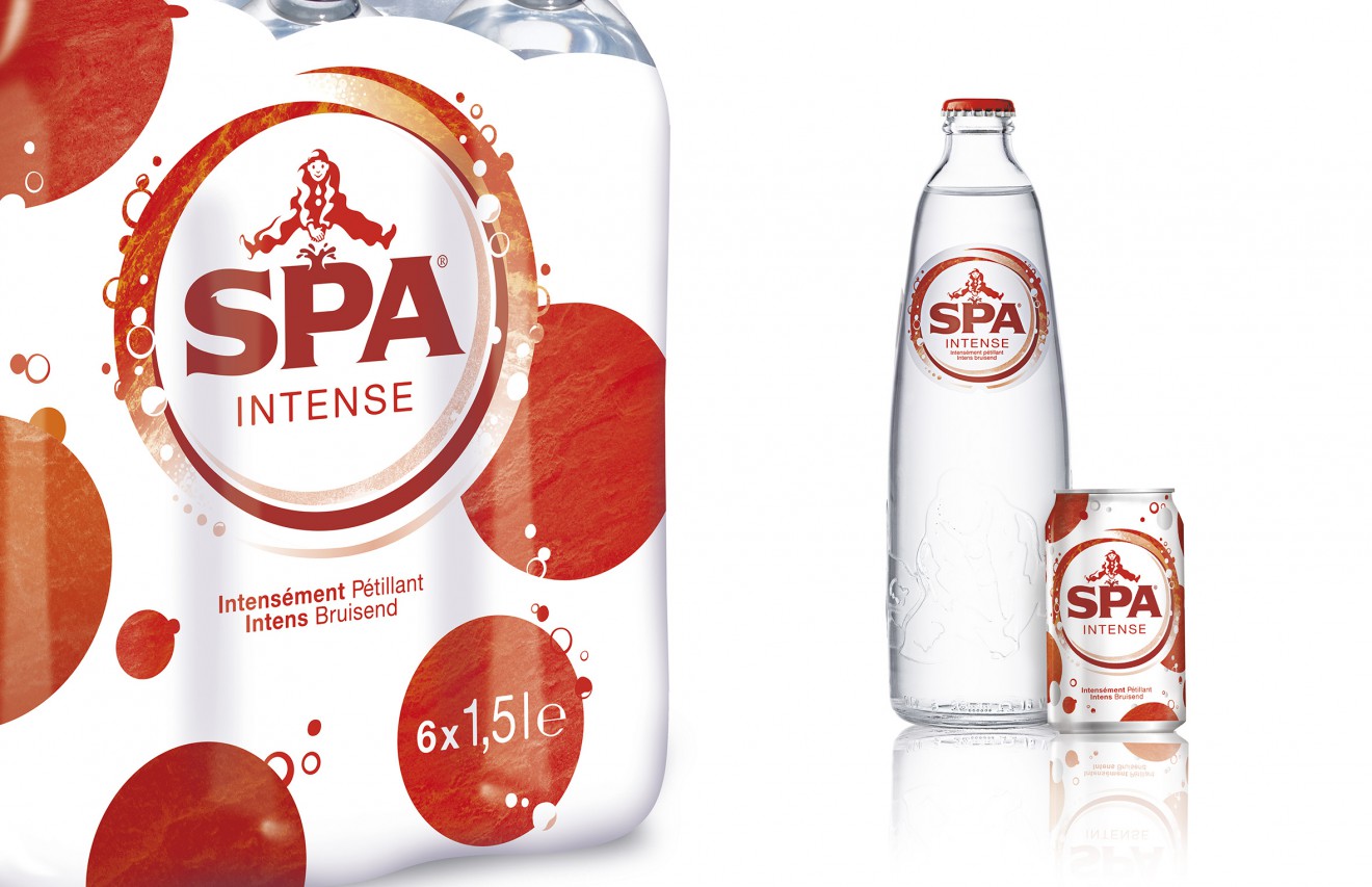
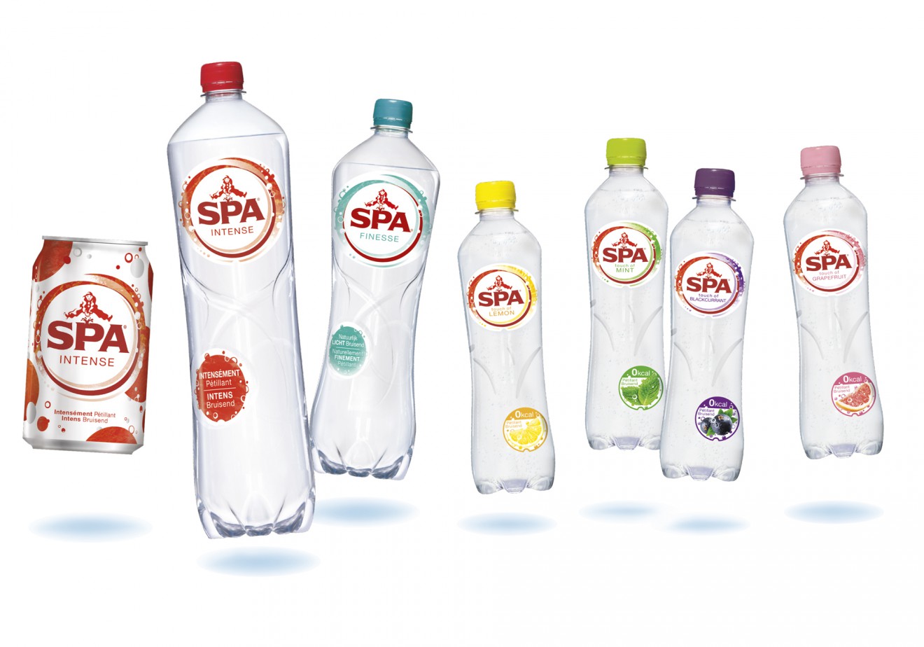
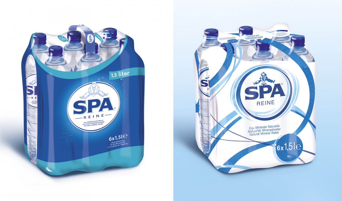
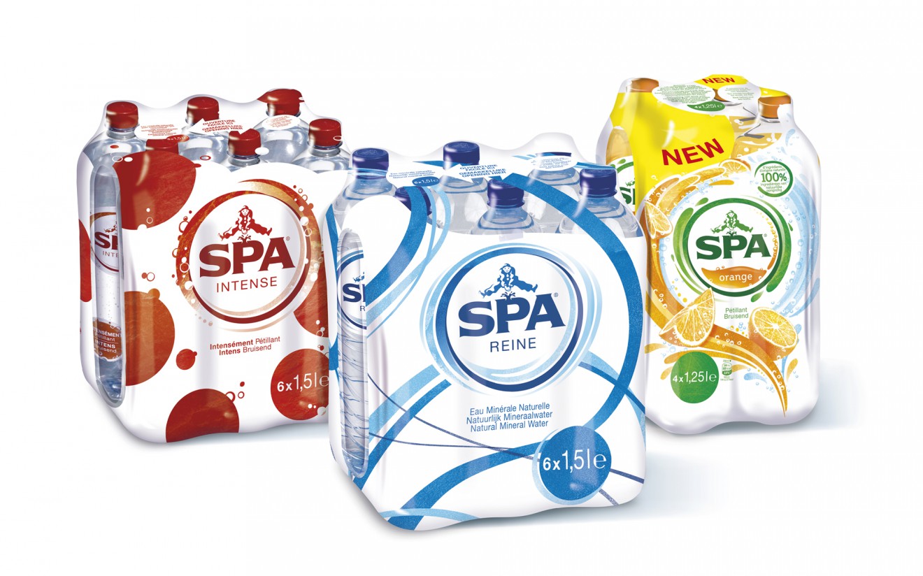
The logo showcases its powerful status and naturality with the important reintroduction of the brands’ source, reawakening ( brand mascot ) ‘Pierrots’ energy and reason to exist. From there we created 3 sub-brand identities, each empowering its own product related identity and character.
We wanted them to look and behave the way they exist, think and feel, each personality with its unique character, permeating through the ‘sub-brand’ and packaging design.
A character of caring for Spa Still, invigorating and alive for Spa Sparkling, curious and pleasure seeking for Spa Lemonades.
These all united together within one vibrant family ready to enter the modern era of brands eager to communicate directly with how their consumers really feel. A consumer intuitive simplification and amplification of a brands core promise and values in an ever evolving competitive world.
As an ode to the never-ending source of Spa water, aninstallation turns drops of rain into beautiful sounds, lights and projections,against the spectacular backdrop of the nature reserve Spa.