PREMIUM BISCUITS by Maison Bruyère
French fine cookies since 1964.
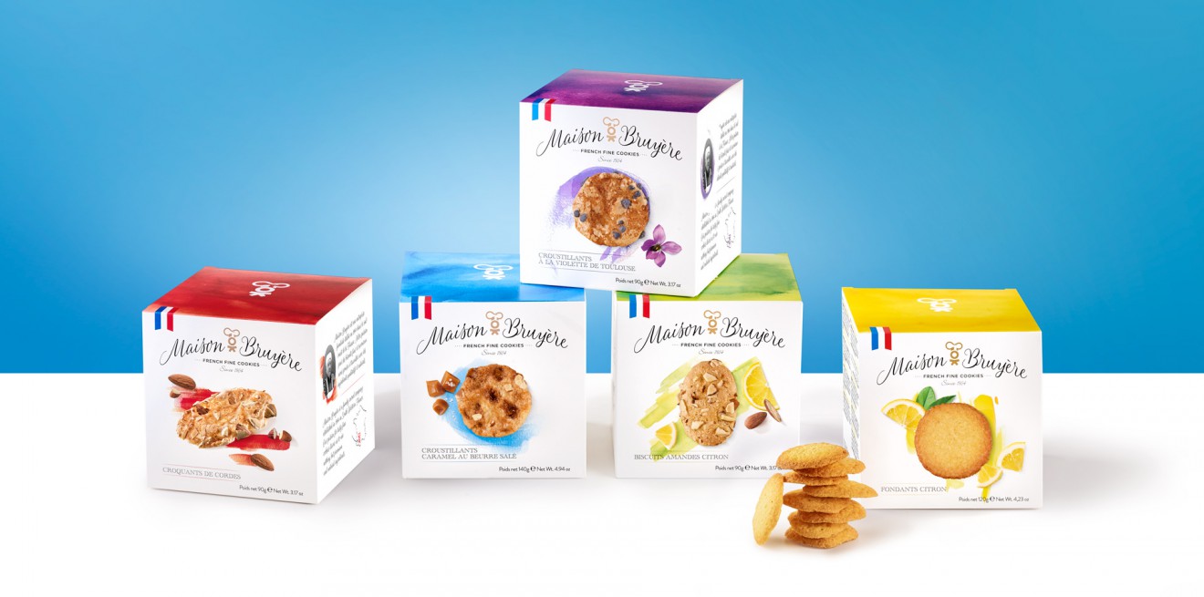
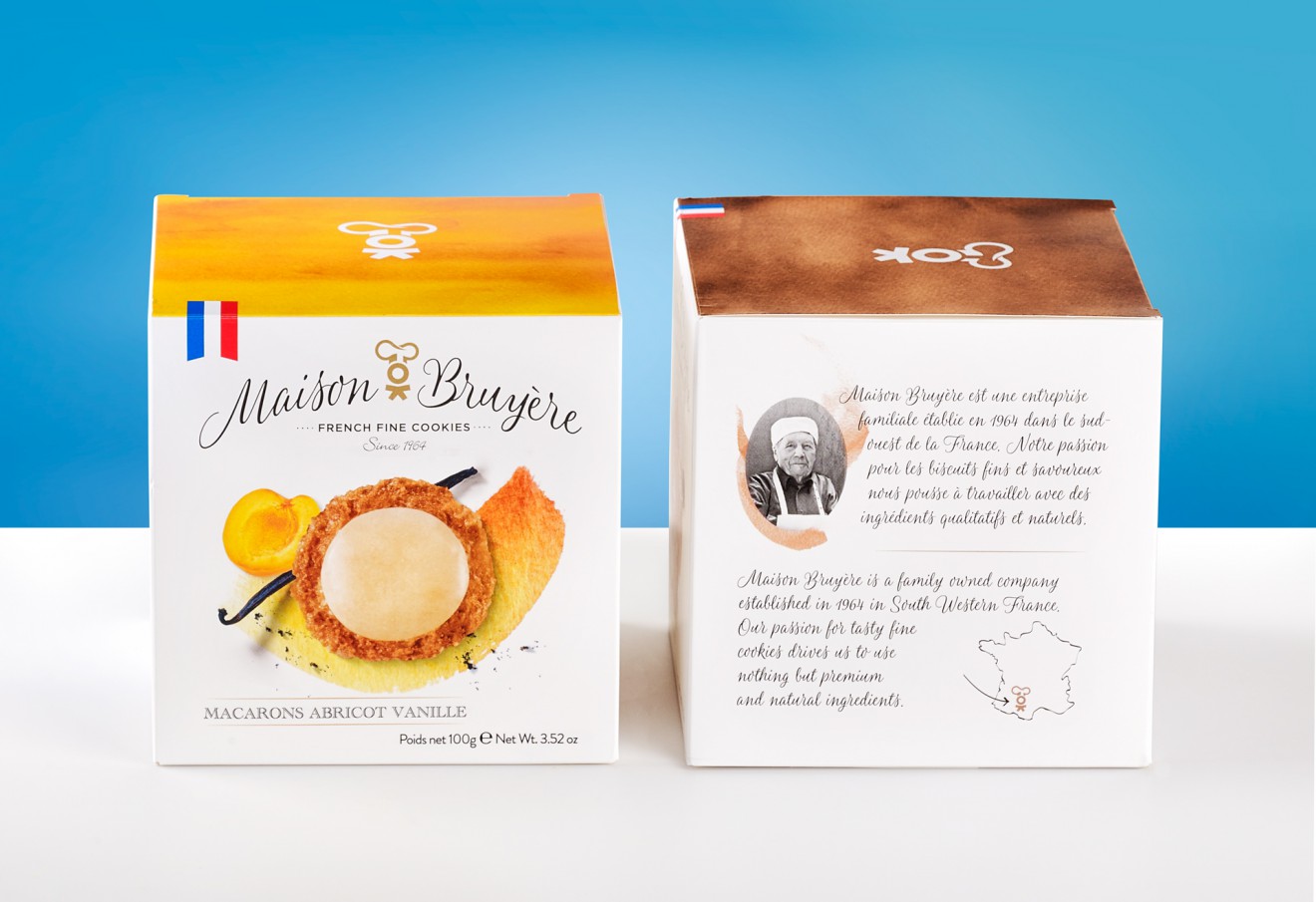
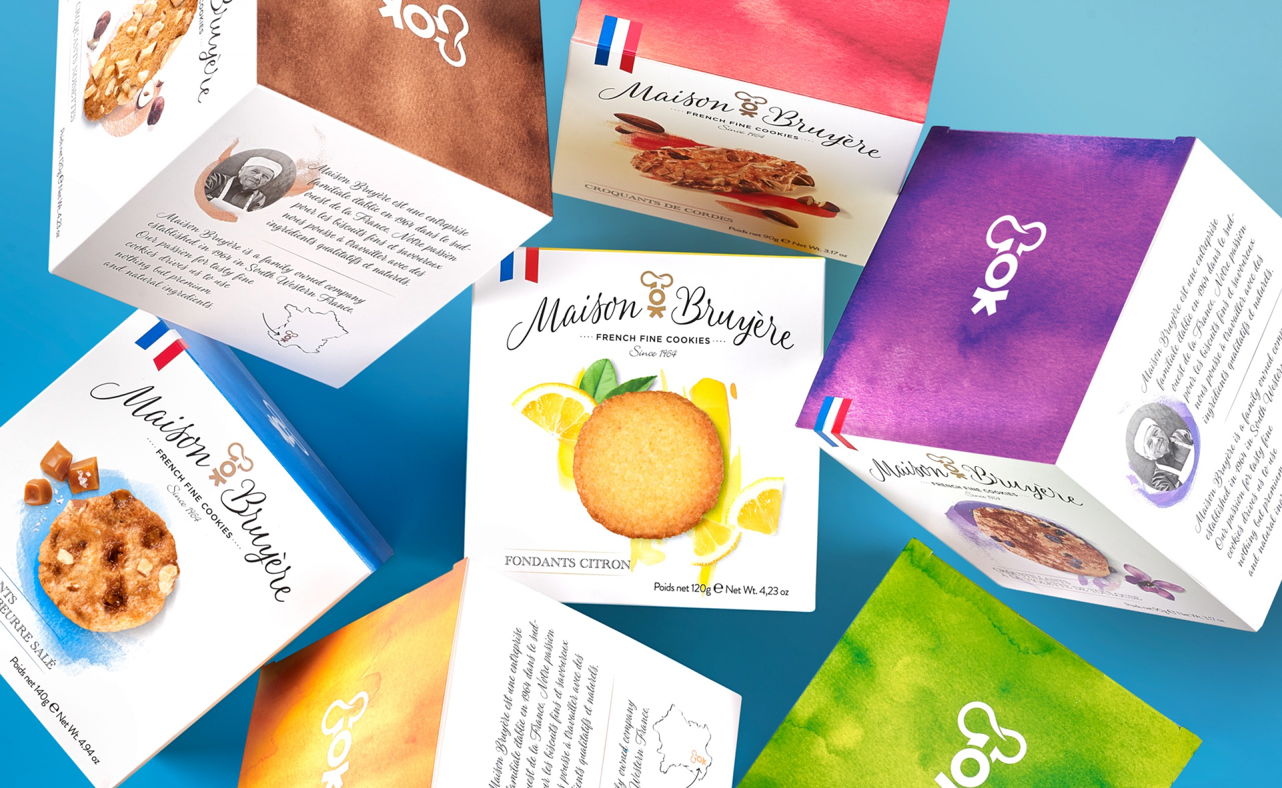
Maison Bruyère is a French family business that makes premium, specialty biscuits. Founded in 1964; three generations later, they still claim to uphold their original philosophy of using only natural and noble ingredients. They proclaim to have always been very careful with the quality of their refined biscuit creations. They offer a wide range of local specialties and are proud of their French heritage and true authentic flavours and recipes.
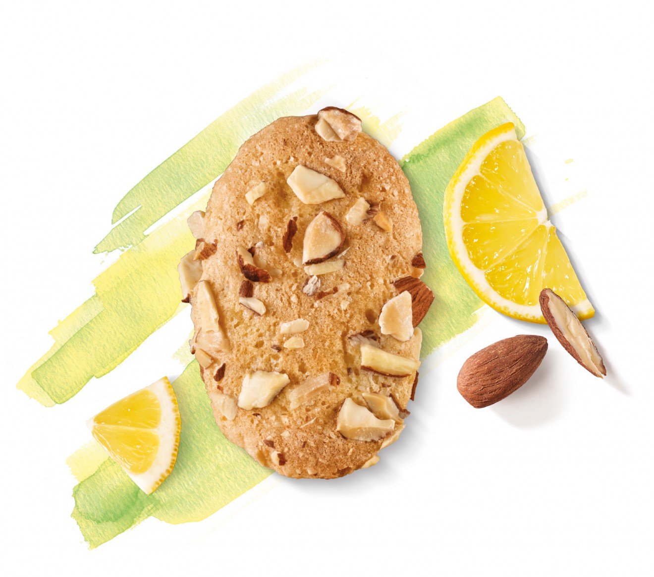
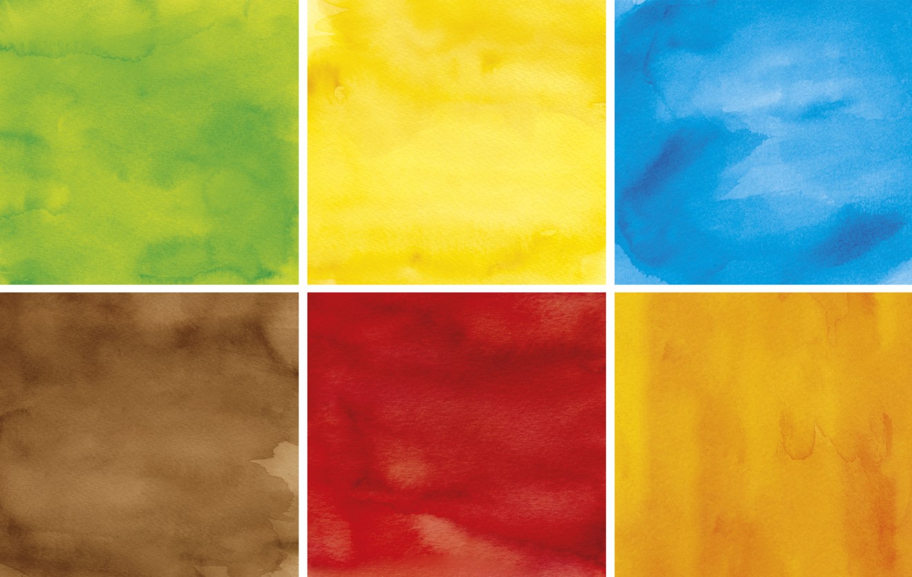
Maison Bruyère asked Quatre Mains to update their existing packaging retail range whilst maintaining a link with their previous design. Being fond of their typography style and little baker man icon, we combined both into a more up-to-date ‘Maison Bruyère’ branding. We gave the packaging a new classy, yet modern look, while focusing more on appetite appeal. Although the product already has a premium look, the packaging remains accessible in a retail environment. Adding a picture of the founder helps bringing back the trust of the consumers. The handmade watercolor drawings give the design a more unique and recognisable style.
Chique, n’est-ce pas?