Does your Brand need a Hand?
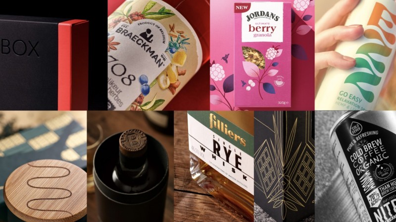
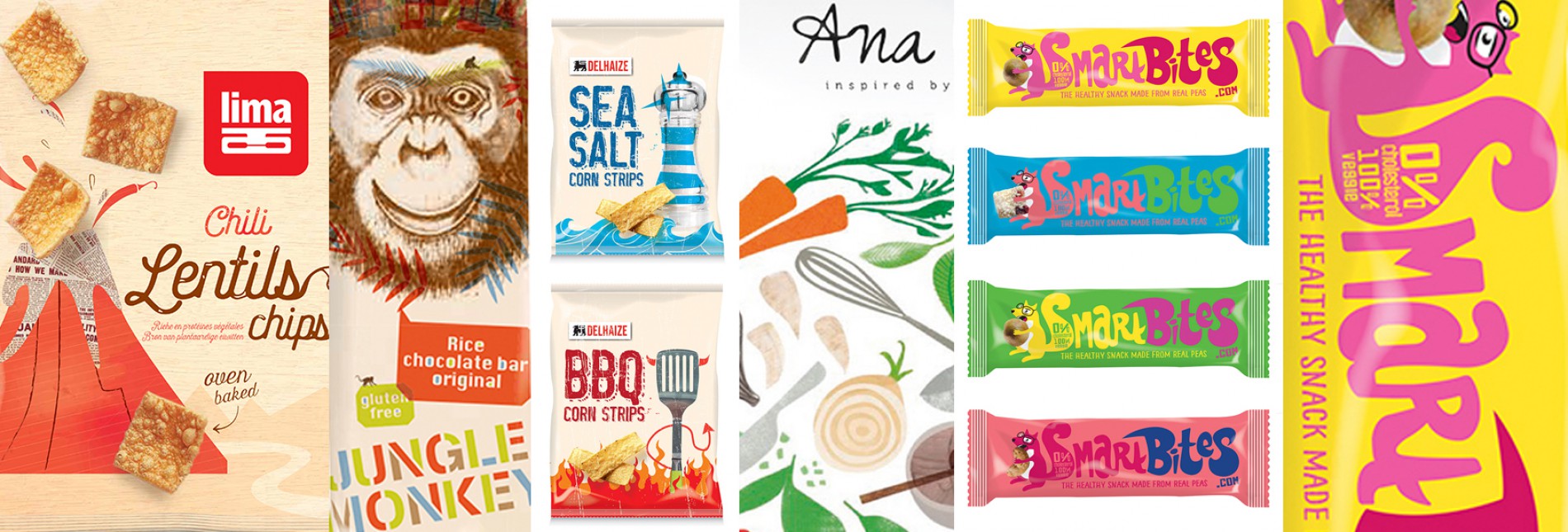
Packaging Design Trends in 2016.
1. The luxury of Less
Don’t get me wrong: we’re not talking about luxury packaging here, but about packaging design that allows itself the luxury of saying more with less. Using subtlety in the message and tactility in the execution. And combined with a subdued colour palette in which a dash of highlighter creates packaging that cleverly catches the eye of tomorrow’s shopper. User-friendly design makes the product accessible.
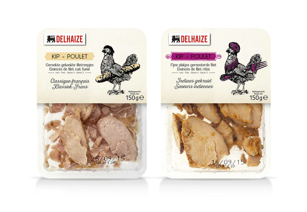
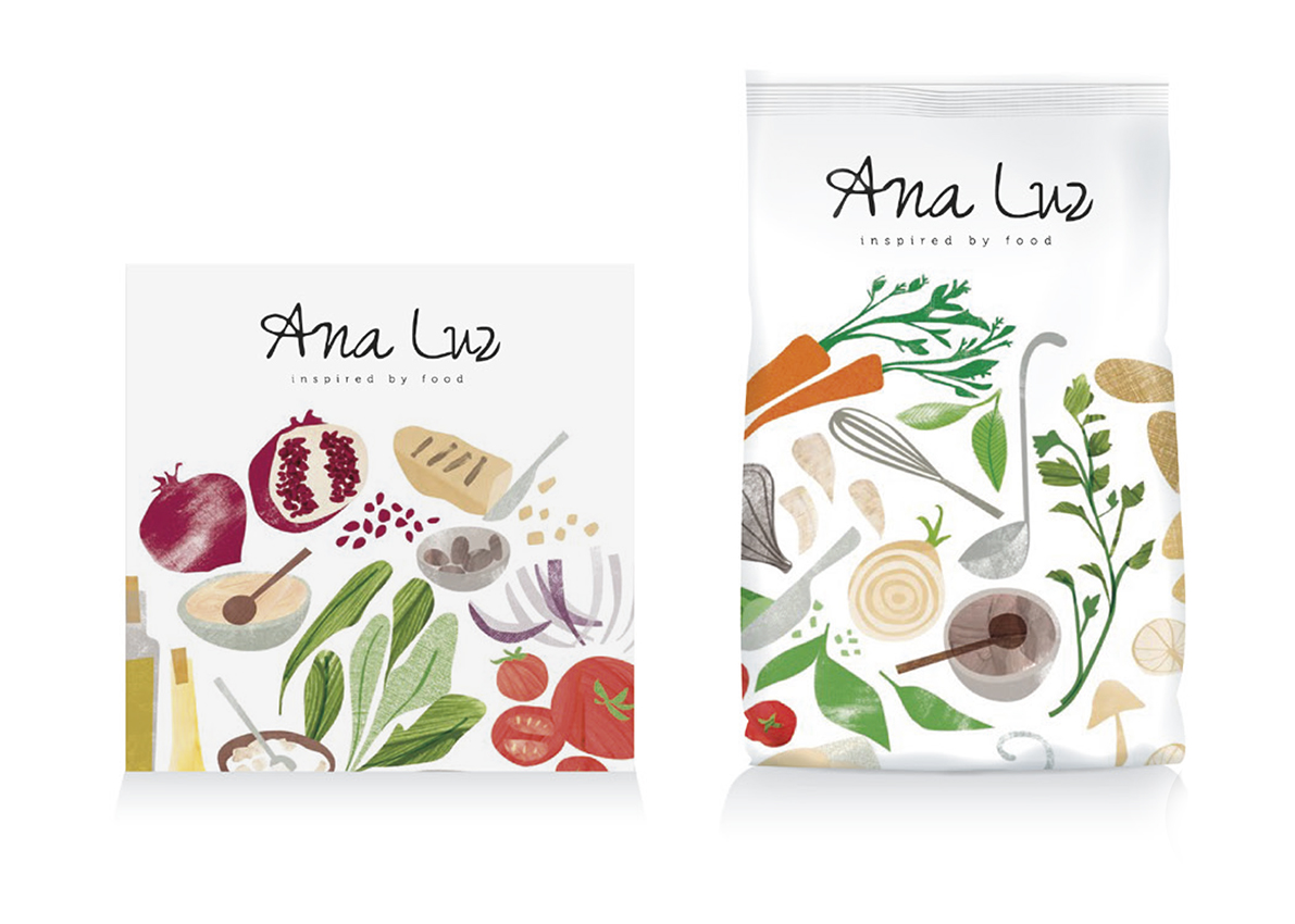
2. Visual 'Storytelling'
Terms such as sketchy artwork, quirky illustrations, graphical text, illustrative branding and vintage characters are all part of the packaging vibe of tomorrow. It’s a clear-cut trend that’s making its way here from the far north of Europe and is giving packaging design more personality and identity than ever before. It’s less about ‘branding’ and more about ‘personality’. Because in the People-to-People (P2P) business model, the consumer has become the brand.
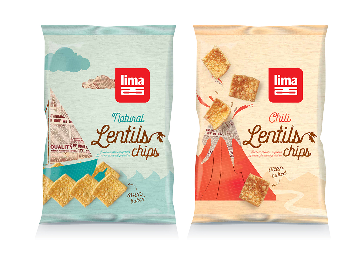
3. Inspired by ‘Nature’
‘Wood be Green’ packaging has been on the trend radar for ages now and natural materials that sit close to the actual contents of the pack are also on the rise. So it is high time for the packaging industry to take the initiative and draw inspiration from the biology of nature to come up with new materials and insights that reduce our carbon footprint. So, what can we learn from this biomimicry? Will, for instance, the natural packaging of fruit or the constitution of seaweed provide a helping hand in bringing new packaging technologies to the marketplace? The alternative packaging of yesteryear, usually intended for niche products only, has now become mainstream and is being used increasingly for a broad audience of consumers.
4. Ultra ‘Pur’
Saying what it’s really about in an uncomplicated way and not hiding the truth behind a wall of terms and claims that no one understands. Packs printed in monochrome or duotone make the ultimate message super-simple. Straightforward and abstract, the use of geometry and subtle designs generates a high level of confidence in consumers. Pure, inventive design, spiced with a dash of humour, does a great job in an interactive world in which we share everything on visual social media. Give your packaging its own visual identity that’s harder for the competition to copy.
Patrick De Grande
Quatre Mains, creates impact
Get in touch